
YouWorkForThem just launched a brand new site this week. If you are unfamiliar with YWFT, it’s an online store that carries books, t-shirts, posters, stock images and more.
We love books at Grain Edit so, we took some time to browse through the book section and select some of our top picks.
We’ve included links below each description, so you can get more info/purchase the book if you want to.
Dave’s picks

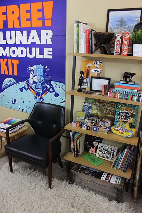
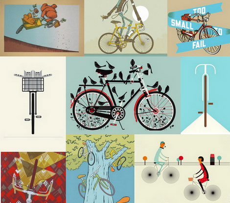
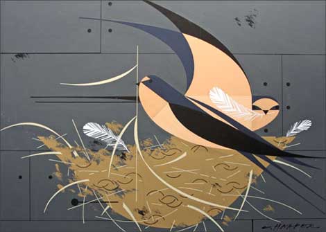
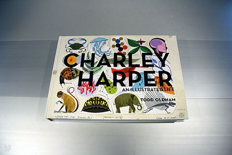
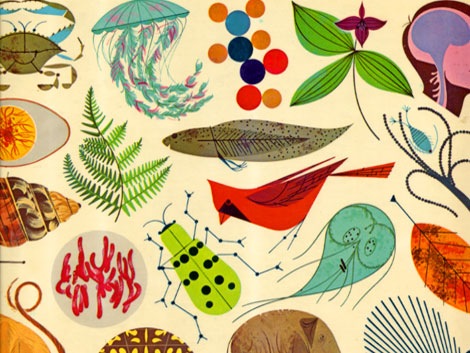
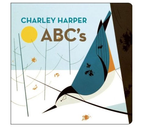
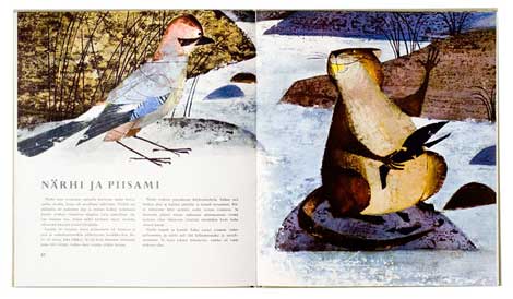
Charley Harper – An Illustrated Life
This mammoth 420 page book put together by Top Designer Todd Oldham is a wonderful tribute to Charley Harper. The book is filled with full color examples of Charley’s stunning work.
Click here for more for more info/ purchase a copy.

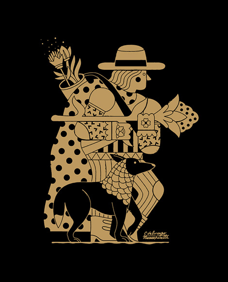
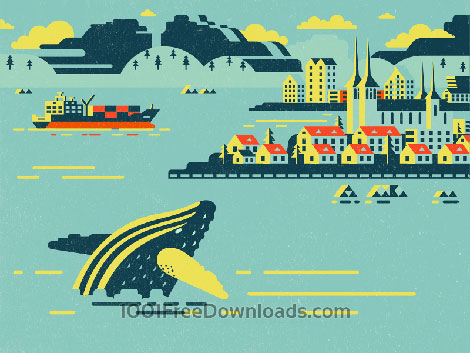
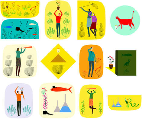
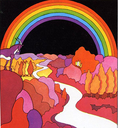
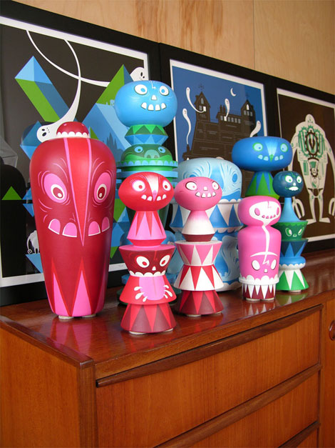
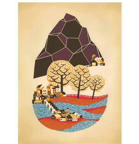
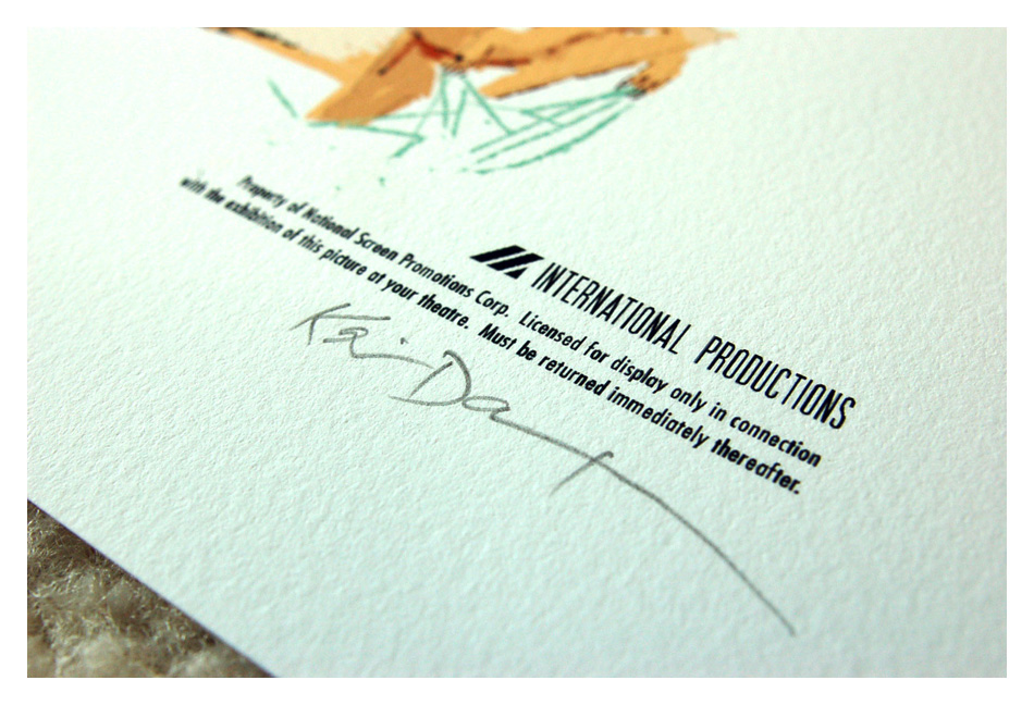
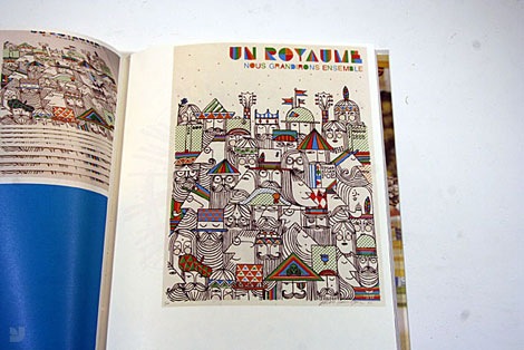
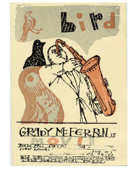
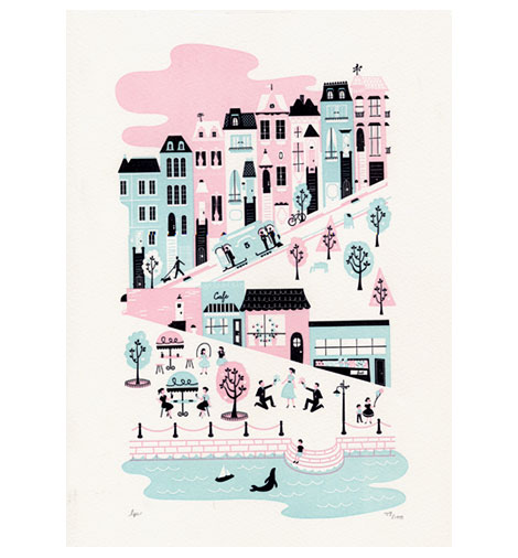
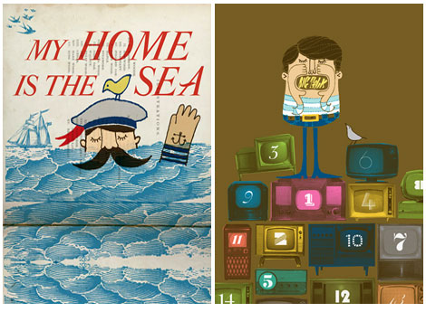
Steven Harrington: Our Mountain
I love Steven Harrington’s illustration style and this book serves as a wonderful overview of his work. This copy is signed and drawn on by Steven Harrington himself!
Click here for more for more info/ purchase a copy.
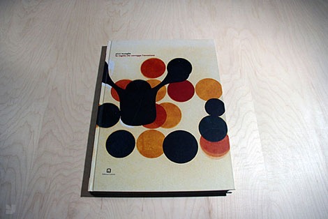
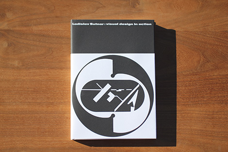
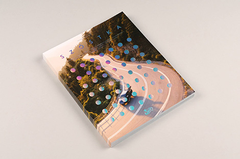
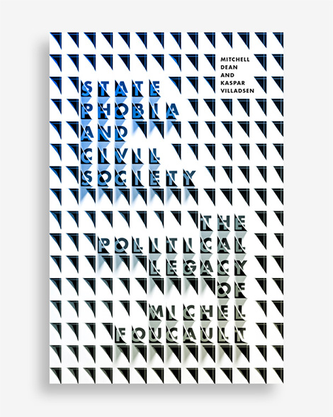
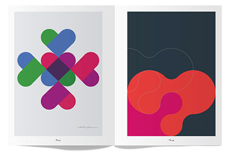
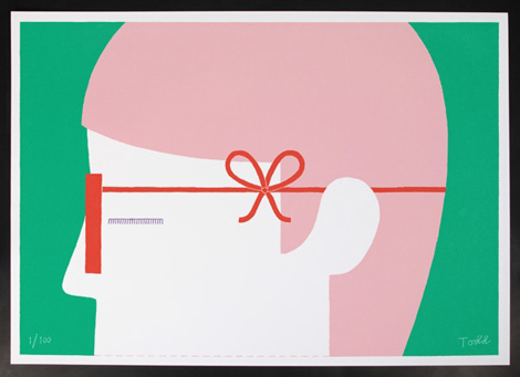
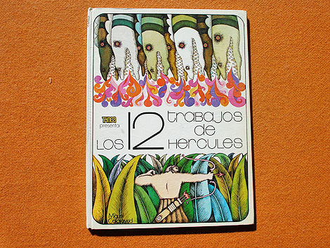
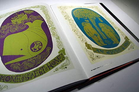
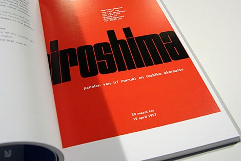
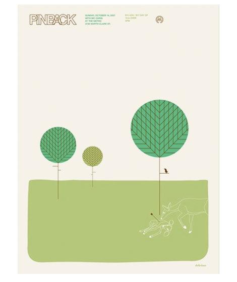
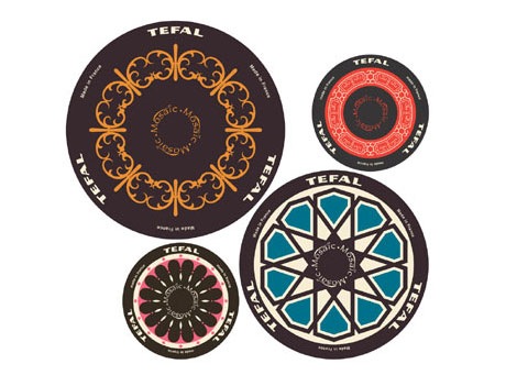
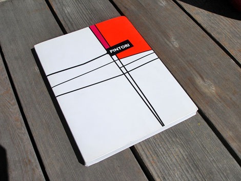
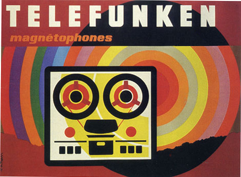
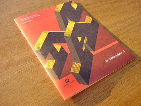
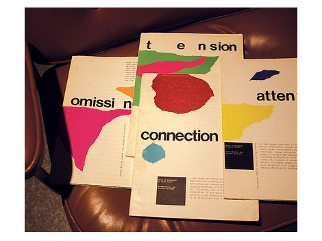
Pino Tovaglia: The Rule That Corrects Emotion
We received a copy of this book from the publisher a few months back and loved it. You can see our review of the book here. YWFT got in some copies and now you can own a copy of this hard to find Italian import too.
Click here for more for more info/ purchase a copy.
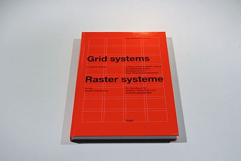
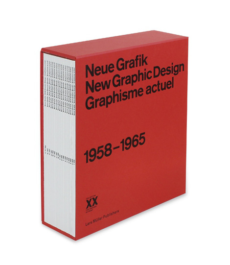
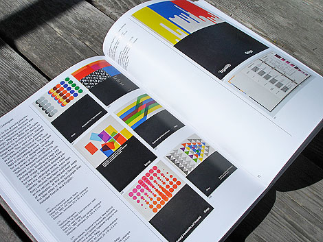
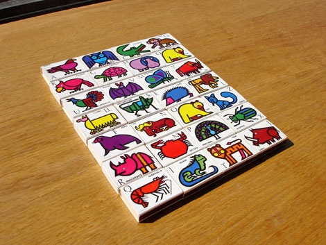
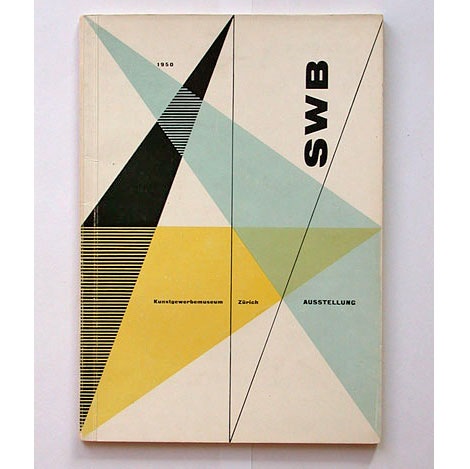
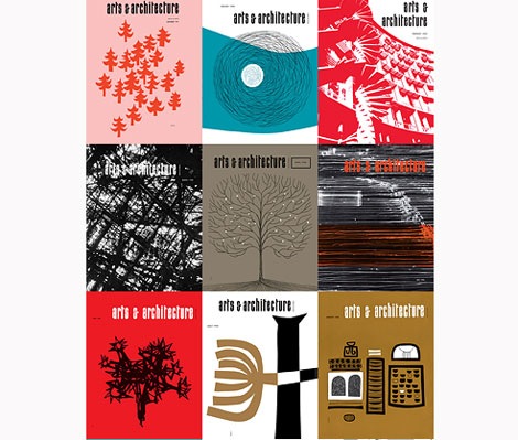
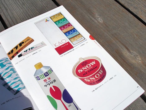
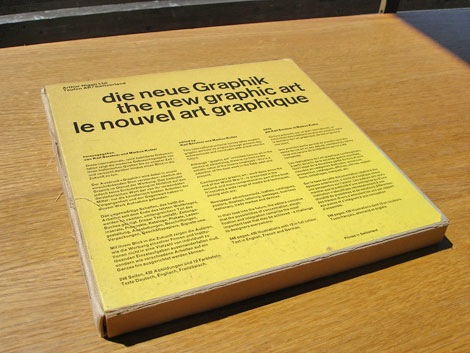
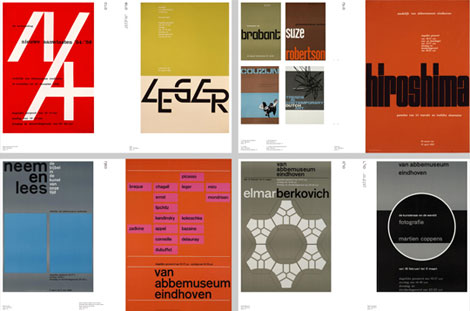
Grid Systems in Graphic Design
Josef Muller Brockmann’s magnum dopest. The definitive book on grid systems. Every designer should be required to own this.
Click here for more for more info/ purchase a copy.

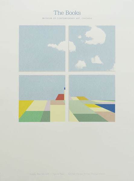
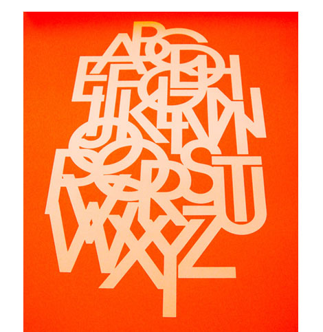
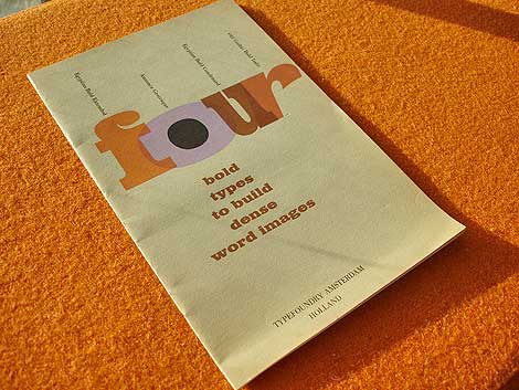
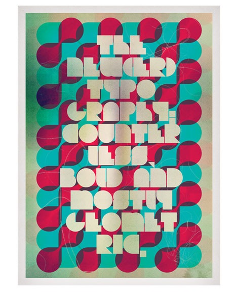
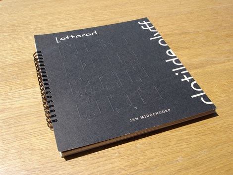
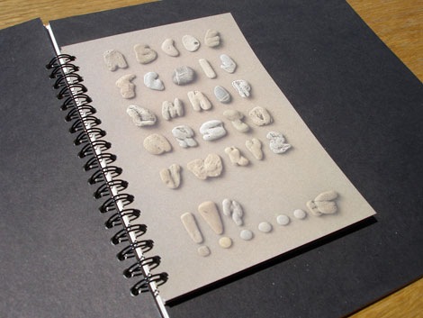
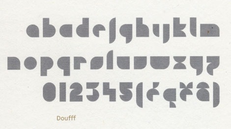
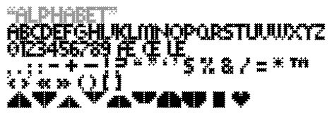
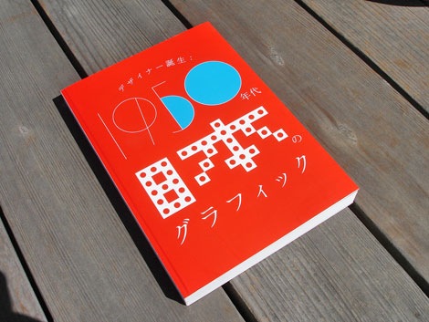
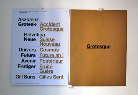
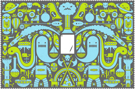
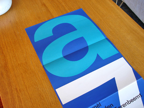
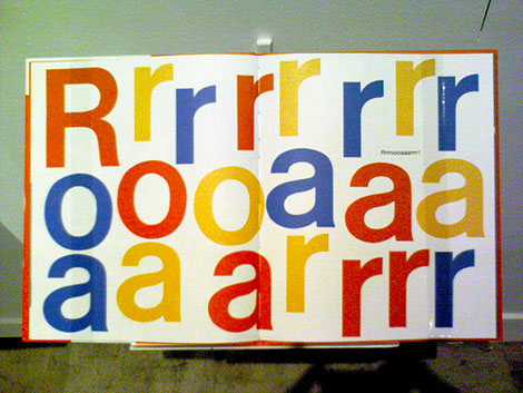
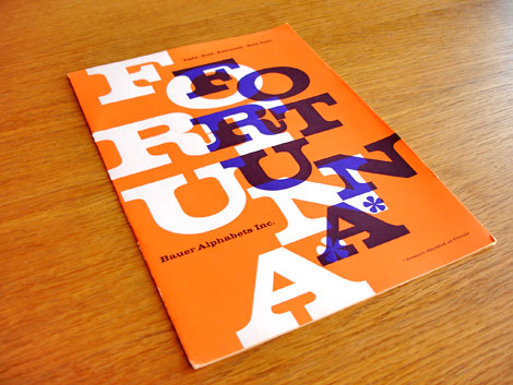
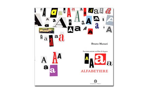
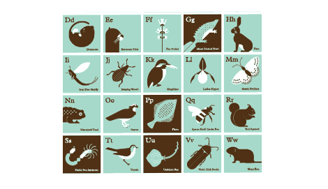
Wim Crouwel Alphabets
I really want a copy of the Wim Crouwel monograph: Mode En Module, but this book will have to due for now. Mode en Module has been out of print for a while and now goes for crazy cash. Wim Crouwel Alphabets (as seen above) is now of out of print as well and I’m sure it won’t be long before it increases in value. YWFT them still has a few copies, get your hands on one while you still can.
Click here for more for more info/ purchase a copy.
——
Ethan’s Picks
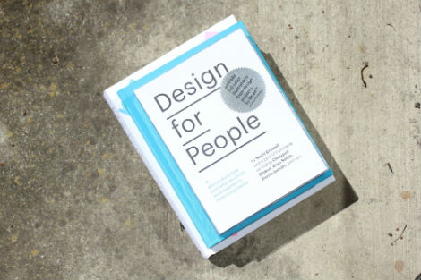
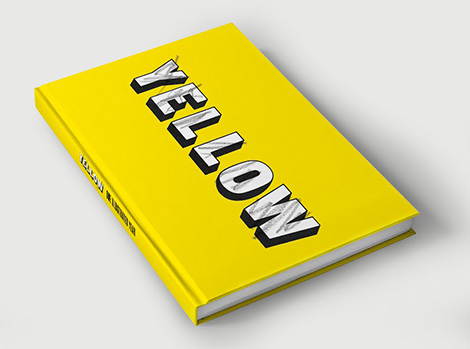
How To Be a Graphic Designer Without Losing Your Soul
As a design student, I am constantly looking for that juicy “tell-all” graphic design book. The one where you learn everything about being a real designer before actually getting a job. I love hearing different tips and tricks from seasoned designers. But my quest is over, because that book is here.
Adrian Shaughnessy breaks the process down into the necessary steps: how to find a job, being freelance, setting up a studio, running a studio, the creative process, etc. All of my burning questions answered in one book! Adrian also includes interviews with Neville Brody, Rudy VanderLans, Andy Cruz, and Natalie Hunter, among others, plus a forward by Stefan Sagmeister.
Click here for more for more info/ purchase a copy.
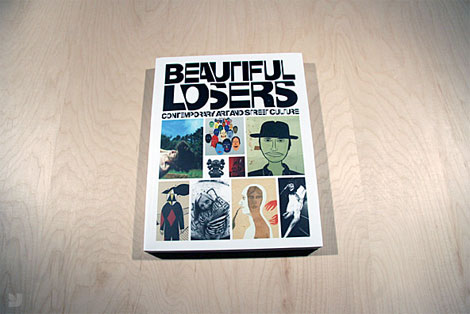
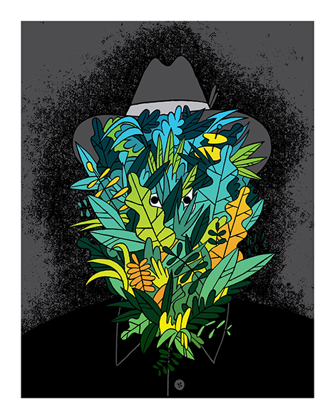
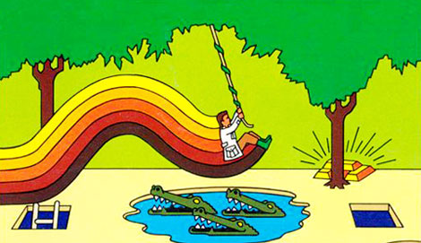
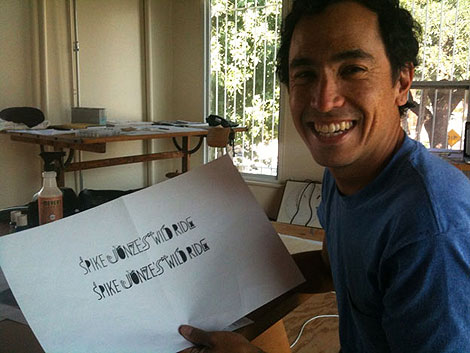
Beautiful Losers
One summer I spent a month attempting to learn how to skateboard. In the three years since then I’ve probably only landed two tricks successfully. I either got hurt or was too intimidated. Beautiful Losers is a way for me to vicariously live out my 1990s street and skate culture fascinations, without having to get on a skateboard.
Beautiful Losers tells the story of how artists and designers like Shepard Fairey, Spike Jonze, Mike Mills, Barry McGee, and others built their own art community independent of the mainstream art institution.
Click here for more for more info/ purchase a copy.
 Share on Facebook


