


Ken Leung interview
Being a fan of Monocle magazine, I’m excited about our next guest. Ken Leung is a London based freelance designer who helped launch Monocle magazine and until recently served as it’s art director. In today’s interview, Ken shares his love for Textas (marker pens), some of his influences and a few of his favorite books.
Ok, here we go..
Where are you from originally?
I was born in Kuala Lumpur but my family moved to Perth when I was two months old, so I am very much an Australian.
When and how did you come to be interested in graphic design?
I was rarely without my Textas (marker pens) as a kid and I remember spending hours drawing the logos of my favourite brands onto reams of computer paper. By the age of 10, I had pretty much memorized most of the well known corporate identities.
Who or what are your influences?
My bookshelves are mainly filled with monographs of all the great modernist graphic designers and typographers. I am also influenced from other areas like music, architecture and film as I think it helps to bring a fresh perspective to my work. I get just as inspired by the beauty and simplicity of a Mogwai track as I do from a Jost Hochuli book.
What was your first design job?
I started off as a newspaper designer straight out of university which taught me how to work to very tight deadlines. It also got me really interested in editorial design even though at the time I was being advised to go into web as print was supposedly dying. I am so glad I stayed with print as I think newspapers and magazines will always be an important source of information and entertainment.
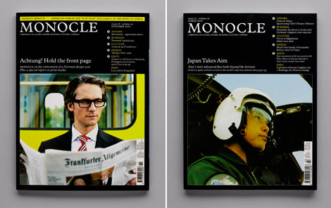
How did you get involved with Monocle?
There were a handful of creative agencies that I really wanted to work for when I first moved to London. Winkreative was at the top of my list because of its editorial background (being owned by Tyler Brûlé from Wallpaper*), as well an amazing body of corporate identity work like Stella McCartney, Craft Design Technology and Swiss Airlines. I worked with them on a variety of editorial and branding projects until Tyler started Monocle and I was brought on to work on the launch in late 2006.
Monocle’s layout is built upon a rigid grid based structure. What led you to head in that direction?
Monocle’s design philosophy is an unquestionable nod to Swiss graphic design. The Brockmann-style grids provide a strong foundation to begin building and designing a page in the most legible and concise way possible. Using such a strict grid also enforces restraint, which, in my opinion is where the most interesting design comes from.
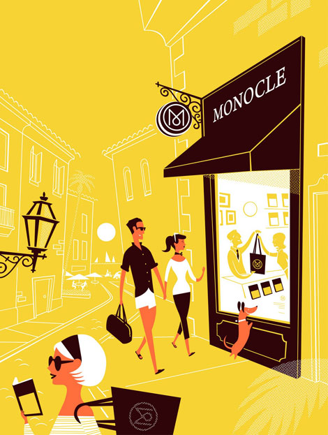
Illustration by Lab Partners.
I notice many of the illustrators you collaborate with for Monocle have a similar aesthetic. Could explain your selection process?
I choose illustrators that display a sense of craftmanship and detail in their work. They should have confident styles that aren’t based on trends or an over-reliance of technology. A sense of wit never goes astray either.
If you had to recommend 2 books to another designer what would they be?
“Grid Systems in Graphic Design” by Josef Müller-Brockmann is a great reference for designing with grids. I also love the Japanese design magazine IDEA that produces comprehensive monographs of famous designers every issue.
What are you currently working on?
After Art Directing 25 issues of Monocle I have just gone freelance to concentrate on independent work. Currently, I’m focusing on a couple of editorial projects in New York so hopefully you’ll see more of my work on newsstands soon.
—
I’d like to thank Ken for taking time out of day to share with us. If you would like to contact Ken you can email him at [email protected]
———————-
Enjoy reading this interview? Please leave a note in the comments and consider signing up for our tasty free grain edit RSS feed.
Also worth checking: Adrian Johnson interview.
———————-
Tagsgraphic-design, Interviews, magazines, UK
