Richard Alan Roberts: Graphic Design & More
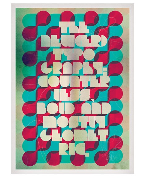
Yummy geometric type served upon gelatinous globs of red and blue. I’ll take it. Get some here.
Tagscontemporary, graphic-design, posters, Typography, UK
09.17.08 in Found design by Dave
Share This Share on Facebook


10 comments
Comments feed for this article
Trackback link
http://grainedit.com/2008/09/17/richard-alan-roberts-graphic-design-more/trackback/
Great poster, great blog.
09.17.08 |
Dee Beale |
Found design |
Wow, that’s lovely. Any idea what typeface that is?
09.17.08 |
CG |
Found design |
Thanks for your comments, yeah the typeface is Bifurk it’s available at Dafont.com. Hope that helps!
Cheers again for the post Dave!
09.17.08 |
Richard Alan Roberts |
Found design |
what’s the second word?
09.17.08 |
m matyus |
Found design |
It is NEW(ER), it was based around an article I read on ‘Speak Up’ about the current style of typography, hence the use of type on the poster. I know, it does throw a few people off.
09.17.08 |
Richard Alan Roberts |
Found design |
This look goregeous, maybe I should take one too. hmm…
09.18.08 |
Nina |
Found design |
Dave. I like it. I also liked the matchstick boxes. Those were lovely. On a completely unrelated note, here is a link I found with a selection of “gig posters” I’d never heard the term before but it is self explanatory. The posters are something else. I think you should take a look. Hope you are doing well, Milena.
http://wellmedicated.com/inspiration/50-amazing-gig-posters-sure-to-inspire/
09.19.08 |
Milena |
Found design |
that looks great
09.21.08 |
horacio |
Found design |
Hey Milena,
Thanks for sending that my way.
I love gig posters!
Jason Munn/ Small Stakes is a gig poster artist. Some of his posters are can be seen in the link you sent, plus we featured an interview with him.
http://grainedit.com/2007/11/01/jason-munn-interview/
09.22.08 |
Dave |
Found design |
hey what font did u use for this poster ?
01.09.12 |
Nicholas |
Found design |