Pagan and Sharp

One of the newest and most interesting typographic duos that has emerged lately, Pagan and Sharp—run by Carlos Pagan and Lucas Sharp—has released a new typeface called Sharp Sans. Based on the wonderfully simple vision of geometric styling, and a touch of humanism type theory, Sharp Sans does well in so many modern treatment situations that call for a bit of fun.

Along with Sharp Sans, they have produced Malleable Grotesque and the beautiful serif face, Hera Big. Pagan & Sharp are the creatives behind such notable work as the the latest Print 20 under 30 branding, Pinterest Logo, and recent New York Lottery campaign (Carlos’ work at DDB). With such lovely projects, they are well on their way to making a big splash in the typeface design world. Keep up with their latest news by following their twitter and keep an eye out for hopefully many more typefaces to come!

(more…)

Leah Reena Goren

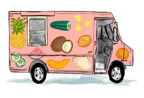
Welcome to the light, airy world of Leah Goren. Her illustration style is perfectly California, with bright yet washy shades of yellows, oranges and blues. Leah is one of the very few young illustrators to break the mould of paper and explore other mediums—namely textiles. You can see her work gracing the dresses and iPhones of girls on city streets everywhere.

(more…)

Mansi Shah

Graphic designer & pattern maker Mansi Shah really has a wondeful grasp on what playful design really looks like. She manages to create a sunny outlook throughout her whole body of work—whether by using interesting, undulating lettering, or by creating bright and quirky vector-based compositions. Her latest venture is really inspiring—Shah Editions, where she creates limited edition products, turning them into small-run works of art. Keep up with the latest from Mansi by visiting her site and her amazing (& sort of secret!) illustration portfolio.

(more…)

Elena Giavaldi

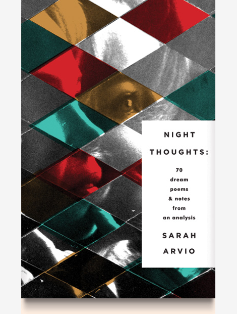
Talented designer and illustrator Elena Giavaldi really knows how to make judging a book by its cover easy. As a book cover designer, she creates very cool, contemporary compositions for some of the best publishing houses in the business. She also manages to put very personal touches on each project, and add a bit of extra interest with unique type choices and very modern, experimental lettering. Other than her expansive covers archive, her portfolio runs the gamut of graphic design, making her an incredibly versatile designer. To keep up with Elena, look for her work in a bookstore near you!

(more…)

Lotta Nieminen—Design

While most Grain Edit readers know Lotta Nieminen for her extraordinary illustration styles, but she also has an incredibly rich and beautiful design portfolio. Her keen eye for typography and layout design is relatively unmatched, and each project somehow manages to out-do the last. Together, her two portfolios create an exciting mix of work & almost a perfect dichotomy of truly minimal vs. extremely detailed.

(more…)

Matthew Tapia

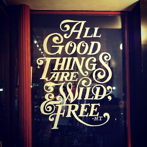
I was recently introduced to the work of lettering artist Matthew Tapia. He’s been an active figure in the skate and surf scene, but his elegant handiwork is incredibly well suited for all sorts of intricate lettering design. As a testament to his love for his craft, I witnessed him slaving away at 2am on the above mural, at a shop nearby my apartment (Raised by Wolves)—now that’s some dedication! To keep up with Matthew’s current work follow him on tumblr, and keep an eye out for his work hopefully soon in a shop (or on a store window) near you!

(more…)

Jesse Ragan

Type designer extraordinaire, Jesse Ragan, released the latest iteration of his website this past week. Chock full of new and meticulously designed work, Jesse’s type design gets more interesting with each project. His projects range from the current typeface of V Magazine, to the logotype for Glade, to working closely with Hoefler-Frere Jones on major typefaces like Gotham and Archer. Jesse, a self proclaimed designer of serious typefaces, is sure to continue to awe and inspire aspiring (and current!) type designers.

(more…)

Tomi Um

I love the portfolio of Tomi Um. Her work is clever and thoughtful—just so perfectly editorial—and yet retains such an artful feeling, that she takes the idea of conceptual/op-ed illustration to a different level. I’m consistently impressed at her ability to bring a vibrant visual life to news articles, and makes me hope that I can bring the same sort of excitement to my own work. Tomi has rightly won several awards and accolades over the past few years (such as ADC Young Guns & Print Magazine’s NVA), and here’s to many more for this great young illustrator.

(more…)

Mary Kate McDevitt

mary mcdevitt

The sweet and quirky work of Mary Kate McDevitt never fails to delight. Her personality shows through in every brush stroke and chalk mark, and really accentuates her obviously love for her craft. With a quickly growing client list of industry big-timers like Chronicle Books, Lehigh University, Better Homes & Gardens and Rachael Ray Magazine, Mary Kate seems to be on a path to lettering success.

(more…)

Rifle Paper Co.

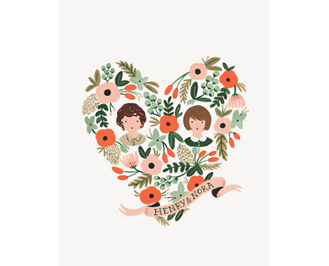
I love the work coming from Rifle Paper Co., the small studio of husband & wife team, Anna & Nathan Bond. Sweet and charming, they make work that speaks well to the sentimentality of their illustration style, and embodies the idea of nuanced design.

(more…)

Page 1 of 212