Justin Pervorse Interview
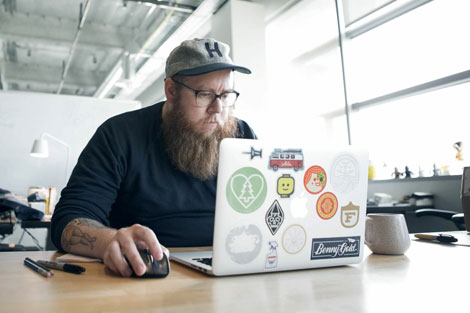
Continuing our series of process related interviews, we chat with illustrator and designer Justin Pervorse. A Bay Area transplant via Atlanta, Justin has been relentlessly perfecting his craft over the last decade.
I first caught wind of Justin’s talents during his tenure at Mailchimp, where he injected his infectious personality into a series of slick illustrations and campaigns for the email giant. He has since moved on to Dropbox’s internal design department, a position that has allowed him to further expand his creative capabilities. Through the support of his peers, Justin and his team have created a series of self-initiated projects that explore and uplift the spirit of the brand. In today’s interview we highlight one of these projects, delve into his workflow and discuss his earliest days as a designer.
Lets start off with a little bit about your background. Where are you from originally?
I was born in the wonderful northern beauty of Michigan and after a short stint in South Carolina my family moved to the suburbs of Georgia where I grew up. The majority of my childhood was spent playing outdoors and building things with whatever random junk I could find. I always had a wild imagination that consistently led to me doing crazy things — usually playing with fire or trying to blow something up but getting into trouble was a regular occurrence for me as I was always very adventurous.
I loved to draw growing up but I never really thought about it as a future career. My parents were both creative in some sense but neither had any major background in general art. My mother did have a short artistic exploration in college so as a kid I was amazed with the few drawings she had kept from that point in her life. My old man had a very unique job in building ropes courses and climbing towers. It was definitely a bragging point to tell all my friends that my Dad built zip lines for a living and even better that I got my occasional share of zippy adventures. Though I didn’t understand it yet my parents were always very good to encourage me about my creativity and wild ideas.
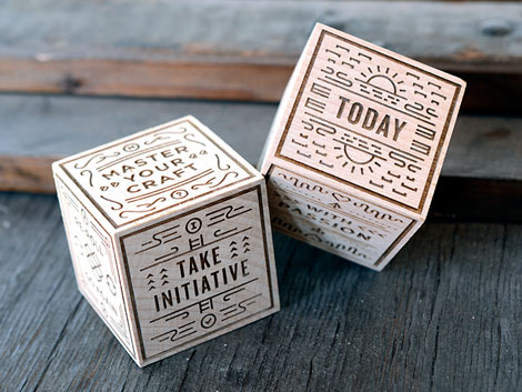
Dice created for an internal office team at Dropbox
Moving into my awkward years of high school I started to take more interest in art and took as many drawing, painting, photography and computer classes as I could. I yet again found myself indulging in mischief in a printshop class where I learned boatloads about offset, letter press printing, finishing and a lot of other production techniques. I liked to make fake business cards, stupid bumper stickers to put on friends cars and the occasional weirdo mini zine to share with friends. Between print shop and photography I really started to find more interest in design but it was still a while before I found my calling as a designer.
When and how did you become interested in illustration and design?
After high school I considered college but instead explored a stint of playing music and delivering pizzas, which for the record is still my all time favorite job. I love being a designer but some of the weirdest things would happen to me on deliveries.
Playing music resulted in a lot of design work for my own bands and friends bands. I was primarily started off designing shirts, posters and album artwork which over time lead to a bigger breadth in projects. I’d pretty much take any work I was offered back then, even if it wasn’t something I was interested in or familiar with specifically because I wanted to try new things to learn through those projects. I still don’t regret taking the route of being self taught as it gave me a lot of options to explore different things, which over time led me to realize how much I loved to illustrate and thus my career path began.
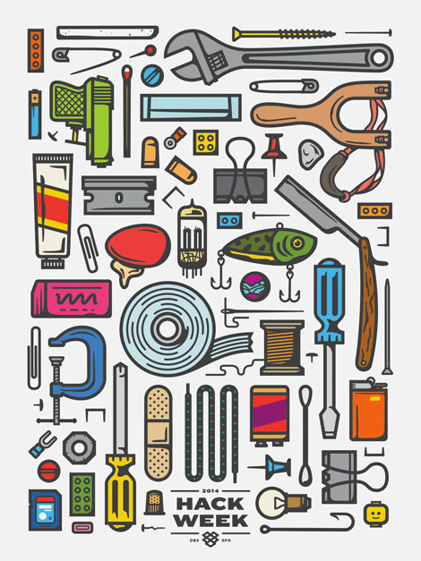
Poster created for 2014 Dropbox Hack Week
What design project are you most proud of? and why?
This is a hard question for me to answer because I look back on most projects and I’m proud of them all on some level, even some of the terrible ones that I will probably never speak of. I like to think that I learn something new on every project and I feel proud that I get to design fun stuff for a living in the first place.
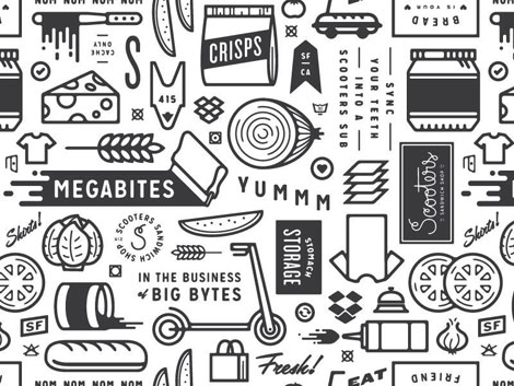
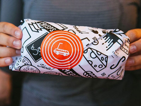
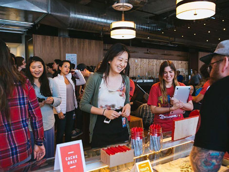
A project that I am very proud of recently though was one I worked on at Dropbox for our annual Hack Week along with fellow designer Drew Roper. I’ll begin this by saying how lucky I am to work somewhere that I can take some level of my crazy childhood ideas and turn them into actual work. I dreamed up the idea to create a shop within the Dropbox office that would serve up made to order t-shirts for all the employees and attendees of Hack Week. It originally started around the concept of one of those bodega or mega mall kiosks with the tacky palm tree logo that sells cheap sunglasses and quickly evolved into a fully branded, built out deli that I named “Scooters Sandwich Shop”. We pushed on every detail with things like custom screen printed sandwich wrap paper used to roll shirts once they were finished, custom scratch pads for taking orders, developing an ordering system and even made a daily secret password system that would land you a secret shirt. We would broadcast our deli hours every day via email and would serenade a sea of people with a curated metal playlist as they all lined up and waited for their shirts. The whole project was crazy and sometimes stressful but its by far one of my favorite things I’ve ever worked on. In the end I am not only proud that I got to make that crazy idea happen but that it created an experience that brought joy to so many people.
Scooters Sandwich shop project
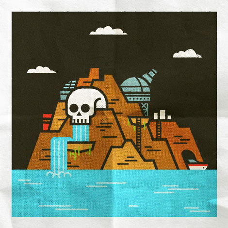
We would love to highlight one of your projects. Could you walk us through Treasure Island 2090 Gift Shop Print? Please include the tools you worked with to achieve the final look.
I really enjoy designing just for fun sometimes and it usually results in trying something new. I thought it would be fun to think of a futuristic treasure island that is more of a tourist attraction and illustrated a commemorative print that would be picked up in the gift shop. I mean, why not?
I started with vector forms in illustrator and then worked in photoshop to get the textures and final color tones adjusted to make it visually look more like a folded up poster. I wanted to experiment with some vector textures so I used the Standard Issue Vector Textures to add some subtle halftones and some Vector Supply Sponge Brushes to add some subtle texture to the edges of the artwork. I finished it up in photoshop with some of my own paper and grain textures.
What were some of the thoughts that fueled the direction of the design?
I wanted to to stick to with basic shapes and some subtle line details so I could allow for the textures to bring more character and detail to the illustration.
In what ways did the initial concepts differ from the finished?
I actually just dove straight into this one. Normally I don’t do a ton of sketching unless I’m really unclear of where to start and even then its sometimes just a bunch of chicken scratch in my sketchbook or on post-it notes. I’d say it landed pretty close to what I had envisioned in my head.
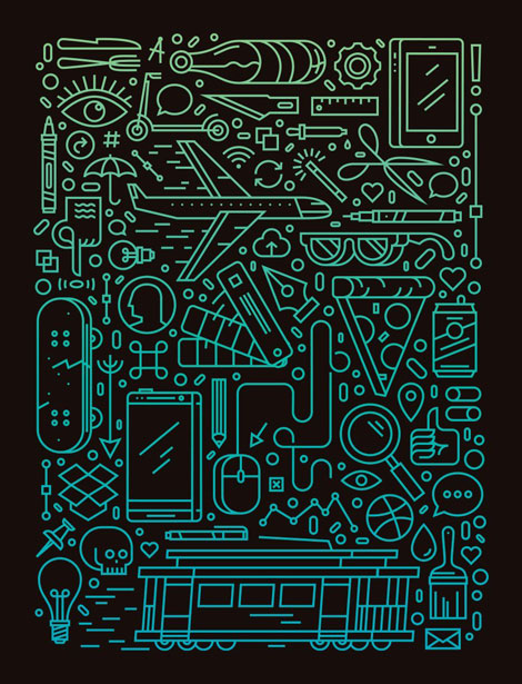
SF Dribbble meetup illustration
How has your work evolved over the years?
I actually took a long look back at some of my old work recently. Some as far back as 10 years ago and I had a pretty good laugh. I’d say my work has come a long way over the years but I think the biggest evolvement my own personality into my work. I try and add some bit of weird or funny to everything I create. I think putting your personality into your work is important and makes your work more unique. It took me awhile to realize that as a designer but once I did I feel more attached to what I am working on.
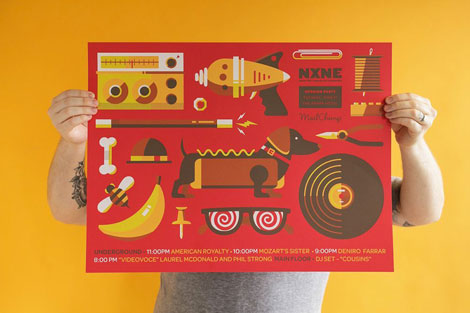
NXNE poster
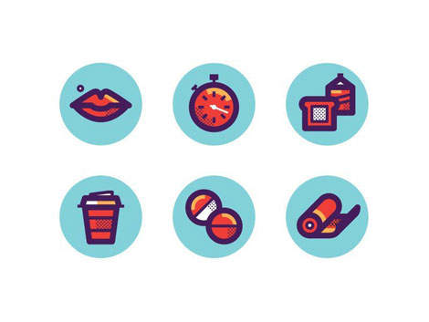
Icons created for Men’s Health magazine
What are your passions outside of design?
I have a lot of passions outside of design but a lot of them still relate back to design in a way. I really love to cook which is truly just a different form of design and its art that you can eat. I can make some mean pasta and know my way around a grill pretty well. I’m also really into riding motorcycles and working on them. I personally own two and plan to own many more in the future. Riding, coupled with traveling and camping is a really nice way for me to relax and clear my mind. Some of my best ideas have come to me while riding or being out in the wilderness cut off from everything else.
Most importantly though is spending time with my wife and son. They mean the world to me and drive me to continue doing what I do every day.
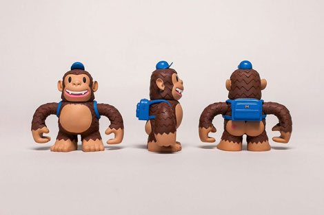
Mailchimp Freddie toy
We would like to thank Justin for taking time to share with us. You can see more of his work here.
——

This interview is brought to you by RetroSupply Co. Working with authentic materials (including real paint, ink, paper and screen textures from screen printing shops) they have crafted a vast library of vintage inspired design resources for Photoshop and Illustrator.
Get 9 Best-Selling Design Goods Free
Sign-up for updates about new products from RetroSupply and get instant access to 9 best-selling goods.
Save 20%
RetroSupply Co. is graciously offering grain edit readers a discount on all products for a limited time. Type in GRAINEDIT20 at checkout to save 20% off all purchases.
——
Also worth viewing…
Josh Brill Interview
Brad Woodard Interview
Ty Wilkins Interview
Follow us on RSS, Instagram, Pinterest, Wanelo,


