Laura Carlin

Laura Carlin
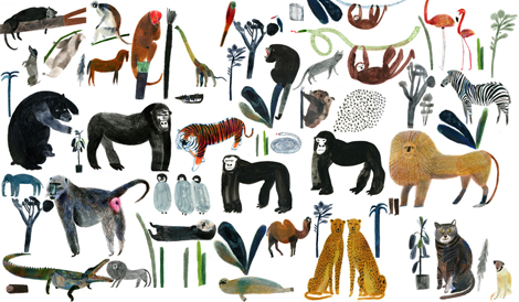
Laura Carlin has a knack for creating the most interesting projects with a completely new sort of illustration. In fact, I wouldn’t even know how to relate her work to anyone else’s, since her style is so uniquely eccentric and lovely at the same time. I especially love her animals on ceramics, and the textures that she creates on paper with translucent paint and rough paper.
(more…)

Stone and Spear

Walking the fine line between design, illustration and collage, is Stone and Spear, aka Simon Cook. His pairing bright colored shapes with simple allusions to photomontage, he creates intricate compositions that are slightly crazy but really entertaining. I am most drawn to the intense color schemes and how he designs each piece with a graphic designer’s eye, which makes his work quite unique.

(more…)

Mansi Shah

Graphic designer & pattern maker Mansi Shah really has a wondeful grasp on what playful design really looks like. She manages to create a sunny outlook throughout her whole body of work—whether by using interesting, undulating lettering, or by creating bright and quirky vector-based compositions. Her latest venture is really inspiring—Shah Editions, where she creates limited edition products, turning them into small-run works of art. Keep up with the latest from Mansi by visiting her site and her amazing (& sort of secret!) illustration portfolio.

(more…)

Raymond Biesinger

Raymond Biesinger, who was one of the first editorial illustrators that I learned about when I got out of college, has some lovely new work on his freshly updated website. One of my personal favorites, Raymond seems to take the most simple of concepts to an entirely new level by creating intricate, complex worlds by using minimal color palettes and impressive line work. You can see Raymond’s influence on many current editorial illustrators, which makes him an important part of the industry’s foundation. He also has several great side projects, including his band, The Famines, & a book which comes out in November called Black & White Illustrations.

(more…)

Elena Giavaldi

Talented designer and illustrator Elena Giavaldi really knows how to make judging a book by its cover easy. As a book cover designer, she creates very cool, contemporary compositions for some of the best publishing houses in the business. She also manages to put very personal touches on each project, and add a bit of extra interest with unique type choices and very modern, experimental lettering. Other than her expansive covers archive, her portfolio runs the gamut of graphic design, making her an incredibly versatile designer. To keep up with Elena, look for her work in a bookstore near you!

(more…)

Lotta Nieminen—Design

While most Grain Edit readers know Lotta Nieminen for her extraordinary illustration styles, but she also has an incredibly rich and beautiful design portfolio. Her keen eye for typography and layout design is relatively unmatched, and each project somehow manages to out-do the last. Together, her two portfolios create an exciting mix of work & almost a perfect dichotomy of truly minimal vs. extremely detailed.

(more…)

Matthew Tapia

I was recently introduced to the work of lettering artist Matthew Tapia. He’s been an active figure in the skate and surf scene, but his elegant handiwork is incredibly well suited for all sorts of intricate lettering design. As a testament to his love for his craft, I witnessed him slaving away at 2am on the above mural, at a shop nearby my apartment (Raised by Wolves)—now that’s some dedication! To keep up with Matthew’s current work follow him on tumblr, and keep an eye out for his work hopefully soon in a shop (or on a store window) near you!

(more…)

Jesse Ragan

Type designer extraordinaire, Jesse Ragan, released the latest iteration of his website this past week. Chock full of new and meticulously designed work, Jesse’s type design gets more interesting with each project. His projects range from the current typeface of V Magazine, to the logotype for Glade, to working closely with Hoefler-Frere Jones on major typefaces like Gotham and Archer. Jesse, a self proclaimed designer of serious typefaces, is sure to continue to awe and inspire aspiring (and current!) type designers.

(more…)

Mary Kate McDevitt

mary mcdevitt

The sweet and quirky work of Mary Kate McDevitt never fails to delight. Her personality shows through in every brush stroke and chalk mark, and really accentuates her obviously love for her craft. With a quickly growing client list of industry big-timers like Chronicle Books, Lehigh University, Better Homes & Gardens and Rachael Ray Magazine, Mary Kate seems to be on a path to lettering success.

(more…)

Gratuitous Type / No. 2

I was sent this really cool book—or “pamphlet”, as they call it—called Gratuitous Type / No. 2. A self proclaimed “pamphlet of typographic smut”, this small anthology of current interesting typography, lettering and fonts really runs the gamut of interesting new styles. With an advanced design and extremely impressive printing, the publisher/designer and editor (Elana Schlenker) has done a wonderful job putting everything together.

(more…)

Page 1 of 3123