Ty Wilkins Interview
It’s rare that I come across a designer whose work has as much personality and charm as Ty Wilkins. Hailing from Austin, Ty’s portfolio is filled with character-driven projects that showcase his mastery of color, texture and repetition.
Prior to launching his own studio, Ty worked for Gardner Design, where he developed branding, packaging, signage and redesigned LogoLounge. He also traveled extensively, which had a profound impact on his aesthetic sensibilities. Currently, Ty can be found developing advertising campaigns, editorial illustrations and identity work for a wide range of clients including Target, Monocle and Wired UK. In today’s interview, Ty graciously shares his beginnings as a designer and grants us a glimpse into his creative process.
Lets start off with a little bit about your background. Where are you from originally?
I was born in Texas and grew-up mostly in Texas and Oklahoma. I graduated from high school in Buenos Aires, Argentina and attended college at Auburn University. I now live in Austin, Texas.
When and how did you become interested in illustration and design?
I love to draw. Growing up, I thought this meant that I would become an animator. As I started researching colleges during my last two years of high school, I realized that animation wasn’t offered as a major at any of the schools I was considering. Instead I discovered “computer art” and “graphic design” in the college course catalogs. I thought that one of these majors might be my way to sneak into the animation industry. I enrolled at Auburn University and after a brief stint as an international business major, switched to graphic design. While taking a Corporate Identity class I discovered a passion for symbols and logo design. The process of distilling complex information into a succinct, unique and memorable icon remains endlessly fascinating.
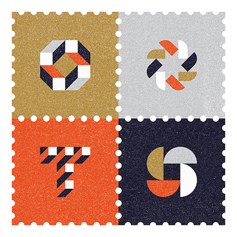
We would love to highlight one of your projects. Could you walk us through the creation of your recent stamp project?
The tools that I used for this project include pencil, paper, Illustrator & Photoshop. I combined several methods to create texture. I visited my local public library and made photocopies of white sheets of paper until black specs started to appear in the copies. I inverted the color, boosted the contrast and repeated the process until I had photocopies full of random flecks. I scanned this texture and combined this with noise I generated in Photoshop and a texture from RetroSupply. These techniques help create the illusion that the artwork was printed on paper.
What were some of the thoughts that fueled the direction of the design?
My work spans both branding and illustration. Minimal iconic gestalt-like geometric shapes and limited color palettes are common threads among all my work. So when creating this piece for my studio I sought to capture these aspects of my work. I am fascinated by the way two dimensional shapes can suggest three dimensional forms. Three of the symbols are composed to form an interior negative space (a diamond, star and square). The dimensional T is the new symbol for my studio.
In what ways did the initial concepts differ from the finished work?
My initial concepts were more illustrative and detailed. I explored creating a line of environmentally themed stamps with more elaborate scenes of trees, fish and environments. After a few rounds I decided to create something that worked equally well for the branding side of the studio.
What are your passions outside of design?
I love getting outside and being active. I enjoy hiking and biking during most months and when it gets hot outside I like to go paddle boarding and swimming. Austin has several great swimming spots. Two of my favorites are Barton Springs and Hamilton Pool.
We would like to thank Ty for taking time to share with us. You can see more of his work at tywilkins.com.
——

This interview is brought to you by RetroSupply Co. Working with authentic materials (including real paint, ink, paper and screen textures from screen printing shops) they have crafted a vast library of vintage inspired design resources for Photoshop and Illustrator.
Get 9 Best-Selling Design Goods Free
Sign-up for updates about new products from RetroSupply and get instant access to 9 best-selling goods.
Save 20%
RetroSupply Co. is graciously offering grain edit readers a discount on all products for a limited time. Type in GRAINEDIT20 at checkout to save 20% off all purchases.
——
Also worth viewing…
Josh Brill Interview
Brad Woodard Interview
Ty Wilkins interview


