Finnish graphic design : annual report

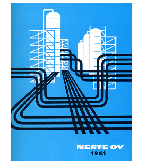
1961 Neste Oy Corporate annual report designed by Olli Stelander. Great use of limited color. This was when drilling for oil was hip, the indie rock (Get your shale on!) of the energy industries. This annual probably doubled as their tour poster.
For more design work from Finland check my post on Finnish book design.
Tags1960s, annual-reports, finland, graphic-design, Illustration, Mid-century, modern, vector
01.08.08 in Off Our Bookshelves by Dave
Share This Share on Facebook


5 comments
Comments feed for this article
Trackback link
http://grainedit.com/2008/01/08/finnish-graphic-design-annual-report/trackback/
01.09.08 at 5:46 am
Pingback from Finland » Blog Archive » Cold
what’s the deal with Scandinavians and great, clean design??
01.08.08 |
Frater Gymnos |
Off Our Bookshelves |
Don’t suppose there’s any chance of seeing inside that anywhere?
Would love to see how the design is mirrored in the copy!
–
Simon Aronson
http://www.yourannualreport.co.uk
01.22.08 |
Simon Aronson |
Off Our Bookshelves |
Hey Simon,
Unfortunately I don’t have a copy of the annual report. I just have a book that highlights the cover. I’d love to see the inside as well.
01.22.08 |
Dave |
Off Our Bookshelves |
The cover looks great, but I’m afraid the inside might be less impressive.
The modernist influence in Finland seldom reached the fields of typography and layout
06.02.10 |
Erkki |
Off Our Bookshelves |