


Mike Davis interview
Mike Davis aka Mike the 2600 King is part of a design collaborative known as Burlesque of North Of America. In addition to their design work they are a full service screenprinting studio.
I first ran into Mike while on a cross country record digging trip in 2003. My friends and I were crashing with some of the cool cats at galapagos 4. They heard that Mike was spinning at one of the local clubs, so we decided to check it out. Mike was laying down some serious funk/ soul heat that night and the club was packed. Later I found out that in addition to be a great dj, he was an excellent designer creating posters for my friends at anticon.
I’ve been impressed with the work Mike (and the rest of the guys at burlesque) have been creating over the last several years. They have produced outstanding posters for Diplo, Lyrics Born, Boris, Arcade Fire, Mogwai and Why? amongst others.
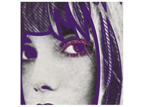
Before we jump into the interview, I’ve put together a slideshow that highlights some of Mike’s design work over the past few years.
[pictobrowser 10159078@N03 72157604123524508]
Continuing with our designer interview series, grain edit is proud to present Mike Davis.
Let’s start off with some background info on Burlesque.
Why Burlesque? How did you come up with the name?
Y’know, it was kind of one of those names that was just floating around before it became official, then when I moved up to Minneapolis to work with these guys, it just fell into place like “Yeah I guess that’s what we’re gonna call ourselves.” When you think about it though, Burlesque refers to things that are a little bit risqué, a little dangerous, but not completely perverted… like something that you can proudly display in your house but take down if your parents come to visit. So there’s an element of mystery, an element of danger, and also an element of vintage ephemera.
Who is Burlesque and how did you guys meet?
Burlesque began as a collective of graphic designers, illustrators, and screenprinters. We all used to work together on Life Sucks Die, a Minneapolis-based graffiti magazine that highlighted, beyond graffiti, music interviews, roadkill, and full frontal male nudity. You know… real family friendly stuff. So the magazine was doing really well from 1997 until about 2001 when everyone just started to move on to wanting to do other things. It wasn’t that peoples’ hearts weren’t still into doing Life Sucks Die, it’s that it started to demand full-time attention that not everyone could devote. Some people went on to pursue music careers or other jobs, and some of us assembled to take the things we learned while doing the magazine (page layout, Photoshop skillz, event organization and promotion) and start doing freelance graphic design full time. I was living in St. Louis doing freelance design at the time (under the name Twelve Car Pileup) and decided that a move to Minneapolis would be my best decision to kick things off with these guys. In the fall of 2003, I packed up and left St. Louis to start working with Wes Winship, Aaron Horkey, George R. Thompson IV, and Skye Rossi in the Life Sucks Die office space. We were designing album artwork and flyers for Rhymesayers, anticon, and designing and printing concert posters for local venues First Avenue and Triple Rock Social Club. It was doing these posters that started to gain us attention of bands and labels from out of town – groups like Arcade Fire, Converge and Death Wish Records, Hyrda Head Records, and The Melvins.
Since then, we’ve moved into a larger space to accommodate more screenprinting equipment, have hired on two full-time print production wizards and a mail order / customer service wizardress, plus now have an art gallery in the front room of our studio where we showcase our friends’ artwork and local rock groups.
How did you become interested in graphic design?
I’ve been interested in art and drawing my whole life, but never really thought I’d be able to make a career out of it. When I got to college – Washington University in St. Louis, I stumbled upon a Graphic Design elective my first year and liked it enough to transfer to the art school and major in Graphic Design. The more I learned about it, the more I became interested in it. I was also really into graffiti around this time and the design stuff I was learning was really influencing my graffiti, and vice versa.
What was your first design job?
Right after I graduated in 1999, I interviewed at a few different design firms around St. Louis, most of them being far more conservative than I was looking for. At one of my interviews, one of the younger designers pulled me aside and handed me a business card for a small studio called Chameleon Creative, telling me ‘This is probably the kind of place you’re looking for.’ The card’s design was pretty edgy for St. Louis and I couldn’t help but send them a resume and letter. Surely enough, I heard back from them and eventually started working with Chameleon. It was indeed a small studio – I was the fourth person on board alongside the two young owners, one of whom was a drum & bass DJ, and the lead designer, with whom I still remain in contact. I probably learned more about design in my first month at Chameleon than I did in all four years of college.
After about a year or so, we got bought out by a stupid PR firm and moved into a beige cubicle farm. After their helpless sales staff failed to be able to sell any of our design work, layoffs starting happening, I lost all my passion to create interesting work, and I got cut. I decided to start doing freelance design, taking on whatever nickel and dime work I could (club flyers, wedding invites, business cards) as I slowly built up my portfolio and client list.
Who/ what are some of your biggest influences?
We keep our office filled with all sorts of vintage magazines, books, records, toys, and packaging. Having that stuff around really helps to keep us excited about creating interesting artwork. Design wise, my strongest influences are primarily from the 1960s and ’70s – Milton Glaser, Herb Lubalin, Peter Max, Otl Aicher, Saul Bass, Wes Wilson, and Alfredo Rostgaard. Y’know – the usual suspects. There’s something about the shapes and lines from that era that really resonates with me – something I can’t quite describe in words but know when I see.
What current designers do you admire?
Steven Harrington from National Forest, Delicious Design League from Chicago, Little Friends of Printmaking from Wisconsin, Geoff McFetridge, Adam Garcia from The Pressure, and Wes, Aaron, Todd, and George from Burlesque.
What is a typical day like for Burlesque?
I’m usually the first person in – around 9:30 or 10. I start deleting the 100 or so spam emails I receive each night and replying to the real ones. Jodi gets in at 10 and starts going on packing mail orders or racking prints, Ben and Bjorn show up around 11 to start printing and doing print-related tasks (exposing screens, mixing ink, cleaning and reclaiming screens, cutting paper). I’ll be working on design jobs, usually in Adobe
Illustrator, while answering phone calls and organizing stuff. Mike Cina from YouWorkForThem will come down the hall to say hi. After working for a while at home, Wes will show up in the early afternoon and then we’ll order lunch, often from either Burrito Loco, Mesa Pizza, Zakia Deli, or this place which is quasi-racistly called Chin Dian, which serves both Chinese and Indian food. The owners are a married couple – one Chinese and
one Indian, so I guess it’s OK but still I feel weird saying their name. Chin Dian. Anyways, lunch happens and work continues. Pinball games ensue, we’ll go down the hall and bug the YouWorkForThem guys, I’ll keep designing, printing will happen, someone will stop by to look at the gallery show, then we’ll eventually go home and sometimes Wes will stay late to have some quiet night time design time.
[pictobrowser 10159078@N03 72157604079986092]
Photos of Mike’s office
I notice a great deal of handwritten/ custom type and illustration in your design work. Have you always incorporated these elements into your work? If not, what led you to head in that direction?
I like to send in mock-ups or comps to clients by doing rough doodles on paper and then coloring them in with Photoshop. For a job with Melting Pot Music in Cologne, I sent in a colored comp, got approval, then began working on the final cleaned-up version in Illustrator. I showed him what I had about 1/2 way through and he said “No no! I like the sketched version!” Since then, I’ve been trying to do more hand-drawn type and
illustration work, the latter definitely inspired more recently by ’60s and ’70s illustrations and posters. It’s been a nice challenge to combine both my hand-drawn and computer-rendered artwork together.
I know you are a big music collector / DJ. How do you feel your passion for music has influenced your work?
Every song has some kind of image that fits with it. Sometimes it’s obvious and jumps right out, sometimes you have to noodle around and find it. But working on art to promote music is kind of the ideal job for me as those are my two … things, I guess you’d call them.
———————————————————————————————————————
I’ve asked Mike if he could highlight a project for us. With the pictures he has provided you can see how the project progressed from the initial concept to the finished product.
Diplo – New Years Eve – San Francisco show poster
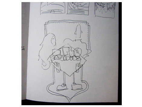
1. I was asked to design and screenprint a poster for Diplo & Nick Catchdubs’ New Years Eve 2008 show in San Francisco. I felt doing something bold and brassy would fit the New Years Eve aspect, but keeping the subject matter loose, light-hearted, and somewhat nostalgic would fit the music both of these guys spin. I rarely spend too much time sketching out ideas before I get moving on the computer. I had an idea for the layout of the whole poster in my head and just did this really quick doodle to remind myself of what I wanted to do. In this case it would be both artists’ names in big type, framed in a big clunky diamond being held up by cartoony hands. The space up above would be filled with a collage of weird imagery – at this point I just figured it would be a woman’s face with long hair and a space shuttle with big clouds of exhaust blasting out of it. At this point I was ready to get crackin’ on the computer.
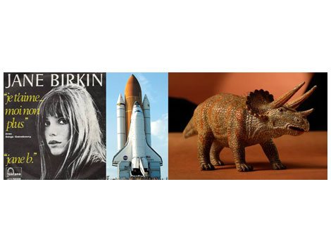
2. I started collecting source imagery from which to make illustrations. I’ve used Jane Birkin for a couple of different projects as she just embodies this inimitable mid to late-1960s über-hotness. Space shuttle images are not hard to come by on the internet, but dinosaur photos are, so I had to settle for a photo of a toy Triceratops, one of the illest dinosaurs ever. Using a Diplodocus would have been way too obvious.
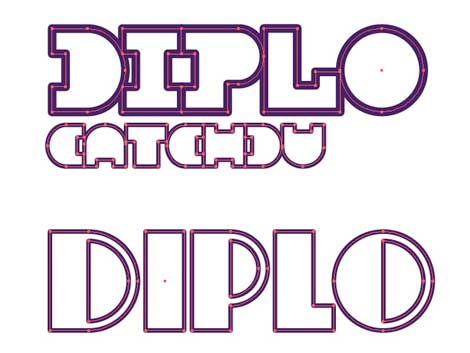
3. An early round of type experimentation in Adobe Illustrator. I drew all of the type by hand… by mouse really… but I guess really with that built-in Apple laptop mouse trackpad cause my external mouse was seeing its last days around the time I was working on this
poster so I forced myself to become proficient at designing using just that trackpad.
4. Zooming in really close to trace the details on Jane’s face.
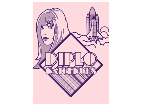
5. Starting to line up the main elements, now it’s time to start filling up the top and balancing out the bottom. The design started to stray a bit from the original sketch, but that’s OK. The feel of the design stayed true to what I had originally intended.
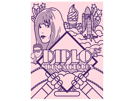
6. Boom. The main outlines are all in place, now it’s time to add some color and really bring it home.
7. I worked on color as I put the whole thing together, keeping each color on its own individual layer to make setup for screenprinting easy. Some of the colors here are achieved by mixing two together. The green, for example, is transparent yellow on top of blue, and the orange is yellow on top of pink.
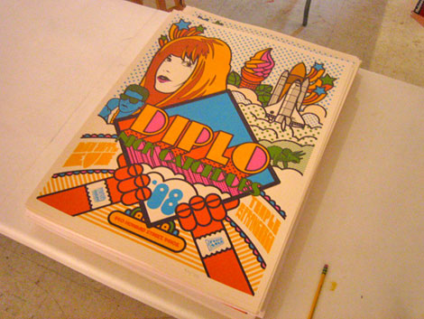
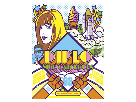
8. The final product – four-color screenprint trimmed down and ready to be signed and numbered.
You can buy a copy of the Diplo poster here.
———————————————————————————————————————
The 30 second design challenge
———————————————————————————————————————
Through years of scientific training and data we have concluded that “the world’s best design ever†will be created in 30 seconds. It will be a design so intense that a young designer’s mind will instantly blow up when he/she sees it. We are on a quest for that design. Well, thats not the full truth. In the 30 second design challenge we give our interviewee a concept. They then have thirty seconds to sketch out a rough thumbnail.
Mike’s been nice enough to join us for this session of the 30 second design challenge. In today’s challenge, we’ve come up with a fictitious folk rock group and album.
Ok here we go, Mike we’d like you to design a poster for Fantasy Cow’s new album of milk drinking songs called – Mother Milk I
Oh man this is terrible, but here we go!
Let the 30 seconds begin..now!
……..30 seconds later
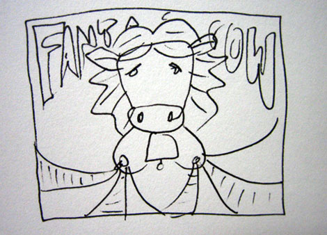
Ha! This is crazy! Thanks
We would like to thank Mike for taking the time to share with us. You can see the rest of Mike’s work at Burlesque of North America as well as his personal site Twelve car Pileup.
You can purchase posters from Mike and the rest of the Burlesque of North America crew here.
Make sure you check out Mike’s exclusive Dj Mix / Lp cover art gallery for grain edit.
Tagscontemporary, Designers, graphic-design, Interviews, Typography, USA
