


Simon Page interview
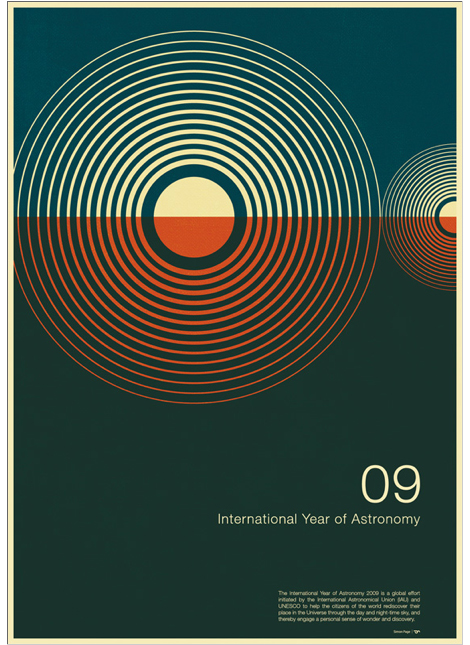
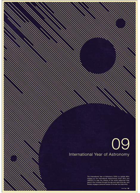
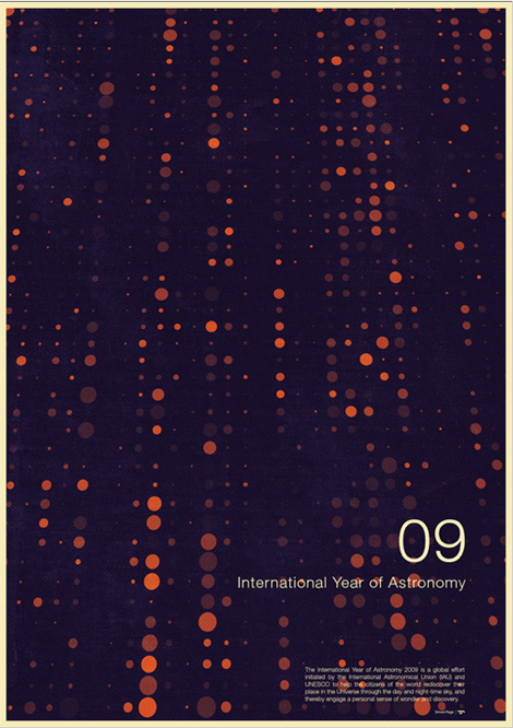
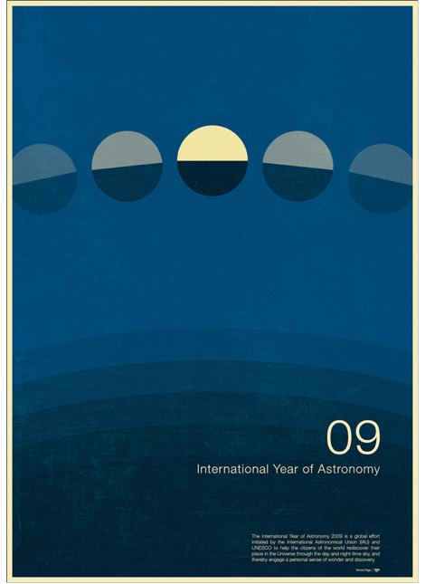
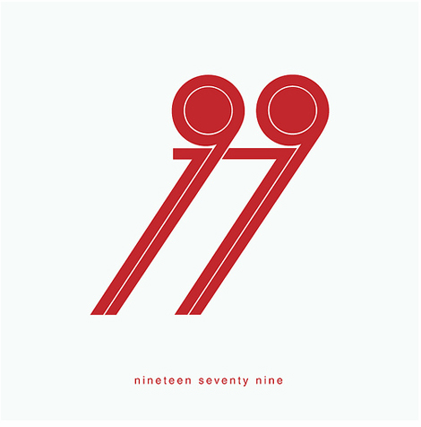
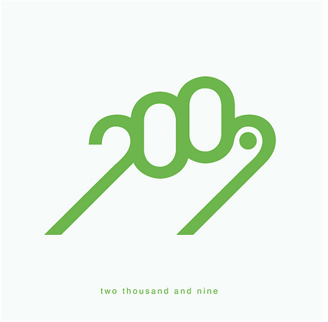
2009 International Year of Astronomy Poster designed by Simon C Page
Simon Page is a self-taught graphic design whiz with a mathematics background. He takes shapes and morphs them into cerebral abstractions. His style shifts around futuristic digital designs and 1960s minimalism, trotting the delicate line between simplicity and detail. His International Year of Astronomy 2009 poster designs caught the eyes of discerning design writers, including the New York Times and Creative Review. It may be the year for Astronomy but its equally a big year for Page, his posters got a boost in sales from all the acknowledgment he’s been getting in print and on the web.
Where are you from originally?
From the UK – born and breed.
When and how did you come to be interested in graphic design?
I’ve been interested in it since I was a kid. I think the first experience of really being blown away by graphic design was when I first saw some record covers from Yes albums – which I still love to this day. I have only really got involved in promoting myself and creating my own self-initiated design pieces this year – having got into to it through designing corporate presentations as part of my full-time job.
Tell me what you were doing before doing graphic design.
I left university with a degree in applied mathematics and this landed me in a good job working in the City. I then got quite involved in programming and database development which then progressed to having to create corporate presentations which is where I first got involved in graphic design, just over a year ago now.
How does your math background influence your designs?
I think maths has inspired me hugely and influenced more geometric designs than I probably would of created otherwise. I also think a lot of artists, like myself, subliminally use mathematics in their creations – such as the golden ratio for creating eye candy layout designs.
I find it very satisfying getting mathematically correct proportions when designing something like a logo, for example. But for me the main connection between math and design is pure and simple, it’s geometry. The golden ratio is probably one of the most popular examples of math and design coming together but look back at the works of Leonardo Da Vinci, for instance, he used mathematics all the time in his art. I also believe some of the best designers work with math, in a number of aspects, even though they probably do it completely subconsciously.
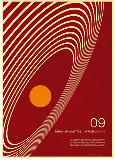
How did your designs become the official International Year of Astronomy posters?
Quite by chance. The designs started off as a self-initiated project quite late in the year when I discovered it was the International Year of Astronomy (IYA 2009). I initially thought this would be a great project to promote it and me. The IYA found them through my Flickr account, loved them and contacted me. I think the fact they are something quite fresh from all their other promotional material that they have used, being more 70s Swiss than cutting edge Trek, has really helped them stand out as something a bit special.
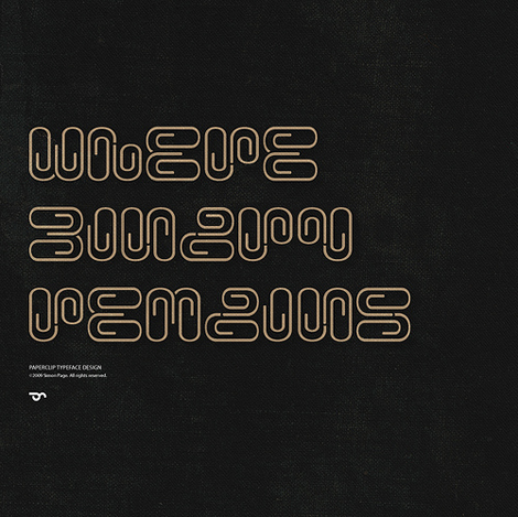
What is your approach to typography design?
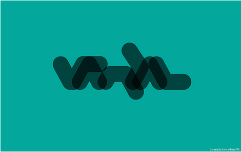
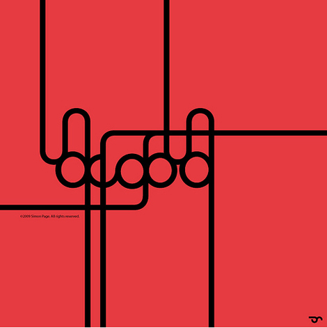
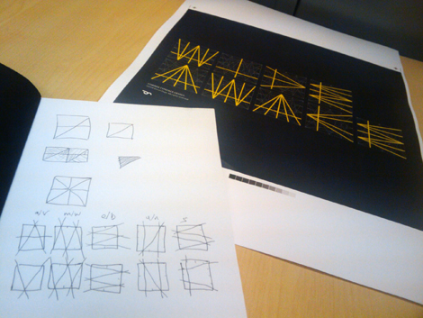
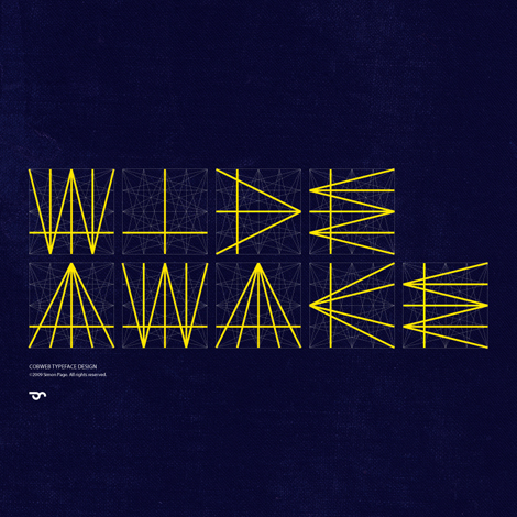
I don’t think of myself as a true typographer as my typography designs are pretty much all vector based illustrations. My work in illustrations generally starts with being given a word or sentence to use. I will then look for relationships in the letter pairs and play around with a number of variations till I get a style I like and which fits the project. For A-Z typefaces I generally start working with a few key letters and then begin to extend these to a full set.
I’m really interested in how typography has now become an art form in itself and I also love the ability of working with letters almost as shapes but keeping legibility in the design (although anyone following my Flickr account will know I love “hard to read” a little too much.
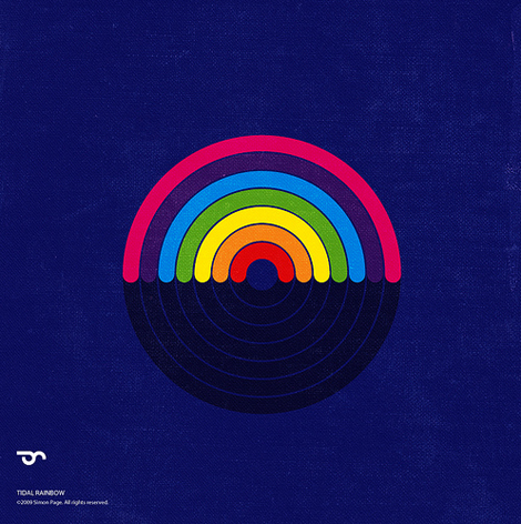
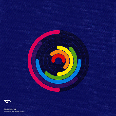
How did you come up with the idea for the Rainbow designs?
This Tidal Rainbow was inspired by a photo I saw from inside a boat of a porthole with an interesting lens flare on the sea. The curves on the bottom of the Rainbow are representative of waves.
Which design project was your favorite?
My favourite project albeit not a real project was probably the Tron posters I created. This was another self-initiated set of work but the design agency that Disney use for their movie posters contacted me. They wanted to know if I would like to come in for an interview – as I had been selected with 9 others for a role they had, which would involve work on Tron 2010 material. I got very inspired when they released the first movie trailer and totally geeked out over it. I have always been a massive fan of the original film and so this is one of those project you just love to do and I couldn’t resist. This was so awesome and encouraging to know that people like this were looking at my work, unfortunately at the time I wanted to remain in freelance work – so didn’t pursue it.
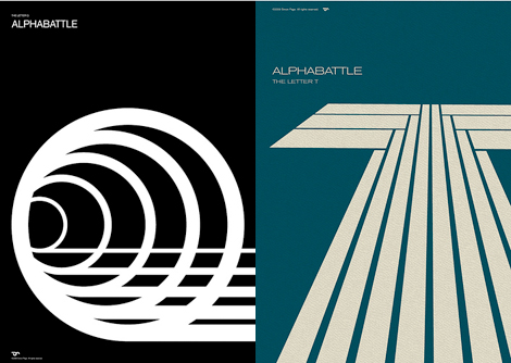
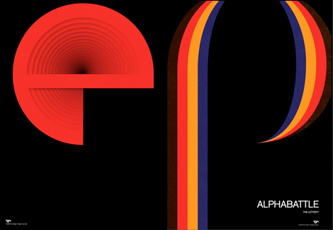
Alphabattle is a weekly design challenge on flickr. You submit great pieces. What is your process of producing them?
I try and do something different with each letter each week and it really is just influenced by what sort of projects I am working on that week. I like the discipline of it, I love typography, it adds to my portfolio and it’s interesting thinking up a design based solely around just a single letter.
What are you currently working on?
This week I’m working on a number of t-shirt designs – this is something totally new to me and I’m interested in finding out where it leads and if I can come up with something fresh in this medium.
Where do you find inspiration for your work?
Inspiration has generally come from the Internet and great websites, like your own, which showcase all the latest designs and designers. But I am beginning to look at other areas of designs for inspiration now, like early Amish quilt designs which are so unique and wonderful.
What were five things on your holiday wishlist?
1. Muller-Brockman Print (Akari)
2. Hustle Kings (Playstation 3 Game)
3. FontBook (Great reference book of Fonts)
4. Snow (Who doesn’t?)
5. Wacom Tablet (Enough said)
We would like to thank Simon for taking the time to share with us. You can see the rest of his work, and keep up-to-date with his happenings on his website. Also catch Simon on Flickr and Twitter.
You can purchase original prints +posters at his shop.
———————-
Enjoy reading this interview? Please leave a note in the comments and consider signing up for our tasty free grain edit RSS feed.
Also worth checking: Scott Hansen / ISO50 interview.
———————-
Tagsgraphic-design, Interviews, posters, Typography, UK
