Josh Brill Interview
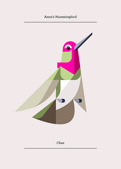
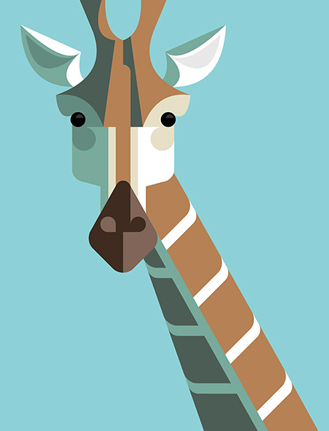
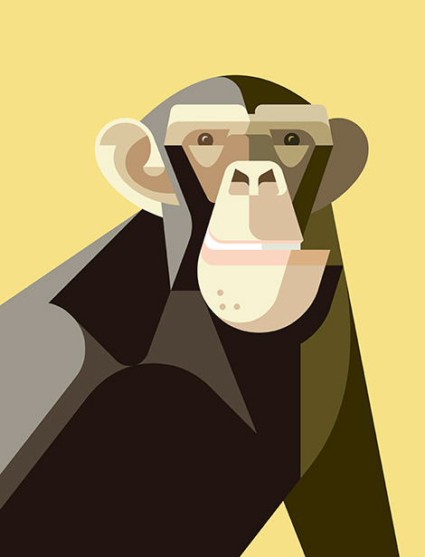
I was first introduced to Josh Brill and his work though through his Flora Fauna collection. With nature serving both as a catalyst and a muse, the ongoing series explores and catalogs the identities of plants and animals from around the world. To illustrate these explorations Josh chose to eschew conventional realism in favor of a style that echoes cubist techniques. The end result is vibrant, bold and visually intoxicating.
In addition to sharing the same passion for illustration and design, I was excited to discover that Josh and I shared a similar upbringing. We unknowingly haunted the same swimming holes and drank from the same slush puppy wells while growing up. This served as fodder to fuel our friendship and with this in mind, i’m delighted to present today’s interview with him.
Lets start off with a little bit about your background. Where are you from originally?
I was born in Norway, Maine and raised in the Lake Region area nearby.
When and how did you become interested in illustration and design?
When I was a kid, I became interested in art through pop culture including animation, comic books, skateboard graphics and video games. Though I did not know it as a profession, just for what it was, something fun to me. It wasn’t until high school that I learned that people do this for a living. A friend gave me some comic books to read and I loved the artwork. As I learned more about the artists behind these books I grew excited. It was hard to believe that people could make a living from drawing fun pictures. I told my mom I wanted to be a comic book artist and she was generally supportive. I think she was just happy to see I had a possible career direction. From here I took the closest course in desktop publishing and to be honest, I did not enjoy it. It was the early 90’s and they were still teaching the old paste up methods and the design examples were formulaic at best. This led me to take classes at the Kubert school for cartooning and animation before enrolling in Maine college of Art. It was here that I gained a renewed appreciation for the art.
When did “Lumadessa” come into being and what is the story behind the name?
“Lumadessa” took shape in the summer of 2003. At the time, I was still new to field and I didn’t have much client work to show. I was making short experimental interactive narrative art pieces in Flash, and I needed a portfolio site to showcase my skills. After completing the website I decided I wanted to create an identity that would compliment my work but also allow me to grow with it. I liked the word luminosity, because it worked for the literal side of art and the interpretation of light for creativity. The word “odyssey” struck a chord for me as well, as it implies the journey that art takes you on. From there, I combined the two words to form Lumadessa.
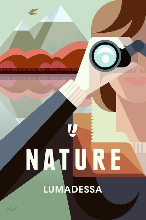
We would love to highlight one of your projects. Could you walk us through the Nature Explorer poster? Please include the tools you used to create this project.
I used Flash and Illustrator to create the vector art, then brought it into Photoshop and used RetroSupply Co.’s Blacksmith filter actions and brushes to create a subtle press printing with an ink bleed effect. Next, I added some light textures using a Wacom tablet.
What were some of the thoughts that fueled the direction of the design?
I have been working on animal art for seven years and while i’ve enjoyed making the work, it’s a challenge to stay focused on one thing. Overtime, it’s caused creative fatigue and for this poster I wanted to head in a different direction. I wanted to logically bridge my existing animal work with my new found love of travel posters. I am planning to create a complete series of posters, but for this initial attempt I chose to create something that encourages others to embrace and explore nature.
In what ways did the initial concepts differ from the finished work?
When I started the project, my intentions were to create a Maine travel poster. Unfortunately, I became busy with other projects and reached a creative stopping point. When I came back to the poster, I toyed with other locations, like Patagonia and Acadia that might work better for such an iconic theme as nature, but each time my explorations felt visually forced. I then realized that this project was more about nature as a visual symbol, rather then a place.
What are your passions outside of design?
Wait a minute, there is a life outside of design? When did this happen? (laughter) All kidding aside, my job takes up much of my time. When possible, I love to travel. The next trip i’m planning is to Acadia National Park in Maine to do some hiking and exploring. In addition, I’ll be taking reference photos for a travel poster based on the park.
——
We would like to thank Josh Brill for taking time to share with us. You can see more of his work at Lumadessa.com. For a limited time Josh is offering $10 off his Nature Explorer poster. Please use the coupon code “GrainEdit1012” at checkout. The offer is good till 10/12/14 at midnight.
——

This interview is brought to you by RetroSupply Co. Working with authentic materials (including real paint, ink, paper and screen textures from screen printing shops) they have crafted a vast library of vintage inspired design resources for Photoshop and Illustrator.
Free Brushes + Textures!
If you sign up for the RetroSupply newsletter you will receive an amazing collection of brushes, textures and templates.
Sign up here to receive all the goodies.
Save 20%
RetroSupply Co. is graciously offering grain edit readers a discount on all products for a limited time. Type in GRAINEDIT20 at checkout to save 20% off all purchases.
——
Also worth viewing…
Brad Woodard Interview
Brent Couchman/ Moniker SF Interview
Ty Mattson Interview


