Typ journal from Czechoslovakia
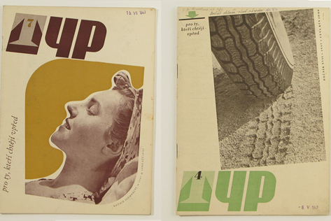
Young people working in the printing industry in Czechoslovakia from 1920s to mid century were graced with a beautiful journal, Typ. The decision to use only a couple of colors, lots of negative space, play with alignment, and change the placement of the title kept the design on the forefront, in the late 40s and today.
Via Amass
——————–
Also worth checking: Typografische Monatsblatter.
Not signed up for the Grain Edit RSS Feed yet? Give it a try. Its free and yummy.
——————–
Tags1940s, czechoslovakia, graphic-design, magazine, Typography
01.18.10 in Found design by Diana
Share This Share on Facebook


6 comments
Comments feed for this article
Trackback link
http://grainedit.com/2010/01/18/typ-journal-from-czechoslovakia/trackback/
01.18.10 at 8:48 pm
Trackback from uberVU - social comments - Social comments and analytics for this post...
The decision to use only two colors and the large negative space was mostly due to cost effectiveness. Designers had to be more creative with a much smaller budget back then.
01.18.10 |
Giorgetta McRee |
Found design |
Gorgeous
01.18.10 |
john |
Found design |
It’s amazing how less is more.
lydialene.wordpress.com
01.18.10 |
Lydia |
Found design |
Lovely compositions. Like Giorgetta said, constraints drive creativity.
01.27.10 |
Tracy |
Found design |
Thank you for share
02.16.10 |
Petit |
Found design |