2018 A’Design Award & Competition Winners
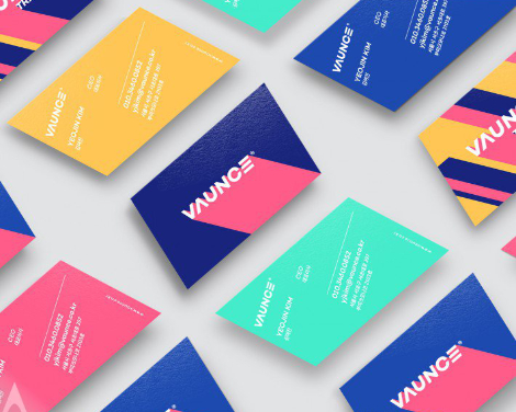
VAUNCE Trampoline Park Brand Identity Design by PlusX and Vaunce
The 2018 A’Design Awards winners have been announced! Pulling from a large pool of entrees, The esteemed award is presented to artists whose work rises above and excels in the area of creativity, technology, and design.
The contest is divided into a broad range of categories including Visual Communication, UI and UX, Photography and more. Entries are then carefully considered by an international panel of design professionals, scholars, and members of the press. Winners receive the A’Design trophy, invitations to exclusive design clubs, as well as services to advance their careers. In addition, they are honored for their accomplishments at the award ceremony in Como, Italy later this year.
Congratulations to everyone who participated! Here are some of our favorite entries from this year’s prizewinners: