


Q & A with Jason Munn of the Small Stakes
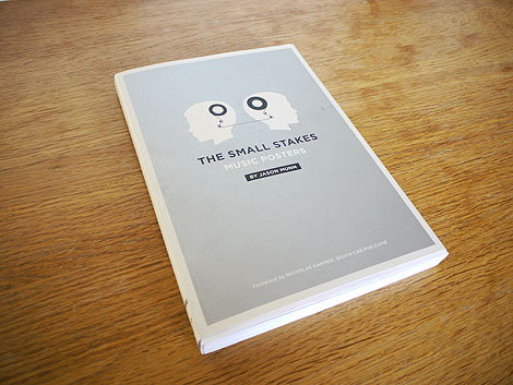
The Small Stakes Music Posters by Jason Munn ©2010
Not too long ago we asked you, the readers, for questions to pass along to Jason Munn regarding his recent book published by Chronicle. In today’s Q + A session he shares his answers to some of the questions we received.
Besides creating posters, what other projects do you work on or would like to work on?
Depending on the time of year, 75-100% of the work I am doing is posters. I am typically very busy with posters during the spring and fall when a lot of bands are out touring. At the moment, I am winding down after working primarily on posters for the last three months and I am about to get started on a couple of album packages, as well as to continue work on an identity/poster for a TV show. A lot of my work tends to be music related, but I will occasionally do projects for ad agencies, publishers, and local small businesses. Most recently I did a series of posters for Storyville Coffee which at the moment are being used in-house, and I just completed a bike related art print for the Poster Cabaret. As far as the type of projects I would like to work on in the future, I am not positive. I will continue to put most of my attention towards the posters and possibly some self-initiated projects that I have yet to think of.
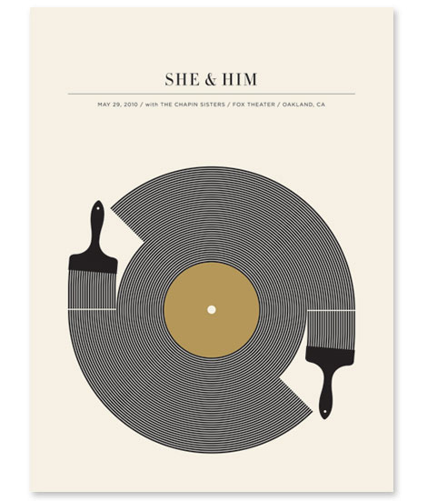
She & Him, 2010
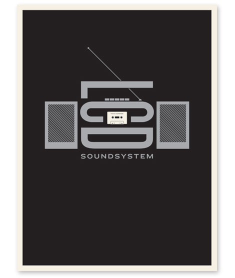
LCD Soundsystem (This is Happening), 2010
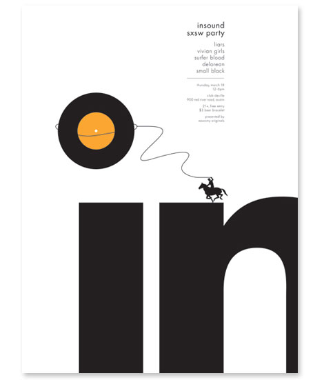
Insound (SXSW Showcase), 2010
Your style is very distinct. How long does it take for you to create a poster? Do you find yourself revising your concepts much?
I wish I could say a poster will always take me a certain amount of time, which would be helpful for scheduling reasons, but the truth is that some of them happen quite quickly and others really take awhile for me to figure out. Deadlines play an important role in this process. With most posters I have a week or so to get a design completed, but occasionally there is one where I will have a day or two. The concept part typically takes the longest for me. I do my best to embrace this aspect of the process, but will be first to admit that I can become impatient when ideas aren’t working out. Once I have an idea I like and the basic forms are down, there is a lot of revising that happens. Ideally I like to get the forms down and then have a day or two to revise; typically, it’s the small revisions that really make a poster for me. Since I work alone, I also like to have someone look at my designs before I send them off for approval. I like to have my wife look at the designs to see if the concept reads similar in her mind as it does in mine. Dirk Fowler and I also send a lot of work back and forth to each other to get feedback on what we are working on.
How did you get into the business and how would you recommend getting your foot in the door?
Like most poster designers, I had always been fairly obsessed with music, and when I started to get into design, I naturally wanted to find a way to combine the two. While I was a student, I began designing flyers, album packages, and t-shirts for friends of mine that were in bands. I would often combine my school projects with some of the work I was doing for friends’ bands when it was possible. While I was in school and first began checking out design magazines, the work that jumped off the page for me was the posters by Aesthetic Apparatus and Jeff Kleinsmith. Later, when I moved to Oakland from Wisconsin, I attended the first Flatstock, a show where different poster artists from around the country were displaying their work at a space in San Francisco. This was the first time I saw some of the posters I had previously only seen in magazines. After seeing this work, I really wanted to be able to make posters at some point, but was unsure about how to get started. My focus at that time was to find a job in a design studio, but this plan was not working out how I initially hoped. My first job after moving out here was in a t-shirt printshop that printed shirts for bands. Around this same time, some of my friends began booking shows at a venue in Berkeley called The Ramp, and they asked me to make posters to promote the shows. This is how I got started making posters on a regular basis. Most poster artists I know started in a similar way, creating flyers and posters for friends, local bands or their own bands.
How much input do the bands have into their poster designs? Are there any bands that have had a big say in their design?
Most of the time I am not given a particular direction by the band, but I do try to create something that can accompany the bands’ sound or themes in their music as well as something that will appeal to their fans. I don’t always succeed at this, but that is my main goal when I start thinking about a poster. A few years ago I was asked to create a poster for Josh Ritter, and he requested the design be somehow Idaho based. This had me stumped for a while, a long while, but eventually led to the Idaho/Grand Piano poster, which I was really happy with, and I wouldn’t have come up with that solution without his request. Most of the input I get from bands is what not to include on a poster. I’ve done a few posters for Flight Of The Conchords, and one of their early requests was that the poster design not be based on a specific song from the show. This is understandable since they typically have a poster made for each show, and I’m sure they prefer to avoid overlapping concepts. In general, I view the posters as collaboration between myself and the bands even if I am not getting direct input from them.
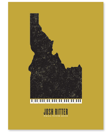
Josh Ritter – Fall Tour, 2006
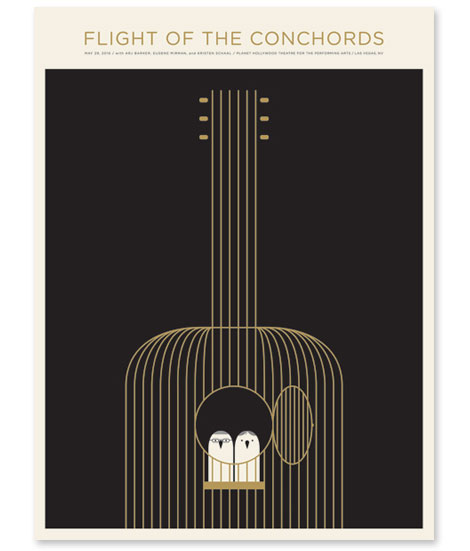
Flight of the Conchords, 2010
What kind of marketing/publicity did you do that put you in contact with Chronicle Books and any other publishers or manufacturers you have worked with?
I had worked with Chronicle on a couple of different projects over the last few years, and have really enjoyed working with them. About two years ago they approached me about possibly publishing a book of the posters. I had not previously thought about putting a book together, and I was honored by Chronicle’s interest in me. I’ve always admired their work and was excited about the prospect of publishing a book with them.
What was the process in creating your new book? Compiling all of your work for the book must have been interesting — it looks like a pretty introspective process. How was it informative for you to go through your past projects with this focused, curatorial eye?
When Chronicle and I first started to talk about the book, there was a lot of different ideas on how the posters should be presented, the format of the book and so on. We agreed on presenting the posters very simply, one per page, chronologically by year. I definitely wanted to keep the book simple in design, and I think Chronicle did a wonderful job on the design, layout, and production of the book. The end result is a simple catalog of many of my posters with some added features that lend itself well to the design, like the use of metallic inks throughout the book. One of my favorite parts of the book is the back cover, which may sound kind of weird, but I love the large field of silver with just the radio/barcode at the bottom. Going through some of my older work was sometimes difficult since there are certain posters that I would approach differently now, but when I would step back and try to look at the work as a whole and not focus on individual posters, the process became easier. My hope is that when someone views the book, they would see a progression in the work overall and see how certain designs and ideas lead into others.
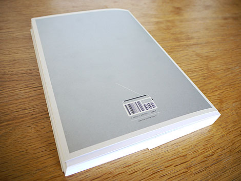
Back cover of the book.
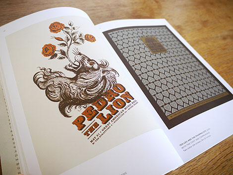
(L) Pedro the Lion, 2003 (R) Ted Leo and the Pharmacists, 2003
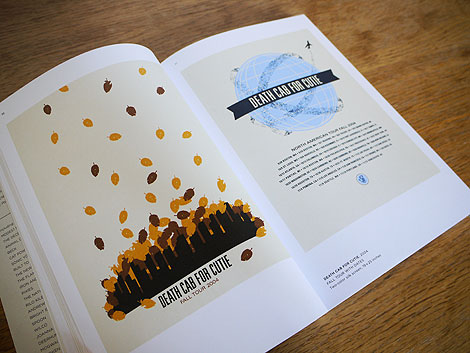
(L) Death Cab for Cutie (Fall Tour), 2004 (R) Death Cab for Cutie (Fall Tour w/ Dates), 2004
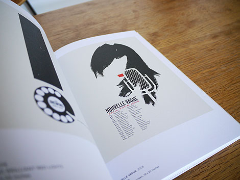
(R) Nouvelle Vague, 2006
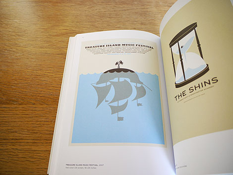
(L) Treasure Island Music Fesitval, 2007 (R) The Shins, 2007
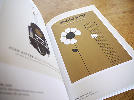
(L) Josh Ritter, 2009 (R) Monsters of Folk, 2009
When looking through all of your work, do you see similarities or trends within specific pieces or time periods? Can you get a sense of where your future work is headed?
I definitely see similarities, mostly within time periods. Most of the early work was primarily based on found imagery, altering or combining two or more found objects to create something new or changing the context of imagery. I still occasionally use found imagery and textures when I feel it’s appropriate. Even though the recent work looks different than the earlier work, I feel it uses a similar way of thinking, and the progression has happened fairly naturally. I know that the early work has played an important role in how I work and think about imagery now. I feel the more recent designs have become simpler in look, but stronger in concept. There are always a few posters a year that I am real happy with or feel different about in some way and I try to build off of those as much as I can. Often it can be the band, directly or indirectly, that challenges me to try something different from my normal approach to coming up with a concept. As far as where the work is headed – I am not sure, but my hope is that it will keep progressing and challenging me. I’ve been happy with the work so far this year, it’s been my favorite year since I started making posters.
The book looks beautiful! What’s next for The Small Stakes?
Thank you. What’s next? I am not quite sure, and I am OK with that. I really enjoy what I am doing and want to continue to create posters while at the same time remaining open to seeing where the work leads. As I mentioned earlier, I would like to try some self-initiated projects in the near future, possibly some more collaborative work as well. This summer I plan doing a collaborative project with Dirk Fowler. He is a great friend, as well as a designer I’ve looked up to very much, and I’m excited to see what we end up creating.
———————-
A huge internet high five goes out to Jason for taking time to share with us. If you like what you see, check out his website and pick up some prints from his store.
The Small Stakes: Music Posters by Jason Munn is available for purchase at Chronicle books.
Details: 7×10 in.; 150 6-color images throughout, printed on wood-free paper, foreword by Nicholas Harmer of Death Cab for Cutie
Many thanks to all the readers that submitted questions.
———————-
Enjoy reading this interview? Please leave a note in the comments and consider signing up for our tasty free grain edit RSS feed.
Also worth reading: Jason Munn interview (2007)
———————-
TagsBooks, contemporary, Interviews, jason munn, posters, USA
