Chicago 3 - Society of Typographic arts design annual

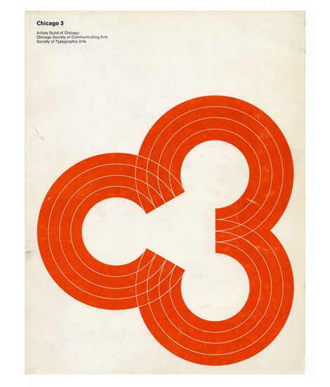
Cool cover for the 1969 Chicago 3 design annual. Consists of three “C’s” or if you look from left to right, the letter “C” and the #” 3″. The annual is a catalog of work from the Artists Guild of Chicago, Chicago Society of Communicating Arts and the Society of Typographic Arts.
06.01.08 in Uncategorized by Dave
Share This Share on Facebook


7 comments
Comments feed for this article
Trackback link
http://grainedit.com/2008/06/01/chicago-3-society-of-typographic-arts-design-annual/trackback/
06.02.08 at 10:20 am
Pingback from Phil Coffman - Designer » Chicago 3 Poster
very nice
06.02.08 |
Daniel Feary |
Uncategorized |
This is one of those timeless “why didnt I think of that?” designs. So simple and so damn good.
06.02.08 |
Mike Davis |
Uncategorized |
What a great find! I’m actually on the board for The STA, I’ll be sure to pass this along.
06.02.08 |
Mig Reyes |
Uncategorized |
Nice find. The design is absolutely gorgeous. I love the colors. Looking at it makes me think of an old VW Passat.
06.02.08 |
Patrice Esser |
Uncategorized |
damn, that’s awesome…
06.03.08 |
Andrew |
Uncategorized |
Brilliant design!
06.04.08 |
Dani |
Uncategorized |