2009

You are currently browsing the yearly archive for 2009.

The Jazz Loft Project

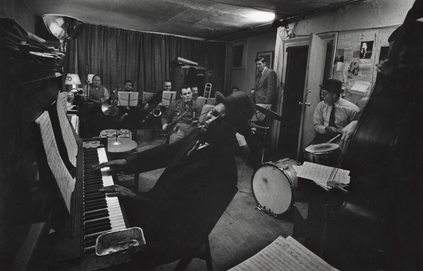
From 1957-1965 W. Eugene Smith, a prolific American photographer, documented New York jazz musicians in his small loft and ended up with 4,000 hours of audio and 40,000 photographs. His dilapidated loft in the wholesale flower district was the place for late-night jam sessions for Miles Davis, Charles Mingus, Charlie Parker, Thelonious Monk, Steve Reich, Zoot Sims, Roland Kirk, and Alice Coltrane. He also recorded drug addicts, neighborhood cops, radio programs about aliens, MLK and JFK on the radio, James Baldwin and Frank Lloyd Wright in interviews. When Smith died, he accumulated 1,740 reels of tape. Below are some of his photos and tape boxes from his collection.

Read the rest of this entry »

Jingle Bells illustrated by J.P. Miller

jingle bells, j.p. miller

Take a look at these adorable smiling faces filled with holiday cheer!

J.P. Miller’s illustrations for Kathleen N. Daly’s Jingle Bells (1964) are just so festive and inspirational! The story is a nice twist on the old holiday tune, and is about a sleigh full of animals that help Santa when he needs it the most. I love Miller’s use of color and texture to achieve different values, and his depiction of animals are always so whimsical. Did you notice they’re all smiling with sweaters on?

Read the rest of this entry »

Denmark Christmas Seals 1962

denmark christmas seals
1962 Denmark Christmas Seals designed by Erik Petersen

Glædelig Jul! In the early 1900s, a Danish postal clerk came up with the idea of selling Christmas seals to raise money for children with tuberculosis. Over 100 years later, these “cinderella” (unofficial postage) stamps have become a worldwide holiday tradition. In 1962, Erik Petersen designed this sheet of Christmas seals, depicting the gamle håndværk (“old trades”) of Denmark. I want to live inside this illustration; I’d stop by the pipe maker’s shop on my way to pick up some candles and clogs.

Read the rest of this entry »

Kitsune Noir Poster Club

kitsune noir poster club

Jez Burrows – Walden (Part of the Kitsune Noir Poster Club)

Over the next several months, several design blogs (including grain edit) will be collaborating with the stellar art & design social network Society 6. First up is the Kitsune Noir Poster Club. Bobby of the excellent Kitsune Noir asked five of his favorite artists to interpret books they really enjoy into a print that will be a lasting work of art.

The project includes:

Jez Burrows – Henry David Thoreau’s Walden

Mark Weaver –  Herman Melville’s Moby Dick

Frank Chimero – Kurt Vonnegut’s Slaughter House Five

Cody Hoyt – David Foster Wallace’s Infinite Jest

Garrett Vander Leun – Cormac McCarthy’s The Road

Read the rest of this entry »

Sanna Annukka Shop – Soul Birds

sanna annukka

Sanna Annukka Limited Edition Wooden Soul Birds

Sanna Annukka recently launched a new portfolio and online store. I love these solid brown oak Soul Birds which are now available for pre-orders in her shop. I’ll have to add these to my Christmas list!

On her website, Sanna shares this bit about the the Soul Bird which stems from Finnish mythology. “In Karelia there was an ancient belief in the Sielulintu or Soul bird. The Sielulintu was thought to deliver the soul to newborn babies and also to transport the soul to the afterlife at the moment of death. It was believed the Sielulintu protected a persons soul at it’s most vulnerable; when dreaming, and it was tradition to keep a carved wooden bird by the bedside to keep the soul safe during sleep.”

Read the rest of this entry »

Limited Edition Grain Edit T-Shirt Available for Pre-Order

grain edit t shirt

Grain Edition #01 – Limited Edition Grain Edit T-Shirt designed by Invisible Creature

We are excited to announce the Limited Edition Galaxy Blue Grain Edit T-Shirt designed by Seattle’s own Invisible Creature. We love the design and hope you do too! The 5 color t-shirt features a gaggle of cool creatures sitting down for story time (my favorite is the little guy with the red and blue eyes). Each shirt is lovingly screen-printed by the guys and gals over at Blue Collar Press right here in the good ole USA.

The shirts will be $20 till this Friday at Midnight (PST). After that the price jumps up to $25. Also for every t-shirt you purchase you will receive 1 entry in the 2009 Grain Edit Holiday Giveaway Bash.

*** Please note this is a PRE-ORDER. We will be receiving the shirts at the end of Dec and shipping orders the first week of January. ******

You can PRE-ORDER the Limited Edition Galaxy Blue Grain Edit Shirt here.

For more details + pictures etc.

Read the rest of this entry »

2009 Holiday Wish Lists (UPDATED)

holiday list

Dear Santa, Hanukkah Harry, and Kwanzaa Ken:

Searching high and low across the vast realm of the interwebs, we’ve collectively compiled probably one of the hugest lists imaginable with some of our favorite artists! We’ve all been on our best behavior, assisting elderly ladies and gents across the street and working our fannies off. Please take a moment to give this list a good read, and say you’ll bring some of these things our way!

Sincerely,
Grain Edit & Friends

Read the rest of this entry »

Introducing the Grain Edit Job Board

grain edit job board

Introducing the grain edit job board. For job seekers, we already have some listings posted plus on the main page of the job board you can sign up for job alerts or subscribe to the job listings RSS feed. We’ve also created a twitter account for the job board , so you can follow listings there as well. We’ve added a link to the new section in our top navigation, so you can easily access the listings whenever you want.

For companies interested in posting a listing to our job board, we offering a special discount. Use the coupon code ‘promo’ to receive 50% off.

Read the rest of this entry »

ISO50 Interview

Scott Hansen ISO50

For this exciting addition to the Grain Edit interview series, we kept it local — seeking out one of San Francisco’s finest, Scott Hansen, aka ISO50. My first acquaintance with Scott came in the spring of 2005. The pre-Grain Edit crew had headed up to a lecture in Sacramento featuring Scott discussing his work and process.

I love the work of ISO50 just as much now as I did way back in ’05. It has a great historical reference, while still remaining contemporary. Scott does a nice job of combining clean, graphic forms alongside texture and pattern.

In this interview Scott talks about his entrance into graphic design, his creative process, his interest and involvement in music and photography, and, among many other things, his top 5 favorite albums.

So, pull up a chair in one of your favorite Dolores Park cafes (or imagine yourself there), and take look:

Read the rest of this entry »

Robert Samuel Hanson Illustration

robert samuel hanson

By land, sea, and air, this illustration takes us everywhere!

Created by illustrator Robert Samuel Hanson for Monocle magazine, this landscape playfully takes us to the scenic countryside to the bustling city. The piece is nicely laid out, with a very clean, matter-of-fact style.I really love all the details Robert’s included, from the tequila truck and Mayan temple, to the billboard advertising cerveza and masked news person…this is where I want to be today.

Read the rest of this entry »

Hybrid Design interview

Hybrid Design studio

Hybrid Design was formed by the husband and wife design team of Brian Flynn and Dora Drimalas. The San Francisco based firm has worked with a diverse body of clients including Nike, Upper Playground and Vans. The dynamic duo are also the brains behind Super 7 and Hybrid Home.

In today’s interview Brian reveals some of his influences, shares insights on managing a design firm, and even manages to squeeze in a somewhat obscure reference to Cameo.

Read the rest of this entry »

Criterion Collection DVD Covers

Cover for The Bad Sleep Well (1960) – Directed by Akira Kurosawa

The Criterion Collection is well-known for restoring rare, unique and cult classic films from famed directors like Akira Kurosawa, Jean-Luc Godard, Luis Buñuel, and Wes Anderson. Equally respected is their cover art and supplements to their DVDs. For 25 years, Criterion Collection has been pairing art house films with strong design. From typography to photography, they elevate box art to poster art with work that never cease to impress.

Read the rest of this entry »

Vintage Audi Poster

vintage audi poster

Just found this vintage Audi poster over at AisleOne. Looks like it was created sometime between 1968 and 1972 by Armin Hofmann. Simple and elegant.

Read the rest of this entry »

Mark Giglio Studio Visit

mark giglio studio

Pen Pencil Stencil is the online home and physical workspace of Mark Giglio. Mark is an amazing illustrator/ designer who’s worked on projects with a diverse mix of companies including: 2k by Gingham, Apple, Dwell, GSP, Nike, Tolleson Design, and others. Recently I had the pleasure of hanging out with Mark at his Oakland based studio.

Read the rest of this entry »

Kurokawa Nakagin Capsule Hotel

nakagin capsule

Nakagin Capsule Tower (AKA The BC25 Capsule) designed by Kisho Kurokawa

The 60s and 70s were an exciting period for Japanese architecture. In particular, the Metabolist Movement which was founded by a group of futuristic visionaries, including late architect Kisho Kurokawa, puts forth ideas of “large scale, flexible and extensible structures that facilitate an organic growth process”. Perhaps the most exemplary metabolist building is the Nakagin Capsule Tower built to accommodate bachelor salarymen in downtown Tokyo.

Read the rest of this entry »

Lotta Nieminen Illustration

lotta nieminen

I spy with my little eye—a dapper gentleman suffering from writer’s block!

Created for Markkinointi & Mainointa (Marketing & Advertising) magazine by Finnish illustrator Lotta Nieminen, this illustration has varied textures and layers that work so well together. The color palette is cool and complementary, and I really dig the different shapes that she uses to accentuate the man’s face and clothing…symmetry at its finest!

Read the rest of this entry »

Jez Burrows

jez burrows

Poster for Instal 09 music festival

New site + work to boot from grain edit favorite Jez Burrows.

Read the rest of this entry »

Happy Thanksgiving!

Have a great holiday and we’ll see you on Monday!

Tom Palumbo Photography

tom palumbo

Outtake for Junior Bazaar, early 1950’s

Absolutely stunning photographs from Tom Palumbo. Tom got his start working under the art direction of Alexey Brodovitch at Harper’s Bazaar. He later went onto shoot for Vogue, and many other publications.

The photos seen here are part of an extensive archiving project with New York’s Wonderbred.

Read the rest of this entry »

Czech Tourist Map

czechoslovakia map

Beautiful tourist map from Czechoslovakia (now the Czech Republic) dating back 1966. I love the bold colors and simple line work. I’m guessing that the illustration inside the red square on the left side is a beer. Look at that foamy top! Sweet mother of beverages!

Read the rest of this entry »

A Friend of Mine

A Friend of Mine - Graphic Design

A Friend of Mine is Melbourne, Australia based design studio that is turning out some fancy work. This identity system for The Modern Flower Co. is so snappy — I love seeing the system work across multiple pieces. Plus, typography integrated into latticework is always exciting.

Read the rest of this entry »

Jonas Bergstrand Illustration

jonas bergstrand illustration

Mmm…deliciously patterned sweets!

Swedish illustrator Jonas Bergstrand has an awesome eye for patterns and keen sense for earthy color. These posters, originally created for Pippi Day—an anniversary celebration for Astrid Lindgren’s children’s hospital, nicely juxtapose thick and thin lines, and also has many interesting patterns and forms.

Read the rest of this entry »

The Swell Season Concert Poster by Doublenaut

The Swell Season
The Swell Season Concert Poster by Doublenaut

This week’s poster pick was made possible by the creative minds that make up Doublenaut. Doublenaut is stationed in Toronto, Canada and is made up of brothers Andrew and Matt McCracken.

Read the rest of this entry »

Birds of a Feather 2

Heather Amuny-Dey
J’adore by Heather Amuny-Dey

If your in the San Francisco area this Saturday (11/21/09), this looks like it’s going to be a good show.

Details:
Super7 is proud to present the follow up to 2007’s blockbuster show “Birds of a Feather” with the new aptly titled show “Birds of a Feather 2” featuring artwork by Dora Drimalas, Heather Amuny-Dey and Shay Ashley-Ometz. This show features three original new prints from each artist (nine in total) as well as a sampling of older, out-of-print and rare prints from each artist’s personal archive to create a whimsical and wonderful reflection on their lives.

Read the rest of this entry »

Bodega: Vinyl Wall Art Collection Curated by Arkitip

cody hudson bodega

Cody Hudson for Bodega – CH5 Wall Decal

We’ve been seeing some good things happening in the world of wall art within the last few months, first with Poketo’s Spacetime Collection and now with Arkitip’s Bodega Collection.

Bodega is a curated collection of large scale, eco-friendly, temporary indoor art. The concept is to make the art of emerging and established artists alike, affordable and available to the public. Each piece is delivered as a complete package for the consumer and includes ready-to-apply art piece and tools for installation. Obsessed with process, Bodega creates high quality, layered die-cut vinyl art editions; representing some of the most captivating artists of our generation.

Read the rest of this entry »

Herbert W. Kapitzki: Graphic Designer and Teacher

herbert kapitzki

Posters for the International Design Center Berlin (IDZ)

Herbert Kapitzki, a former student of Willi Baumeister, conceived and designed exhibitions for the state industrial inspection board (Landesgewerbeamt) in Stuttgart in the 1950s and the early 1960s. He developed a distinct language of forms modelled on constructive forerunners, and campaigned for the popularisation of functional graphic design. His own groundbreaking work was exemplary in this respect.

Read the rest of this entry »

Lisez, Jouez et Decouvrez La Scandinavie avec Andersen

lisez jouez et decouvrez la scandinavie

lisez, jouez et decouvrez La Scandinavie avec Andersen -by Paul de Roujoux, Pamela Labonnelie and Mireille Ballero. Illustrations by Martine Bourre c1975 editions des deux coqs d’or

La Scandinavie avec Andersen is a beautiful children’s book about Scandinavian culture. The book is filled with stories, games and activities.  Just think, your child could be making his/her very own Nils Holgersson costume right now! For the budding young history buff, there’s a section on the Drakkars and Vikings. If your child is too scared to look at tough guys with helmets, head straight to the fuzzy Nordic animals in chapter one. Have a four year old that’s into logging? No problem, this book has you covered. There’s a section on the Scandinavian timber industry in the middle of the book. Soon your young one will be able to turn raw material into fine Danish furniture!

More pictures after the jump.

Read the rest of this entry »

Mark Weaver

mark weaver

I’ve always been impressed with Mark Weaver’s continuously fantastic collage series Make Something Cool Every Day. Firstly, making something like this every day is a great project — I love when designers make their personal work public. Secondly, these collages are an interesting mishmash of styles and images. Mark has a keen sense of knowing what types of images work well together.

Read the rest of this entry »

Cult + Classic Film Stills From the Hot Dog!

classic film stills

A Colt is My Passport (1967) – Directed by Takashi Nomura

If your into classic + cult films it would be worth your while to check Shannon Maldonado’s I Love Hot Dogs.  Several times a week Shannon curates a selection of stills from a particular movie. I appreciate her selection process as she sometimes includes typographic/design details that can easily go unnoticed (think street signs, window lettering, etc.). For fans of the art of film title design, there’s plenty of that stuff as well.

Read the rest of this entry »

Lubalin Now Exhibition at the Cooper Union

lubalin now, cooper union

I visited New York last week, just in time to attend the opening reception of the Lubalin Now exhibition at the Cooper Union.

The place was incredibly packed with ladies and gents in polychromatic garb, chatting about type with a nice drink in their hand. It was interesting to see the work of contemporary designers, such as Jessica Hische,  Brett Macfadden, Justin Thomas Kay, Deanne Cheuk, and HunterGatherer, juxtaposed against Lubalin’s original works.

Read the rest of this entry »

Visual Acoustics Film – The Modernism of Julius Shulman

visual acoustics julius shulman

I had a chance to check out Visual Acoustics this weekend and I highly recommend it. The documentary is about the life and work of Julius Shulman, a brilliant architectural photographer whose photos captured the history of modernist architecture in Southern California. During his prolific career he worked with nearly every modern architect since the 1930s including John Lautner, Frank Lloyd Wright, Richard Neutra, PIerre Koenig, Charles and Ray Eames, Craig Ellwood, Raphael Soriano and Gregory Ain.

The release of this film seems especially timely, given that Julius recently passed away. If you are unfamiliar with his work, you are in for a real treat.

Read the rest of this entry »

Vintage Travel Posters

vintage travel posters

1. Come to AfricaDesigned by Gerard van de Voort – c1975

How about virtual tour around the world to start off the week?  I dug up a handful of travel related posters from 1950s -1970s for all the desk jockeys that are itching to get out of town. Enjoy!

Read the rest of this entry »

Autografik: Modern Transportation Graphics

autografik

Hell yea. Cool logos on trucks + vans! It doesn’t get much better then this. The Autografik flickr group is set to serve as an archive for modern design applied to motor vehicles. Thanks to Jonathan Turner aka insect54 for setting this bad boy up.

Read the rest of this entry »

Mihail Mihaylov

Mihail Mihaylov

Funkadelic! There is some serious soul in this typeface from Bulgaria-based designer Mihail Mihaylov. I’m such a sucker for bold type — I love the juicy, drippy, saturated feel of these letters. I can’t quite tell if the type is sprouting, or three-dimensional, or both.

In addition to Funkadelic, Mihail’s other work shows a nice combination of experimentation and style. I love the textural, hands-on feel of the Quotes alphabet studies, and the subsequent large-scale “E” poster. Really fun work.

Read the rest of this entry »

Monsters of Folk Poster

monsters of folk
Monsters of Folk Concert Poster by Jason Munn of The Small Stakes

The poster pick for this week features this Monsters of Folk Concert Poster designed by Jason Munn of The Small Stakes. This is a nice example of the impressive and sophisticated work that The Small Stakes churns out. Note the harmony in the composition and see if you can spot any patterns in this poster. This is smart design.

This poster is available for purchase here.

Sollinero Illustration

sollinero illustration

Ah! Nothing beats a spot of tea and the company of man’s best friend!

The composition of this print, created by Buenos Aires illustrator Sollinero, is nicely balanced and uses a relaxing color palette consisting of warm ochres and cool blue. I really love the patterns and details throughout the print, especially the little baubles that tie the rug, lamp, lounge chair, and gentleman’s pants together.

Read the rest of this entry »

Brionvega Brochures

brionvega brochures

Brionvega rr126 Turntable/ radio brochure c1970

Beautiful brochure covers for the Milan based electronic company Brionvega. Design by Bob Noorda.

Read the rest of this entry »

You Need the Plate

1972 Munich olympics plate

1972 Munich Olympics Plate : Pictograms designed by Otl Aicher

Now all your favorite 70’s stick figures can hide underneath your food. Spotted this gem on Ebay a few days back.

Read the rest of this entry »

Dan Cassaro / Young Jerks

Dan Cassaro / Young Jerks

Brooklyn-based Dan Cassaro is the front man, ring leader, and typographic skipper of Young Jerks — his no-nonsense moniker. Making your way throughout the aisles of Dan’s portfolio, you’ll notice typography gracing posters, logos, books, other printed materials, and a swath of motion graphics. Fancy typography, indeed. Mr. Cassaro has the knack for creating keen type that makes you smile. I urge you to head over and take a look.

Read the rest of this entry »

Twitter Lists

twitter lists

A few days ago Twitter rolled out a new feature called “lists”. This feature is still in Beta, so it appears it’s only available to a small group of users right now. Lists are a way to organize the people you follow and to discover new and interesting Twitter accounts. We set up a handful of lists in different catergories, so you can easily find new designers & artists to follow.

Our lists include some of our favorites to follow in graphic design, typography and illustration. We also set up lists for web design, blogs and stores, but these lists need alot of work. You can find all of our lists on the right hand side of our Twitter profile page. These lists are far from comprehensive, so if you have any suggestions of people to add please let us know in the comments.

Graphic Design Referenced

graphic design referenced

Graphic Design Referenced by Bryony Gomez-Palacio and Armin Vit

I recently got my hands on a copy of Graphic Design Referenced. This is the latest project from the dynamic  design duo of Bryony Gomez-Palacio and Armin Vit, who also happen to be the brilliant minds behind the UnderConsideration network of sites. As the official press release states, “Graphic Design, Referenced is a visual and informational guide to the most commonly referenced terms, historical moments, landmark projects, and influential practitioners in the field of graphic design. This is a very ambitious project to say the least, but I’m quite impressed with the final result. I’m amazed at the amount of information they were able to cram into this 400 page book.

Read the rest of this entry »

Darling Clementine Design & Illustration

darling clementine illustration

Play that saxophone letter E!

Norway’s Darling Clementine designed this jazzy poster for Blårollinger, a concert series for children and adults in Oslo. I am in awe of all the little creatures and singing and playing instruments; they fit so well with the large type, which have also been personified to have fun! I also really dig the color scheme, with its warm and cool complements…very appropriate for the season and weather.

Read the rest of this entry »

70s Portuguese Brochure

70s portugal brochure

Beautiful brochure for a chain of hotels in Portugal.

From the inside of the brochure: “From the oldest times, “pousada” in Portuguese has meant “resting place””inn”. Quiet isolated situations by the sea shore, in the mountains or on the plains. Lovely views, wealth of history, traditional culture.

The Pousadas make up a network of hotel establishments built by the state, housed in historic buildings, castles, palaces, and monasteries or specially built.”

Read the rest of this entry »

Modern SeeSaw

spacetime wall art

The girl on the end is seriously hating on the little dude. Ride on bro!

I came across this ad in an old Italian design magazine a few years back. I scanned in the image and quickly forgot about it. In my haste I forgot to write down any relevant information. Now I’m stuck without a clue as to who made this super cool kids toy.

Read the rest of this entry »

Poketo + Kitsune Noir = SPACETIME!

poketo wall decals

YES! Our wall decals from the Poketo and Kitsune Noir collaboration, SPACETIME, finally arrived! This collaboration features four of our favorite illustrators: Mike Perry, Damien Correll, Cody Hudson, and Andy Miller. These gents each designed wall decals, shirts, and wallets.

Read the rest of this entry »

Daily Drop Cap


Are your initial caps lacking luster? Is your first letter feeling timid? We all know how tough it can be being a capital on the internet — so much pressure. But there’s good news! The Daily Drop Cap can really give your nervous caps a second wind.

Read the rest of this entry »

Sasquatch Music Festival Posters by Invisible Creature

sasquatch music festival

Sasquatch Music Festival Poster (Bubbles) – Designed by Invisible Creature

This week our poster pick(s) are a series of posters designed by Invisible Creature for the Sasquatch Music Festival.  The series presents a  host of  characters that we’re certain you’ll enjoy.  A limited color palette was employed throughout this series that is filled with whimsy and sure to please. I am especially fond of Sigmund and Blanche. If I had enough wall space they could all live with me.

The entire series is available at the Poster Cabaret.

Read the rest of this entry »

Meg Hunt Illustration

meg hunt

Step aside Partridge Family, there’s a new bus in town!

This four-color print, by the wonderful Phoenix based illustrator Meg Hunt, incorporates a few of my favorite things: animals, transportation, and lots of patterns! This mobile zoo accounts for a lot of animals, including a llama, zebra, long necked giraffe, and even a tiny little quail. I really love the juxtaposition of wood grain patterned bus against the intricately patterned road and buildings, and the color scheme makes me want some bubble gum. Fun!

Read the rest of this entry »

Vintage Russian Posters – Real 1970s Proper Like

vintage Russian posters

Most articles I see related to Russian poster design tend to focus on the film and propaganda posters of the 1920s and 30s. Works by Alexander Rodchenko and El Lissitzky as well the Stenberg brothers often come to mind.  This post is dedicated to an era of Russian poster design that seems to get less coverage. The 1970s.

Don’t miss this one!

Read the rest of this entry »

Lubalin Now

lubalin now

Lubalin Now: The inaugural exhibition in the newly re-located Herb Lubalin Study Center of Design and Typography.

On view in Cooper Union’s new gallery, the installation includes recent posters, publications, and motion graphics by internationally recognized graphic designers that spotlight an emerging trend toward expressive lettering and typography. Original sketches, magazines, logotypes, and posters selected from the Lubalin Center Archive will illuminate Lubalin’s influence on contemporary graphic design.

Featured artists include Herb Lubalin, Justin Thomas Kay, Non-Format, Marian Bantjes, Markus Eriksson, Brett MacFadden and many more.

Read the rest of this entry »

Fernando Volken Togni

Fernando Volken Togni - Illustration

Very fun work from Brazilian illustrator Fernando Volken Togni. The color palettes for these illustrations are perfect — they draw me right in. I love Fernando’s simple, super graphic, super bold, and super tasty illustration style. That peacock is dying to be made into a print.

I’ve been a fan for a while now — can’t wait to see more.

Read the rest of this entry »

Chronicle Books 555 Event

chronicle books 555

I had a blast speaking at Chronicle Books’ 555 event last week. Huge thanks to Suzanne LaGassa and the rest of the Chronicle crew for the invitation. The theme of the night was centered around blogs/design communities. Lauren Smith and Derek Fagerstrom from the Curiosity Shoppe and Smarts and Crafts, David from BoingBoing, Joe from Typophile, and Suzanne from the Chronicle Book’s blog also presented that night. Each of us we’re given five minutes to speak about our process and inspiration. It was great to meet everyone and I hope this series continues!

You can see pictures from the event here.

Terrible Yellow Eyes

terrible yellow eyes, alberto cerriteño

“With a Private Boat” by Alberto Cerriteño

Terrible Yellow Eyes is a collection of works inspired by Maurice Sendak’s beloved children’s book, Where the Wild Things Are. Illustrator and animator Cory Godbey created the project to pay tribute to and celebrate Sendak’s story about a young boy sailing to the land of the Wild Things and conquering its inhabitants.

Read the rest of this entry »

Katie Kirk Illustration & Design

katie kirk

wedding invites designed by Katie Kirk

I love these wedding/reception invites designed by Katie Kirk of Eight Hour Day. The invites are for Katie’s sister who plans to get married in Mexico and then have a giant pig roast in Wisconsin. I hope the pig on the front of the invite enjoys his last days of freedom! He’s on his way to being ham nugglets.

Last time we checked in with Katie she was wrapping up work on her first children’s book. The book, which is titled Eli No!, tells the story of a mischievous dog and his journeys. At the time, the book was lacking a publisher. Since then, the book has secured a deal with Abrams. Looking forward to the release!

Read the rest of this entry »

We Have Our Winner

Thanks to everyone who took part in our giveaway! It was great to see all your comments. We randomly selected our winner in the Photo-Lettering giveaway earlier today.

Check the Grain Edit email update/ RSS feed tomorrow morning. The winner will be listed at the bottom.

——————————————————

Many thanks to House Industries for sponsoring the giveaway. Check their store for Photo-Lettering blocks, t-shirts and prints.

——————————————————

Polish Book Covers

polish book covers

Will over at the excellent Journey Round My Skull posted an amazing collection of Polish book covers. There is some seriously wacky stuff going on these book jackets. Whats up with beard face?

Read the rest of this entry »

Mikey Burton

Mikey Burton

It’s great when you find that one designer that can wear various design hats. Such is the case with Philadelphia’s Mikey Burton. Looking through his portfolio, I’m impressed with the amount, style and conceptual range of his work. The edgy boldness of the letterpress prints is a nice balance to some of the quieter, more restrained logos.

Read the rest of this entry »

alphabeasties and other Amazing Types

alphabeasties

I’ve been a fan of Werner Design Werks for a few years now, so I was excited to hear about their recent release of alphabeasties: and other Amazing Types. This beautiful children’s book features animals crafted out of typefaces. How about an alligator set in Volta EF? You got it! There’s even a dachshund made out of “d”s set in Bauhaus. Gary fans rejoice!

In the same vein as Bruno Munari’s Alfabetiere, alphabeasties achieves a perfect balance of fun and well-executed design. Pick up a copy for your your kid, but don’t be suprised if you end it keeping all to yourself.

Read the rest of this entry »

‘Cutie Bear’ by Delicious Design League

delicious design league
Cutie Bear by Delicious Design League. 18″ x 24″

The best part about bringing you the poster pick series is reading your responses to our selections. This week can’t disappoint because it is virtually impossible to see the work of the designers at Delicious Design League and not be smitten.

Delicious Design League is based in Chicago and commandeered by Billy Baumann and Jason Teegarden-Downs. The firm focuses on designing for the music industry but leaves room for all things design. ‘Cutie Bear’ feels right at home here at Grain Edit. Clean lines and smart color combos never go out of style. The trick is to make it look effortless, but it’s obvious a great deal of thought goes into something so, well, cute.

Cutie Bear is available for purchase here.

Read the rest of this entry »

Neither Fish Nor Fowl interview

jim datz neither fish nor fowl anna wolf photography

(Photo by Anna Wolf)

Let’s travel to the boogie down borough of Brooklyn, New York — home to the colossal rides and hot dogs at Coney Island, the beautiful Central Library, and one of my favorite illustrators Jim Datz.

For those who are in the know, Jim goes by the moniker Neither Fish Nor Fowl. His work is reminiscent of olden times, with images of sailors, explorers, keystone cops, and mustached men in bowler caps.

In this interview, he discusses his transition from architecture to illustration, dapper gents and hippies, his creative process, and reveals something that most folks don’t know about him.

Let’s dive right in, shall we?

Read the rest of this entry »

18 Dick Bruna Book Covers

dick bruna

Dick Bruna- Book covers

Lets start the week off right. How about a dose of Dick Bruna book covers.

Read the rest of this entry »

Said the Computer to the Specialist

A while back we posted the first issue of Nobrow’s fabulous illustration zine, Gods & Monsters. Said the Computer to the Specialist continues in the Nobrow screenprinted zine tradition, with this conceptually dark body of work from Tom Rowe.

Read the rest of this entry »

Celestino Piatti + dtv Book: The Unity of the Program

 alt=

Celestino Piatti + dtv: The Unity of the program – Edited by Jens Muller

Two weeks ago we featured the Philips-Twen book from Lars Muller’s new A5 series. Celestino Piatti + dtv is the third title to be released in the series and my favorite of the bunch.

Celestino Piatti was born in the little Swiss village of Dietlikon on January 5,1922. Early on his parents recognized his talent and secured him training at the Kunstgewerbeschule (School of Applied Arts) in Zurich and later a graphic design internship with fellow Swiss designer Fritz Buhler. After four years with Buhler he left to start his own studio and eventually landed the job of a lifetime. In 1961 Deutscher Taschenbuch Verlag (dtv) hired Piatti to design their bookjackets. A comission that lasted up to his death in 2007. For over thirty years, he endowed the books published by dtv with a singular and unique look. He became the most productive book designer of all times, producing covers for over 6300 books that sold in a total print run of over 200 million copies.

Read the rest of this entry »

Christopher Lee / The Beast is Back Illustration

christopher lee the beast is back

Los Angeles based illustrator, Christopher Lee, has an eye for designing kooky characters. This poster, originally created for Gallery 1988‘s group show “Crazy for Cult,” has a fun take on some characters from cult classic movies. The colors are reminiscent of my mom’s old tupperware (hooray for avocado green!), and the mixture of type is really pleasing to the eye. From Howard the Duck to Data from The Goonies, there are so many little intricacies within each character of this poster that it forces my hungry eye to want more!

Read the rest of this entry »

San Francisco Book Sale 2009

san francisco book sale

Last week I had a chance to stop by the 45th Annual San Francisco Book Sale which was held at the Fort Mason Festival Pavilion. The place was filled with books.  According to the event’s website it is the biggest book sale on the west coast. The five-day event features 300,000+ books in over 50 categories.

Read the rest of this entry »

Photo-Lettering Alphabet Blocks, Prints & T-Shirt Giveaway

photo lettering

Back in June we posted about the launch of House Industries’ Photo-Lettering website. I knew it was just a matter of time before some of those tasty Photo-Lettering typefaces ended up on a slab of wood. That time has come. Last week House announced the release of the Photo-Lettering (Plinc) alphabet blocks as well as a new House Industries serigraph series.

To celebrate the new line of Photo-Lettering products we’ve teamed up with House Industries for a special giveaway.

One lucky winner will win:

Read the rest of this entry »

Friends of Type

This is the story of a brand new blog called Friends of Type. If you have friends and a healthy interest in type, this blog was made for you. A self described “sketchbook, archive and dialogue,” Friends of Type is the place to see typographic process, doodles, and finished work. I’m sure it will become a typographic who’s who in the near future.

Read the rest of this entry »

Andrew Bird Poster by Methane Studios

andrew bird poster
Andrew Bird Poster by Methane Studios. 18″ x 24″

There is so much to love and appreciate about this week’s poster pick by Methane Studios. Let me begin by pointing out the color combinations which I happen to think are perfect. This awesome beast is impressive with its geometric body, patterns, and textures. It’s great seeing how the patterns take on new life with different coloring. As always, the type use and positioning is very well done.

The Andrew Bird poster is available for purchase here.

Vintage Esquire Covers: 1953-1961

vintage esquire june 1955

Over the highways and byways we go on the free and open road!

Esquire magazine’s June 1955 issue playfully depicts a typical aerial view of a freeway using toy cars and colored paper. It’s composition is simple and engaging, with its bright primary colors, windy roads, and cars on the move. I especially enjoy the smart and effortless integration of the magazine’s mascot, Esky (designed by E. Simms Campbell), into the area within the highway and in the highway itself. The tiny map of the Motor City is a nice touch too!

Read the rest of this entry »

Ken Leung interview

ken leung

Being a fan of Monocle magazine, I’m excited about our next guest. Ken Leung is a London based freelance designer who helped launch Monocle magazine and until recently served as it’s art director. In today’s interview, Ken shares his love for Textas (marker pens), some of his influences and a few of his favorite books.

Ok, here we go..

Read the rest of this entry »

Scandinavian Logos of the 1960s & 70s

scandinavian logos

K.P. Jorgensen & Son Logo – Part of 1960s & 70s Scandinavian Logos Set

This made my day. Vancouver based designer Oliver Tomas uploaded an amazing collection of Scandinavian logos from the 1960s & 70s to his flickr account. Thanks Oliver!

Read the rest of this entry »

Tom Messenger


Tom Messenger, a designer and illustrator from London, makes one of the best t-shirt prints I’ve seen. I love his bold stripes, buttons, colors, and breast pocket details. Tom’s work has great texture and personality to it. His range of color accentuates his very flat, bold style nicely.

Read the rest of this entry »

Lumadessa / Josh Brill: Flora Fauna – Bird Editions

josh brill

Western Tanager 5″x7″ – Designed by Josh Brill

Cool bird prints from Josh Brill. Josh is the man behind Lumadessa, a little art and design label out Portland, Maine. The prints are from his Flora Fauna collection which catalogs the design identities of plants and animals from around the world. The collection also examines the visual character differences and similarities of species. It’s a field guide of discovery, beginning with birds.

Read the rest of this entry »

Vintage German “Vero Construc” Booklets

Vero Construc, Germany, Graphic Design

Vero Construc toy construction kit -1975

Nuts, bolts, and sprockets! These are the makings of fine toys, as well as these awesome vintage booklets!

Created for the East German toy company Vero in 1975, these colorful booklets itemize all of the pieces included in the “Construc” construction kit and instructs children in building a stop light. The back cover reads, “Toys With System for the Creators of Tomorrow’s World.” How inspiring!

Read the rest of this entry »

Philips-Twen Book: Realism is the Score

philips twen book

Philips-Twen: Realism is the Score – Edited by Jens Muller

Just got my hands on a few of the Lars Muller A5 titles and they don’t disappoint. I’ll try to get photos of all three titles up on grain edit within the next week or so. Unfortunately these titles are unavailable in the U.S right now, but should be available soon. Amazon has a release date of October 1st.

Read the rest of this entry »

Vintage Arcade Game Graphics

vintage arcade games

Pitfall (Activision) circa 1982

Nick Dart recently launched a cool resource for vintage game graphics. Art of the Arcade features game packaging, advertisements, logos, etc. from the golden era of arcade gaming, the 70’s and 80’s. I miss Pitfall!

On a related note, if you ever find yourself in Portland,OR, you have to stop by Ground Kontrol. The place is filled with classic games like Q-Bert and Pac-Man.

Read the rest of this entry »

Ed Nacional

Meet Ed Nacional. Recent New York Times intern, Parson’s design student, and all around purveyor of great design. Ed’s typographic style, sensibility and skills struck me right off the bat. I especially love the “Nita Nita” graphics and the “We Cab Double You” typography. Sweet stuff.

Read the rest of this entry »

Geoff Mcfetridge: Where the Wild Things Are Title Design

geoff mcfetridge

Geoff Mcfetridge and some of the concepts for the final credits for the upcoming “Where the Wild Things Are” film.

I know i’m not the only one excited about the upcoming Where the Wild Things Are film directed by Spike Jonze. The film is based on a book of the same name published in 1963 by author/illustrator Maurice Sendak. I remember staring at the book for hours when I was a kid. It’s still one of my all time faves.

Read the rest of this entry »

Poster Pick: Sonic Youth at the Turner Hall Ballroom

sonic youth

Sonic Youth Concert Poster designed by the Little Friends of Printmaking

After our interview with the Little Friends of Printmaking we decided to make their Sonic Youth print our Poster Pick of the week. If you haven’t seen the interview yet, it’s worth checking out. Melissa and JW break down the process of creating the Sonic Youth poster from the initial concept to the finished product.

You can purchase the Sonic Youth – Milwaukee concert poster at Poster Cabaret.

Toru Fukuda Illustration

toru fukuda

C’mon ride the train & ride it! Toot! Toot!

This cheerful train track is created by Tokyo based illustrator and character designer, Toru Fukuda. He runs a delightful website titled Drawing Wonder, where he illustrates whimsical cartoons inspired from the 1960s and 1970s.

This particular illustration depicts unhitched trains, alternate tunnels, a nice water tower, even a free wheelin’ mustached conductor! Using multiple hand drawn layers, bright primary colors and thick lines, Toru successfully channels his inner Ed Emberley. Who’s up for a ride to Happyville?

Read the rest of this entry »

Poland Wieliczka Salt Mine Postcard 1972

Wieliczka Salt Mine

1972 Poland Wieliczka salt mine postcard designed by K. Rogaczewska.

Poland’s Wieliczka Salt Mine, in the suburbs of Kraków, produced table salt continuously for over 700 years. Although operation ceased in 2007, visitors can still tour the mine, where they can see statues and artwork carved entirely out of salt (including a chapel, complete with salt chandeliers!). In 1972, K. Rogaczewska designed this postcard, which depicts the hillside town of Wieliczka and the salt crystals of its mine. Read the rest of this entry »

Eric Smith / I Draw All Day

I love the portfolio from Washington-based Eric Smith. Mr. Smith’s work seems to represent his friendly, optimistic personality quite well. Based on his monikor (I Draw All Day) and portfolio, one can assume that Eric does, indeed, draw all day.

Style wise, the overall simplicity, boldness, and use of color is very compelling. I’m particularly drawn to Eric’s hand-drawn typographic work and style. I love the way in which the letters are formed and put together.

Read the rest of this entry »

Little Friends of Printmaking interview

Little Friends of Printmaking

(Photo credit: C. Taylor)
The latest installment to the Grain Edit interviews takes us to Milwaukee, Wisconsin: home to big name breweries, delicious Gouda, and husband-wife design duo…The Little Friends of Printmaking!

Melissa and JW Buchanan are the brains behind the Little Friends, and they are best known for their often outrageously intricate prints that explore everything from the complexities of the mind, fun-loving animals, to leisure time activities.

In this interview, they discuss the perks about working with their significant other, the highs and lows of attending art school, and their creative process.

And now, let the fun commence!

Read the rest of this entry »

Paige + Modern

James Birrell

James Birrell – View of the elevated restaurant, Centenary Pool, Brisbane’ (via Paige Modern)

Many thanks to Paige Russell for featuring us in her “Meet the Maker” series. Paige is a product designer with a passion for hunting vintage modern. Her blog’s (Paige + Modern) mission is to celebrate both vices and be home to all other great things she find along the way; inspiration, cheekiness, smart-pants thinking, sharp design, eye candy, & tales of great explorers.

Read the rest of this entry »

Lars Muller’s New A5 Book Series

orba squara

Celestino Piatti and dtv: The Unity of the Program – Edited by Jens Muller

I can’t wait to get my hands on these books.

Lars Muller has just launched the A5 series of books. The series is intended as a growing archive on graphic design. Each volume introduces outstanding personalities and important themes from the history of international graphic design, with numerous illustrations, essays and interviews. The series kicks off with books focused on Celestino Piatti, Philips-Twen and Hans Hillmann.

I’m really excited about the Celestino Piatti book. For more than 30 years, he endowed the covers of books published by dtv with a singular look. With more than 6300 covers to his credit, amounting collectively to a total of 200 million volumes, Piatti was one of the most productive designers of all time.

Read the rest of this entry »

Orba Squara

orba squara

Fresh air and the open road!

The fine folks at Random Collective designed a unique website chronicling New York based singer-songwriter Orba Squara’s journey across some of the United States. Commemorating his second album, Orba Squara’s site boasts a beautiful visual diary complete with photos, custom maps, and neat type treatments. Its layout is a 430 ft long lateral scroll, which translates the daily findings of the trip appropriately.

Orba Squara’s website is Random Collective’s first project. Founded by Jose Cabaco, Random Collective is all about connecting people from different disciplines, to work on a variety of projects. As its name suggests, it can be anything; a band of 2 or 20, writers or art directors, designers or photographers, architects or webcoders…even all of the above!

Check out Orba Squara’s website, and stay tuned for their website.

Read the rest of this entry »

grain edit goes to Portland!

For the last week or so your trusty Grain Edit crew have been in the sunny city of Portland, Oregon. This city is great — the weather is perfect, the people are nice, and the design is spectacular.

A few of the highlights so far include the 12 hour drive up, hanging out with some amazing designers, Portland’s vast food cart cuisine, waffle sandwiches, vintage video games, and much more.

This Sunday we’ll be making the long trek back to the Bay Area. Be on the lookout for lots of fun goodies from our week long trip here.

Stefan Kanchev Logo Design, Stamps & TV Graphics

aesthetic apparatus

aesthetic apparatus

Television graphics

Absolutely stunning work from Stefan Kanchev (1915-2001) who was a Bulgarian graphic artist. During his prolific career he designed hundreds of logos, posters, stamps, book covers, labels as well as graphics for TV. Much of his work is inspired by Bulgarian folklore and traditions.

In 1994 Stefan Kanchev was recognized as one of the top ten designers of trade marks in the world along with Paul Rand, Saul Bass and etc. The title was awarded by the International trademark centre in Ostend, Belgium. His logo work will blow your wig back.  I highly suggest you spend a few minutes browsing his archives.

Read the rest of this entry »

We Have Our Winner

Thanks to everyone who took part in our giveaway! It was great to see all your comments.

We randomly selected our winner in the  HunterGatherer Laptop Sleeve Giveaway this weekend.

Our winner will be listed at the bottom of the Grain Edit Email Update and Grain Edit RSS Feed.  For those of you who subscribe to the email updates, the email should arrive soon.

——————————————————

Many thanks to Incase for sponsoring the giveaway. You can see all the latest Incase happenings at the Incase blog.

——————————————————

Keep an eye out for the next grain edit giveaway and enjoy the rest of the weekend.

Jenny Grigg

Jenny Griggs Book Covers

These book covers from Australian designer Jenny Grigg are absolutely superb. I love how she uses texture and composition to make such playful and compelling work. I want to touch and feel these books as much as I want to read them.

Read the rest of this entry »

Doom Flower Print by Aesthetic Apparatus

aesthetic apparatus

Doom Flower Mini Print by Aesthetic Apparatus – 6″ x 6″.

Many of you are familiar with the distinctive works of Aesthetic Apparatus and this week we’re happy to add their ‘Doom Flower’ to our growing list of poster picks. This design studio continues to please us with their creative choices and prints like this. The colors used here stay true to their Doom series which is well worth browsing. The flow relies heavily on color and shape in the creation of the energetic flower pattern. The skull in the center adds an interesting balance and helps break things up a bit. I think this demonstrates great use of color and pattern. Those guys make it look so easy!

This print is available at www.postercabaret.com

Read the rest of this entry »

Odiléa Toscano: Graphic Design & Illustration

olidea toscano

Brazilian designer, Odiléa Toscano, illustrated delightful magazine covers and book jackets in the 1960s and 1970s. This particular illustration, created as the cover of Visão Magazine in 1962, omits a handful of energy as it uses bright complementary colors and geometric heavy forms and type. I really enjoy the intricate cutouts of the subject’s hair and the shapes he’s about to twist with his wrench!

(Via Design Diário)

Read the rest of this entry »

Cristiana Couceiro Modern Collage Work

cristiana couceiro

Beautiful collage work from Lisbon based designer Cristiana Couceiro.  As Steve Mehallo puts it, “When one thinks of collage, it’s usually something  . . .  scrapbooky. Not always the case.”

In a recent issue of Moloko, she talked about gathering source material. “On Saturdays I like to go through the flea market collecting memories. Feira da Ladra as we call it here in Lisbon. That means Thief Fair, which is funny collecting other people’s memory to build a new one”. Her source material comes from a variety of modern sources including: record covers, Canadian logos, 1960s paperback books, Latvian magazines, Swiss posters, as well as work from the Bauhaus.

Read the rest of this entry »

We Are The Friction

This second edition of Sing Statistics, “We Are the Friction” looks to be quite spectacular. I really, really can’t wait to get my hands on it.

Read the rest of this entry »

HunterGatherer Laptop Sleeve Giveaway

huntergatherer

15″ HunterGatherer Laptop Sleeve

For our latest giveaway we’ve teamed up with Incase. Incase recently released the HunterGatherer Laptop Sleeve and iphone slider case. This is a part of a series of projects curated by Arkitip. To celebrate we’re giving away a 15″ Hunter Gatherer laptop sleeve to one lucky winner.

Read the rest of this entry »

Twitter List Update

designers on twitter

Way back in the olden days of computers, when the internet was still a small child, we highlighted some of our favorite designers using Twitter. As designers jumped on left and right, and Twitter exploded, our post evolved several times over.

Now, with well over fifty listings , we present another update to Designers On Twitter. There are lots of great designers on this latest update, including Hatch Design, Odopod, Julia Rothman, Sing Statistics, Ellen Lupton, Christopher Simmons, Hybrid Design, Brett MacFadden and Crew Design, among others.

Check out the list: Designers to Follow on Twitter.

S.britt Illustration

s. britt

Ah, the joy and merriment of the carousel! This record cover by Portland based illustrator, S.britt, depicts all the fun adults can have riding on whirling whimsical animals.

Created for Canadian based bands The Low Tones and The Redstripes, this illustration juxtaposes cheery animals and people with the morbid title of “Spin Till You Die.” The assortment of colors remind me of my mom’s Tupperware from the ’70s, and the textures add a familiar worn-in touch. The pink and white of the carousel top are also like Mother’s Circus Animal cookies. Yum!

Read the rest of this entry »

Hatch interview

jaqk cellars

JAQK Cellars wine shippers designed by Hatch

This is part 2 of a 2 part interview. You can view part 1 at the excellent iso50.

Hatch is a San Francisco design firm founded by Joel Templin and Katie Jain. In part one of our interview, Alex spoke with Katie and Joel about the firm and their design process. In part two we take a look around the studio and talk with Katie about the packaging for JAQK cellars.

Read the rest of this entry »

Portugal 1981 Census Stamps

invisible creature

1981 Portugal Recenseamento Nacional Censos stamp designed by José Luiz Tinoco.

Beautiful Portuguese stamp from the 1980s. That man’s head is either made of IBM punch cards or little people windows. You make the call.

Read the rest of this entry »

Build a bike!

We all love a good fixie. Clean lines, simple mechanics, and oh so trendy. And if you’ve been drooling over that Don Clark Nor Cal print below, this just may be your summer bicycling dream come true.

Cruising Craigslist for bikes is great, but you never quite know what you’ll end up with. Urban Outfitters took out the guess work and teamed up with Aristotle Bikes, bringing you fancy fixies that you can customize on the web. Click the components and they magically change colors! Thanks for the awesome bikes, internet!

Get your cogs on at Urban Outfitters Bikes.

The Public Works


Public Works looks to be a sweet gallery show and speaker series. It’s happening in Chicago, and focuses on those designers who have contributed to the independent art and music scenes there. You can find it at the Andrew Rafacz Gallery, including the likes of Chris Eichenseer, Justin Fines, Cody Hudson, and Andy Mueller, among others.

Also check the AIGA Chicago for lectures by Delicious Design League, Harper Reed and Dawn Hancock.

Read the rest of this entry »

Poster Cabaret Bicycle Art Prints

invisible creature

Nor Cal – Designed by Don Clark of Invisible Creature – 17.5″x17.5″

We’re excited to announce The Poster Cabaret 2009 Bike Print Set. Bicycle ridership has increased in recent years and as someone that rides daily I am glad to see so many artists inspired by them. The series features artists like Don Clark of Invisible Creature, Eleanor Grosch of Pushmepullyou Design, Brian Turner of The Cricket Press, Jay Ryan, and Diana Sudyka.

All are interesting and dynamic designs that will no doubt not simply appeal to cyclists. I love what Eleanor Grosch has done in the aptly titled ‘Bicycle’. It is an awesome design made up of a few simple shapes and colors, but it drew my attention immediately.

The limited edition prints are available at www.postercabaret.com

Read the rest of this entry »

David Klein: Vintage TWA Posters

David Klein

If only travel posters still looked this good!

American illustrator, David Klein (1918-2005), created numerous travel posters for Howard Hughes’ Trans World Airlines (TWA) in the 1950s and 1960s. His posters use eye-popping colors, iconic landmarks, and scenic images to advertise global travel.

The composition of this particular poster is fantastic, as Klein sets the St. Louis Gateway Arch against a festively patterned background, emphasizing its momentous size. The analogous colors of the type, airplane, and old courthouse are a warm treat too!

Read the rest of this entry »

Olivetti Lettera 22 Manual

olivetti lettera 22

Olivetti Lettera 22 Manual

I’m blown away by this Olivetti Lettera Manual Ed Cornish posted over at the excellent we made this (blog). Absolutely stunning! You can see the full manual at Ed’s Flickr account.

Read the rest of this entry »

Cecilie Ellefsen Illustration

Cecilie Ellefsen

Cecilie Ellefsen is a Norwegian illustrator and animator with a fine talent for creating intricate dioramas made of paper and plastic. Her work incorporates brightly colored cutouts of animals, forests, and mythical creatures. Her compositions pose a lot of depth, and they’re so fun to look at (especially when they’re lit!). Read the rest of this entry »

Conor Oberst Concert Poster

conor oberst poster

Conor Oberst Concert Poster by Vahalla Studios. Handmade three color silkscreen measures 18″x 24″.

The poster pick series presses on with a piece by Tad Carpenter of Vahalla Studios. I like the limited color palette used in this poster and think that it compliments the scene perfectly. It is quiet yet delightful. The use of pattern throughout the poster is as terrific as the type choices. Plus, I’m a sucker for buildings in a background.

You can purchase the Conor Oberst poster at www.postercabaret.com

Read the rest of this entry »

Guest post at Vintage Kids’ Books My Kid Loves

le vaillant petit tailleur

Le Vaillant Petit Tailleur – Illustrations by E. Probest c1963

I’d like to thank Burgin over at Vintage Kids’ Books My Kid Loves for inviting me to guest post on her wonderful blog. If you haven’t been to her site before your in for a real treat. She often features kid’s books from the 1950’s-1970’s and from some of my favorite illustrators including Abner Graboff and Ed Emberley. For my post, I decided to share a french book entitled Le Vaillant Petit Tailleur. You can see all the mages here.

Read the rest of this entry »

The Whimsical Works of David Weidman

hong kong festivals stamps

The Whimsical Works of David Weidman – Published by Gingko Press.

David Weidman’s name may not be familiar, but his work certainly is. Weidman began his career as an animator in 1950s Los Angeles, painting backgrounds for Hannah Barbara and setting the standard for the look of cartoons of that era. However, like a true entrepreneur he soon began to work for himself, and went on to establish a style that is today instantly recognizable and iconic. A printmaker, ceramicist, font designer, painter, cartoonist, and silk screener, Weidman never stopped experimenting as an artist. Today at age 87 Weidman’s staggering body of work is just as modern and visually stunning as it was forty years ago. His graphic sensibility and expert use of saturated color palettes evoke the vintage modern look while remaining completely relevant to contemporary designers.

If you don’t have a copy of this book yet, it’s seriously worth picking up. You can can pick up a copy here.

Read the rest of this entry »

Mig Reyes – Blog Wars Poster

hong kong festivals stamps

People are dying for blogs y’all

Blog Wars? What the heck is going on in Chicago? People killing each other over raw RSS product? Naw, turns out Blog Wars is a gathering of Chicago’s top dance music DJs—who all happen to run successful blogs.

The poster was created by talented designer and all around rad guy Mig Reyes. I love how Mig breaks up the rigid grid with streams of folkadelic type which parallel the flow and feel of vinyl records. It slightly reminds me of Lance Wyman’s identity work for the 1968 Mexico Olympics which played off traditional Huichol Indian art. I hope Mr. Reyes printed up extra copies of this poster, because I know some people will want to get their hands on this war-torn gem!

Read the rest of this entry »

A. Micah Smith / My Associate Cornelius

Upon viewing the work of Micah Smith, aka My Associate Cornelius, I 1) greatly enjoy the Bottle Rocket reference within the name, and 2) love the work.

One of the things i enjoy about Micah’s work is the range and personality found in it. There is a strong sense of playfulness throughout his portfolio; the work feels like it’s active and doing something.

Read the rest of this entry »

Hong Kong Festivals 1975 Stamps

hong kong festivals stamps

1975 Hong Kong festivals – official first day cover and stamp set designed by Tao Ho

Tao Ho is a Hong Kong-based architect, designer, teacher, and writer. He studied under Sigfried Giedion and Josep Lluís Sert at Harvard’s Graduate School of Design and worked with Bauhaus founder Walter Gropius at the Architects Collaborative. In 1975, Tao Ho designed this first day cover and stamp set to commemorate Hong Kong’s Tin Hau, Dragon Boat, and Mid-Autumn festivals.

Read the rest of this entry »

Edward McGowan Illustration

edward mcgowan

Illustration for Cottage Life Magazine

Edward McGowan is an Edinburgh based illustrator with a keen eye for bright colors and rough textures.

This particular illustration, created for Cottage Life Magazine, features a white house surrounded by tall cone shaped clusters of trees and various patches of green. The composition draws one’s eye to the tiny house and skinny path, which connects the earth to the sea. The textures within this piece are coarse, and the illustration itself is reminiscent of those found in my old Social Studies books from elementary school.

Read the rest of this entry »

Simmelkiaer Grotesk Type Specimen

simmelkiaer grotesk

Simmelkiaer Grotesk – Grafisk Compagni

I found this type specimen sheet when I was digging through a printer’s collection last summer. Anyone have any info on Simmelkiaer Grotesk or Grafisk Compagni?

Read the rest of this entry »

Renegade Craft Fair

renegade craft fair

This weekend the grain edit crew headed over to the Renegade Craft Fair. The event was held at the giganticle Fort Mason Center Festival Pavilion. The place was packed with Men of the Yarn and friendly Thimble Queens all carefully curating their collections of handmade goodness. I’ve never seen so many t-shirts and pillows in my life! It was a palace of soft joy!

We had a blast meeting everyone. Handshakes & hugs to the following people: Frank Chimero, A. Micah Smith A.K.A My Associate Cornelius, Lorena Siminovich & the crew from Petit Collage, Sasha Barr and Meagan Claire Hall of Wonder Thunder and Klover Kim (Please don’t break my arm, if you don’t win the next giveaway!)

Read the rest of this entry »

Komboh Design & Illustration

komboh

Editorial Design for Issue One of Pendulum Magazine (2009)

Ah, the bustling city. This magazine cover by Canadian dynamic design duo, Komboh, has it all: high-rises, cars, trucks, and busy people. Juxtaposing the grime of the city is a thick, clean white coil, which adds a simple graphic element to the crowded urban streets. The design is straightforward, clean, unpretentious, and nice to look at.

Read the rest of this entry »

Flight of the Conchords Poster by Patent Pending

flight of the conchords

Flight of the Conchords Concert Poster designed by Jesse LeDoux of Patent Pending.  18″ x 24″.

This week we have our sights on a Flight of the Conchords Concert Poster by Patent Pending. Based in Seattle and headed by Jeff Kleinsmith and Jesse LeDoux, Patent Pending was established by the design duo in 1999.

My favorite thing about viewing the work of other designers is seeing how they approach details in their design. I’m impressed with several parts of this poster and I enjoy that it is understated and relaxed. The typographic work is smart and attention grabbing without too much visual info to distract from it. As a fan of FoTC I think it captures their vibe really well.

This poster is available for purchase at www.postercabaret.com

A Quick Interview with Christopher Simmons

The Good Design Book

Examining some possible layouts.

We recently received news from long-time Grain Edit friends, MINE™, about their new book in the works, tentatively titled The Good Design Book. This book is aimed at those with a critical eye and an interest in how design can affect the greater good.

Combining essays from designers as well as showcasing approximately 70 projects, the book takes a current look this expanding movement, and offers resources for those looking to get involved.

Read the rest of this entry »

Jazzin’ the Black Forest: The Guide to Saba/MPS Jazz Records

jazzin the black forest

Jazzin the Black Forest – The Complete Guide to Saba/MPS Jazz Records -Published by Crippled Library c1999

Jazzin´the Black Forest is the story of the SABA/MPS jazz label. It was established during the early 1960s  and is considered to be Germany´s first independent label. From the label’s beginnings up to its sale to Polygram in 1983, SABA/MPS released over 700 LPs. This book features full color images of all the LPs, a complete index as well as poster reproductions.

Read the rest of this entry »

Herb Lubalin Archives

herb lubalin

For the Herb Lubalin fans out there, Justin Thomas Kay has just uploaded a slick collection of images from a recent visit to Lubalin’s archive at the Cooper Union in NYC.

In addition to Justin’s Flickr account, you can find photos from the Lubalin collection at 12oz Prophet + So Much Pileup.

Read the rest of this entry »

Nobrow Issue 1: Gods & Monsters

Nobrow Gods & Monsters

Cover illustration by Stuart Kolakovic

Nowbrow Press‘ recently sent over their spectacular first issue, Gods and Monsters. Twenty four talented illustrators and designers have been carefully selected to create work around a specific theme. I love all the pieces exhibited in the issue, and a few of my favorites come from Alex Spiro, Reuben Rude, Toby Leigh, Jordan Crane, and Sarah King.

Read the rest of this entry »

Poster Pick: Blanca Gomez – Bang!

blanca gomez

Bang! by Blanca Gomez printed on archival giclee, measures 16″ x 20″

This week we’d like to transport you to the wonderful world of illustrator and graphic designer, Blanca Gomez. Gomez is an artist living and working in Madrid, Spain.  Her designs are neat, simple, and often amusing.

Bang! is a great example of the simplicity Gomez offers up in her work. This selection is playful and can’t help but bring a smile to your face. The gentleman is drawn simply and elegantly, while the red heart offers the perfect pop of color in an otherwise somber scene.

Bang! is available for purchase at the Poster Cabaret.

Always With Honor: Design & Illustration Part 2

Always With Honor

Illustrations for Good Magazine by Always With Honor

Let it be known! These are charted waters, literally!

Designed by Brooklyn based creative collective Always With Honor for GOOD Magazine’s June issue, this devastatingly entertaining info graphic depicts the “Largest Bankruptcies in History.” Its design is straightforward, simple, and fun as it uses bright colors and geometric shapes. Each boat appropriately corresponds with the data, with tiny sailboats depicting small money loss and huge cruise ships depicting major losses.

Read the rest of this entry »

Swiss Graphic Design Book Now Available

geigy

Corporate Diversity: Swiss Graphic Design and Advertising by Geigy 1940-1970

A few months ago we featured the book Corporate Diversity: Swiss Graphic Design and Advertising by Geigy 1940-1970 on grain edit. At the time the book was only available in Europe. We’re excited to announce that it is now available for purchase in the U.S. I highly recommend this book. Don’t sleep on this one! Lars Muller and the Museum für Gestaltung Zürich did an excellent job presenting the material.

You can purchase the Book here. Get it before it sells out!

Read the rest of this entry »

Dirk Fowler / F2 Design

Dirk Fowler / F2 Design

Like many, gig-posters provided my first introduction to graphic design. The images seemed to perfectly articulate the ideas and spirit of the bands I was so obsessed with. During a recent “Best of the Best of Poster Designers” conversation, I was reminded of Dirk Fowler‘s work and it’s solid place in design history.

With the speed and ease of the Internet it’s easy to see design trendiness proliferate and to focus on the latest and greatest. In a time of gig-poster saturation, it can be nice to take a step back and see where a lot of current work gets it’s roots and inspirations.

Read the rest of this entry »

Abner Graboff

abner graboff

Mr. Angelo by Marjory Schwalje – Illustrations by Abner Graboff c1960

Ward Jenkins has an excellent interview with Jon Graboff over at the Ward-O-Matic.  Jon is the son of the uber talented Abner Graboff, an American artist who illustrated a slew of amazing children’s books during the 1950s and 60s.  In one part of the interview Jon mentions that his brother informed him that their dad had designed the CBS “eye” logo but didn’t receive credit for it. The credit went instead to the chief art director at the network. That art director would be William Golden. Is it possible that Abner Graboff designed the CBS eye logo?

Read the rest of this entry »

Marcus Walters Illustration & Design

Marcus Walters

After feeling around, I’ve come to this conclusion: I can afford a relaxing day in the sun and enjoying more work by UK based illustrator Marcus Walters.

Created for Barclays Bank, this illustration is bright and cheerful amidst a neighborhood of homes for sale. The clever type contained within the cloud nicely complements the analogously colored homes. I especially enjoy the intricate details that lie within the trees and the decoration of the homes. Read the rest of this entry »

Hermann Eidenbenz

mike cina mix

Hermann Eidenbenz – grafa international poster 1936

Beautiful poster from Swiss designer Hermann Eidenbenz. Hermann also designed the Clarendon typeface. Brings back memories of delivering newspapers as a kid.

Mike Cina mix

mike cina mix

Mike Cina – Spirit Edit Jazz Mix

In this 4th installment of grain edit mixtapes, we caught up with design nut and all-around awesome guy Mike Cina. When Mike isn’t manning the helm at YouWorkForThem he’s digging through your grand pa’s record collection. Today we’re excited to present an exclusive jazz mix he created for grain edit readers.

Before we get to the mix, I had a chance to pick Mike’s brain on record collecting, typography and album cover art.

Read the rest of this entry »

HypeForType

HypeForType

Si Scott’s Hunter

HypeForType is looking good. It’s a best of, it’s a who’s who, it’s a one stop typographic super shop featuring lots of inspired designers and typographers making great looking type.

Under the supervision of Alex Haigh (of Thinkdust), HypeForType brings together type designers and gives them a unique spot to showcase their work.

Read the rest of this entry »

Poster Pick: Andrew Holder – Mountain Town

andrew holder

Mountain Town archival giclee print 16″ x 21.5″

This week’s poster pick features another amazing print from Andrew Holder. Mountain Town features a trippy farm scene complete with a gushing river flowing uphill and a mountain cut like a gemstone. I can’t get enough of Andrew’s work. Someone needs to loan me a boat filled with cash, so I can buy all his prints.

Mountain Town is printed on 100% cotton rag archival fine art paper. Hand signed & numbered edition of 100. Available exclusively at the Poster Cabaret.

The print is also available in blue.

Supercinq Design & Illustration

Supercinq

One of my favorite past times is sewing, and seeing this poster by Paris based graphic design and illustration studio, Supercinq, makes my crafty little hands flutter with joy!

I love all of the playful shapes and objects within this poster, as well as the clustered mix of fancy hand drawn type. I especially like the color scheme of this piece. The black hand holding a white needle with red thread provides a nice contrast against the lightly textured aqua background.

Read the rest of this entry »

HunterGatherer iPhone Case & Laptop Sleeve

huntergatherer

huntergatherer

Incase and Arkitip have launched the latest installment of the Curated by Arkitip project with New York-based HunterGatherer. The HunterGatherer 15” Sleeve for MacBook Pro and HunterGatherer Slider Case for iPhone 3G S and iPhone 3G are available today at goincase.com and arkitip.com with availability following shortly in select Apple retail stores and better boutiques.

Read the rest of this entry »

Milton Glaser: To Inform & Delight

Milton Glaser

The new documentary about Milton’s life and work, To Inform and Delight, is being released in a number of cities throughout the US this summer. Upcoming locations include:

June 27: ALBUQUERQUE / Guild Cinema
July 2: BOSTON / MFA Boston
July 7: WESTHAMPTON / Westhampton Beach Performing Arts Center
Aug 12: AUSTIN / Alamo Drafthouse, AIGA Austin
Aug 27: ORANGE COUNTY / Orange County Museum of Art
Aug 27: ATLANTA / AIGA Atlanta

Lost Charley Harper Paintings Rediscovered

Charles Harper

I’d like to thank Rena Hopkins of the Charley Harper Art Studio for passing on the good news that a lost trove of original Charley Harper paintings have been rediscovered. These paintings were commissioned for the Ford Times and Lincoln Mercury Times Magazines and include many pieces from Charley’s beloved bird series. You can find out more info at the studio’s exciting new blog. Original Harper prints for Ford Times magazine are available for purchase here.

Read the rest of this entry »

Rodrigo Fuenzalida

Rodrigo Fuenzalida

Rodrigo Fuenzalida is a designer, illustrator, and typographer from Caracas, Venezuela. His work has a great balance between being nostalgic, experimental, and fun.

In addition to being super talented, Rodrigo is also generous. Upon the momentous occasion of his site reaching 5,000 hits, he is giving away three (3!) of his fonts. The three are quite awesome, and happen to be
GERD, K5 and LINE_A.

Thanks Rodrigo!

Read the rest of this entry »

The World of Kane

world of kane

Will Kane has been laying down quality posts since 2005, which in the world of blogging would make him sort of a legend. His blog is a visual buffet of vintage design, cult film, modern architecture, cute french girls and fashion from the middle of the century. All the good stuff we love. If you haven’t been to his site before, you need to do it now. Enter the World of Kane.

Here’s a small taste of some of the tasty bits Will has been cooking up…

Read the rest of this entry »

Pablo Lobo: Design & Illustration

Pablo Lobo

It’s a fact: adding the letter “D” at the end of the word “Designer” creates a “Designerd.” Should we be ashamed of this? I SAY NOT!

This clever little poster by Brazilian based graphic designer and illustrator, Pablo Lobo, is for the Designerd in all of us. Its monochromatic color scheme resonates true simplicity, and I like how the delicately fancy white typeface is set against a dark thought bubble.

Maybe the thickly mustached gentleman is contemplating the quirks of his next big project? Or perhaps how awesome it is that he’s designed the first pair of pantoes (pant-shoes)!

Read the rest of this entry »

Maria Rehm – Katzchen im Zoo

maria rehm

Maria Rehm – Katzchen im Zoo c196?

It hard times being on lockdown. As the Lifers Group once said, “your living in the Belly of the Beast“. Sometimes you just need a homie to talk to. In this loveable children’s tale, a little black cat goes to visit his crew holding it down at the local zoo. He chats it up with some birds, an elephant and even some silly seals.

Read the rest of this entry »

Paul Rand Tribute Site

paul rand

Daniel Lewandowski has put together a wonderful tribute site to Paul Rand. The site is filled with examples of Paul’s work including posters, logos, packaging and more. There’s even a gallery section with slick photos of Paul hanging out with Bradbury Thompson, Will Burtin and his cat.

Read the rest of this entry »

We Have Our Winner

Thanks to everyone who took part in the Kevin Dart – Yuki 7 Giveaway! It was great to see all your comments. We randomly selected our winner earlier this evening.

Our winner will be listed at the bottom of the Grain Edit Email Update and Grain Edit RSS Feed.  For those of you who subscribe to the email updates, the email should arrive soon.

——————————————————

We’d like to thank Kevin Dart for sponsoring this giveaway. Catch Kevin on twitter and his personal website. You can purchase Kevin Dart prints and Yuki 7 products at the Fleet Street Scandal store.

——————————————————

Stay tuned for our next giveaway and have a great weekend!

Jonathan Calugi / Happy Lovers Town

Jonathan Calugi
This work from Italian designer/illustrator Jonathan Calugi is summed up nicely with his moniker Happy Lovers Town. Jonathan’s work is fun, friendly, quirky, and awesome — just like a town full of happy lovers.

Read the rest of this entry »

Giveaway Ends Tomorrow – Not too Late to Enter

Kevin Dart Yuki 7 Fleet Street Scandal

If you haven’t signed up for our Kevin Dart: The Yuki 7 Screen Gems Giveaway it’s not too late. Giveaway ends tomorrow at 5pm. We’ve teamed up with Kevin to giveaway an advanced signed copy of Seductive Espionage: The World of Yuki 7, A complete set of signed Yuki 7 prints and a t-shirt.

Enter now – It’s quick, easy and free to enter.

Coast Modern Architecture Documentary

coast modern

Kaufmann House designed by Richard Neutra in 1946

This looks like its going to be a must see flick for modern architecture fans.

Filmmakers Michael Bernard and Gavin Froome have created a documentary that will take you on a journey through three generations of modern architecture on the West Coast of North America.

This film speaks with the architects and their patrons, and asks if Modernism’s time has finally come or did it ever really go away.

Read the rest of this entry »

Designer’s Bookshelf: Sam Grawe of Dwell Magazine

sam grawe

Innovations – Illustrations by Syd Mead

The last time we mentioned Sam Grawe on grain edit we were drooling over his collection of ceramic owls. Sam is the Editor-in-Chief of Dwell and member of the ultra cool nu balearic cosmic disco band Windsurf. Here for grain edit readers Sam shares pictures of some of his favorite books and the stories behind his finds. Enjoy!

Read the rest of this entry »

Alphabet! Keychain Collection by Mike Davis

Mike Davis, Burlesque Design

What a way to hold your keys! These Alphabet! keychains by Mike Davis of Burlesque Design are not only fun, but functional too! Originally created as a poster design and gift for his niece, these little letters are now a series of vinyl zipper pull keychains for Kidrobot. Each tiny colorful package contains a surprise letter. Mmm…the letters “B” and “D” look so delicious!

Read the rest of this entry »

Buddy Carr Skateboard Designed by Antonio Carusone

buddy carr skateboards

Buddy Carr Skateboards teamed up with Antonio Carusone of Aisle One to create this beautiful board. Now you can Ollie and say hello at the same time.

Read the rest of this entry »

Sessions / Free Font!

Free fonts are a dime a dozen — there are so many of them, and so many of them are bad. That’s why I was excited to run across Sessions, a beautiful face designed by John Skelton. John designed Sessions using FontStruct, FontShop‘s online (and free) type construction tool.

Read the rest of this entry »

New Pardon My Hindi Prints + Party

pardon my hindi

Mumbai Smoke silkscreen poster-18″x24″

Awesome new prints from Pardon My Hindi. All three limited edition prints are signed/numbered and hand screened on archival paper.

Read the rest of this entry »

Noah Butkus / Pollyn

alphabet thesaurus

Pollyn album cover

There’s a cool interview with the talented Noah Butkus over at Matthew Newton’s site . Dig into Noah’s surreal landscapes and haunting characters.

Noah recently designed the cover for the L.A based band Pollyn. Keyholes, tiger heads, and cool type…..it’s all there.  You can hear Pollyn’s music here.

Kevin Dart interview

kevin dart

Original Soundtrack from Yuki 7 film, Roman Rendezvous

The latest addition to our Grain Edit interview series takes us to the sunny, pigeon littered streets of Los Angeles: home to Hollywood – movie capital of the world, and artist Kevin Dart. Heavily inspired by films and artwork from the ’60s, Kevin beautifully creates the dazzling, glamorous, exciting world of Yuki 7: a gorgeous feisty international globe-trotting spy.

In today’s interview, Kevin transports us to the year 30,000, discusses his adventurous background, and of course his inspiration for creating the Yuki 7 character. Before we get started, here are a few examples of Kevin’s work…

Read the rest of this entry »

Methane Studios: The National Concert Poster

The national poster

The National live at the Tabernacle, Atlanta – concert poster 18″x24″

This week’s poster pick features another cutting edge design from Methane Studios. The overall design is simple and understated, but manages to remain visually engaging. The subtleties in this poster are exactly what make it interesting to look at. I really like everything about how the band name is presented and appreciate the sense of depth created by the paper knife. There is great use of space and type throughout , I especially like how the type is managed at the very bottom of this poster.

You can purchase the poster at postercabaret.com

Kevin Dart: The Yuki 7 Screen Gems Giveaway

Kevin Dart Yuki 7 Fleet Street Scandal

Adventure, mystery, intrigue! This irresistible giveaway package has it all!

To commemorate the July 3rd release of Seductive Espionage: The World of Yuki 7, we’ve teamed up with the wonderful Mister Kevin Dart in presenting The Yuki 7 Screen Gems Giveaway! This package is chock-full of behind-the-scenes goodies, sure to make your jaw drop!

Read the rest of this entry »

The Deck Ad Network Readership Survey

deck network survey

The Deck Ad Network survey.  Answer a few questions, have a few laughs and enter to win some goodies.

Photo Lettering – Alphabet Thesaurus Vol.2

alphabet thesaurus

Photo Lettering website

Photo-Lettering was a mainstay of the advertising and design industry in New York City from 1936 to 1997. PLINC, as it was affectionately known to art directors, was one of the earliest and most successful type houses to utilize photo technology in the production of commercial typography and lettering. It employed such design luminaries as Ed Benguiat and sold type drawn by the likes of Herb Lubalin, Milton Glaser and Seymour Chwast as well as countless other unsung lettering greats. The company is best known by most of today’s graphic designers for its ubiquitous type catalogs.

House Industries purchased the entire physical assets of Photo-Lettering and is carefully digitizing select alphabets from the collection and plans to offer them through the new Photo Lettering website.

To celebrate, I thought it would be nice to dig up one of my Photo Lettering catalogs. Here for your viewing pleasure is Alphabet Thesaurus Vol.2

alphabet thesaurus

Alphabet Thesaurus Vol 2 – A Treasury of Letter Design

Read the rest of this entry »

We have our winners

Thanks to everyone who took part in our giveaway! It was great to see all your comments.

We randomly selected our 2 winners in the  Human Empire/Andreas Samuelsson t-shirt giveaway earlier this evening.

Our winners will be listed at the bottom of the Grain Edit Email Update and Grain Edit RSS Feed.  For those of you who subscribe to the email updates, the email should arrive soon.

——————————————————

We’d like to thank Soundscreen Design for sponsoring this giveaway. Please consider signing up for their email newsletter to keep up with all the latest product releases and giveaways.

——————————————————

Stay tuned for our next giveaway, coming soon and have a great weekend!

Giveaway Ends at 5pm – Not too Late to Join

If you haven’t signed up for our  Human Empire / Andreas Samuelsson T shirt Giveaway it’s not too late. Giveaway ends at 5pm today (05/29/09).

Jeff Canham

Jeff Canham
Jeff Canham‘s typographic compositions are like tidal waves of cool; they’re like the Mavericks of type. His use of icons with a variety of type styles give the work excitement, depth, and sophistication. I love the sign painted feel and texture of the work, as well as the color palettes.

Read the rest of this entry »

Arthur Erickson – Graham House

arthur erickson

Graham House built in 1965 by Arthur Erickson

The passing of Arthur Erickson last week was as devastating as the demise of his masterpiece, the Graham House, in 2007.  Yet the world still continues to be enamored and inspired by his modernist works, particularly his early projects such as the Smith House, the Hilborn House and the Fire Island House to name a few.

Read the rest of this entry »

Grain’s Eye View: The Mountain Label / Chris Bettig Studio Visit

Christopher Bettig, The Mountain Label

Chris Bettig runs a studio out of his home in Los Angeles, CA called The Mountain Label. He has an impressive amount of work consisting of laser etched wood, collages, paintings, and lovely prints. Over the weekend, I had the pleasure of visiting with him. In today’s Grain’s Eye View, Chris gives us some handy advice on collecting and an interesting glimpse into the future.

Read the rest of this entry »

Ferris Bueller House For Sale

ferris bueller house

The Ben Rose home designed by A. James Speyer and David Haid

Anyone have 2.3 million dollars I can borrow? The mid-century modern home featured in Ferris Bueller’s Day Off is now for sale. If we all chip in $5 we might be able buy this house in 10 years. Maybe they accept trades? I hope the red 1961 Ferrari 250 GTO comes with the house.

Read the rest of this entry »

T-Shirt Giveaway Ends Friday- Not too Late to Enter

Human empire t shirt

We’ve teamed up with Soundscreen Design to give away a few t-shirts. It’s quick, easy and free to enter. See our Human Empire / Andreas Samuelsson T shirt Giveaway post for all the details. Giveaway ends Friday.

Enter now>

Mid Century Modern Home Plans

second homes for leisure living

Vacation home designed by Bay Area architect Henrik Bull – illustration by Bob Wandesforde

The image above is from a promotional booklet entitled Second homes for leisure living. The booklet was produced by the Douglas Fir Plywood Association and features floor plans and dimensions for 18 vacation homes built with fir plywood. Included are plans for homes designed by modern architects such as George Matsumoto, Frederick Liebhardt, David George and Henrik Bull.

Read the rest of this entry »

Chad Hagen: Nonsense Info Graphics

What is this graph measuring? Stalagmite height? Point source density? Christmas tree farm growth? We don’t know, but they sure do look good. Chad Hagen has made a great collection of “Nonsense Info Graphics” and put them in a set on his Flickr.

Read the rest of this entry »

Typografische Monatsblätter

typografische monatsblätter

TM Nr. 12, 1956, 75. Jahrgang

Typografische Monatsblätter is a Swiss magazine that focuses on typography and photography. Over the years the magazine has played host to an all star cast of contributors including: Herbert Matter, Emil Ruder, Max Caflisch, Wolfgang Weingart, Jan Tschichold, Adrian Frutiger, Jost Hochuli, Walter Cyliax, Helmut Schmidt, Atelier Eidenbenz, Hans Rudolf Lutz and many others. Flickr user Berlintypes has assembled an amazing collection of these magazines from the 1950s -1990s. Enjoy them all here.

Read the rest of this entry »

Natsko Seki: Illustration

Natsko Seki illustration

Ladies and gentlemen, boys and girls! Check out this lovely poster created by London based illustrator Natsko Seki!

In this piece, Seki combines hand drawn elements with intricate details of collage. I love that the bright primary colors are platforms for the bevy of performers, including busy cyclists and trumpet tooting trained seals. She really captures the magic and enthusiasm of the circus with the layered composition, all of which remind me of Boniface’s Holiday by Russian animator Fyodor Khitruk. Did you happen to see the bear on the bicycle?

Read the rest of this entry »

1970 Belgian Co-op Stamp

belgian stamp

It’s been a while since I’ve posted any stamps, so I figured it’s time. This stamp commemorates the 75th anniversary of the Alliance Cooperative Internationale. It was issued on the 27th of June, 1970 and was designed by J.Malvaux.

Read the rest of this entry »

Human Empire / Andreas Samuelsson T shirt Giveaway


Human empire t shirt

Human Empire – Vinyl is Forever T shirt

Soundscreen Design is a product design company inspired by music. They are curating, manufacturing and distributing a line of t-shirts, hoodies and tote bags featuring artists’ iconic interpretations of the phrase “Vinyl is Forever”. Inspired by iconic visual slogans such as “I (heart) NY” and “Virginia is for Lovers”, and referencing music obsessives’ everlasting love of vinyl records, the series will appeal to music, art and fashion fans alike. For avid music fans, vinyl has become both the format of preference as well as a badge of honor. The wearables are designed to be a badge they can wear proudly.

To celebrate the release of the Vinyl is Forever product line we’ve teamed up with Soundscreen Design for a special giveaway.

Read the rest of this entry »

New giveaway Monday

We have a few t-shirts up for grabs. See you on Monday. Have a great weekend!

Paul Sych / Faith

neutraface blocks

I’m really impressed with these typographic treatments from Paul Sych. Each one of them is totally sublime and refreshingly unique — they break out nicely from the common type trends going around. On one hand the work is very playful and expressive, but on the other hand also demonstrates a sophisticated knowledge and expertise of the letterforms.

Read the rest of this entry »

Weekend Event

nate wragg show

If your in the L.A area, Gallery Nucleus is throwing a party for the release of the second installment of the Ancient Book Series “THE ANCIENT BOOK OF SEX AND SCIENCE”. The show will run from 7pm to 11pm with all artwork for sale, and all the artists (Nate Wragg, Lou Romano, Don Shank and Scott Morse) will be on hand at the gallery the whole night.  The book will be available for $20 dollars, and there will also be some new prints for sale as well. I have the first book in the series and it’s really good.

WORKtoDATE So-Cal Fire Poster Project

neutraface blocks

Thanks to Greg Bennett of WORKtoDATE for sending us this poster he created for the So-Cal Fire Poster Project. The destruction of the wildfires is portrayed by physically making, photographing and then compositing various textures such as burnt paper, water stains, ash and grit. The poster is for available for purchase here. One hundred percent of the proceeds will be given to the Salvation Army, for the 2007 California Wildfire fund.

You can see more of Greg’s work at Worktodate.com. He has a new blog as well!

Neutraface Slab

neutraface blocks

It’s here! Long rumored, leaked, and made into products, Neutraface Slab is available now. Neutraface Slab features five display weights, four text weights with italics plus a unique stencil style.

Read the rest of this entry »

Christopher Bettig / The Mountain Label

Christopher Bettig

Ah, if only trees really looked like this!

Los Angeles based artist, Christopher Bettig, created this neatly abstracted tree for GRSF’s Tree Show V. I really enjoy the cool analogous colors paired with the varied stacked geometric shapes. This piece has a nice overall balance with its symmetrical design, and totally reminds me of the geometry found on the exterior of the Mary Blair designed “It’s a Small World” ride.

Read the rest of this entry »

We have our winner

We tallied the votes in our Loto de Socorrismo caption writing contest and #5 is the winner! Congratulations to Emily D ! She will be receiving a hard to find kid’s book that we will soon be featuring on grain edit.

You can catch Emily at her blog and twitter. She has an Etsy store as well.

Thanks to everyone that contributed captions! New giveaway coming very soon.

Anna Monika Jost

Olivetti poster

Olivetti / Charter Hall Nairobi 1966 Offset 84×59.5 cm

Stunning poster by Anna Monika Jost. I’m guessing all the circular shapes are either gumball’s or typewriter keys. I’m betting on the later (secretly wishing it’s the gumballs though). I wonder if all the letters and numbers spell out some sort of code. Wait a minute, Olivetti is in Italy. Maybe its a code prediciting the release date of the Davinci code part 15 starring Tom Hank’s son. Whoops, sorry I got sidetracked. Back to Jost. Anyone have any info on her? I couldn’t find much online.

Help us pick a winner

In our previous post on the kid’s board game Loto de Socorrismo we asked our readers to create captions for the images. We’ve selected our five favorite captions, but we need your help in picking our winner. Please list your favorite caption (only pick 1) in the comments. The caption with the most votes by Tues May 12th, 2009 5pm PST wins!

Read the rest of this entry »

1960s BOAC Timetable

boac timetable

Boac Timetable Jan1,1969-Mar 31,1969

I’m a sucker for vintage airline ephemera and this BOAC timetable doesn’t disappoint. Huge thanks to Stuart Hobday and Stephanie for sending in these pictures.

Read the rest of this entry »

Paul Hollingworth / Slinkytype

Paul Hollingworth / Slinkytype

I remember getting Slinkys around the holidays and thinking “Awesome! I can’t wait to work the stairs with this!” Then, within an hour (without fail) the poor Slinky would be stepped on, kinked, and forever ruined. And the cycle would repeat a year later.

This sans-kink typeface, Slinkytype, from Paul Hollingworth brings me back to those exciting stairs-filled days. I love how the playfulness mixes with precise geometric details — the perfect combination of typography and nostalgia. And that white type on black is super snappy.

Read the rest of this entry »

Teenage Engineering Styrofoam Turntable and Op-1 Synth

teenage engineering

Teenage Engineering DIY Styrofoam Turntable Kit

I’m fascinated by this turntable designed by Teenage Engineering. It’s lightweight/portable and the whole unit is made out of high density Styrofoam (even the tonearm). I could really use one of these on my record digging trips. Unfortunately it will not be produced and only one unit was built for research purpose.

Read the rest of this entry »

Methane Studios: Mogwai Concert Poster

Methane Studios

Mogwai Concert Poster by Mark McDevitt of Methane Studios.  Handmade four color silkscreen measures 19″ x 25″ .

Continuing with our poster pick series we’ve selected this eye-catching, Mogwai concert poster designed by Methane Studios. I really like the bold use of color and all the geometric patterns that take form. The coloring reminds me a bit of the Technicolor logo (a favorite) used in old film posters. I’m also diggin’ the form of the type and the contrasting background.

Methane hails from Atlanta , GA and was formed by artists Mark McDevitt and Robert Lee. The pair have been designing screen printed posters since 1998 for a variety of US and foreign bands such as Pearl Jam, Wilco, and Dave Matthews Band to name a few.

You can order this poster and others by Methane at postercabaret.com

Maija Louekari: Illustration & Design

Maija Louekari

What a scrumptious illustration by Finnish illustrator and designer, Maija Louekari! She has a sensational eye for bright punchy colors, geometric forms and patterns, as well as fine lines. Louekari won a design competition staged by the Univeristy of Art and Design Helsinki and the iconic textile and clothing designer Marimekko in 2003.

Read the rest of this entry »

Loto de Socorrismo: The Morbidly Funny Game for Kids

loto de socorrismo

#1 Loto de Socorrismo produced by didacia – Made in Spain

Umm not sure what to think of this one. This has to be the craziest kid’s board game I’ve ever seen. Someone has to translate the text.

WE NEED YOU. HELP US WRITE CAPTIONS FOR EACH IMAGE

In the comments – write a caption for one or more of the images. Include the picture # with your caption. We’ll pick our favorites and one lucky person will WIN A PRIZE.

Read the rest of this entry »

Almir Da Silva Mavignier

Almir Da Silva Mavignier

Brasiliana – Munchen Deutsches Theater Poster

Really beautiful work by Almir Da Silva Mavignier. He was born (1925) in Rio de Janeiro Brazil and later studied at the Hochschule für Gestaltung in Ulm under Max Bill. In additon to his graphic design work he was also an accomplished painter.

Read the rest of this entry »

Layer Tennis: Aaron Draplin Vs Chris Glass

layer tennis

12pm PST (2pm central) today I will be providing live commentary for the epic Layer Tennis match between Aaron James Draplin and Chris Glass. Post your comments about the match to Twitter and include #lyt in the message and they’ll show up right here on the Crowd Page. Plus you can follow the official LT Twitter feed.

Cookie / Made in England

Cookie / Made in England

Simon Cook (aka Cookie) is a designer, illustrator, sock monster maker, occasional traveler, and super hiker. His work is packed to the gills with fun. I love looking at a designer’s portfolio and seeing their personality and excitement evident in the work. You definitely get the feeling that he puts everything he has into whatever project he’s got in front of him.

Read the rest of this entry »

The Architecture of Gomorrah – La Vele di Scampia

la vele di scampia

I recently saw Gomorrah, which took the Grand Jury Prize at Cannes, and was definitely intrigued and curious as to the origins of the beastly, monolithic sail-like housing complexes where the movie was shot. La Vele di Scampia, or the Sails of Scampia was an offshoot of the post-war modernist social housing explosion gripping the world, including Naples, Italy where it was located. Each complex, shaped like a sail, consists of apartment units with stairs leading to central walkways on each floor. The result is a spectacularly open public space in which people can see and be seen.

Read the rest of this entry »

Jeffrey Bowman: Illustration & Design

Jeffrey Bowman

Can’t see the wood for the trees – Poster for shop opening.

Today we would like to introduce you to UK based illustrator/designer, Jeffrey Bowman whose work has been influenced by everything from space exploration and the wonders of the universe to the intricacies of type face creation and pattern repetition.

Read the rest of this entry »

Ladislav Sutnar: Catalog Design Progress

catalog design progress

Catalog Design Progress: Advancing Standards in Visual Communication by K. Lonberg-Holm and Ladislav Sutnar – published by Sweet’s Catalog Service ©1950

Really excited to present today’s book. It’s a classic by the highly underrated designer Ladislav Sutnar.

Ladislav Sutnar was born in Pilsen, Czechoslovakia on november 9, 1897. He was educated in Prague. In 1939 he traveled to New York as an exhibition designer for the Czech Pavilion at the World’s Fair. Due to the war he ended up staying in New York and was later hired by Sweet’s Catalog Service. It was here along with Sweet’s research director K Lonberg Holm that Sutnar would produce a body of work that would help to lay the foundation of information design as we know it today. One of the books to spawn from that partnership was Catalog Design Progress. The book chronicles the pair’s thoughts and experimentations with the layout and organization of information.

Read the rest of this entry »

Graphic Design Twibe for People on Twitter

Wayne Pate

A twibe is a group of Twitter users interested in a common topic who would like to be able to communicate with each other.  On each twibe’s page, there is a list of twibe members.  There is also a tweet stream that lists tweets from twibe members which contain key word tag.

We created a twibes for grain edit, mid century modern and graphic design.

Join the graphic design twibe here.

Join the mid century modern twibe here.

Join the grain edit twibe here.

—————–

Catch us on Twitter @grainedit

Grain’s Eye View: A Glimpse into Wayne Pate’s Studio

Wayne Pate

Wayne Pate runs a whimsical design studio in Brooklyn, NY called GoodShapeDesign. He has the best doodles, and also sells playful prints on his website. Today, we have the pleasure of getting the Grain’s Eye View on Wayne’s studio, including info on his favorite objects and some handy organizing advice.

Read the rest of this entry »

(Another) Update to Designers on Twitter!

Grain Edit / Designers on Twitter

Holy twit! It doesn’t stop! Designers seem to be jumping on Twitter left and right. It’s turning out to be an awesome community of designers. If you haven’t made the Twitter jump yet, then here’s a little more incentive. And if you’re already up on Twitter, here are some new faces.

Some of the new people on the list include House Industries, Kate Bingaman-Burt, Ministry of Type, Monocle, Chris Glass, Jason Munn, and Kid Robot among others.

Check it out. Follow your favorites. Tweet it up!

50+ Designers on Twitter: Our favorites to follow.

Advice to Sink in Slowly

Advice to Sink in Slowly

Advice to Sink in Slowly is a great idea. It’s an ongoing series of posters designed by recent graduates aimed at helping and inspiring first year students. All incoming students at participating Universities receive one of the posters.

Read the rest of this entry »

Till Wiedeck: Graphic Design

Till Wiedeck

German based designer, Till Wiedeck, really melts my heart with his fabulous collection of type. This particular typeface, titled “HM Melt,” was inspired by a simple letter “a” found in a mid-’70s edition of The World of Logotypes by Al Cooper. It’s terrifically impressive that he was able to create such a fresh typeface solely based around the shape of one letter. I really love his experimentation with geometry and the positioning of various drops, simulating that the type is really melting!

Read the rest of this entry »

Richard Perez / Skinny Ships

richard perez


I’m really impressed by this work from Richard Perez. His typographic and illustration work is super fancy. He seems to have no problem navigating styles as well as tackling a variety of design projects — his work ranges from hand drawn type and illustration, to identity and traditional design. All of his work is direct, and compelling with great execution and color palettes.

It’s really refreshing to see the enthusiasm and personality in all of Richard’s work. It’s also nice to see that we share a few things in common, including VHS tapes, Lincoln, and kittens.

Read the rest of this entry »

Sneak Peek at Rilla Alexander’s Studio

rilla alexander

Rilla Alexander is a member of the well known and respected art and design collective, Rinzen. The group’s posters and album covers have been exhibited at the Louvre and their large scale artwork installed in Tokyo’s Zero Gate and Copenhagen’s Hotel Fox. Today she gives Grain Edit readers a sneak peek into her studio and shares some of her favorite objects.

Read the rest of this entry »

Grain Edit & Poster Cabaret

poster cabaret

poster cabaret

You may have noticed our new poster picks section in the right column. We’ve teamed up with our friend Lad at Poster Cabaret and every few weeks we will be highlighting a piece from the the online store’s collection of limited edition gig posters and hard to find art prints. Poster Cabaret carries posters by many of the artists we feature on grain edit including: The Small Stakes, Aesthetic Apparatus, Matte Stephens, Vahalla Studios, Delicious Design League, Doublenaut, Invisible Creature and more.

Our first poster pick is the Beck Concert poster designed by Jason Munn of The Small Stakes

poster cabaret

Mein Erster Brockhaus – German Children’s ABC Book

mein erster brockhaus

Mein Erster Brockhaus – Ein Buntes Bilder – ABC c1963 Published by F.A Brockhaus Wiesbaden Germany

What young German boy wouldn’t want a book filled with Spargel, Spatz, Specht and Schwable? (most of those were birds..but one was asparagus. I’ll let you guess which one.) This alphabet book is filled with those little dudes. If I ever go to Germany, I’m taking this book with me. I’ll be name dropping German nouns all day. This is the OG way to learn a language. Watch out Rosetta Stone!

Read the rest of this entry »

Dress Code interview

Dress Code

Welcome to the latest addition to the Grain Edit interview series. But wait, there’s a twist! We sneaked a book review into the mix as well. I know, very tricky.

Our latest interviewees are Andre Andreev and Dan Covert. They’re from New York City, and they’re known as Dress Code. They recently published a book entitled Never Sleep, which details their experience and transition from design students to design professionals. Never Sleep is a practical and vital guide for design graduates wondering what to do after school.

At the combined age of (roughly) 50 Andre and Dan’s work has been recognized by I.D., CommArts, Print, Graphis, Metropolis, The Type Directors Club, The Art Directors Club, CMYK, HOW, Adobe, Steps Field Guide to Emerging Talent and Young Guns. They met while studying graphic design at California College of the Arts and worked at MTV before starting Dress Code.

OK, so get your game on already:

Read the rest of this entry »

Frederic Chaubin: Photographs of Soviet Architecture

frederic chaubin

“Druzhba Holiday Center Hall” (Yalta, Ukraine, designed by Igor Vasilevsky 1984)© Frederic Chaubin

Fascinating photos from Frederic Chaubin. Many of his images feature strange buildings from the former Soviet Union.  Most of the structures were built during the 1970s and 80s and look like something straight out of Sci-fi movie.

Read the rest of this entry »

Zdenek Ziegler Posters

zdenek ziegler

Poster for Vysoka Zed’ (The High Wall) c1964 Directed by Karel Kachyna

Stunning posters from the Czechoslovakian designer Zdenek Ziegler.

Read the rest of this entry »

Hotel Aranyhomok

hotel aranyhomok

Hotel Aranyhomok – Kecskemet, Hungary

Beautiful luggage label for Hotel Aranyhomok. The hotel still exists. Read the rest of this entry »

Thanks to Everyone That Entered the Giveway!

Thanks to everyone who took part in our giveaway! It was great to see all your comments.

We randomly selected our 2 winners in the  House Industries/ Alexander Girard Giveaway earlier this evening.

Our winners will be listed at the bottom of the Grain Edit Email Update and Grain Edit RSS Feed.  For those of you who subscribe to the email updates, the email should arrive soon.

——————————————————

Many Thanks to House Industries for sponsoring this giveaway! Be sure to check out their full catalog of fonts, objects and clothing as well as their Alexander Girard collection.

——————————————————

Stay tuned for our next giveaway, coming soon and have a great weekend!

The Art and Illustration of Kevin Dart

Kevin Dart

Very happy to run across the work of Kevin Dart this morning — he has some serious talent going on. His rough textures and sketchy illustration style combine so nicely with the clean 60’s style graphics and type. His work feels like a perfect fit for Seijun Suzuki’s gangster movies. And I love an airplane with a swoosh. I also want that suitcase. So yummy.

Read the rest of this entry »

Giveaway ends at 5pm PST – Not too late to sign up

alexander girard blocks

If you haven’t signed up for our House Industries/ Alexander Girard Giveaway it’s not too late. Giveaway ends at 5pm today (04/10/09).

Grain Edit Featured on DaWanda

DaWanda

Thanks to the wonderful folks over at DaWanda for inviting us to curate a collection of our favorite items from their website. DaWanda is a European based marketplace for artists and designers to sell their work.

Check out what we picked here.

Read the rest of this entry »

Twitter list update

Grain Edit / Designers on Twitter

Holy tweet! Designers and Twitter seem to go great together. Since we posted our 50 (or so) favorites last month we’ve seen a lot of new designers popping up on Twitter, and we forgot to mention some designers as well. We decided an update was in order.

Some of the new faces on the list include ISO50, Invisible Creature, Design Sponge, Okay Great, The Dieline, Wink, and more.

Check it out. Follow your favorites. Tweet it up!

50+ Designers on Twitter: Our favorites to follow.

Vintage Porsche Posters

vintage porsche posters

Europa-Bergmeister 1966 designed by Volz

Typography at 200mph. Amazing Porsche posters designed by Erich Strenger and Volz.

Read the rest of this entry »

Tim Gough interview

Tim Gough

(Photo credit: Adam Wallacavage)

The next addition to the Grain Edit interview series takes us to Philadelphia: City of Brotherly Love, home of founding father Ben Franklin and the Liberty Bell, and double agent Tim Gough. A man of mystery, by day, Tim works as the Art Director for the Philadelphia Weekly. By night, he emerges from the cheese steak littered streets of Philly to do one thing: rid the world of dull illustrations.

Tim successfully melds images of spies and monstrous creatures with bursts of color, densely clustered patterns and rough textures, creating dynamically rich works. In this interview, he discusses his hometown and background, perplexing experiences after college, influences, and his creative process.

And now to reveal the enigma…

Read the rest of this entry »

Not too Late to enter our Alexander Girard / House Ind. Giveaway

alexander girard blocks

If you haven’t signed up for our House Industries/ Alexander Girard Giveaway it’s not too late. Its quick, easy and free to enter. Giveaway ends soon though, so sign up before we cut off the entries.

Click here for all the details of the giveaway.

Read the rest of this entry »

Corporate Diversity: Swiss Graphic Design by Geigy 1940-1970

corporate diversity

Corporate Diversity- Swiss Graphic Design and Advertising by Geigy 1940-1970. Published by Lars Muller +Museum fur Gestaltung Zurich – Back cover image of Acaralate canister designed by Markus Low in 1967

The fine folks at Lars Muller have just published an excellent book titled Corporate Diversity: Swiss Graphic Design and Advertising by Geigy. I know alot of designers (myself included) that are extremely excited over the release of this book. It chronicles the work of the design studio J.R Geigy AG which was a launching pad for one of the great periods of Swiss graphic design, in the 1950s and 1960s. It’s amazing to see the quantity and quality of the designers associated with Geigy. Under the leadership of Max Schmid for many years, the studio employed Roland Aeschlimann, Karl Gerstner, Jörg Hamburger, Steff Geissbuhler, Andreas His, Toshihiro Katayama, and Nelly Rudin, among others. Freelance designers such as Michael Engelmann, Gottfried Honegger, Armin Hofmann, Herbert Leupin, Warja Lavater, Numa Rick, and Niklaus Stoecklin were also used. In the 1960s, the Basel office, most especially George Giusti and Fred Troller, was involved in developing the studios of the subsidiaries in the United States and the United Kingdom, placing more emphasis on advertising. This is the first comprehensive presentation of Geigy design, an important Swiss contribution to the international history of design.

Read the rest of this entry »

New Work From Wink!

Wink - Rebel Green

Wow! Super snappy new work from Wink. Wink is always on-point design-wise, and this is no different. Their latest work is for Rebel Green, a new aesthetically conscious and eco-friendly company with products aimed at reducing and reusing.

I love the illustration and typographic work throughout the product line — it harkens back to a simpler and more honest time. I’ll admit I’m not the best at washing before ingesting fruit, so this very well might be what I need. How about them apples!

Read the rest of this entry »

Designer’s Bookshelf: Michelle McCormick

Designer and blogger, Michelle McCormick, has an incredible eye for collecting an array of bits and baubles. Her bookshelves house a wonderful assortment of books, colorful stamps, and tons of interesting objects, all of which are featured on her blog Inspiration Resource. Michelle has a great eye for intricate details, and her blog showcases various themed collections, posted daily as sources of inspiration.

Michelle happily shares all of these things with the readers of Grain Edit. Enjoy!

And now, over to you Michelle!

Read the rest of this entry »

Ongoing Events & Resources

ANDREW HOLDER AT SUBTEXT GALLERY

Andrew Holder - Subtext

More Andrew Holder! Here at Grain Edit we love Andrew’s work, and it’s awesome to see him popping up in more shows and galleries. We just want to see his work up here in the Bay Area! I guess we’ll have to wait. But if you are down south, be sure to check out Andrew’s show in San Diego at Subtext Gallery & Design Bookstore. It’s going on until April 26th.

Press release from Subtext Gallery: Andrew Holder is a recent graduate of Art Center College of Design in Pasadena, California, and his talent has earned him shows in Australia, San Francisco, and now in his home away from home, San Diego. Andrew has already built up a steady flow of clientele, including Roxy, Poketo, National Geographic, The Toronto Times, and Arkitip Magazine. He was born in St. Augustine, Florida, but spent most of his youth growing up in San Diego. His work has a hint of Scandinavian folk-art with a modern-day twist. Sleepy seaside towns and country landscapes are prominent in his pieces, made up of simple geometric shapes and organic line work. Andrew’s pieces are memorable, distinct, and beautifully engaging.

Read the rest of this entry »

Four Bold Types to Build Dense Word Images + Doodle Socking!

 type specimen book

Four bold types to build dense word images c. early 60s?

Beautiful type specimen booklet produced by Typefoundry Amsterdam and imported by Amsterdam Continental. Includes samples of Egyptian Bold Extended, Annonce Grotesque, Egyptian Bold Condensed and Old Gothic Bold Italic.

From the intro of the Booklet:

Read the rest of this entry »

Afreeka! DJ OM and DJ Makossa Psych Mix and Monthly Show

 AFREAKA

Flyer design: Mike Schofield Resource Room Productions

Deejay OM is a long time friend of mine. We used to roll around Northern California hitting busted record shacks and dirt malls while bragging about our latest private press lp scores. The man has an insane record collection. He’s the guy with the Og PI-R Square 45 you wish you had. Make that 10 copies you wish you had. Every first Wednesday of the month at the Attic in the Mission district of San Francisco OM along with DJ MAKossa lay down some seriously rare grooves. For tonight’s show (April 1st 2009) they will be showing the 1978 Brazilian Psychedelic horror flick Hallucinations of a deranged mind to accompany the music.

Today for grain edit readers OM and MAKossa have prepared 2 special live sets. They drop everything from raw American psych to spaced out funky electronics ala Pierre Henry. OM starts off his set with a classic psych cut by Animated Egg and eventually works into a track off his Reheated Naan and Curry lp that is so hard that it will break your face. MAKossa serves up a killer Turkish track, Jamaican chatter and drums thicker then a hippopotamus covered in maple syrup.

Read the rest of this entry »

Ward Jenkins: A Very Busy Man

 ward jenkins

One of our favorite illustrators from the Pacific Northwest is Ward Jenkins. He has to be one of the busiest guys in the biz. He creates amazing illustrations, chats it up on twitter, contributes to Drawn!, maintains several flickr groups (here and here), runs a fantastic blog (his blog is one of the first blogs I started reading) and on top of all this he just completed his first children’s book, which will be published by Simon & Schuster in June 2009. I’m starting to think that Ward is not one person, but rather a small organization with one heck of a cool name.

Ward just released 7 new prints in his Ward-O -Matic Etsy Shop (I know, he has a shop too, where does get the time?) To celebrate he’s holding a giveaway. To enter you have to leave a comment on this post by 11:59 midnight PST on Wednesday, April 1st, 2009. The winners will be announced on Friday, April 3rd.

Visit Ward’s blog to enter the giveaway.

Read the rest of this entry »

House Industries interview

alexander girard

House Industries is not your typical type foundry. Unlike most foundries that strictly focus on type design, House take things one step further. Their fonts become springboards to new ideas and products that are often integrated into themed experiences complete with lush packaging and slick catalogs. A great example of this is their work on the 2004 release of Neutraface. They created a reproduction of Richard Neutra’s Boomerang chair and pillows to coincide with the release of the font collection. In addition, they created limited edition packaging (with die cuts and metallic inks) to accompany the hard copy of the fonts. In an age when people more and more seek cheap and immediate goods,  I cherish these premium experiences.

House Industries most recent project pays tribute to the modernist designer Alexander Girard. In my opinion it is their most impressive collection to date. It includes a Type Family, a Nativity Set, t shirts, alphabet blocks, lettering, Marilyn Neuhart designed Casa dolls and more. We spoke with Andy Cruz (Co-owner and art director) about the research and development of the products.

Read the rest of this entry »

New Giveaway this Monday

 house industries

Yep its true, we love you guys (or maybe we’re just desperate for attention) so we’ve put together another giveaway for Monday. I’m really excited about this one. If you missed out on our last giveaway, heres your chance to take home some goods. Make sure you sign up for the Grain Edit RSS or email updates so you can be involved in this giveaway. Visit us on Twitter as well @grainedit.

Upcoming & Ongoing events

CHARLES HARPER EXHIBITION

The Public Trust / Charley Harper Exhibition

Charley Harper fans rejoice! The Public Trust is currently running an exhibition of Mr. Harper’s works throughout April. That massive Charley Harper book is amazing, but man, wouldn’t it be great to see the actual paintings in person? If you’re in the Dallas, TX area and happen to go, let us know how it is!

Thanks to James for passing this along!

————————————

THE PRACTICE SESSIONS APRIL 2 – 4 2009

The Practice Sessions

The Practice Sessions is a workshop and panel discussion by Antonio Carusone, Frank Chimero, Duane King and Matt Owens taking place at the National Student Show & Conference in Dallas, Texas. The Practice Sessions was created by Thinking for a Living, an ever-growing platform dedicated to the concept of open source design education. Through a network of topic specific design sites with a focus on education and resources, we share our thoughts, inspirations, critical analysis, design histories and individual experiences relating to a career in design.

Read the rest of this entry »

A must have for a designer


It’s becoming more and more important to have an online presence if you are a designer. Clients and potential employers have come to expect immediate access to your work and offering a strictly paper based portfolio is no longer an option. In addition to being a place to display your latest projects, having a website will allow you to easily share your resume, collect payments and notify users of the various associations and social media channels you participate in.  In the past setting up a website was intimidating and often limited to designers with coding experience. With the wealth of tools now available it is no longer necessary to have coding experience to create a well-designed portfolio. Below are just a few of the options.

 For those looking for a simple and clean platform that is free or low-cost, Carbonmade or Cargo Collective should fit the bill. Both options include hosting and allow you to easily modify the look. In addition, you can embed audio and video files and add slideshows.

 If you are looking for a solution that includes ecommerce capabilities, Squarespace, Shopify, and Goodsie are worth looking into. In addition, 1and1 offers lots of tools  to create a robust website. All of these options will allow you to sell products and manage your orders.

Erik Nitsche General Dynamics Convair 880 Jet Poster

Erik Nitsche

The Swiss-born modernist graphic designer Erik Nitsche created some amazing posters for General Dynamics including the well known Atoms for Peace series. This poster for the Convair 880 commercial jetliner is one of the harder ones to find. I wish I had an extra $1000 laying around the house because one popped up on ebay last week.

Huge thanks to Ebay seller gbs4783qxq for letting me use this image.

Also worth checking: Erik Nitsche Subway poster & Erik Nitsche General Dynamics Annual Report

Shiny New grain edit iphone icon

grain edit iphone

For those of you who want to bookmark grainedit on your iphone, we now have an icon thingy. Note to self, I need to update my apps.

The “Lost” Ads: Retro DHARMA Advertisements

Lost ads

For the LOST fans in the house. Adam Campbell put together these mock vintage/retro ads inspired by the tv show. Fun stuff…..Get “lost” here.

Read the rest of this entry »

Andy J. Miller: Design & Illustration

YES! I am really digging this fun and colorful design by Andy J. Miller of Koma Design. Created for Palmercash T-shirts, this design reminds me of one of my favorite animation shorts from Sesame Street featuring an out of this world pinball machine. Miller’s composition is dense, but it’s constantly keeping the eye moving. Every shape and figure melds and trickles it way into another someplace else, creating an overwhelmingly pleasing pattern.  His candy coated color scheme is pretty yummy too!

Read the rest of this entry »

Evan Hecox Paris Sketch print

evan hecox prints

I’m big fan of Evan Hecox’s work. I have the two Tokyo Fishmarket prints hanging in my office. I love how he’s able to capture the subtle and beautiful moments in everyday life. The latest addition to his body of work is inspired by his travels in Paris. He was particulary fond of the hand lettering found on the signs of the street vendors.

The Paris Sketch Print drops in April, but is available for preorder now.

Read the rest of this entry »

Jacques Auriac Posters

Jacques Auriac


So, I’m hanging out my with friend and fellow book nerd Sean Flores a while ago and he’s breaks out these incredible posters designed for Bally in the 1980s. My jaw drops! He tells me they were created by French designer Jacques Auriac. Who the heck is Jacques Auriac?  I’m thinking.  Then Sean mentions that a Paris based publisher produced a catalog of his work. Ahh crap!! just what I need, another expensive import book to track down. A year later and a trip to Tokyo I finally got my hands on this thing.

Read the rest of this entry »

Thanks to Everyone That Entered the Giveway!

Thanks everyone for taking part in our giveaway! We had over 1,400 people enter. It was great to see all your comments and look forward to another giveaway.

We randomly selected our 4 winners in the Grain Edit Design Stimulus Giveaway earlier this evening. 1st person we randomly picked will receive 1st choice of the 4 prize options. 2nd person picked will receive 2nd choice and so on. From those four winners we then randomly selected a winner for the grand prize.

Our winners will be listed at the bottom of the Grain Edit Email Update and Grain Edit RSS Feed.  For those of you who subscribe to the email updates, the email should arrive soon.

——————————————————

Many Thanks to all the wonderful designers and stores that sponsored today’s giveaway. Without them this wouldn’t of been possible. Please visit their websites and support their work.

2K Gingham, Aesthetic Apparatus, Arkitip, Tad CarpenterCD Ryan (CD Ryan is currently having a sale so visit his shop), Frank Chimero, Chronicle Books, Damien Correll, Doane PaperEnormous Champion, Brian Gossett/ Quality Goods IncSteven Harrington, Hybrid Design/ Hybrid Home, Morten IvelandSteve Mehallo, Pardon My Hindi, Studio on FireTes One, Thinking for a Living, Tim Gough, You Work for Them,

——————————————————

Stay tuned for our next giveaway, coming soon!

Giveaway is Now Closed

We’ve shut off the comments for the Grain Edit Design Stimulus Package Giveaway. We will now prepare for the drawing and select our winners. We will announce the winners later tonight.  The winners will be listed at the bottom of the Grain Edit Email Update and Grain Edit RSS Feed. For those of you who subscribe to the email updates, the email will arrive sometime between now and tomorrow morning.

Thanks everyone for taking part in our giveaway and have a great weekend!

Giveaway ends at 6pm PST – Not too late to sign up

grain edit giveaway

If you haven’t signed up for the Grain Edit Design Stimulus Package Giveaway, It’s not too late. Giveaway ends at 6pm Pacific standard Time.

Grain Edit on Dwell

grain edit dwell

Huge thanks to Sam Grawe and the rest of Dwell for featuring Grain Edit in their Blog Round up. I’m a long time Dwell fan so, this is a huge honor for me.

You can see the post here.

Svetoslav Simov

Svetoslav Simov

Fontfabric is an awesome independent type foundry run by Svetoslav Simov. All of the faces have great concepts and personality to them. I like the balance between experimentation with dimension and geometry and the playfulness of the faces. Each one is so unique and specific, they seem to be the perfect fit for that “one project.”

Read the rest of this entry »

50+ Designers on Twitter: Our favorites to follow.

Grain Edit / Designers on Twitter

Alright, so Twitter is the hot thing right now. Somewhere in-between blogging and instant messaging, it’s a super addicting way to see what the design community is up to. Frank Chimero just ate a muffin? It’s crepe day at Chronicle Books? @gogograce just blipped The Style Council? I’m in!

Read the rest of this entry »

New Grain Edit Fan Page on Facebook

grain edit

In addition, to the Grain Edit Facebook group we’ve created a fan page. This will not replace the Facebook group, but we do plan to use it to announce special events and giveaways.

Join us at the Grain Edit Fan Page.

Also catch us on Flickr and Twitter.

Props Radio – Designer Music vol. 1+2

props radio

Designer Music #1 – A Special Music Mix for Grain Edit Readers

Once a week I look forward to receiving a hot dj mix from my friend Freddy over at Props Radio. Sometimes it’s funk, other times it’s Soul, Disco, Jazz or Hip Hop. Two weeks ago, he blew my mind with his 3 FEET HIGH AND RISING turns 20 mix. The mix paid tribute to this classic De La Soul album (easily in my top top 5 Hip Hop albums of all time) and included many original songs that Prince Paul sampled to create this masterpiece. This week Freddy serves up not one, but 2 special mixes especially for Grain Edit readers!

Read the rest of this entry »

Grain Edit on Inspiration Resource

british stamps

I want to thank Michelle Mccormick for inviting me to contribute to her wonderful blog Inspiration Resource. I’ve been a fan of her site for a while, so I was excited when she asked if I would be willing to share a few pictures of how I organize and collect inspiration. I happily agreed and broke out the camera. In the post you’ll see a few pictures of the folders I use to store labels and the mylar envelopes I use to store brochures and maps.

You can see all the pictures here.

Read the rest of this entry »

Ad for Jupp Ernst Chair by Helmut Lortz

helmut lortz

I want this chair! It was designed by Jupp Ernst and manufactured by Polstermobelfabrik Eugen Schmidt Gmbh during the 1950s. If the chair wasn’t cool enough, Helmut Lortz nailed it on the design of the AD. Someone needs to buy me this chair along with a Robin Day Form Unit Sofa. Please?

Read the rest of this entry »

Exclusive Maxim Dalton Desktop Wallpaper for Grain Edit

Maxim dalton

We’re super excited to present this wallpaper designed exclusively for Grain Edit by one of our favorite illustrators…. Maxim Dalton. We approached Maxim about the wallpaper a few weeks ago and was thrilled when he agreed. Since he is based in Buenos Aires, I asked if he would include the Buenos Aires National Library in the illustration. This beautiful, spaceship looking, brutalist beast was designed in 1961 by the architectural team of Clorindo Testa, Francisco Bullrich, and Alicia Cazzaniga. The library is the large building on the left hand side of the illustration.

Read the rest of this entry »

New Prizes Coming in The Grain Edit Giveaway

grain edit giveaway

New Prizes coming…

If you haven’t signed up for the Grain Edit Stimulus Package Giveaway it’s not too late! We’re giving away over $1000 worth of goodies. So What are you waiting for? It’s quick, easy and free to sign up.

Click here to learn more about the giveaway.

Exclusive new desktop wallpaper

Exclusive new desktop wallpaper coming later today.

Introducing Grain Edit Wallpapers

hans lammle

After we posted this cityscape by Sigrid and Hans Lammle we received a few emails from readers that wanted to have the image as a wallpaper. We thought that was a great idea, so we loaded the image into Photoshop and lovingly chopped up some new sizes.

You can download the cityscape at our new Designer Desktop Wallpaper Page.

Designer’s Bookshelf: Amy Cartwright

Amy Cartwright is a talented illustrator who designs and illustrates cards, books, and other products for clients including: Hallmark, 3M, Scholastic, and Proctor & Gamble. In her spare time she curates one of our favorite blogs, Stickers and Stuff. The blog showcases vintage kids books and wonderful examples of modern design. Here for grain edit readers Amy shares pictures of some of her favorite books and the stories behind some of her finds. Enjoy!

And now over to you Amy…

Read the rest of this entry »

Borja Bonaque

Borja Bonaque city scape

Love, love love! this work from Spain-based Borja Bonaque. I’m a huge fan of city-scape illustration (à la Evan Hecox and Andrew Holder) — so I was pretty enamored with Borja’s work to say the least. The texture, composition, and (superb!) color choice all work together to give these illustrations that heavy punch. That city above reminds me a little of Sin City, and those other comic book-to film adaptations.
Read the rest of this entry »

Andrew Holder Interview

andrew holder

We’ve mentioned Andrew Holder on grain edit before, but I just got word of a cool interview with him over at Defgrip. In the interview he discusses some of his recent work for arkitip. He also shares some of his favorite artists. I was suprised to see David Weidman on the list.

After you read the interview, check out the rest of Defgrip. It’s a great site that covers BMX culture, photography, art and design.

Not signed up for the Grain Edit RSS yet? Give it a try. Its free and yummy.

NEW GRAND PRIZE – Evan Hecox Limited Edition Signed Print

evan hecox

We’re proud to announce a new addition to our Grand Prize in the Giveaway. Along with the $150 gift certificate from 2k Gingham and collection of goods from You Work From Them, one lucky winner will be walking home with a limited edition Chinatown Summer print by Evan Hecox courtesy of the rad folks over at Arkitip.

Read the rest of this entry »

Frank Chimero interview

Frank Chimero Coffee and Tea

I’m very excited about our next addition to the Grain Edit interview series. When the gigantic Grain Edit interview arrow landed on Springfield, MO we knew just who to call: Frank Chimero.

You’ve likely seen Frank’s designs and illustrations making the rounds on the design blog circuit lately. And with good reason; Frank’s work effortlessly combines humor, wit, and style with a fresh and honest point of view.

Frank opens up and shares some of his thoughts and insights regarding his design background, his influences and teaching experiences, and of course his famed process. If you’re a fan of the States’ series, then there’s also a super surprise waiting for you further down in the interview.

OK, enough. Here we go:

Read the rest of this entry »

New Grand Prize coming later today!

Keep checking in!  We’ll be announcing a new addition to the Grand Prize in the Grain Edit Stimulus Package Giveaway!

Jorg Hamburger

jorg Hamburger

Chum mach mit 1962 poster designed by Jorg (jurg) Hamburger / Photograpphy by Hans Peter Muhlemann for Eidg Drucksachen und Materialzentrale – Bern Swirzerland

Beautiful poster by Jorg Hamburger. Swiss minialism at it’s finest. I love the kids climbing in the background and how the poles make for a perfect natural grid.

Read the rest of this entry »

Holy Giveaway! The Grain Edit Stimulus Package

grain edit stimulus package

The US Economy is falling apart and people are down. We came up with the “Grain Edit Design Stimulus Package Giveaway” as a way to cheer people up during these rough times and to thank our amazing readers for their continued support.  For the giveaway, we contacted some of our favorite illustrators and designers that we’re featured on Grain Edit within the last 6 months and asked if they would be willing to participate. Thanks to all our sponsors for helping to make this happen!

Sounds Great, but how do I enter?

Read the rest of this entry »

It’s coming…

The Giveaway launches later today. Keep checking in.

Grain Edit on the Read Between the Leading Podcast

RBTL podcast

Read Between the Leading is a wonderful new weekly Podcast that features Aaron Heth and Matt McInerney discussing issues related to design and typography. For episode 5 they invited us on the show to discuss how Grain Edit got started, the skittles website and Modernista’s site, and a bit about typographic terminology.

Read the rest of this entry »

New giveaway this Monday

grain edit giveaway

For those of you who missed out on our last giveaway we’ve got another one big one lined up for this coming monday. Goodies from Steven Harrington, 2K Gingham and many more. You won’t want to miss it.

Don’t want to miss the giveaway? Sign up for the Grainedit RSS Feed or Grain Edit email updates. Catch us on twitter as well @grainedit

Booooooom yea!

Booooooom

We’re big fans of the art and design blog Booooooom,so we’re super excited to see that they’ve included us in their list of 17 creative websites to bookmark (unless you are dumb)! Make it 18! add Booooooom to your boomarks! It’s a great site.

Steve Mehallo / Jeanne Modern typeface

Steve Mehallo - Jeanne Modern typeface

Steve Mehallo - Jeanne Modern typeface

I’m really excited to show this new typeface from long time Grain Edit friend and design-champ Steve Mehallo. Jeanno Moderno consists of nine faces, and bridges over two centuries of type history. Plus, it has some of the spiciest italics you’ve ever seen.

MyFonts is having a great sale on the family right now: For a limited time, save 25% on any single font from the Jeanne Moderno family. This is going on until April 19th. (Perfect idea for my birthday on the 14th). Or you can pick up the entire family for $99.

Get more details here

Read the rest of this entry »

Objectified Film Poster Designed by Build

objectified poster

Objectified Movie poster 27″ x 39″, metallic silver and black, lithograph.

Beautiful poster design from Michael C. Place and his studiomates at Build for the upcoming Objectified documentary. The poster features drawings of dozens of objects from designers in the film and more. I like how the word “objectified” is subtly placed within the contents of the objects.  Clean, minimal and modern. I love it. Should be available in the shop soon.

Wink lecture poster for CSCA

wink poster

I knew the sun had a mustache! Great new work from the guys at Wink for a recent lecture with the Columbus Society of Communicating Arts. If they ever recreated this mobile in real life it would be interesting to see if the bird poop gets its own string.

You can hear excerpts from the lecture here.

On a side note I love their signature. Wink script sometime soon?

Sanna Paananen: Illustration

Although it is raining, I’d love to join this golden man for a relaxing tranquil time at the beach. Finnish illustrator, Sanna Paananen, has a real knack for using rich saturated complementary colors and thoughtful line work. In this pleasingly orchestrated composition, we see a nice contrast between the golden sands of the beach and the blue details of the rain, umbrellas, and man’s speedo. Paananen plays with the positive and negative space, concentration, and shape of the rain drops, creating a rhythmically soothing effect to the piece. I especially like the simplistic details in the shell’s line work. Read the rest of this entry »

Quality Goods Inc – Drive Less Walk More

brian gossett

Drive Less Walk More by Brian Michael Gossett

Lots of fun work over at Quality Goods inc. The online shop features work from George Katz, Stephen Kelleher, Justin Blyth, Evan Di Leo, Bran Dougherty-Johnson and Brian Michael Gossett. These guys have some serious middle name action going on.

Read the rest of this entry »

Grain Edit is on Twitter!?

twitter grain edit

Ok so we are twaddling, twapping, twerding, twoahbowing, whatever it is we’re on Twitter now! You’ll find random musings, extra credit links, and eventually even some giveaways just for our twitter homies.

Catch us on Twitter @grainedit

Sigrid + Hans Lammle

sigrid and hans lammle

Beautiful Cityscapes designed and illustrated by the German couple Sigrid and Hans Lammle. These illustrations were for a calendar published in 1957. Really amazing details and the colors are super bright and saturated. I need more of this! Any guesses as to what city this might be?

Read the rest of this entry »

Ben Barry / Design For Fun

Ben Barry

Loving this work from design-champ Ben Barry. The design and format of the piece work together nicely to capture that spirit of 1950’s residential.
Read the rest of this entry »

Akimoto vs Black Slabbath-Battle of the Slab Serif Typefaces

black slabbath font

Black Sabbath designed by Stefan Kjartansson

I’ve been receiving emails in regards to the similarities between the Akimoto typeface (featured in our previous post) and Black Slabbath. I think its only fair that we feature Black Sabbath here as well. You make the call.

Read the rest of this entry »

Akimoto: A Yummy Fat Slab Display Typeface

akimoto

I’m so glad that Finnish based designer Ossi Gustafsson emailed me about his typeface Akimoto. I’m all about the fat slab typefaces and this is my new favorite. Thin spearheads jut into the characters and define the negative spaces. This makes for a nice contrast against the thick slabs. I gave it a test run and it looks great.  Akimoto comes in three flavors and is available for purchase at Myfonts.com.

Read the rest of this entry »

Bombo! (aka Maurizio Santucci) Illustration

Like people playing footsie, some trees just wanna play rootsie!

Such is the case in this fun, skillfully crafted illustration by Italian illustrator, Bombo! (aka Maurizio Santucci). Like a fine puzzle, all the pieces fit together nicely. The composition creates a realistic pop-up environment that I wish I could travel to, and I really enjoy the tangled roots and the nervous expression on the tree’s face. Read the rest of this entry »

Welcome Grace!

grace

We’d like to officially welcome Grace Danico as the newest member of the Grain Edit team.  You might of noticed her name popping up on the site over the past few months as she’s been digging up lots of goodies for us.

We asked Grace to mention a few things about herself:

Read the rest of this entry »

Typographica 7 edited by Herbert Spencer

typographica

Herbert Spencer was the editor and founder of the highly coveted Typographica design journal. A total of thirty two issues were published between the years of 1949 and 1967. The journal was known for its high standards in design and production and eclectic mix of subject matter.

Read the rest of this entry »

1958 USSR Pavilion Brochure

1958 ussr pavilion

Really fun illustrations found in this brochure for the USSR pavilion at the 1958 World Fair.

Read the rest of this entry »

Steven Harrington Sleeve!

Steve Harrington

Every laptop needs a home. Sadly for most laptops, home is just a generic black sleeve. How glum! But thanks to Steven Harrington and Arkitip, laptops around the globe are smiling and cheering.

The “Curated by Arkitip” project aims to get sweet designs on your Apple products. Steven has also designed an iPhone slider for the project as well.

In addition to the goods, there is a nice video interview with Mr. Harrington himself. In it he talks about the project, his process, and caffeine-free tea.

Curated by Arkitip with Steven Harrington. Video link is in the middle of the page.

Swink Direct Mail Promo Piece

swink design

Many thanks to the good people at Madison, Wisconsin based design firm Swink for sending me this awesome promotional piece. Swink put this together as a way to invite people to reconsider the way they’ve been marketing themselves and to believe in the power of a good story — their story. It comes with two plaid lawn chairs (so you can invite a friend), a fire and your very own dinosaur. To top it off, the whole thing comes packaged in a mailer with a giant smiling hot dog! That’s what I’m talking about!

The piece was letterpressed by the always top notch studio on fire.

Read the rest of this entry »

Dan Reisinger Perpetual Calendar

dan reisinger calendar

Dan Reisinger: Zurich – 125 years Perpetual Calendar.

I’m drooling over these pictures of the Perpetual Calendar that Barry of the Studio Smith blog just sent me. The calendar was designed by Dan Reisinger for the Museum of the Modern Art in New York. Great score mate!

Read the rest of this entry »

Milkfed Press Studio Visit

Milkfed Press

A few weeks ago, we had the pleasure of hanging out with Victoria of Milkfed Press, a letterpress and bindery studio based in Oakland. Her space is large and bright, filled with a wonderful collection of equipment and type, and was originally a grocery store where the owners used to stash cash within the walls.
Read the rest of this entry »

El Al Airlines Playing Cards

el al playing cards

Recently dug up this deck of El Al Israel Airlines playing cards. El Al commissioned Israeli artist and designer Jean David to design the set which portrays the Kings, Queens and heroes of Israel’s past. Love the design of the joker. He looks like some crazy elf with danish modern candle holders on his head and a speed bump for an arm.

el al playing cards

Read the rest of this entry »

San Francisco International Antiquarian Book Fair

sf book fair

I stopped by the The 42nd California International Antiquarian Book Fair in San Francisco this past weekend and saw some really nice books. This is the largest antiquarian book fair in the U.S. and features booksellers from around the world. I saw lots of great pieces by Piet Zwart, Bruno Munari and a ton of rare children’s books. I was really surprised by the prices though. Many of the books were overpriced, especially considering the current economy. Anyone else get a chance to go? Thoughts?

Read the rest of this entry »

Toykyo

Toykyo

My first reaction upon being greeted by the above images was to smile. These are two pieces from Toykyo, the rad Belgian-based firm. They seem to wear many design-hats, and have work on an interesting variety of projects. Their personality definitely remains visible throughout their work. I love the the stylized shapes, simplicity, and bold use of color. Plus, major points for working in a Pacman ghost next to an elephant!

Read the rest of this entry »

Legistyles: Free Custom NetNewsWire Themes

netnewswire themes

I use NetNewsWire to read all my feeds. One of the great things about it is that you can use custom CSS styles. Antonio over Aisle One has put together a wonderful set of NetNewsWire styles that he calls Legistyles. As he mentions on the Legistyles site “Much attention has been paid to the design and typography of the styles to improve legibility and readability, and to enhance the overall reading experience.”

Currently there are 4 styles available.

Serif Black 1.0, Serif White 1.0 (Titles and body text are set in Baskerville)

Haaus (Titles are set in Futura and the body text is set in Lucida Grande)

and Brockmann (Titles and body text are set in Helvetica)

Check it out for yourself here.

Human Empire

A simple, yet striking album cover designed by Human Empire. The head is constructed out of pure wood, and is reminiscent of the PBS logo from the early 1970s. The three dimensional strands of blocks on the side of the head look like stab wounds oozing with multicolored blood. If only our blood was that interesting!

Read the rest of this entry »

Bolda Display Font from The Infamous Foundry

bolda display font

The last time we mentioned Bolda Display on Grain Edit we were drooling over its eventual release. Well now its available for purchase. I gave it a test run and I have to say, I love this font.  I can’t get enough of those lowercase bubbly round slabs. Definitely one of my faves over the past year. It comes in two styles, regular and outline. This has to be the best (and only) font to be inspired by 1970s ping pong fashion.

Read the rest of this entry »

Vintage Cassette Tape Covers

vintage cassettes

Bruce Jamieson of the top notch design firm I Love Dust emailed me about this diamond mine of vintage cassette tape inserts he just uploaded to Flickr. The collection includes covers from Happy Sound, Bonsonic, Philips, BASF, WHSmith, Emitape, AGFA, TDK and a grip of others.  Lots of great material from the 1970s and 80s.

Read the rest of this entry »

Duane King: BBDK & Thinking for a Living

thinking for a living

Duane King is the creator of Thinking for a Living. A well curated collection of recommended readings and online resources. The site is filled with links to top notch design blogs and firms. Many of the resources are available in a special zine that they put together. In addition to Thinking for a Living, Duane is the creative director of Santa Fe based studio BBDK. They recently completed a project for Italian glassware company Luigi Bormioli. We don’t usually cover web design on grain edit, but I think this site is worth checking out. Clean, minimal and elegant. Very nice.

Read the rest of this entry »

Dan Reisinger Design & Illustration

dan reisinger design

Dan Reisinger was born in Yugoslavia in 1934 to a family of painters. His early life was filled with adversity including losing most of his family to the Holocaust. In the 1940s he moved to Israel where he eventually joined the Air Force. It was here that he met his mentor and friend Abram Games. In the 1960s he set up a design studio in Tel Aviv where he helped to design the Israeli Pavilion at Expo’67 as well as create a body of work for El Al Airlines.

Read the rest of this entry »

Juno Safety Matches

juno safety matches

Grain Edit reader Dan Chamberlain sent in this rad safety match label from the 1970s.  He discovered it on a recent trip back to his hometown in Essex where he stumbled upon his Grandfather’s collection of matchboxes.

You can see some of the other labels from his grandfather’s collection here.

Netdiver Best of The Year 2008 (BOTY)

netdiver boty 2008

Netdiver now in its tenth year just put together one heck of a best of the year list. They aimed to list 100, but couldn’t do it. Check out all 110 solid picks here.

Spacesick’s Retro I Can Read Movie Series

I can read movies series

Spacesick absolutely nailed it with his I Can Read Movies Series. The series features cult movies redone as vintage paperback covers similiar to the Penguin book cover art of the 1950s + 60s.  Spacesick was partly inspired by Moss’s Movie Poster Remakes series, and all the musty old textbooks and digests that he used to love flipping through as a kid. I think my favorite is Highlander. Not only is the design great, but its absolutely hilarious.

(via neatorama)

Also worth checking:

Vintage Penguin book covers

Japanese book covers

PUFF by William Wondriska

PUFF by William Wondriska. Published in 1960 by Pantheon Books Inc.

Wondriska creates an imaginary world where even the smallest things count by playfully juxtaposing the teeny character of PUFF against a backdrop of enormous red type, concetrated lines and textures, and monumental structures.

Read the rest of this entry »

Wildsville – The Art of Derek Yaniger

derek yaniger wildsville

Wildsville : The art of Derek Yaniger – Published by Korero Books

I first found out about Derek Yaniger through Otto von Stroheim’s Tiki newsletter. His art harks back to the sketchy, loose line illustrations often found in cookbooks, maps, pamphlets and packages of the 1950s and 60s. It’s filled with references to hot rods, beatniks and tiki culture. It’s colorful, fun and always full of suprises.

Read the rest of this entry »

Hotel Deutschland, Leipzig

hotel deutschland

Hotel deutschland, Leipzig, Germany luggage label

Check the bird in the logo. Very similar to the Braniff Airlines logo designed by Alexander Girard.

also worth checking:

Hotel Rigi Luggage label

Jean Jullien

Jean Jullien

This illustration spent some quality time as the desktop background on my laptop, and was the subject of many rave comments. London based illustrator/designer Jean Jullien did the illustration for Kitsune Noir‘s very cool desktop wallpaper project. I really love these dimensional illustrations, very bright, playful and quirky.

Siggi Eggertsson

Talk about a new spin on the old family portrait!

Icelandic illustrator/designer, Siggi Eggertsson, successfully combines unusual geometric shapes and muted colors to create refined abstractions. He has an impressive collection of work, ranging from posters and type to mosaics made from his collection of 20,000 basketball cards from the 90s. See more on his website, www.vanillusaft.com.

Images via Product of God.

Tomorrow Partners: Hello, New Video

hello new video

+++Recommended viewing +++

“New won’t stay still. It finds us, ready or not.” These words lead us into this beautiful video by Berkeley based Tomorrow Partners. Really nice short celebrating the power of “new”.  Illustrations by Sarah Labieniec, who also creates really nice things over at Lab Partners. Take a second out of your day, to watch this. Enjoy!

Read the rest of this entry »

Grain Edit On Designers Who Blog

designers who blog

Many thanks to Catherine (cat) Morley for featuring Grain Edit on Designers Who Blog. She runs a great site that includes interviews with bloggers and tips for writing. Check it out!

1960s Zurich Booklet Designed by Franz Fassler

Zurich Switerland Map

Zurich Excursions 1963-Printed by Orell Fussli in Switzerland

The Swiss do it again! Top notch layout by Franz Fassler. Fassler also designed the cover of anwendungstechnik moderner anstrichstoffe seen in our post on modern Swiss book design. This booklet contains information on escorted and non escorted tours around Zurich.

Read the rest of this entry »

Eli No! Children’s Book

eli no childrens book

Eli No! tells the story of one trouble-making dog and the one word that is never far behind. The book was designed and illustrated by Katie Kirk & Nathan Strandberg of Eighthourday.

Read the rest of this entry »

Max Dalton

Max Dalton

Love the pattern and texture in this awesome illustration from Max Dalton. Max is a Buenos Aires (by way of Barcelona, Paris, and New York), based illustrator and animator. His work reflects his diverse background nicely. I love how he’s able to capture the feeling and aesthetic of a certain time, and make it his own. And his type is super snappy.

Check his site, and his blog.

Andrew Holder: Art and Design

Andrew Holder

I really love this piece by California artist and graphic designer, Andrew Holder. The composition is fantastic and somewhat unexpected, creating an illusion of depth amidst seemingly flat geometric shapes. I especially enjoy his playfulness with color and texture. To see more of his work, visit his website andrewholder.net.

(Image via the Hibbleton Gallery).

Terry Posters – Vintage Movie Posters and Books

terry posters

Chlapec a opička c1963

My good friend Wes dropped one heck of a link on me. Terry Posters is pure poster sweet corn. The shop is named after Monty Python member and director Terry Gilliam who was present for the opening. Their online store features a huge collection of Polish and Czechoslovakian film posters. The children’s poster section is especially nice.

Also worth checking:

Polish poster gallery

Deutsche Bundespost got five on it

deutsche bundespost 1956

Deutsche Bundespost Internationale Polizeiausstellung IPA 1956

Giving a big hi five to the world y’all.

Airside 2009 Calendar

Airside Calendar

My #1 resolution for 2009 was to post a new 2009 calendar. Thank you to Airside for making it happen! Their sweet type-befriends-bird ’09 calendar is a real beauty. I love how each month is displayed and presented. It includes 27 illustrations, and is printed on recycled paper made from 100% post-consumer waste using bio-vegetable-oil-based inks. Not too shabby.

Order it! Airside blog! Airside!

Via Ilike.

Pardon My Hindi

pardon my hindi

Part blog, part store, Pardon My Hindi serves up lots of goodies like this print seen above.

After you check out the store, swing by the blog where you can see Kumar (Of Wes Anderson movie fame etc.) serve up chai the right way! Plus every friday its “dance time” where they drop a serious Bollywood gem like this. Pass the naan and get ready to get down!

What up hero? This is a must see! Heck yea!

Tim Gough Illustration & Design

Philadelphia based illustrator and designer, Tim Gough, has a real knack for eye popping color and  juxtaposing thin, densely clustered lines with stronger meatier ones, creating some rich textures.

Read the rest of this entry »

Matte Stephens paintings at Jonathan Adler stores

matte stephens paintings

We’re big fans of Matte Stephens here at Grain Edit, so we’re excited to announce that his work will be displayed at the SoHo, Madison ave and Columbus St. Jonathan Adler stores in New York. Other stores around the country will be added. If your in The NYC area, stop on by. Go Matte!

Keep an eye on Matte’s blog to see if his work is coming to a Jonthan Adler store near you.

Tes One Danny Print

tes one danny poster

tes one prints

I’m really into this tribute poster to the Shining by Tes One. I asked Tes if he could share with Grain Edit readers some of his thoughts in the making of this poster.

Read the rest of this entry »

Tad Carpenter

Tad Carpenter

Love the variety from Kansas City designer/illustrator Tad Carpenter. His character illustrations are super imaginative and unique. It’s nice to see the range of his work as well: traditional design, installations, posters, identity, packaging, painting, and more. Lots of fun type poking out here and there as well.

In addition to his personal work Tad ropes steers at Design Ranch during the day, and co-runs Vahalla Studios, a screen printing super shop.

Vahalla recently had a gallery show. See the highlights video on Tad’s blog.

Olivetti Underwood Divisumma 24 Manual

Olivetti underwood divisumma calculator

Ok We’re back. I hope everyone had a great New Years! Lets start things off with our first ever…

Conservationist of the Month:

Grain Edit reader Brad Mosher rescued this endangered Italian specimen from a stinky dumpster in an alleyway. To quote Brad, “It was beautiful, broken and smelled of rancid oil and other typical foul goo.” Way to go Brad! Great score and thanks for helping to make this planet a better place.

Read the rest of this entry »

Page 1 of 198123...Last »