Vintage Esquire Covers: 1953-1961
Over the highways and byways we go on the free and open road!
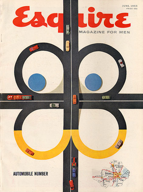
Esquire magazine’s June 1955 issue playfully depicts a typical aerial view of a freeway using toy cars and colored paper. It’s composition is simple and engaging, with its bright primary colors, windy roads, and cars on the move. I especially enjoy the smart and effortless integration of the magazine’s mascot, Esky (designed by E. Simms Campbell), into the area within the highway and in the highway itself. The tiny map of the Motor City is a nice touch too!
Founded in 1933 by Chicago publisher David Smart and editor Arnold Gingrich, Esquire magazine has a rich design history, with Paul Rand as its art director from 1936-1941.
The covers featured today are primarily under the art direction of designer Henry Wolf, who was the magazine’s art director from 1952-1958. Wolf’s refined style left a sophisticated impression on the magazine’s image. After his departure, he was replaced his assistant, Robert Benton, from 1958-1964.
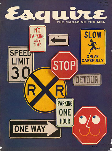
Esquire Magazine (June 1956)
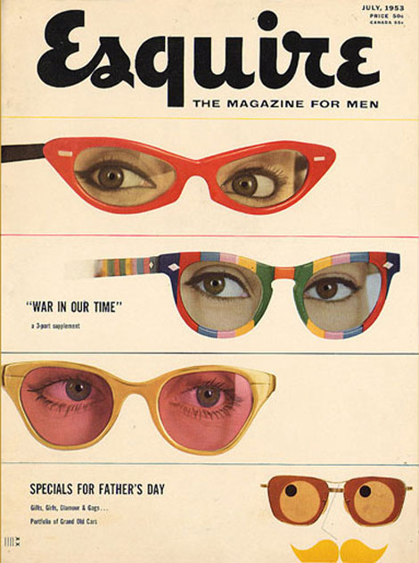
Esquire Magazine (July 1953)
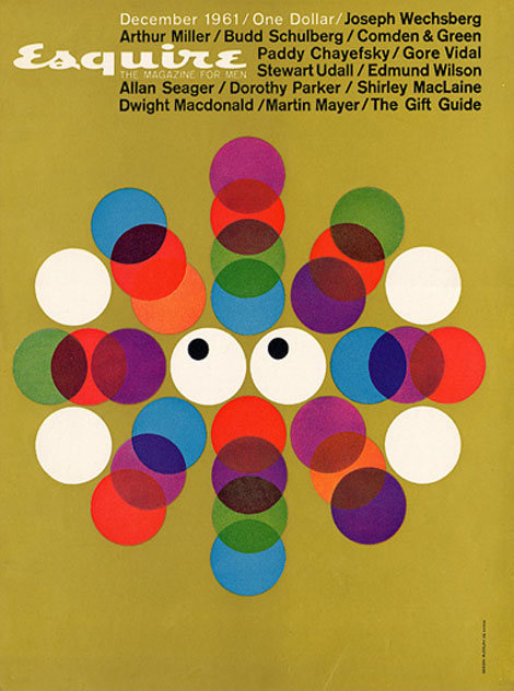
Esquire Magazine (December 1961)
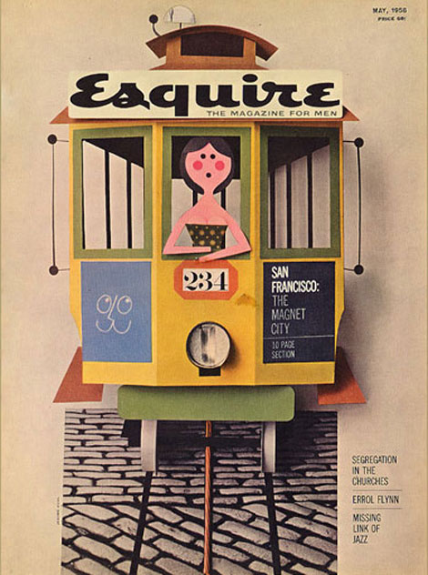
Esquire Magazine (May 1958)
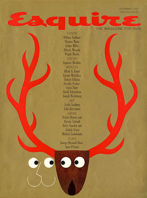
Esquire Magazine (December 1959)
Esquire has a full archive of its entire collection of magazine covers from 1933 to present on full view on their website. There, you can see the Esky’s early antics. Definitely check it out, and don’t forget to look at the neat covers by George Lois from 1962-1972!
Tags1950s, 1960s, graphic-design, Illustration, magazine covers, USA, vintage
09.23.09 in Found design by Grace Danico
Share This Share on Facebook


18 comments
Comments feed for this article
Trackback link
http://grainedit.com/2009/09/23/vintage-esquire-covers-1953-1961/trackback/
09.23.09 at 7:36 am
Pingback from Twitter Trackbacks for grain edit · Vintage Esquire Covers: 1953-1961 [grainedit.com] on Topsy.com
09.23.09 at 7:33 pm
Pingback from Design Diário
09.24.09 at 3:34 pm
Pingback from grain edit · Vintage Esquire Covers: 1953-1961 | Design2o
09.24.09 at 3:34 pm
Pingback from grain edit · Vintage Esquire Covers: 1953-1961 | Design2o
09.25.09 at 12:56 pm
Pingback from Color + Design Blog / Vintage Color & Design: Esquire Magazine by COLOURlovers
09.25.09 at 6:41 pm
Pingback from Vintage Color & Design: Esquire Magazine « iTrendStyle
09.27.09 at 2:03 pm
Pingback from Фoto-inbox
Great covers, I have some of the George Lois ones framed and on display in my flat. I love the spectacles one above.
09.23.09 |
Delicious Industries |
Found design |
George Lois is TOPS. Great post. These are my favorites: http://www.okaygreat.com/?p=351
09.23.09 |
Dylan |
Found design |
I like Esquire, but, looking back on their covers on their website, they haven’t been clever with a cover since about 2004.
09.23.09 |
Señor Nuevo/Oki-Ronin Enterprises |
Found design |
These are great!
09.23.09 |
deb |
Found design |
The 1961 cover could be a cover for Eye. Similar typography and style…
09.24.09 |
morgan |
Found design |
Great covers. I love how bold and graphic these are. I love that little (cat?) face that keeps popping up.
09.24.09 |
aleks sennwald |
Found design |
Clever, fun, beautiful, elegant and innovative. American design at its best!
09.25.09 |
laura@popdesign |
Found design |
I know that cut paper is considered to be the archaic predecessor of Illustrator. However, there is something so very charming about the cut paper covers! I think it’s the idea of a crispy graphic with the hand-made feel that does it for me.
09.25.09 |
Genevieve Simms |
Found design |
Esquire has really good covers… much more of them: http://en.tspot.pl/news/magazines-and-newspapers-since-the-beginning-till-now-esquire/
09.28.09 |
Karol Zielinski |
Found design |
This sort of work makes me lament an aesthetic that I wasn’t lucky enough to ever witness in real time. It’s so simple and clean and the colors are so vivid and painstakingly considered. It makes me want to work harder.
09.30.09 |
Caitlin Kuhwald |
Found design |
gorgeous.
10.01.09 |
seesaw designs |
Found design |