


Till Wiedeck: Graphic Design
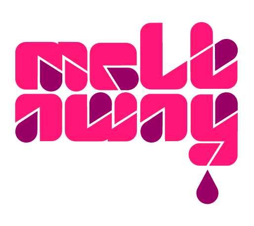
German based designer, Till Wiedeck, really melts my heart with his fabulous collection of type. This particular typeface, titled “HM Melt,” was inspired by a simple letter “a” found in a mid-’70s edition of The World of Logotypes by Al Cooper. It’s terrifically impressive that he was able to create such a fresh typeface solely based around the shape of one letter. I really love his experimentation with geometry and the positioning of various drops, simulating that the type is really melting!

I really dig the extra portly type on this Heron debut EP. It certainly provides a nice balance with the fine portrait in the background.
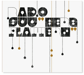

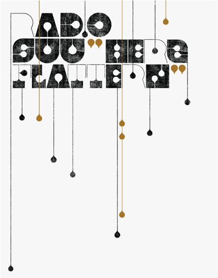
It keeps getting better and better with this kid! Created as a new visual identity for the band Radio Suu, this design feels rustic with its rough textures, yet refined with its geometric intricacies.
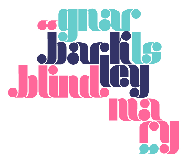
Inspired by the Gnarls Barkley song “Blind Mary,” this particular typeface (titled “HM Mary”) is like a twist on an old classic. It’s a chic contemporary typeface reminiscent of type from the 1970s.
For more peeks at some awe-inspiring work, check out Till’s website tillwiedeck.com.
——————–
Not signed up for the Grain Edit RSS yet? Give it a try. It’s free and yummy.
Tagscontemporary, germany, graphic-design, Till Wiedeck, Typeography
