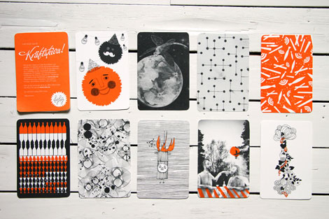
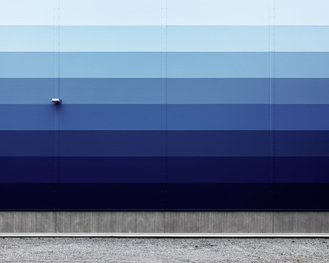
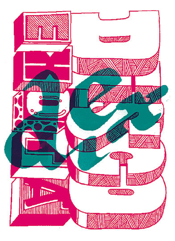
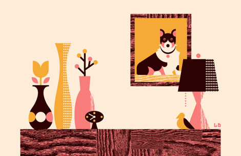
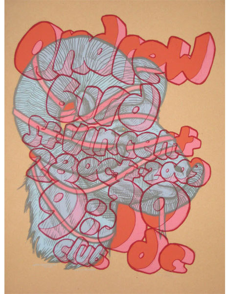
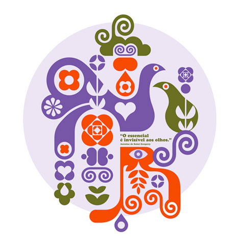
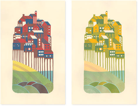
Erick Montes
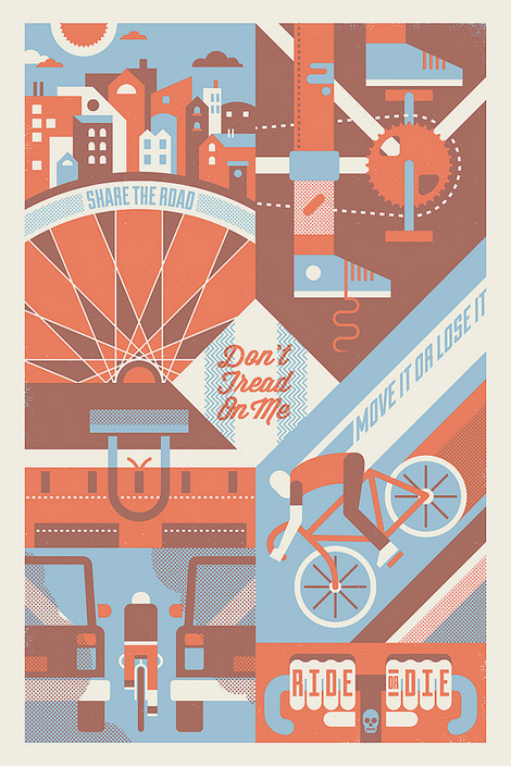
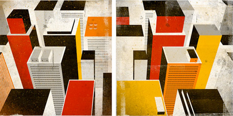
Erick Montes is an illustrator and designer living in Austin, TX. I like his style a lot; it’s a nice mix of textural, hand-drawn elements with clean lines and great color palettes.
05.01.13 | Ethan | Found design |  1 comment


You are currently browsing Ethan’s articles.
Erick Montes is an illustrator and designer living in Austin, TX. I like his style a lot; it’s a nice mix of textural, hand-drawn elements with clean lines and great color palettes.
05.01.13 | Ethan | Found design | 1 comment
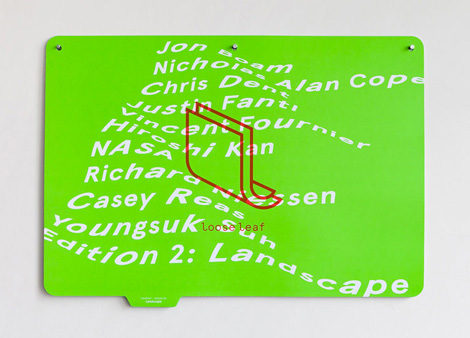
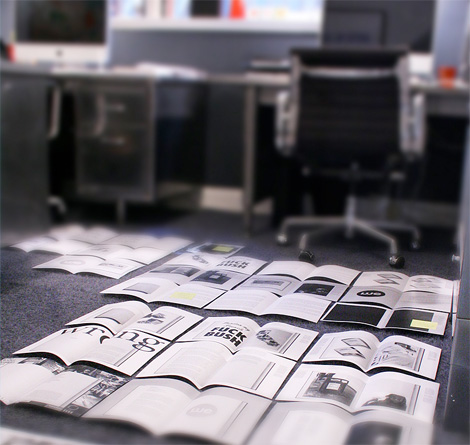
Loose Leaf is a project by Manual, located here in sunny San Francisco. Caught somewhere in between art publication and curated print series, the format of the project is part of what makes it so enticing. Each edition comes as a series of leaves, hole-punched and ready to install. This allows the user to continually rotate and swap out images.
04.18.13 | Ethan | Found design | Comments closed
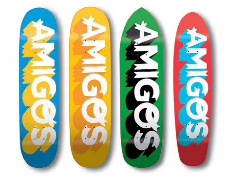
Fun skateboard branding from Grain Edit friend, Sasha Barr. This whole collection is bright and playful and has a ton of personality; I love the chips and salsa board, and the beer theme. Check out the Amigos shop for all of your beer and food-themed skateboard needs.
04.03.13 | Ethan | Found design | 4 comments
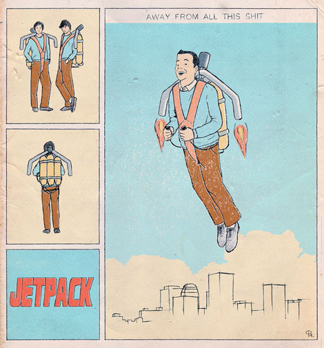
Woodcum is the monikor for one Philip Igumnov. Similar to the Jetpack image, his flickr stream is full of this vintage, 50s style ephemera. While the work is inspired and nostalgic, his take is decidedly more surreal and abstract. I love the use of collage and the sense of humor and play found in this collection.
03.27.13 | Ethan | Found design | Comments closed
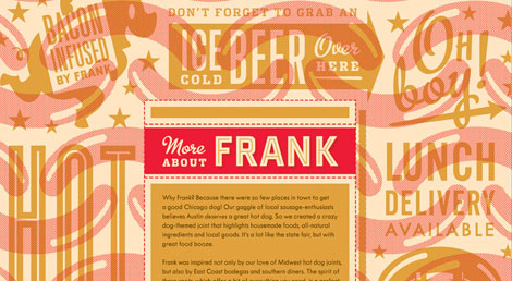
Barrett Fry is a designer and a Texan. Or, at least, he is currently residing in Austin, Texas. He’s working at Pentagram under DJ Stout. His work is bold and colorful, with a strong emphasis on design for the food industry. Of all his projects, those were my favorites.
03.20.13 | Ethan | Found design | Comments closed
Lovely work from Shed Labs, the Greenville, SC-based design and screenprinting studio. Their aesthetic is bold and textural, and their work is very lively. The wit and sense of humor found in the work functions nicely with their colorful, playful style.
02.27.13 | Ethan | Found design | 6 comments
Founded is a Newcastle-based studio specializing in branding, packaging and environmental projects among other things. To me, their strong suit are their branding and identity projects. They do a great job of making subtle references and effectively using restrained typography while still managing to be witty — all within a very clean, minimal style.
02.20.13 | Ethan | Found design | 1 comment
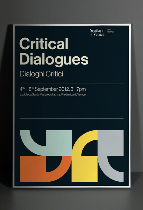
I love this Critical Dialogues pieces and the other work from the Glasgow-based Graphical House. I’m a fan of their bold, clean work and the nice balance between playful and smart.
02.06.13 | Ethan | Uncategorized | 11 comments
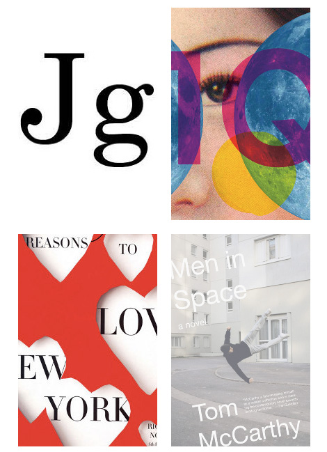
I’m so impressed with the consistently impressive, type-driven book cover work of Jonathan Gray. Generally, his covers are predominantly typographic, but they don’t operate under a single, rehearsed style. There’s so much variety and life to his body of work; it’s amazing to see all of this coming from one person.
01.30.13 | Ethan | Uncategorized | 1 comment

Mr. Chris Rushing is a designer/illustrator/art director working in NYC, at Time Warner. He has a great number of interesting projects and a nice site with which to neatly house them. It looks as though while working at TW Chris has had the chance to create some great web and interactive experiences — these projects are interesting, and well worth a look. What really attracted me to his work, though, was his skill in lettering and illustration. I love the pinache and wit throughout his portfolio. In general, I’d say his work is smart and succinct; interesting and engaging without being overstated.
01.16.13 | Ethan | Found design | 5 comments
Nice design and lettering from Chris Burnett, a senior at Cal Arts. I love the mix of accessibility and exploration within his work. Looking forward to seeing more after he finishes up school.
01.09.13 | Ethan | Found design, Illustration, Typography | 3 comments
I’ve been a designer with the University of California, Office of the President, for a little over a year now. During my initial interviews I was shown a bold and newly designed mark with accompanying branding elements. That identity system was one of the main reasons I accepted the position. It was so exciting to me that an enormous public institution would actually make the move toward a witty, fresh, charismatic and entirely unstuffy aesthetic — an aesthetic that seemed to go against all standard expectations of what public education should look like. And to have the opportunity to work on the in-house team that actually put this identity in place? Yes, please!
12.05.12 | Ethan | Found design | 33 comments
Nice branding system from lg2boutique, the Canadian-based advertising and branding agency. I really like the contrast between bold and playful here. Very nice work, and it’s all for a benefit.
11.28.12 | Ethan | Found design, Uncategorized | 3 comments
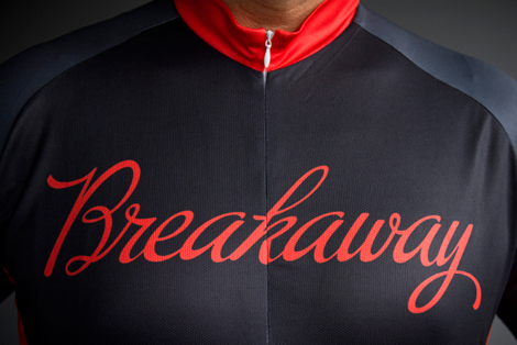
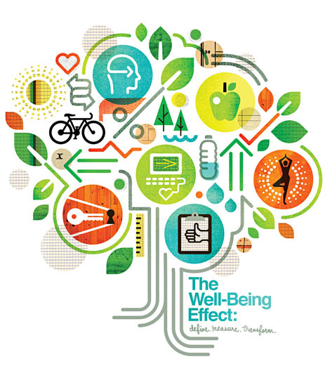
I like the scope and style of this branding project from Boston-based Bluerock Design Co. With the honorable aim of introducing kids to cycling and nutrition, the cleanliness, simplicity and boldness of this campaign are spot on. It feels like the overall aim of this project is inform and inspire, and the bright, crisp graphics really help in that cause. They’ve obviously had some fun in applying the concept to jerseys, bottles, shirts and tickets. A lot of times it feels like branding projects cover a familiar gamut of surfaces: letterheads, cards and websites. It’s nice to see this work on something a little more unique.
11.14.12 | Ethan | Found design | 10 comments
Nice colorful, minimal work from Nathan Godding, a San Francisco-based designer. I love his typographic work and the playfulness of his layouts.
11.07.12 | Ethan | Found design | 4 comments
Nice post on Mubi talking about the Polish film-poster documentary, Freedom on the Fence, and also highlighting some of the work of Waldemar Swierzy.
10.17.12 | Ethan | Found design | 6 comments
Very cool minimal geometric composition/illustration project from Tilman, a Nuremberg, Germany-based designer. Overall, the collection here is strong and I love how spare these compositions are while still being playful.
10.03.12 | Ethan | Found design | 5 comments
Cool daily poster project from Anna Kövecses. Aside from being a wonderful creative exercise, the intent is to highlight successful color palettes and provide inspiration.
09.26.12 | Ethan | Found design | 1 comment
Asatte is a Kobe, Japan-based design studio specializing in identity, cover and package design. I love their crisp, playful and bold forms and color schemes.
09.19.12 | Ethan | Uncategorized | 8 comments
Anagrama is Mexico-based design studio/agency doing a lot of very slick branding projects. I love how full and considered these campaigns are—from the initial mark to the collateral, their thoughtfulness and attention to detail is obvious. They do a great job photographing and presenting their work, as well.
09.10.12 | Ethan | Found design | Comments closed
Element One is a Polish design studio specializing in identity and publication design. Their work is crisp and to the point.
I’m a big fan of their editorial work; the use of scale along with type and image is fascinating. Nothing feels untouched. They can make things loud and bold but delicate at the same time.
08.22.12 | Ethan | Found design | 1 comment
Bandito Design Co. is the home of designer/illustrator extraordinaire Ryan Brinkerhoff. Ryan has his hands firmly entrenched in the exciting gig-poster, screenprinting, music-meets-design scene. He also possesses some fancy hand lettering skills. Skim through his work: it’s hard not to like. I really love his color palettes, and the mileage he can get from using such a small number of colors.
08.15.12 | Ethan | Found design | 6 comments
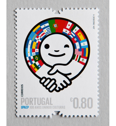
Ze Cardoso is a designer, illustrator and artist hailing from Oporto, Portugal. Recently graduated, Ze has a number of interesting self-initiated projects on his site. I really like the colors and personality in this stamp project, a collaborative effort for CTT, Portugal’s national postal service. They’re bold and playful, and would make sending letters much more enjoyable.
08.08.12 | Ethan | Found design, Uncategorized | 2 comments
I always enjoys seeing studios diverse in clients and in style. Madrid’s Patten does this very well, with their hands in many different areas. Stylistically they are bold and minimal, clever and catchy. Their work in fashion and design spans photography, illustration, lettering and poster design.
08.01.12 | Ethan | Found design | 10 comments
Ever have a dream concert you wish you could attend? Like The Beatles and the Muppets or Raffi and Kanye?
It Was A Famous Night does just that — at least in terms of the gig-poster. The project curates eight artists to dream up their favorite concert and design the poster. Visually, and aurally, there’s some great work here. I’m most excited to see CD Ryan’s Spiritualized, Broadcast, Boards of Canada show.
07.25.12 | Ethan | Found design | 3 comments
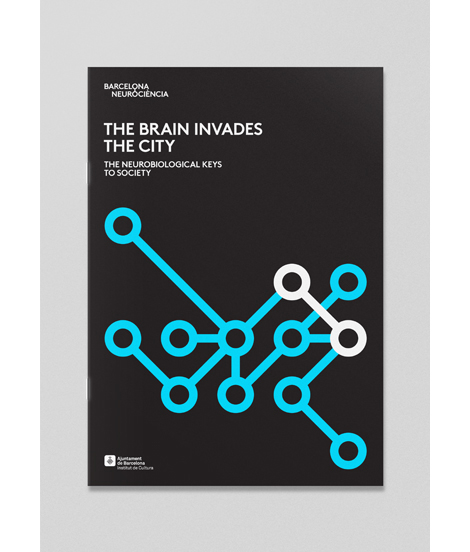
Forma&Co is a collaborative Barcelona-based studio. What really caught my eye with this studio were their large-scale programs promoting various happenings in Barcelona. The scope of the programs themselves are interesting: neurobiology and dusk-’til-dawn free museum accessibility. The visual design of the work is great; F&Co have a bold, fun, boisterous style that attracts attention and translates well to bus signs, banners, and city-specific substrates.
They do a lot of fun illustration work as well; check their site for more.
07.18.12 | Ethan | Found design | 1 comment
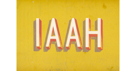
I’ve been a fan of I Am Always Hungry for quite a while so I’m happy to see they’ve recently updated. We haven’t seen any new work from IAAH in some years; as such they’re now releasing 40 projects in as many days. Out of this latest release I’m quite drawn to a number of their typographic studies, experiments and branding for a number of feature films. They’re dark and raw and very playful in their own eerie way.
07.12.12 | Ethan | Found design | 2 comments
We’ve posted a number of great Barcelona-based designers and illustrators in the past, and the work from Atipus is no exception. Atipus is a studio doing really sharp branding, art direction and general design for print and web. What really struck me was the distinctiveness and personality throughout their portfolio. The work is clean and accessible as well as smart and well thought out.
07.05.12 | Ethan | Found design | 5 comments
Lots of cool, crisp typographic work from Denmark-based Mads Burcharth. I love his clean, minimal approach to lettering and type design and his ability to add flourishes and interesting details to his work. His style is strong and bold, and has a great flair to it as well.
06.13.12 | Ethan | Found design, Typography | 6 comments
If you’re a letterpress fan, be sure to check out the work of UK-based Ian Gabb. Ian is a designer, printer and letterpress technician at the esteemed Royal College of Art. He has a fantastic array of printed work on his table-top style website.
06.06.12 | Ethan | Found design | 1 comment
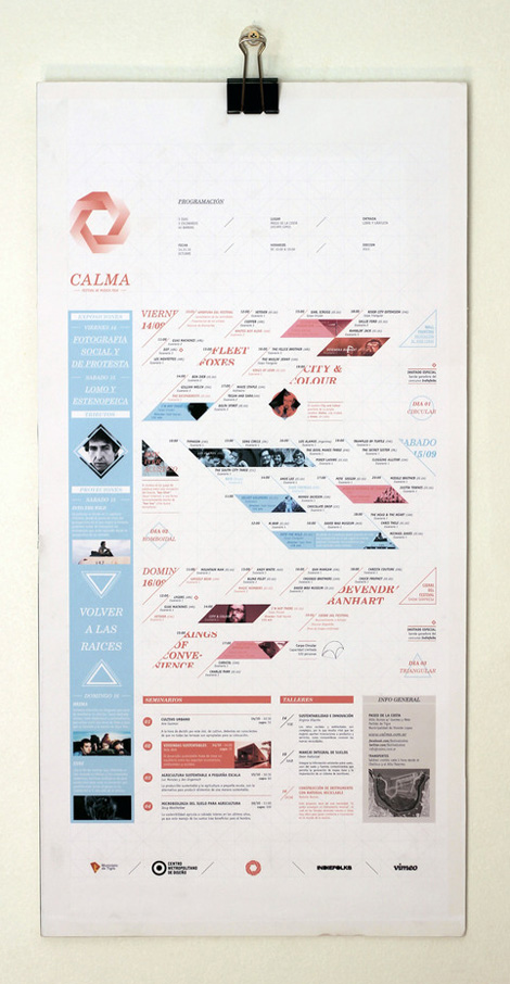
Great work coming from Argentina-based Estudio Tricota. Shown above is their work for Calma, a music festival — I love the movement in the piece and all of the small, considered typographic details.
05.31.12 | Ethan | Found design | 8 comments
Fresh work coming from Mr. Brad Woodard in sunny Southern California. Brad’s an accomplished designer/illustrator and an info-graphics whiz to boot. I love his color palettes, form-making and how deliciously his illustration style bleeds into his information graphics. The two play very nicely together.
05.16.12 | Ethan | Found design | 4 comments

I’ve been a fan of Washington D.C.’s Matt Chase for quite a while now. Matt has a lot of versatility as a designer/illustrator and I’m always impressed with his ability to work with a gamut of styles. He transitions so well between smart identity work, engaging, colorful illustration and on-point lettering.
05.09.12 | Ethan | Found design | 4 comments
One of my favorite book cover designers, John Gall, has a new site up and running. John is a designer with an incredible stylistic range — I love how he is so able to design for such a variety of titles and narratives.
05.02.12 | Ethan | Found design | 5 comments
Wonderful decorative spin on Bodoni produced by classmates Nigel Bents, Paul Oakley and Jonny Holmes at the Chelsea College of Art & Design. I love the intersection of digital and analog in this project — ultimately arriving in the form of a printed piece.
04.25.12 | Ethan | Found design | 4 comments
Lovely work out of America’s heartland from designer/illustrator Alex Perez. The multi-talented Mr. Perez ably navigates between type, packaging, illustration and design.
04.18.12 | Ethan | Found design, Uncategorized | 8 comments
Laura Meseguer is a type designer, letterer and designer from Barcelona, Spain. I love the immediacy of her work and how ably she navigates between play, function, legibility and form.
Rumba (seen after the jump), especially, catches my eye as it has a wonderful calligraphic, hand-lettered quality to it. You can peruse more of Laura’s work on FontShop, House Industries, Type-Ø-Tones and MyFonts.
04.11.12 | Ethan | Found design, Typography | 6 comments
Really digging the layout, lettering and sharp conceptual work from Triboro. Propelled by an endlessly impressive client list, Triboro’s work is thoughtful, engaging and never dull.
04.04.12 | Ethan | Found design | 1 comment
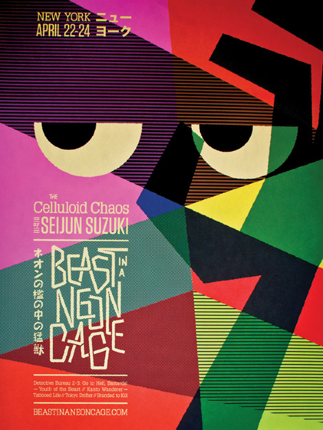
Jon Wong is a Bay-Area based designer working at San Francisco’s esteemed Office. His take and design of a Seijun Suzuki film festival is pretty rad. So inspired and well thought-out. There’s so much punch to a system that carries out successfully over multiple pieces and formats (like the wood engraving and deck of cards).
03.27.12 | Ethan | Found design | 6 comments
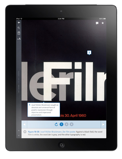
The San Francisco-based Inkling makes smartbooks — interactive textbooks for the iPad. Inkling has recently undergone the incredible task of designing and (re)creating a digital, interactive version of the timeless Meggs’ classic, History of Graphic Design.
03.14.12 | Ethan | Books, Found design | 8 comments
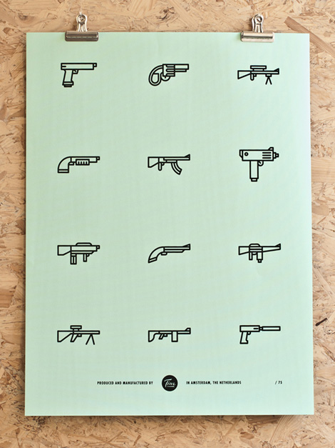
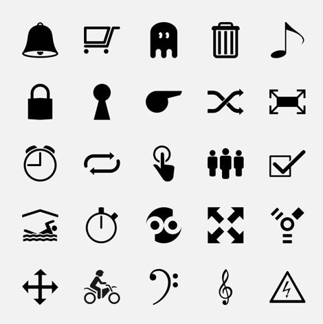
The Netherlands-based designer Tim Boelaars recently released a series of everyday icons. The techniques that make his identity and design work so engaging are present here: bold, whimsical, geometric line work illustrating a range of quirky, commonplace objects.
03.07.12 | Ethan | Found design | 10 comments
Looking through the work of the Swedish photographer Patrik Lindell, it’s hard to choose only a handful of images to show. His work is so focused and consistent and I see many similar qualities with designers’ work that I admire. The compositions are straight-forward, and he has a keen eye for subtle details, pattern, color and structure.
02.29.12 | Ethan | Found design | 4 comments
Very fun, engaging work coming from our San Francisco-based neighbor, Javier Garcia. Mr. Garcia’s style has an energetic, light-hearted feel to it that reminds me of bygone folk art.
In particular I’m drawn to the classical LP sleeve series, shown above. Javier has very clearly captured the feel of these rustic sleeves.
Be sure to check out his blog and Etsy shop!
Read the rest of this entry »
02.22.12 | Ethan | Found design | 13 comments
Mark Gowing is an Australian-based designer. His work encompasses a variety of media, but I find his poster design to be especially compelling. With a Swiss-oriented reference point, Gowing effectively utilizes simple, geometric shapes with engaging results.
02.15.12 | Ethan | Found design | 9 comments
Brighten The Corners is an independent, multi-disciplined design and strategy consultancy with offices in London and Stuttgart. It is also the title of the fourth studio album recorded by indie rock behemoth, Pavement. As an out-and-out fan of Pavement I find this connection quite interesting.
02.08.12 | Ethan | Found design | 5 comments
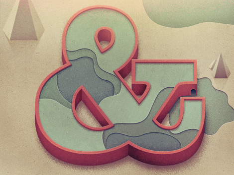
The Florida-based illustrator and designer, Justin Mezzell, has a nice collection of work up on his site. I really dig his flat, straight-forward layouts working together with bright colors and warm textures. That topo-style map ampersand up there is pretty rad.
01.25.12 | Ethan | Found design | 8 comments
Jude Landry, the Mississippi-based designer and educator, has a nice collection of work. Rather than a specific style often repeated, Jude’s work feels more conceptually driven. The thoughtfulness and detail is evident in each project. At the core, though, it’s very approachable and readable.
01.18.12 | Ethan | Found design | 4 comments
Swissted is the project of one, Mike Joyce (the NYC-based designer, not The Smiths’ drummer). This project is fantastic — redoing flyers for classic hardcore punk and indie shows in the swiss modernist style. Lots of angular layouts, grids, transparency and scale. And he’s done so many! Take a gander, it’s fun to look through.
01.11.12 | Ethan | Found design | 9 comments
Interesting concept behind Telegramme Studio, this fantastic UK-based studio. It started as a collab between two designer/illustrators sending work and things back and forth in the post. Eventually this mutual love for design and mail sprang up a fully-functional studio, which we now enjoy here.
12.14.11 | Ethan | Found design | 3 comments
Fun work from the Denver/Dallas group Foundry Collective. These guys have a steady hand in Americana-vintage that translates really well to their identity, packaging and typography. I love their use of color, texture and illustration — their work has loads of personality.
11.30.11 | Ethan | Found design | 4 comments
Scott Campbell is an illustrator, designer, musician — and by the look of his work, a hands-on, analog, form-making lover. The current crop of work on Scott’s site is terrific. It’s clean, it’s messy, it’s bold, it’s abstract. It’s also very textural and dimensional, which I love. He’s great at using rustic imagery with clean layout and typography.
11.16.11 | Ethan | Uncategorized | 9 comments
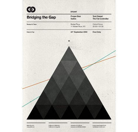
Holy gridness! Very slick work from Ross Gunter, a London-based designer and music lover. Ross is a co-founder of Bridging the Gap, the music and art collective for which this and the following posters were designed.
11.02.11 | Ethan | Found design | 4 comments
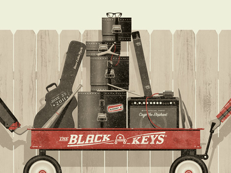
This Black Keys Radio Flyer inspired poster was made by DKNG, the LA-based design crew. They do great work, and are also (awesomely) the resident poster artists for the world famous Troubadour in Hollywood. What a great gig.
I love the concepts and especially the detail within their work. The posters tend to be bold and straightforward concept-wise, but they really pull everything together with fine-tuned details.
10.26.11 | Ethan | Found design | 15 comments
Matt Lehman, everyone! That is, if you’re not already acquainted. Matt’s got a wonderfully warm, lovely style that’s hard to resist. In the piece above, like much of Matt’s work, I’m drawn to the combination of color, texture, layout and wit.
10.19.11 | Ethan | Found design | 23 comments
Welcome to the wonderful world of work from Adam Hill (aka Velcro Suit). Aside from having a cool working moniker (Velcro Suit!), Adam’s work is a real pleasure to look at. He gets a lot of mileage from great color palettes and nice, tight typography.
10.12.11 | Ethan | Found design | 4 comments
Stockholm Design Lab is a Sweden-based laboratory of sorts. As a firm they have their hands in just about everything — design, architecture, product development, video, interiors, and more. Although, a core tenant of their philosophy is not to differentiate between these fields. It appears obvious from their work, and successful.
10.05.11 | Ethan | Found design | 4 comments

I stumbled across the fantastic work of Studio 8 earlier today, and after looking through their portfolio I was a little surprised that I hadn’t heard of them before. The quality and consistency of their work is quite good, and they’ve notched projects for clients large and small. (The above C is part of a typeface designed for Wired Magazine.)
09.21.11 | Ethan | Found design | 3 comments
The work of Patrick Macomber (aka South Yall) is pretty dang terrific. I’m always drawn to those designers that operate within a more minimal framework — it’s exciting to see someone arrive at a solution with the fewest moves possible.
09.14.11 | Ethan | Found design | 7 comments
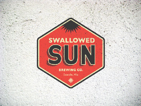
Riley Cran, everyone! Mr. Cran can be found in sunny Seattle, Washington, and has quite the handle on creating compelling logos and marks. I love his branding for Swallowed Sun Brewing Co. — it’s accessible, fun and to the point.
09.07.11 | Ethan | Uncategorized | 13 comments
Peak 21 hails from the south-west of Poland, in Wrocław. Keeping in the Polish tradition, they do some very nice work. I’m a fan of their bold, geometric and minimal style.
08.31.11 | Ethan | Found design | 6 comments
As a young design student at California College of the Arts I had the wonderful opportunity of interning for ReadyMade magazine — way back in its hip Berkeley headquarters heyday.
It was a fantastically unique experience and my first in a bustling design office. Under the guidance of art director George McCalman, the office’s art department was a lively, collaborative, ambitious and (extremely) entertaining place to work — and home to the best design office music jams I have had the pleasure to groove to (courtesy of Mr. McCalman himself).
George is a magazine veteran, having art-directed Mother Jones, ReadyMade and Afar to name a few. He is responsible for relevant, thoughtful editorial design as well as some very compelling branding, packaging and identity work. Recently, I was able to catch up with George and find out about his past, present and future. And of course, his opinions regarding his favorite magazines.
George, take it away:
08.24.11 | Ethan | Features, Interviews | 11 comments
We recently received this title on contemporary typography from the friendly folks at Princeton Architectural Press. The book takes a look at the minimalistic typographic work of a variety of well-known and not-so-well-known designers.
08.17.11 | Ethan | Off Our Bookshelves, Uncategorized | 9 comments
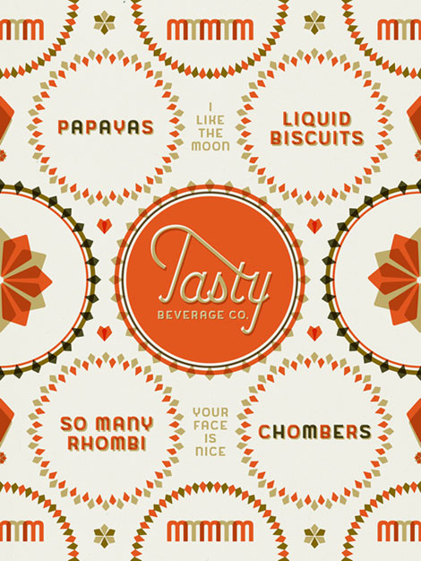
Condiment-loving illustrator, typographer and designer Jaime Van Wart creates some fantastically delicious work. Under the studio moniker Ketchup-Mustard, it’s very fitting that some of her most identifiable pieces were made for a beverage company named Tasty. Van Wart may well be one of the most well-rounded designers to have appeared on Grain Edit. When not creating outstanding typography and identities, she is a software designer for IBM.
08.10.11 | Ethan | Found design | 10 comments
Graphic Design’s hometown, the Netherlands, has no shortage of fantastic designers, illustrators, or artists. Tim Boelaars is one of the many standouts from that fine country.
08.03.11 | Ethan | Found design | 15 comments
Daddy worked hard and Mama didn’t raise no chicken.
Such is the quote that opens Kirk’s portfolio. Delightfully, following sections of the site contain equally awkward colloquial articulations.
07.27.11 | Ethan | Found design | 17 comments
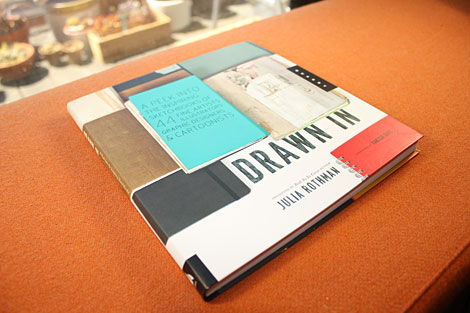
In our current day and age we have a plethora of opportunities to view designers’ sparkling clean, polished work. It’s not as often that we get to view the process or beginnings of this work. Julia Rothman‘s new book, Drawn In takes us into the pages of sketchbooks from 44 artists, designers and cartoonists.
07.13.11 | Ethan | Books, Off Our Bookshelves | 5 comments
Love the quality and breadth of work from Ireland-based designer, Duane Dalton. Mr. Dalton has a great minimal, restrained style which relies heavily on a strict adherence to the grid and the sparse use of color.
07.06.11 | Ethan | Found design | 4 comments
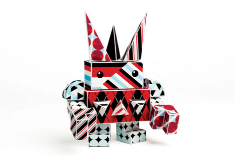
Paper Punk is a startup company that’s equal part hands-on toy, art piece and educational tool. Founded by Grace Hawthorne (ReadyMade magazine co-founder), Paper Punk is the result of her many years engaging people with design and encouraging them to create with their hands.
Punks are constructed out of foldable, brightly colored die-cut paper blocks — each kit comes with stickers and instructions for building and customizing your robot, dog, or car. I love the built-in ability to remix and customize your own creations. The systems uses simple shapes and a variety of patterns allowing you to build a wholly unique creation.
06.22.11 | Ethan | Designers, Found design | 3 comments
Everything-Type-Company is a new design studio collaboration between Geoff Halber (Brooklyn) and Kyle Blue (San Francisco). Their portfolio boasts a nice variety of work for clients such as Yale School of Art, Arkitip, Dwell magazine, and the Walker Art Center.
06.15.11 | Ethan | Found design | 6 comments
Great work from designer Colin Dunn. While still in the design program at MICA, Colin is designing work one would expect to see from someone with more experience. Also, in addition to being enrolled at MICA, Colin is a designer at Pentagram. I love the boldness and clarity of his portfolio — he makes good use of simple typography and a clean layout.
06.08.11 | Ethan | Found design | 5 comments
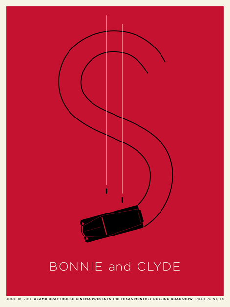
Bay Area designer and long time Grain Edit friend, Jason Munn, was recently commissioned by Alamo Drafthouse to design a series of posters for their cinematic Texas Monthly Rolling Roadshow. The series focuses on films that take place in Texas.
06.01.11 | Ethan | Events, Found design, Uncategorized | 13 comments
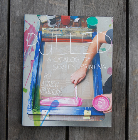
Very excited to see the latest from Mike Perry. Continuing in a similar vein as his other books, Mike does a great job of delving into a specific theme and highlighting important work and people.
Pulled takes a look at design through the medium of screen printing, and shows a wide variety of examples. There’s some really lovely work in here — I also find it helpful to see the results from different designers, and to see what’s achievable with screen printing.
05.25.11 | Ethan | Product Reviews | 7 comments
I am a sucker for the gig poster. That’s the truth.
Running across the work of Alvin Diec was a real treat. Alvin’s in Atlanta, and he sure makes a fine poster, among other things. I love his use of type and restrained style.
05.18.11 | Ethan | Found design | 11 comments
Very sharp, intelligent identity work from Swedish-Australian-Parisian art director Hampus Jageland. It’s delightful to see work that combines striking minimalism with smart thinking. It’s one of those skills that is easy to identify but difficult to imitate.
05.05.11 | Ethan | Found design | 7 comments

Lovely work from London’s Andreas Neophytou. He’s got a slick, contemporary style, with a hand firmly in the past as well. I love his clean lines and colors, as well as his conceptual talents. His portfolio is a swath of smart work—a good example being that mark above, designed for William & Son.
04.26.11 | Ethan | Found design | 13 comments
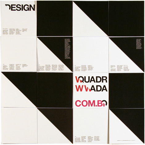
Dutch-inspired Brazilians making amazing design? Yes!
São Paulo based Quadradão is doing just that. I was pretty excited to run across them, they have a very impressive body of work. Such big, fat, bold shapes and colors. In design school I remember trying to get Helvetica to look this good.
04.20.11 | Ethan | Uncategorized | 17 comments
We’ve posted work from the wonderful, self-explanatory project Make Something Cool Every Day in the past. The concept of the project is succinct, and it’s impressive to see the consistent quality of work from various contributing designers.
Marius Roosendaal is no exception. He’s been at the project for awhile, and his contribution is very nice indeed. First of all, I love his range of typography, layouts, type design and imagery. His work is very inspired and consistent.
04.13.11 | Ethan | Found design | 9 comments
Jordan Gray is a designer and illustrator living in Missouri. Currently he’s an art director at Berstein-Rein, and on the side creates some real gems, like the album packaging shown above and below. As a designer, Jordan posseses the illustration skills for the a project like this to succeed – the composition, illustration style, palettes and concept all fit together so nicely.
04.05.11 | Ethan | Found design | 15 comments
Some of the work from Lamosca is pretty familiar, but I became reacquainted with them through a weave of who-did-what for a recent IBM campaign. One of the things they handle quite nicely is the combination of layout and illustration. Their colorful and bold illustrations give the work an immediate pop, but it’s paired nicely with legible, insightful layout. It’s nice when those two can live together in harmony.
Their work feels consistent and jives as a whole, without feeling bored, tired or expected. Among their standout work is their info graphics — which have a quirky, colorful liveliness that isn’t often seen in that area of design.
03.30.11 | Ethan | Found design | 2 comments
I love the range of work from Oakland, CA based designer Carl DeTorres. With multiple projects from Wired and IBM (among others), Carl’s work communicates very clearly. His directness and visual viewpoint, combined with his inventive form making and interesting palettes make for consistently compelling design.
03.24.11 | Ethan | Found design | 9 comments
OMFGCO (The Official Manufacturing Company) is a Portland, Oregon-based thing making machine. Comprised of three gentlemen whose experience includes Wieden + Kennedy, Ace Hotel and probably a million sketchbooks — the crew handles a wide variety of graphic and visual projects with supreme dexterity.
03.16.11 | Ethan | Found design | 3 comments
The Noun Project is a bold idea with a simple mission statement: “Sharing, celebrating and enhancing the world’s visual language”. Essentially, the Project aims to collect, organize and add to the universal library of symbols and images that make up our visual language.
03.09.11 | Ethan | Found design | 1 comment
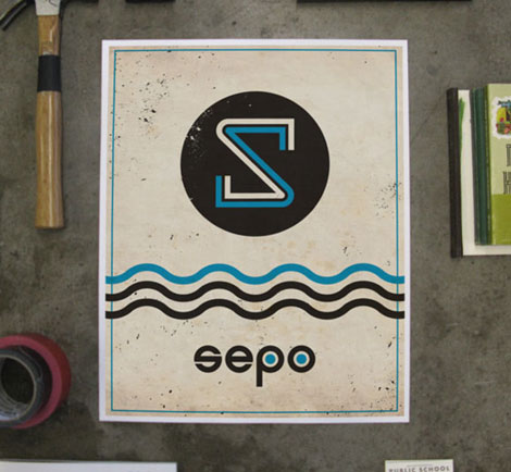
Cody Haltom is a designer working in warm Austin, Texas. He has a nice handle on things large and small and in between. The above logo has a simple yet fun whimsical execution to it. These characteristics, I feel, carry over nicely to his other, more complex pieces. The stationery systems and and Public School identity are good examples of this — all the details seem to simultaneously sing together in design harmony.
03.02.11 | Ethan | Found design | 6 comments
I’m really digging the deceptively minimal work of Mark Brooks. The illustrations are sparse and the images full of contrast, and I feel that the concept quality is top notch. For example, whatever is happening with the exploding — or shattering — giraffe below is amazing.
02.23.11 | Ethan | Found design | 9 comments
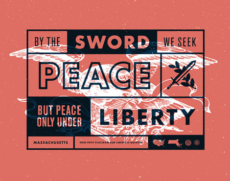
Massachusetts / Mark Weaver
50 and 50 is America’s design project. This wonderful curation brings together 50 of our nation’s most talented and patriotic designers and pairs them with their home state. With the state motto as their inspiration, these designers take those words and engrain them into a 625×492 pixel canvas, giving us a unique perspective into our great land.
02.16.11 | Ethan | Found design | 7 comments
The above (and below) typographic wizardry is brought to you by Simon Walker. I’m a total sucker for typographic compositions of this nature, and Simon has them in spades. Viewing his typographic and compositional skills paired with his bold, grungy take on Americana is an absolute delight.
02.09.11 | Ethan | Found design | 22 comments

Truly lovely typographic work from Mr. Alonzo Felix. He has a remarkable grasp of these letterforms and can pair them nicely with wit and whimsy. The flourishes on the piece below as well as the L, further down, feel especially balanced and help add to the tight compositions.
02.02.11 | Ethan | Found design | 18 comments
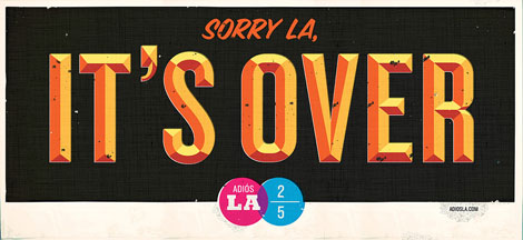
Wonderfully unique concept, execution and typography from L.A. (now NYC) based designer Jon Jackson.
Description from Jon’s site: “Adios LA is a visual goodbye to the city Jon Jackson has called home for years as the artist heads east making New York his new home. Not wanting to string LA along, he has decided to firmly break it off through a graphic billboard series posted on the famous streets of his first love.Jon Jackson has spent nearly his entire life wearing shorts living in LA. He is now zipping the pant legs back on and moving east. Jon is leaving Los Angeles to work for HUGE as a Creative DIrector in Brooklyn”
Best of luck in NYC, Jon!
01.26.11 | Ethan | Found design | 3 comments
Helm Workshop, an Austin, Texas based studio, does some gorgeous work. I love the variety of their poster art and typography — alongside their composition and illustrations.
01.19.11 | Ethan | Found design | 14 comments
I love the portfolio from Austin-based designer Ryan Rhodes (aka Bigger than Giants). His work represents an interesting range of styles and ideas, and he also possesses some superbly handy typographic skills. (See the inked type work for JBG Farms above and below.)
01.05.11 | Ethan | Found design | 12 comments
You need to take a gander at Erik Marinovich‘s work. It mirrors our current holiday climate quite well — bold and bright with a lot of busy hustle and bustle. Erik’s work defies any sort of specific style or set of rules (aside from the majority of it being typographic). The variety and amount of work contained within this portfolio is wonderful and exciting and void of plainness.
12.22.10 | Ethan | Found design, Typography | 17 comments
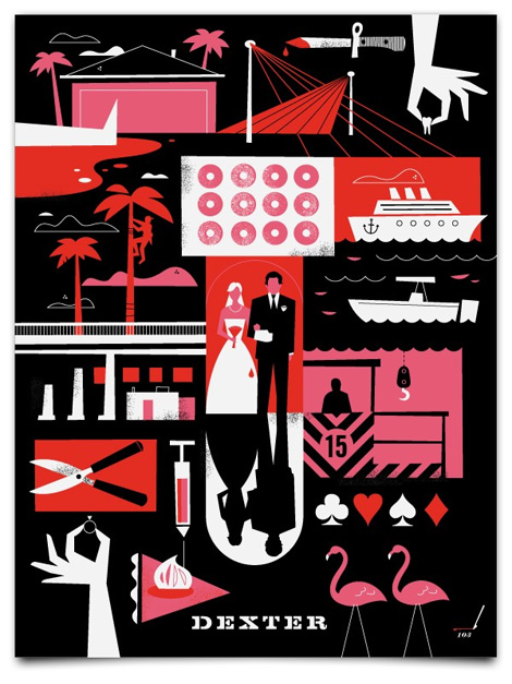
What if all all TV series’ posters looked like this? I can’t imagine a world like that, but what a wonderful world it would be! Ty Mattson, the man behind Mattson Creative, has created posters for both Dexter and Lost.
The composition of these Dexter posters is great — I love the variety of stylized details, all relevant to the show. I’ve seen a few episodes of the first season of Dexter, but these prints pique my interest. There very well may be some more Dexter in my future.
12.15.10 | Ethan | Found design | 9 comments
The above music cover inspired series is one of many self-initiated projects by the Switzerland based GVA Studio. I really love this series, and I can’t help but think that some jazz record was playing while these prints were in the works. Their simplistic, whimsical nature seems to express the feeling of certain kinds of music so well. Looking at this set of prints also reminds me of a number of classical jazz record covers.
12.01.10 | Ethan | Found design | 4 comments
I had a good time flipping through Blake Suárez’s portfolio – there’s quite a lot of fun, eye-catching work to be seen. There is a lot of enthusiasm in this work as well, which is refreshing and exciting to see.
Throughout his experience, Blake has had the opportunity to work with clients like Warner Music and Patagonia, as well as a variety of musicians.
11.24.10 | Ethan | Found design | 5 comments
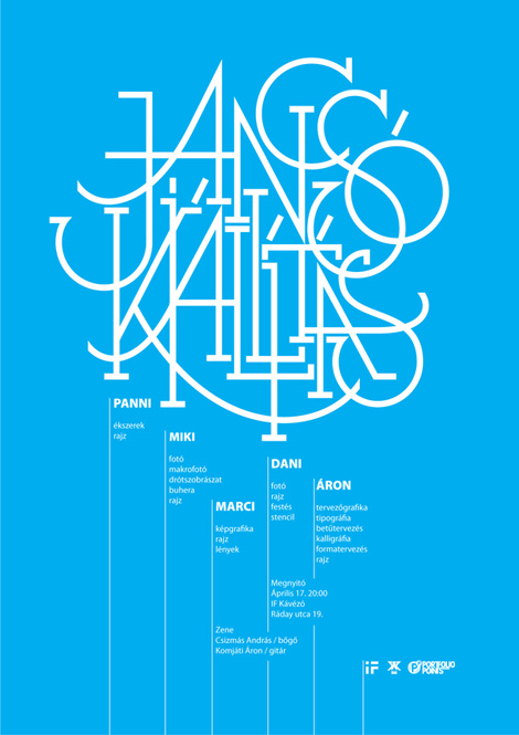
Hungary-based designer / illustrator Áron Jancsó has quite the way with letters. Viewing Áron’s work is a delightfully involved procedure. With such a large variety of typographic experimentation and work, it’s easy to become engrossed with the portfolio while inspecting the various details.
11.17.10 | Ethan | Found design | 6 comments
I love this wonderful identity and stationery system from Abby Brewster. Typographically interesting and well thought out — I want to touch and look and feel each little piece.
The patterns on the inner flap of the envelope are such nice details. How fun would it be to open that letter and be greeted with something so bold! Such a fun surprise.
11.09.10 | Ethan | Found design | 9 comments
In the era of the slick, white, one-dimensional portfolio site, one quickly glazes over after clicking through multiple nearly identical sites. The flip side being that tedious, overly constructed sites become more frustrating and conceptual than actually useful for seeing a designer’s portfolio.
Kelli Anderson has a great site on her hands. It’s unique, fun and easy to use, and it doesn’t get fussy. Her work is exceptional as well. I noticed a nice balance of smart thinking and great hand skills. Kelli has a letterpress in her apartment, so much of her work has a very hands-on, tactile, cared-for feel.
11.03.10 | Ethan | Found design | 10 comments
Sweet type! Kyle Poff‘s portfolio if full of similarly executed identity projects. He’s got a great way with the clean, crisp, stand-out typographic treatments. Hailing from the great city of Chicago, Kyle co-art directs the very cool Materiél Magazine (along with Michael Freimuth). The editorial and more complex design work contained within mirrors this tight, compelling simplicity.
10.22.10 | Ethan | Found design | 7 comments
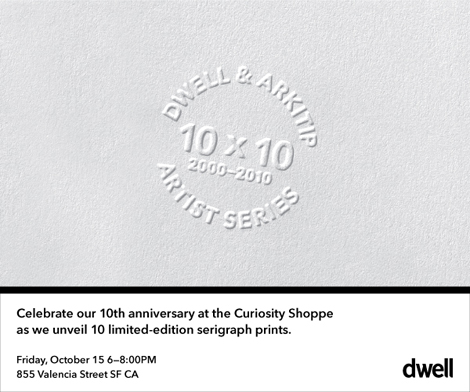
Dwell magazine is turning 10! To commemorate the event, they’ve produced a series of limited-edition serigraphs in collaboration Arkitip and some of their favorite artists. These posters will be on display at the Curiosity Shoppe in San Francisco, starting this Friday the 15th, and running through the end of the month.
If you’re in the area, stop by and say hello! The Curiosity Shoppe is located at 855 Valencia Street in San Francisco’s beautiful Mission District.
10.14.10 | Ethan | Events | Comments closed
Darren Firth is an extremeley talented designer, art director, and founder of Occupy, WIWP, and is currently working for Six.
10.08.10 | Ethan | Found design | 1 comment
Plain and simple, Studio MPLS does great work. It seems like a lot of studios have that big, exciting, one-hit-wonder type piece in their portfolio, and the rest is less than compelling. Often times the client plays into the quality as well; bringing down work rather than elevating it.
It’s nice to see Studio MPLS working with a range of clients and still managing to create smart, fun, engaging design. I really appreciate those firms that can elevate and add meaning to the everyday business or idea, and not just make a flashy gig-poster.
10.01.10 | Ethan | Found design | 9 comments
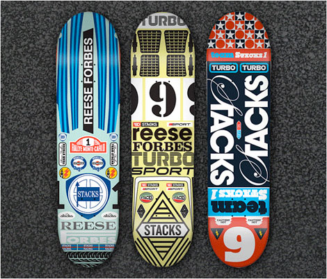
Commonwealth Stacks, a newly launched skateboard line recently sent up some sweet decks. Since 2000 Stacks has existed as the creative outlet for designer and art director Michael Leon, creating Tees and the occasional deck. The Spring of this year saw Michael pursue Stacks full time, partnering with skate legend Reese Forbes to create a brand focusing on quality, style, attention to detail, and authenticity.
09.24.10 | Ethan | Found design | 8 comments
Boutique furniture company Semigood Design, based in beautiful Seattle, boasts an impressive lineup of products. I’d previously seen (and sat on) the made for Dwell magazine Rian stool, but was unaware of the rest of Semigood’s line. With a nod to the past and to Danish styling, the furniture is functional, locally-sourced and sturdy. And with the new flat pack ready-to-assemble line, it’s put together in about 5 minutes.
09.17.10 | Ethan | Found design | 2 comments

Almost exactly 8 years ago the first Flatstock poster show was held in San Francisco. I remember anxiously awaiting my entrance into the show, and subsequently being in awe over the work displayed. I admired all of the work shown, and eventually bought a print from Seripop.
All of the posters exhibited promoted rock shows happening in venues throughout the country and the world. Many exciting books have followed that first Flatstock, covering the exploding rock poster scene. Rock Paper Show is quite a different take on the gig-poster, however — highlighting the posters that were designed to promote the Flatstock event itself. The book contains great work from some of the top-notch poster designers around, including Jeff Kleinsmith, The Bird Machine, Aesthetic Apparatus, The Heads of State, The Small Stakes, f2 Design, and so many more.
09.10.10 | Ethan | Off Our Bookshelves | 1 comment
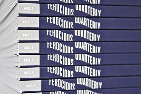
Fantastic new work in the form of Ferocious Quarterly, a curated publication featuring art, illustration, design, short fiction and writing. In the words of publisher Nate Utesch, FQ is “somewhere between an art and culture magazine, a coffee table art book, and an art journal.”
09.03.10 | Ethan | Books | 6 comments
Job Wouters is a designer, illustrator, typographer and massive doodler based in Amsterdam. The sheer range of his work is astounding; it’s been a long time since I’ve seen this kind of variety put out by a designer.
08.27.10 | Ethan | Found design | 2 comments
Justin Fuller (aka Pencil + Paper) has been dishing out some pretty sweet work. He has a fun, comfortable and easy way with typography — blending it well with illustration, identity, and corporate design.
08.20.10 | Ethan | Found design | 11 comments
Timba Smits, what a name! He also happens to be a very accomplished illustrator, designer, and maker of fine typography. It’s pretty fun looking through his’s work—everything is so juicy! From the textures to the unique typography, to the presentation, to the icons, I was definitely engaged clicking and looking.
08.06.10 | Ethan | Found design | 20 comments
“This is my website. There are many like it. But this one is mine.”
So goes the headline at Curtis Jinkins’s website. Curtis’s website is fairly standard: links to work on the left-hand side, and a lot of white space. What’s unique and nice to see is the repeating logo and background images; they make you look twice at what you’re viewing. It’s a small but subtle touch that adds a bit of dimension to the site.
07.30.10 | Ethan | Found design | 12 comments
Paul Tebbott, a designer and illustrator based in the UK, has a very nicely curated portfolio. Aside from having flat-out awesome work, it’s nice to see a consistency and thoughtfulness within his group of work.
I love the quiet minimalism and soft color palette, as well as the smartness contained in each piece. Everything works together nicely, but also functions well on its own.
07.23.10 | Ethan | Found design | 11 comments
Travis Cain is a man of many talents. In a time where we seem to be flooded with posters and poster designers, it’s nice to see a range of work that’s more unique and imaginative. Travis’s portfolio doesn’t feel like a one-hit wonder, but instead feels considered piece by piece.
07.16.10 | Ethan | Found design | 2 comments
And then, all of sudden, a new tricycle was born!
So it goes in this fun, whimsical 2-color print by Allan Peters, a Minneapolis based art director. Allan’s print work is bold and engaging, with a strong emphasis on identity and typography. I feel that his work is elevated through the attention to detail and unique typographic choices.
07.09.10 | Ethan | Found design | 21 comments
Script & Seal, the amazing Portland-based duo of Liz Meyer and Gavin Potenza, created these wonderful posters for a cycling feature in the Portland Mercury.
06.29.10 | Ethan | Found design | 5 comments
Fantastic book covers from Isaac Tobin, a senior designer for Chicago Press. His work is striking and sophisticated, while maintaining a clean minimalism. The covers I think, are also successful in representing the message or idea of each piece.
06.25.10 | Ethan | Found design | 6 comments
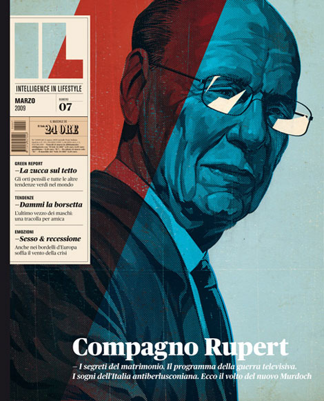
Intelligence in Lifestyle, an Italian magazine and supplement to the Il Sole 24 ORE newspaper, is one tasty piece of work. That striking cover above initially grabbed my attention, but inside is just as compelling.
05.28.10 | Ethan | Found design | 23 comments
For the latest Grain Edit interview, we head to the beautiful Pacific Northwest city of Portland, Oregon. While Portland is known for it’s drizzly rain, recent influx of people, and amazing food cart scene, it is also the home of many talented designers. We here at Grain Edit had the chance to visit PDX and catch up with one of it’s very accomplished residents, Dan Stiles.
Dan is a long time designer and contributor to the contemporary gig poster scene. His work is always very fresh, energetic, engaging and fun. Dan is very successful at creating dramatic work while using minimal colors and patterns. In this interview we chat with Dan about his history as a designer, his thoughts on running a solo studio, working in Portland, and much more.
Enjoy!
05.24.10 | Ethan | Features | 36 comments
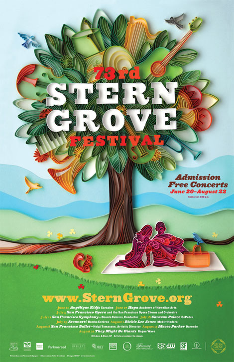
Long time Grain Edit friends and all-around swell studio, MINE™, has a sweet gig going. Each year, the city of San Francisco puts on a free music festival in Stern Grove — and MINE™ is given creative and curatorial license over the promotional poster. Over the years a visual language has been established; the poster contains repeating themes and elements (a tree, a grassy hill, etc). The catch is that each year a different artist or designer is hired to create the main image.
05.14.10 | Ethan | Found design | 3 comments
Fun work from Kansas-based designer/illustrator, Luke Bott. (And a cool last name!) Luke’s work has a playful/whimsical feel to it, as well as solid composition, typography and color choices.
05.07.10 | Ethan | Found design | 5 comments
Wow! Great collection of European book covers from A Journey Round My Skull. So fun to look through. I love the balance of naiveté and compositional sophistication throughout these jackets. It’s amazing the depth that is achieved through simple illustrations and good color choices.
05.05.10 | Ethan | Found design | 12 comments
Great work from ilovedust, a UK-based design studio. The above work is a promo, which (I believe) references the fact one of their offices is located in a former butcher shop. (It sounds like they have the two coolest work spaces in all of graphic design.)
04.30.10 | Ethan | Found design | 2 comments
The Silent Giants, a two-man Michigan-based studio cooks up some sweet silent awesomeness. Although, given the fact that most of their work is music related, the name is more than a little ironic. If you’re like me, you’ve seen the Giants’ work before and not known it — in the form of the popular and stylish Ra Ra Riot album cover.
04.23.10 | Ethan | Found design | 12 comments
This Grain Edit interview takes us to New York’s largest burough—Brooklyn—and to the office of Mike Perry! I’m sure most here are quite familiar with his work. The style is very specific; you definitely know it when you see it. With the help of the fancy-shmancy Internet, Mike’s work seems often imitated, but never duplicated. There is only one Mike Perry, folks.
I became most familiar with Mike’s work with the publication of his first book, Hand Job: A Catalog of Type. While still in school I preordered it, as did many of my classmates. But I had my first real hands-on looks at it over at the studio where I was interning — they had an advance copy. I remember the smell, especially, as well as the general office ogling.
One of the things that strikes me the most about Mike’s work is that he can be making a zine or an object, putting on a show, or designing a typeface, or just doodling—all of his work feels consistent. With whatever he’s doing, you’re always entering the world of Mike Perry.
After the jump, Mike talks about various aspects of his work, his work history, and his favorite Brooklyn restaurant. Let’s get into it!
04.13.10 | Ethan | Features | 17 comments
Love these cutout illustrations and typography from Germany-based Julia Guther. Her work is minimal, colorful, and she uses a wide (and interesting) range of media.
04.09.10 | Ethan | Found design | 6 comments
Matt Keers, the UK-based designer responsible for the above design, has a portfolio full of the same: bold, colorful, and compelling.
04.02.10 | Ethan | Found design | 12 comments
Great work from New York based designer Nikolay Saveliev. The album art shown above in one of my favorites from Nikolay’s portfolio; I love how the intricate patterns work with the map and space imagery. The graphics are fresh, but also speak to the genre and style of music.
03.26.10 | Ethan | Found design | 2 comments
Fun work and a new site from Shaun Lind, a designer, illustrator, Austin-living person, man, and member of the esteemed design/creative collective Public School. There’s a nice balance between the fun and the useful in Shaun’s work. For example, I love amount and quality of identity alongside his interesting self-initiated projects.
03.19.10 | Ethan | Found design | 9 comments
Aerial wonder! These birds-eye illustrations from Philippe Nicolas are pretty fun. Simple, colorful, and oblique—I love how angular and well composed these pieces are.
03.12.10 | Ethan | Found design | 5 comments
This video provides a very interesting look at the design of racing cars in 70s. The graphics on these care are incredible — very minimal and nothing at all like the logo-plastered cars of NASCAR.
03.05.10 | Ethan | Found design | 4 comments
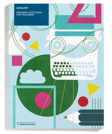
East London design group, Studio EMMI, has a fantastic selection of work. The work shown above was designed for The Prince’s Foundation for Children & the Arts, and was also a recipient for Sappi’s 2009 Ideas That Matter award. The illustrations by Lucy Vigrass are wonderful — I want to jump in to any classroom scene with a typewriter!
02.25.10 | Ethan | Found design | 5 comments
Barcelena design studio Hey has a swath of cool projects. One of their latest, Calendar, features stylized illustrations of some of our favorite cultural and historical icons. Mr. Miyagi, Hulk Hogan, Poseidon, and Inspector Gadget are just a few. Like a good icon, these illustrations are minimal — leaving only the bare essentials to reference their counterparts.
02.19.10 | Ethan | Uncategorized | 4 comments

Sweet birds! I’m really digging this work from Buenos Aires designer / illustrator Leandro Castelao.
The illustrations of animals seem to have a Charley Harper-esque quality to them, but I love how they’re taken to a new “exploded-view” type level.
02.11.10 | Ethan | Found design, Uncategorized | 10 comments
![]()
Friend of Grain Edit and all around good guy, Eric Smith, recently emailed to say that his Live Now project has been updated. Live Now is a collection of designers, illustrators and (most importantly) friends—collaboratively pursuing the idea of “living now.” Communicating through artwork, literature, relationships, exhibitions and more, the project attempts to engage participants to live conscious and happy lives.
02.05.10 | Ethan | Found design | 7 comments
Way, way back in the Fall of 2007 we posted the work of designer/illustrator Andrio Abero. Recently, I noticed that Andrio had redesigned his site, and added a lot of new work. I love the variety in Andrio’s portfolio — there’s a nice range between the simple, bold, and understated and the more textural, fuzzy, washed out imagery.
01.29.10 | Ethan | Found design | 5 comments
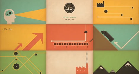
For quite a while I’ve noticed Fossil‘s excellent collateral and identity — I just never knew that the man responsible for much of that work was the one-and-only, Brent Couchman. That is, until now. Brent has a great eye for mixing the clean with the colorful. His bold, bright work is engaging and historically-informed, a real pleasure to look at.
01.22.10 | Ethan | Found design | 18 comments
Wow! Fun, exciting work from Austin-based design collective Ptarmak. Their work is a refreshing example of design that looks great, and is also very usable. I love when design can do both of those things. It’s simple and clear, but equally as sophisticated. And that typography: whew!
01.14.10 | Ethan | Found design | 8 comments
Andrew Bird @9:30 Club poster – Designed and Illustrated by Jay Ryan
The work of Jay Ryan was one of my first introductions to graphic design and gig posters — way back in the olden days. I spent many quality hours checking out his website and taking in his work at Flatstock. Screenprinted squirrels, eccentric characters, and hand lettered typography? It’s so interesting that these diverse objects can come together and say something so compelling about a band like Shellac, or Built to Spill, or Sebadoh.
Jay Ryan is this week’s poster pick — and you can purchase his work through Poster Cabaret.
01.14.10 | Ethan | Poster Picks | 5 comments
Grain Edit friend and design champ Chad Kouri, of Long Live Analog and The Post Family, has a wonderful solo show opening this Friday at Chicago’s Rotofugi Gallery. Chad’s work, like his moniker, is based in the analog. It’s a compelling collage of found images, hand drawn elements, and textures.
01.07.10 | Ethan | Found design | 12 comments
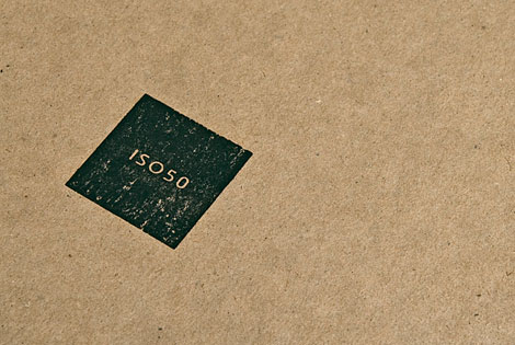
For this exciting addition to the Grain Edit interview series, we kept it local — seeking out one of San Francisco’s finest, Scott Hansen, aka ISO50. My first acquaintance with Scott came in the spring of 2005. The pre-Grain Edit crew had headed up to a lecture in Sacramento featuring Scott discussing his work and process.
I love the work of ISO50 just as much now as I did way back in ’05. It has a great historical reference, while still remaining contemporary. Scott does a nice job of combining clean, graphic forms alongside texture and pattern.
In this interview Scott talks about his entrance into graphic design, his creative process, his interest and involvement in music and photography, and, among many other things, his top 5 favorite albums.
So, pull up a chair in one of your favorite Dolores Park cafes (or imagine yourself there), and take look:
12.14.09 | Ethan | Features | 33 comments
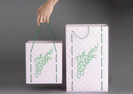
A Friend of Mine is Melbourne, Australia based design studio that is turning out some fancy work. This identity system for The Modern Flower Co. is so snappy — I love seeing the system work across multiple pieces. Plus, typography integrated into latticework is always exciting.
11.20.09 | Ethan | Found design | 6 comments
I’ve always been impressed with Mark Weaver’s continuously fantastic collage series Make Something Cool Every Day. Firstly, making something like this every day is a great project — I love when designers make their personal work public. Secondly, these collages are an interesting mishmash of styles and images. Mark has a keen sense of knowing what types of images work well together.
11.12.09 | Ethan | Found design | 29 comments
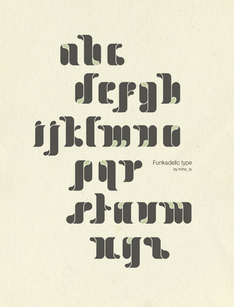
Funkadelic! There is some serious soul in this typeface from Bulgaria-based designer Mihail Mihaylov. I’m such a sucker for bold type — I love the juicy, drippy, saturated feel of these letters. I can’t quite tell if the type is sprouting, or three-dimensional, or both.
In addition to Funkadelic, Mihail’s other work shows a nice combination of experimentation and style. I love the textural, hands-on feel of the Quotes alphabet studies, and the subsequent large-scale “E” poster. Really fun work.
11.05.09 | Ethan | Found design | 3 comments
Brooklyn-based Dan Cassaro is the front man, ring leader, and typographic skipper of Young Jerks — his no-nonsense moniker. Making your way throughout the aisles of Dan’s portfolio, you’ll notice typography gracing posters, logos, books, other printed materials, and a swath of motion graphics. Fancy typography, indeed. Mr. Cassaro has the knack for creating keen type that makes you smile. I urge you to head over and take a look.
10.30.09 | Ethan | Found design | 8 comments
Are your initial caps lacking luster? Is your first letter feeling timid? We all know how tough it can be being a capital on the internet — so much pressure. But there’s good news! The Daily Drop Cap can really give your nervous caps a second wind.
10.23.09 | Ethan | Found design | 12 comments
Very fun work from Brazilian illustrator Fernando Volken Togni. The color palettes for these illustrations are perfect — they draw me right in. I love Fernando’s simple, super graphic, super bold, and super tasty illustration style. That peacock is dying to be made into a print.
I’ve been a fan for a while now — can’t wait to see more.
10.16.09 | Ethan | Found design | 15 comments
It’s great when you find that one designer that can wear various design hats. Such is the case with Philadelphia’s Mikey Burton. Looking through his portfolio, I’m impressed with the amount, style and conceptual range of his work. The edgy boldness of the letterpress prints is a nice balance to some of the quieter, more restrained logos.
10.08.09 | Ethan | Found design | 20 comments
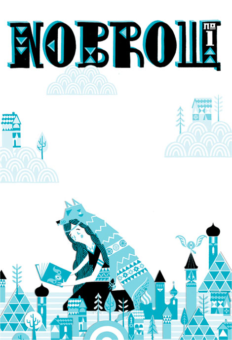
A while back we posted the first issue of Nobrow’s fabulous illustration zine, Gods & Monsters. Said the Computer to the Specialist continues in the Nobrow screenprinted zine tradition, with this conceptually dark body of work from Tom Rowe.
10.02.09 | Ethan | Found design | 6 comments
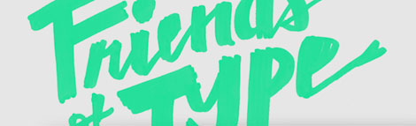
This is the story of a brand new blog called Friends of Type. If you have friends and a healthy interest in type, this blog was made for you. A self described “sketchbook, archive and dialogue,” Friends of Type is the place to see typographic process, doodles, and finished work. I’m sure it will become a typographic who’s who in the near future.
09.25.09 | Ethan | Found design | 6 comments
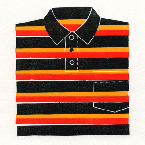
Tom Messenger, a designer and illustrator from London, makes one of the best t-shirt prints I’ve seen. I love his bold stripes, buttons, colors, and breast pocket details. Tom’s work has great texture and personality to it. His range of color accentuates his very flat, bold style nicely.
09.18.09 | Ethan | Found design | 7 comments
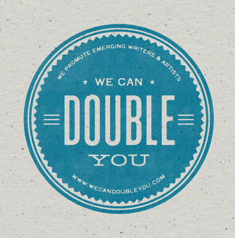
Meet Ed Nacional. Recent New York Times intern, Parson’s design student, and all around purveyor of great design. Ed’s typographic style, sensibility and skills struck me right off the bat. I especially love the “Nita Nita” graphics and the “We Cab Double You” typography. Sweet stuff.
09.10.09 | Ethan | Found design | 16 comments
I love the portfolio from Washington-based Eric Smith. Mr. Smith’s work seems to represent his friendly, optimistic personality quite well. Based on his monikor (I Draw All Day) and portfolio, one can assume that Eric does, indeed, draw all day.
Style wise, the overall simplicity, boldness, and use of color is very compelling. I’m particularly drawn to Eric’s hand-drawn typographic work and style. I love the way in which the letters are formed and put together.
09.04.09 | Ethan | Found design | 20 comments

For the last week or so your trusty Grain Edit crew have been in the sunny city of Portland, Oregon. This city is great — the weather is perfect, the people are nice, and the design is spectacular.
A few of the highlights so far include the 12 hour drive up, hanging out with some amazing designers, Portland’s vast food cart cuisine, waffle sandwiches, vintage video games, and much more.
This Sunday we’ll be making the long trek back to the Bay Area. Be on the lookout for lots of fun goodies from our week long trip here.
08.28.09 | Ethan | USA | 9 comments
These book covers from Australian designer Jenny Grigg are absolutely superb. I love how she uses texture and composition to make such playful and compelling work. I want to touch and feel these books as much as I want to read them.
08.21.09 | Ethan | Found design | 8 comments
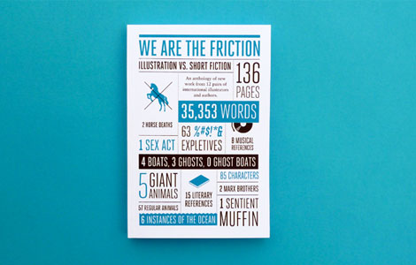
This second edition of Sing Statistics, “We Are the Friction” looks to be quite spectacular. I really, really can’t wait to get my hands on it.
08.14.09 | Ethan | Found design | 5 comments

Way back in the olden days of computers, when the internet was still a small child, we highlighted some of our favorite designers using Twitter. As designers jumped on left and right, and Twitter exploded, our post evolved several times over.
Now, with well over fifty listings , we present another update to Designers On Twitter. There are lots of great designers on this latest update, including Hatch Design, Odopod, Julia Rothman, Sing Statistics, Ellen Lupton, Christopher Simmons, Hybrid Design, Brett MacFadden and Crew Design, among others.
Check out the list: Designers to Follow on Twitter.
08.13.09 | Ethan | Found design | 2 comments

We all love a good fixie. Clean lines, simple mechanics, and oh so trendy. And if you’ve been drooling over that Don Clark Nor Cal print below, this just may be your summer bicycling dream come true.
Cruising Craigslist for bikes is great, but you never quite know what you’ll end up with. Urban Outfitters took out the guess work and teamed up with Aristotle Bikes, bringing you fancy fixies that you can customize on the web. Click the components and they magically change colors! Thanks for the awesome bikes, internet!
Get your cogs on at Urban Outfitters Bikes.

08.07.09 | Ethan | Found design | 18 comments
Public Works looks to be a sweet gallery show and speaker series. It’s happening in Chicago, and focuses on those designers who have contributed to the independent art and music scenes there. You can find it at the Andrew Rafacz Gallery, including the likes of Chris Eichenseer, Justin Fines, Cody Hudson, and Andy Mueller, among others.
Also check the AIGA Chicago for lectures by Delicious Design League, Harper Reed and Dawn Hancock.
08.07.09 | Ethan | Design Events, galleries | 4 comments
Upon viewing the work of Micah Smith, aka My Associate Cornelius, I 1) greatly enjoy the Bottle Rocket reference within the name, and 2) love the work.
One of the things i enjoy about Micah’s work is the range and personality found in it. There is a strong sense of playfulness throughout his portfolio; the work feels like it’s active and doing something.
07.24.09 | Ethan | Found design | 8 comments
Examining some possible layouts.
We recently received news from long-time Grain Edit friends, MINE™, about their new book in the works, tentatively titled The Good Design Book. This book is aimed at those with a critical eye and an interest in how design can affect the greater good.
Combining essays from designers as well as showcasing approximately 70 projects, the book takes a current look this expanding movement, and offers resources for those looking to get involved.
07.15.09 | Ethan | Books | 3 comments
Cover illustration by Stuart Kolakovic
Nowbrow Press‘ recently sent over their spectacular first issue, Gods and Monsters. Twenty four talented illustrators and designers have been carefully selected to create work around a specific theme. I love all the pieces exhibited in the issue, and a few of my favorites come from Alex Spiro, Reuben Rude, Toby Leigh, Jordan Crane, and Sarah King.
07.10.09 | Ethan | Books | 5 comments
Like many, gig-posters provided my first introduction to graphic design. The images seemed to perfectly articulate the ideas and spirit of the bands I was so obsessed with. During a recent “Best of the Best of Poster Designers” conversation, I was reminded of Dirk Fowler‘s work and it’s solid place in design history.
With the speed and ease of the Internet it’s easy to see design trendiness proliferate and to focus on the latest and greatest. In a time of gig-poster saturation, it can be nice to take a step back and see where a lot of current work gets it’s roots and inspirations.
07.03.09 | Ethan | Found design | 26 comments
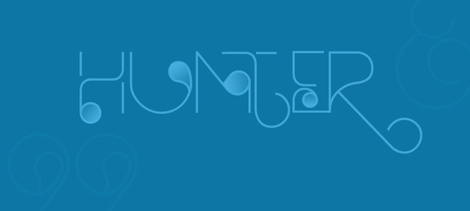
Si Scott’s Hunter
HypeForType is looking good. It’s a best of, it’s a who’s who, it’s a one stop typographic super shop featuring lots of inspired designers and typographers making great looking type.
Under the supervision of Alex Haigh (of Thinkdust), HypeForType brings together type designers and gives them a unique spot to showcase their work.
06.26.09 | Ethan | Found design | 2 comments
Rodrigo Fuenzalida is a designer, illustrator, and typographer from Caracas, Venezuela. His work has a great balance between being nostalgic, experimental, and fun.
In addition to being super talented, Rodrigo is also generous. Upon the momentous occasion of his site reaching 5,000 hits, he is giving away three (3!) of his fonts. The three are quite awesome, and happen to be
GERD, K5 and LINE_A.
Thanks Rodrigo!
06.19.09 | Ethan | Found design | 3 comments
This work from Italian designer/illustrator Jonathan Calugi is summed up nicely with his moniker Happy Lovers Town. Jonathan’s work is fun, friendly, quirky, and awesome — just like a town full of happy lovers.
06.12.09 | Ethan | Found design | 21 comments
Free fonts are a dime a dozen — there are so many of them, and so many of them are bad. That’s why I was excited to run across Sessions, a beautiful face designed by John Skelton. John designed Sessions using FontStruct, FontShop‘s online (and free) type construction tool.
06.05.09 | Ethan | Found design | 5 comments
Jeff Canham‘s typographic compositions are like tidal waves of cool; they’re like the Mavericks of type. His use of icons with a variety of type styles give the work excitement, depth, and sophistication. I love the sign painted feel and texture of the work, as well as the color palettes.
05.29.09 | Ethan | Found design | 13 comments

What is this graph measuring? Stalagmite height? Point source density? Christmas tree farm growth? We don’t know, but they sure do look good. Chad Hagen has made a great collection of “Nonsense Info Graphics” and put them in a set on his Flickr.
05.22.09 | Ethan | Found design | 15 comments
I’m really impressed with these typographic treatments from Paul Sych. Each one of them is totally sublime and refreshingly unique — they break out nicely from the common type trends going around. On one hand the work is very playful and expressive, but on the other hand also demonstrates a sophisticated knowledge and expertise of the letterforms.
05.15.09 | Ethan | Found design | 3 comments
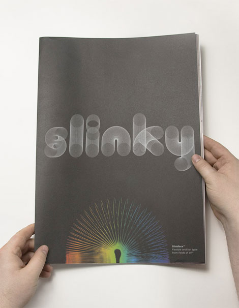
I remember getting Slinkys around the holidays and thinking “Awesome! I can’t wait to work the stairs with this!” Then, within an hour (without fail) the poor Slinky would be stepped on, kinked, and forever ruined. And the cycle would repeat a year later.
This sans-kink typeface, Slinkytype, from Paul Hollingworth brings me back to those exciting stairs-filled days. I love how the playfulness mixes with precise geometric details — the perfect combination of typography and nostalgia. And that white type on black is super snappy.
05.08.09 | Ethan | Found design | 4 comments
Simon Cook (aka Cookie) is a designer, illustrator, sock monster maker, occasional traveler, and super hiker. His work is packed to the gills with fun. I love looking at a designer’s portfolio and seeing their personality and excitement evident in the work. You definitely get the feeling that he puts everything he has into whatever project he’s got in front of him.
05.01.09 | Ethan | Found design | 5 comments
Holy twit! It doesn’t stop! Designers seem to be jumping on Twitter left and right. It’s turning out to be an awesome community of designers. If you haven’t made the Twitter jump yet, then here’s a little more incentive. And if you’re already up on Twitter, here are some new faces.
Some of the new people on the list include House Industries, Kate Bingaman-Burt, Ministry of Type, Monocle, Chris Glass, Jason Munn, and Kid Robot among others.
Check it out. Follow your favorites. Tweet it up!
04.24.09 | Ethan | Uncategorized | 3 comments
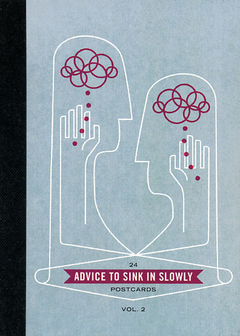
Advice to Sink in Slowly is a great idea. It’s an ongoing series of posters designed by recent graduates aimed at helping and inspiring first year students. All incoming students at participating Universities receive one of the posters.
04.24.09 | Ethan | Uncategorized | 6 comments
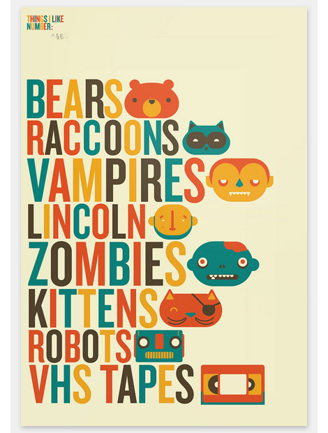
I’m really impressed by this work from Richard Perez. His typographic and illustration work is super fancy. He seems to have no problem navigating styles as well as tackling a variety of design projects — his work ranges from hand drawn type and illustration, to identity and traditional design. All of his work is direct, and compelling with great execution and color palettes.
It’s really refreshing to see the enthusiasm and personality in all of Richard’s work. It’s also nice to see that we share a few things in common, including VHS tapes, Lincoln, and kittens.
04.22.09 | Ethan | Found design | 34 comments
Welcome to the latest addition to the Grain Edit interview series. But wait, there’s a twist! We sneaked a book review into the mix as well. I know, very tricky.
Our latest interviewees are Andre Andreev and Dan Covert. They’re from New York City, and they’re known as Dress Code. They recently published a book entitled Never Sleep, which details their experience and transition from design students to design professionals. Never Sleep is a practical and vital guide for design graduates wondering what to do after school.
At the combined age of (roughly) 50 Andre and Dan’s work has been recognized by I.D., CommArts, Print, Graphis, Metropolis, The Type Directors Club, The Art Directors Club, CMYK, HOW, Adobe, Steps Field Guide to Emerging Talent and Young Guns. They met while studying graphic design at California College of the Arts and worked at MTV before starting Dress Code.
OK, so get your game on already:
04.20.09 | Ethan | Designers, Features | 15 comments
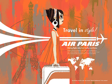
Very happy to run across the work of Kevin Dart this morning — he has some serious talent going on. His rough textures and sketchy illustration style combine so nicely with the clean 60’s style graphics and type. His work feels like a perfect fit for Seijun Suzuki’s gangster movies. And I love an airplane with a swoosh. I also want that suitcase. So yummy.
04.10.09 | Ethan | Found design | 13 comments
Holy tweet! Designers and Twitter seem to go great together. Since we posted our 50 (or so) favorites last month we’ve seen a lot of new designers popping up on Twitter, and we forgot to mention some designers as well. We decided an update was in order.
Some of the new faces on the list include ISO50, Invisible Creature, Design Sponge, Okay Great, The Dieline, Wink, and more.
Check it out. Follow your favorites. Tweet it up!
04.09.09 | Ethan | Uncategorized | Comments closed
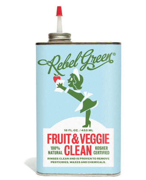
Wow! Super snappy new work from Wink. Wink is always on-point design-wise, and this is no different. Their latest work is for Rebel Green, a new aesthetically conscious and eco-friendly company with products aimed at reducing and reusing.
I love the illustration and typographic work throughout the product line — it harkens back to a simpler and more honest time. I’ll admit I’m not the best at washing before ingesting fruit, so this very well might be what I need. How about them apples!
04.03.09 | Ethan | Found design | 14 comments
ANDREW HOLDER AT SUBTEXT GALLERY
More Andrew Holder! Here at Grain Edit we love Andrew’s work, and it’s awesome to see him popping up in more shows and galleries. We just want to see his work up here in the Bay Area! I guess we’ll have to wait. But if you are down south, be sure to check out Andrew’s show in San Diego at Subtext Gallery & Design Bookstore. It’s going on until April 26th.
Press release from Subtext Gallery: Andrew Holder is a recent graduate of Art Center College of Design in Pasadena, California, and his talent has earned him shows in Australia, San Francisco, and now in his home away from home, San Diego. Andrew has already built up a steady flow of clientele, including Roxy, Poketo, National Geographic, The Toronto Times, and Arkitip Magazine. He was born in St. Augustine, Florida, but spent most of his youth growing up in San Diego. His work has a hint of Scandinavian folk-art with a modern-day twist. Sleepy seaside towns and country landscapes are prominent in his pieces, made up of simple geometric shapes and organic line work. Andrew’s pieces are memorable, distinct, and beautifully engaging.
04.03.09 | Ethan | Events | 5 comments
CHARLES HARPER EXHIBITION
Charley Harper fans rejoice! The Public Trust is currently running an exhibition of Mr. Harper’s works throughout April. That massive Charley Harper book is amazing, but man, wouldn’t it be great to see the actual paintings in person? If you’re in the Dallas, TX area and happen to go, let us know how it is!
Thanks to James for passing this along!
————————————
THE PRACTICE SESSIONS APRIL 2 – 4 2009
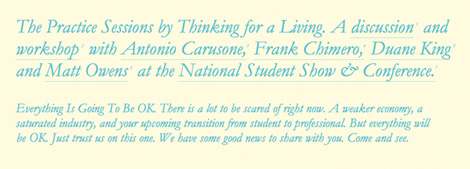
The Practice Sessions is a workshop and panel discussion by Antonio Carusone, Frank Chimero, Duane King and Matt Owens taking place at the National Student Show & Conference in Dallas, Texas. The Practice Sessions was created by Thinking for a Living, an ever-growing platform dedicated to the concept of open source design education. Through a network of topic specific design sites with a focus on education and resources, we share our thoughts, inspirations, critical analysis, design histories and individual experiences relating to a career in design.
03.27.09 | Ethan | Events | 10 comments
Fontfabric is an awesome independent type foundry run by Svetoslav Simov. All of the faces have great concepts and personality to them. I like the balance between experimentation with dimension and geometry and the playfulness of the faces. Each one is so unique and specific, they seem to be the perfect fit for that “one project.”
03.20.09 | Ethan | Found design | 5 comments
Alright, so Twitter is the hot thing right now. Somewhere in-between blogging and instant messaging, it’s a super addicting way to see what the design community is up to. Frank Chimero just ate a muffin? It’s crepe day at Chronicle Books? @gogograce just blipped The Style Council? I’m in!
03.19.09 | Ethan | Found design | 94 comments
Love, love love! this work from Spain-based Borja Bonaque. I’m a huge fan of city-scape illustration (à la Evan Hecox and Andrew Holder) — so I was pretty enamored with Borja’s work to say the least. The texture, composition, and (superb!) color choice all work together to give these illustrations that heavy punch. That city above reminds me a little of Sin City, and those other comic book-to film adaptations.
Read the rest of this entry »
03.13.09 | Ethan | Found design | 10 comments
I’m very excited about our next addition to the Grain Edit interview series. When the gigantic Grain Edit interview arrow landed on Springfield, MO we knew just who to call: Frank Chimero.
You’ve likely seen Frank’s designs and illustrations making the rounds on the design blog circuit lately. And with good reason; Frank’s work effortlessly combines humor, wit, and style with a fresh and honest point of view.
Frank opens up and shares some of his thoughts and insights regarding his design background, his influences and teaching experiences, and of course his famed process. If you’re a fan of the States’ series, then there’s also a super surprise waiting for you further down in the interview.
OK, enough. Here we go:
03.12.09 | Ethan | Designers, Features | 74 comments
I’m really excited to show this new typeface from long time Grain Edit friend and design-champ Steve Mehallo. Jeanno Moderno consists of nine faces, and bridges over two centuries of type history. Plus, it has some of the spiciest italics you’ve ever seen.
MyFonts is having a great sale on the family right now: For a limited time, save 25% on any single font from the Jeanne Moderno family. This is going on until April 19th. (Perfect idea for my birthday on the 14th). Or you can pick up the entire family for $99.
Get more details here
03.06.09 | Ethan | Found design | 6 comments
Loving this work from design-champ Ben Barry. The design and format of the piece work together nicely to capture that spirit of 1950’s residential.
Read the rest of this entry »
02.27.09 | Ethan | Found design | 7 comments
Every laptop needs a home. Sadly for most laptops, home is just a generic black sleeve. How glum! But thanks to Steven Harrington and Arkitip, laptops around the globe are smiling and cheering.
The “Curated by Arkitip” project aims to get sweet designs on your Apple products. Steven has also designed an iPhone slider for the project as well.
In addition to the goods, there is a nice video interview with Mr. Harrington himself. In it he talks about the project, his process, and caffeine-free tea.
Curated by Arkitip with Steven Harrington. Video link is in the middle of the page.
02.20.09 | Ethan | Found design | 4 comments

My first reaction upon being greeted by the above images was to smile. These are two pieces from Toykyo, the rad Belgian-based firm. They seem to wear many design-hats, and have work on an interesting variety of projects. Their personality definitely remains visible throughout their work. I love the the stylized shapes, simplicity, and bold use of color. Plus, major points for working in a Pacman ghost next to an elephant!
02.13.09 | Ethan | Found design | 6 comments
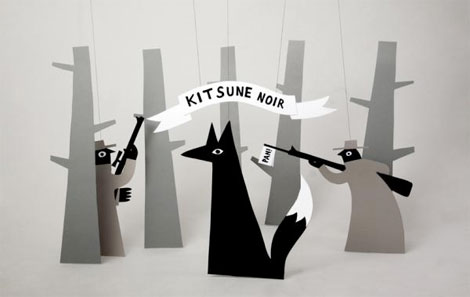
This illustration spent some quality time as the desktop background on my laptop, and was the subject of many rave comments. London based illustrator/designer Jean Jullien did the illustration for Kitsune Noir‘s very cool desktop wallpaper project. I really love these dimensional illustrations, very bright, playful and quirky.
01.30.09 | Ethan | Found design | 5 comments
Love the pattern and texture in this awesome illustration from Max Dalton. Max is a Buenos Aires (by way of Barcelona, Paris, and New York), based illustrator and animator. His work reflects his diverse background nicely. I love how he’s able to capture the feeling and aesthetic of a certain time, and make it his own. And his type is super snappy.
01.23.09 | Ethan | Found design | 8 comments
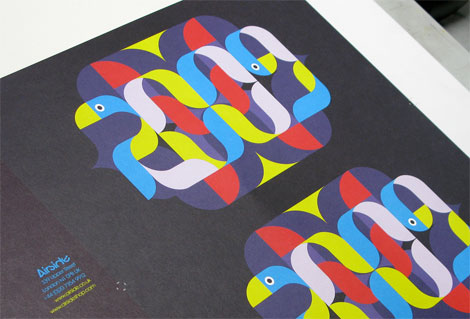
My #1 resolution for 2009 was to post a new 2009 calendar. Thank you to Airside for making it happen! Their sweet type-befriends-bird ’09 calendar is a real beauty. I love how each month is displayed and presented. It includes 27 illustrations, and is printed on recycled paper made from 100% post-consumer waste using bio-vegetable-oil-based inks. Not too shabby.
Order it! Airside blog! Airside!
Via Ilike.
01.16.09 | Ethan | Found design | 5 comments
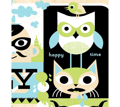
Love the variety from Kansas City designer/illustrator Tad Carpenter. His character illustrations are super imaginative and unique. It’s nice to see the range of his work as well: traditional design, installations, posters, identity, packaging, painting, and more. Lots of fun type poking out here and there as well.
In addition to his personal work Tad ropes steers at Design Ranch during the day, and co-runs Vahalla Studios, a screen printing super shop.
Vahalla recently had a gallery show. See the highlights video on Tad’s blog.
01.09.09 | Ethan | Found design | 9 comments

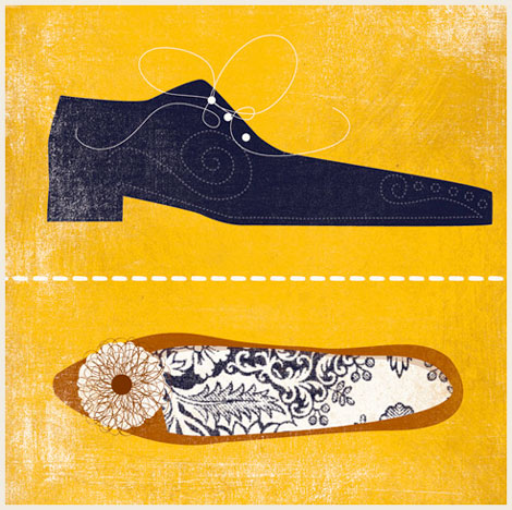
Really, really into these lovely illustrations from Andrew Bannecker. Definitely the best beer and shoe prints I’ve seen in a long time. I love how he mixes flat graphics with intricate details. His work has a nice depth to it as well, thanks in part to those great rough textures.
A few (we want more!) of his prints are available from Charming Wall.
12.19.08 | Ethan | Found design | 10 comments
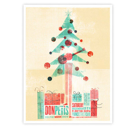
Wow. I’m really impressed with Scotty Reifsnyder‘s work. He has great variety and a nice range of projects up on his site. His use of type and texture is really effective — lots of little details to soak up. Scotty is a recent Tyler School of Art MFA graduate, and works at Headcase Design by day.
12.05.08 | Ethan | Found design | 5 comments
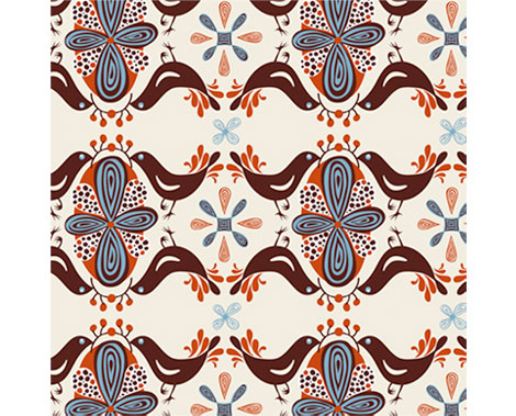
Helen Dardik‘s bird patterns make me happy. All of her work makes me happy, in fact. Helen is an Ottawa (by way of Israel, Siberia, and Ukraine) based illustrator/designer/painter/toy maker. Her work is a nice combination of type, color, texture, and pattern. I love her loose, whimsical style.
Helen is represented by Lilla Rogers, and has an orange blog!
11.28.08 | Ethan | Found design | 4 comments
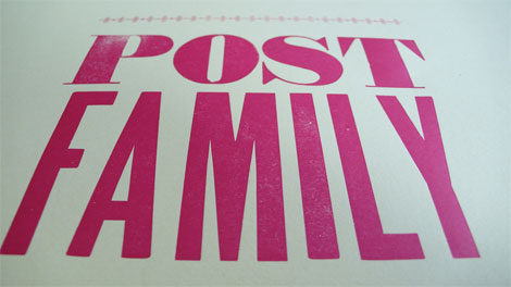
Late start today. We’ve been as busy as a bunch of mid-century bees over here. Gettin’ that bees milk.
The Post Family is a design and cool people collective based collectively in Chicago, the largest city in Illinois. Their collection of prints for sale is really wonderful — I want every one of them. Love that flat, bold, sketchy illustration style. Each of the seven Family members contributes to their blog, and they’ve just started a monthly Studio Tour feature that looks like fun.
But in my opinon, the best feature of the site are the family member bios. I read and chuckled at each one.
The above image with the yummy type was snagged from their Flickr page.
11.26.08 | Ethan | Found design | 6 comments
Fun! Prizes! Things! Anorak has to be one of the coolest kids magazines around. Aimed squarely at five to nine year-olds, Anorak is way more creative and engaging than the Highlights dentist fare I grew up with. In each issue they have original stories written and illustrated by contemporary authors, fashion and style for kids, and new children’s products. I’m definitely sold.
And some of the illustrators include Adrian Johnson, Steven Harrington, and Damien Correll among others.
11.25.08 | Ethan | Found design | 12 comments
Gavin Potenza, aka the Portland Stamp Champ, has some recent and awesome stamp activity going on. Awhile back we posted on his Homage to the Stamp, and now he has something new entitled A Field Guide To: The Stamps of the World. Commissioned by Tiny Showcase, this print takes inspiration from the cultures of various countries (including old favorites such as Brazil, Canada, France, and Mexico), and assembles them in a lovely 21″ x 29″ print.
In addition to this, Gavin’s Homage to the Stamp was available as a letterpress print. (But is now sold-out, sadly.)
See more info, or purchase Stamps of the World for yourself or for your loved ones or for me.
11.21.08 | Ethan | Found design | 5 comments
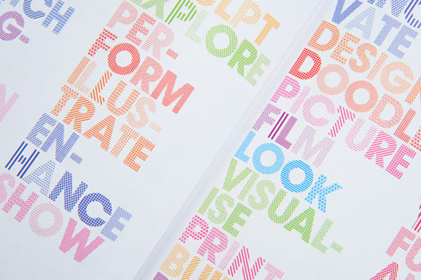
Really love this pattern-filled type by Andrew Townsend, done for Nottingham Trent University’s Art and Design book. Andrew is the art director over at Un.titled, and the purveyor of many fine typographic and design projects on his own site.
His Sports Brand type experiments are well worth checking out, as is Previous/Next.
11.17.08 | Ethan | Found design | 2 comments
Toronto-based Doublenaut sent over some prints recently, including this Wolf Parade gem. I’m loving their type, texture, illustration, and color combinations. Bonus points for a great gargoyle as well!
Also, I believe that ‘R’ belongs in my personal collection.
11.14.08 | Ethan | Found design | 4 comments
Love, love, love these cover illustrations by Cristóbal Schmal! So good. All of his work has this same great texture and quality to it. Makes me want to touch everything! His type is super snappy as well, and integrates nicely with the illustrations. Check his site out, he’s got lots interesting projects and experiments going on.
Via the never-let-you-down Ffffound.
11.07.08 | Ethan | Found design | 9 comments
Brian Roettinger is the L.A. based designer and typographic song-and-dance man behind Hand Held Heart. He created the above work while traveling with Liars and No Age, making individual 7″ covers for each city on the tour.
A lot of Brian’s work has this same focus and attention to detail. Every little piece is thought-out and considered. The work feels experimental and unique, and at the same time deliberate, intentional, and confident.
Check out his Theremin Sans, a typeface made while playing the theramin.
10.31.08 | Ethan | Found design | 2 comments
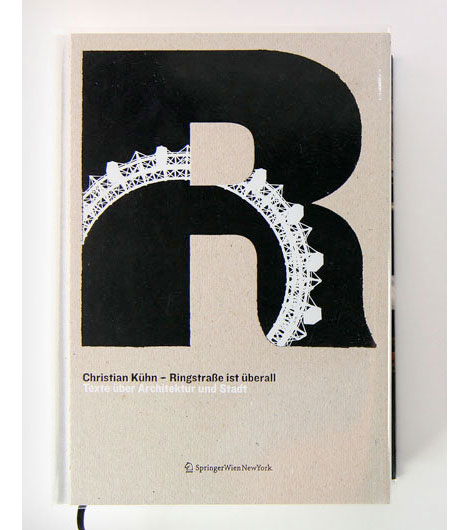
I absolutely love this book cover by Erwin Bauer. Great mix of type and architectural elements. The inside design has some really yummy type details. I love finding work like this, it feels so effortless.
Erwin Bauer is a man, and a design studio based in Vienna, Austria. They work on a wide range of projects, from architecture, traditional graphic design, and type design.
I like their “Rejected” section, which I assume compiles their unused designs. It would be fun to see this from more firms.
10.24.08 | Ethan | Found design | 5 comments
[pictobrowser 10159078@N03 72157608270384854]
Last week we had the chance to hang out with the crew from San Francisco design studio MINE. Under the direction of Christopher Simmons, MINE is a small and versatile design shop. We got the low-down, talked graphic design, told some jokes, and saw lots of cool work.
The office is a little nook in Bernal Heights. Very intimate, and accommodates the three designers nicely. You know you’re there when you see the funky doorbell, the Eames furniture, a bright orange bean bag chair, and the distinguishing sign on the door that reads “this is our office.”
I’m always impressed with the quantity and diversity in the projects they’re working on. They’re driven by concepts, not by a certain style. The work doesn’t look like it was “designed by MINE.” Instead, it makes sense, has personality, and definitely communicates a point of view.
Thanks again to MINE for opening up the studio, and letting us snap these photos.
Enjoy the tour!
10.22.08 | Ethan | studio visits | 12 comments
Voting for the People’s Design Award ends today at 6:00 P.M. Eastern. Our friends at Mine are nominated for Everything is OK, their experimental call to action.
10.21.08 | Ethan | Found design | 2 comments

Argh! The swashbuckling design crew Office worked on the above branding for 826 Valencia’s new pirate supply store. They designed the store’s identity, posters and nearly 50 new products, like Decent Peg Leg Oil, Scurvy BeGone pills and Captain Blackbeard’s Beard Extensions. If you’d benefit from any of these products, or to help out 826 Valencia, cruise by the shop.
10.17.08 | Ethan | Found design | 8 comments
Hello to London based designer Nick Dart. Mr. Dart has a nice collection of CD packaging, poster and print work over on his site. Besides this design for the number two, I was really impressed by his great typeface and logo designs. Definitely one of the top numeral designers out there, for sure.
10.15.08 | Ethan | Found design | 4 comments
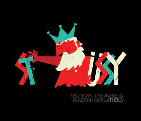
In the midst of Grain Edit’s one year anniversary, we’re super excited to bring you this interview with Adrian Johnson. Mr. Johnson is a UK-based designer/illustrator whose work spans editorial, print, motion, and his own self-initiated projects. He has designed for Mastercard, Giant Robot, Vodafone, and Stussy, to name a few. In the interview, Adrian talks about his background, inspirations, creative process, and of course, zeitgeist.
A lot of work nowadays is stylish, and fun, and cool, but can ultimately become irrelevant due to poorly executed ideas, or lack of decent concepts. I see Adrian’s work as a nice balance between kick-butt graphics and style, and smart ideas that get through to people.
10.02.08 | Ethan | Features | 67 comments
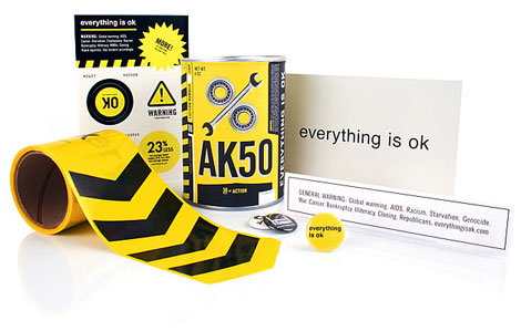
San Francisco design champ Christopher Simmons wants you to get involved. Christopher is a former AIGA SF president and the owner/operator of Mine, an SF design studio. Everything is OK is a social experiment, equal parts activism, commentary, and a call to action to fight complacency. So get off your butt already!
EIOK is a nominee at the People’s Design Awards! Vote, vote, vote.
09.24.08 | Ethan | Designers, Found design | 4 comments
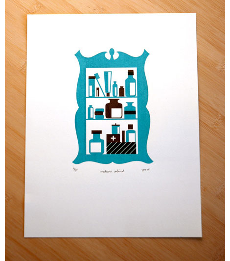
While sifting through Geoff’s site today, it was very hard to find that one thing to show, because it’s all so good. Lots of fun stuff, with lots of personality. I totally love that medicine cabinet print. By day Geoff works for Chronicle Books; by night I don’t know what he does. Sleep, maybe? Anyhow, he is a master at taking various ideas and making them look terrific.
09.12.08 | Ethan | Found design | 1 comment
09.05.08 | Ethan | Found design | 2 comments
I love this image of Morten Iveland’s new typeface, Bolda. Apparently it’s inspired by 1970’s tennis, dart, and ping-pong fashion — a grossly under-represented field of design, in my opinion. Morten lives in Oslo, Norway, where he is a designer at Apt. I was immediately drawn to the design of his site, and his mad photo skills.
Check out Bolda in action.
08.29.08 | Ethan | Found design | 6 comments
Stan Van Steendam is a pretty rad designer out of Belgium, with a pretty cool name. His style is hard to pin down exactly, but I would say it’s bright, vivid, colorful, playful, and compelling. His typography skills are great; you get a good feel for the amount of typographic experimentation going on over there.
Check out his design-your-own-font game, too.
08.22.08 | Ethan | Found design | 1 comment
The New Year is the one man super-shop run by Sasha Barr. Sasha illustrates, designs, and prints lots and lots of posters (among other things). I’m really impressed by the amount of work, and the variety of ideas and execution. His work is a nice combination of rough textures, type, hand-drawn and found images, and fun, quirky ideas.
08.08.08 | Ethan | Found design, Uncategorized | 8 comments
[pictobrowser 10159078@N03 72157606455745289]
I was in New York a few weeks back and had a chance to stop by the studio of design champ collective Rad Mountain. Rad Mountain is the Brooklyn based collaboration of Damien Correll, Justin Fines, Wyeth Hansen, Garrett Morin, and Ryan Waller. You’ve seen their work in/for Good Magazine, Swindle, Nike, Urban Outfitters, MTV, and the AIGA to name a few. Overall, their work feels very hand-crafted, with lots of illustration and hand-drawn type. They really stand out due to their super attention to detail, which gives the work real personality and makes it so much more interesting.
The studio space is split in two; half design office, half screenprinting studio. It’s open and airy, and complements the Rad Mountain hands-on aesthetic really well. Highlights of the visit included seeing some new prints from Justin and Wyeth, and being introduced to Rambo, the design super cat.
Thanks again to the Rad Mountain crew for opening up their studio, and letting me snap some photos.
07.30.08 | Ethan | studio visits | 7 comments

I love these patterns from Telegramme, a London based design and illustration super duo. They have a nice way of mixing old, worn illustration and imagery into their work. Besides patterns and posters they also specialize in web, identity, print, and redesigning playing cards.
07.25.08 | Ethan | Found design | 1 comment
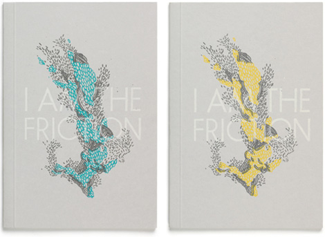
All around design champ Jez Burrows of It’s Nice That, Evening Tweed, and that cool Destroyer poster you’ve been seeing around is at it again. He and Lizzy Stewart are Sing Statistics, and have just put out a wonderful new book called “I Am The Friction.” The book is a combination of short fiction by Jez, and illustration by Lizzy. It reads front to back, and back to front. So the end is in the middle!
See, buy, or read an excerpt of the book at Sing Statistics.
07.18.08 | Ethan | Found design | 3 comments
We’re really fond of Wayne Pate‘s work over here, and were very excited when he sent over a bundle of prints, including the above “Love Saves the Day” piece. In all of his work Wayne really nails it with simple patterns, bold shapes, and perfect colors.
He combines a nice mix of flat organic shapes with textured images and illustrations really well. On his site there’s a nice range between collage work and more simple graphic work. A lot of the elements feels like they could be found in nature, or translated from found objects.
Thanks again Wayne for sending these are way. Keep an eye on the prints section of his site, as Wayne will be releasing some new prints.
07.15.08 | Ethan | Product Reviews | 2 comments
You may have seen these colorful blocks and the accompanying video where they move, running around on the web lately. It’s the work of Evan Geltosky, a recent Long Beach State graduate. On his site he has some nice typographic work, and a sweet poster/illustration of Mike Tyson!
07.03.08 | Ethan | Found design | 2 comments
German Shepherds and Ham Radio! My two favorite things together at last! Matthew Bowers, purveyor of such fine imagery and juicy type, is a Portland, OR based designer. In addition to his regular work, he also publishes the art book series, Downy Bird Art Kingdom.
06.27.08 | Ethan | Found design | 7 comments
Philippe Apeloig runs his own studio, Apeloig, in Paris, France. Not only does Philippe have a lot of work his site, but it’s very well documented and photographed. You can get a sense of the amount of experimentation and playing that goes on in his work.
06.20.08 | Ethan | Found design | 2 comments
Process colors! Animal illustrations! The fantastic pop stylings of Black Kids! Michael Fusco and Co. did a great job of mixing the band’s outgoing, addictive hooks with their literate lyrical side.
In addition to the posters, MFD can also handle your book cover, identity, CD packaging, and wedding invite needs.
06.13.08 | Ethan | Found design | 1 comment
Our good friend and design champ Jason Munn designed the above bag for book publishing champs Chronicle Books. Chronicle wanted to create and encourage a non-wasteful, reusable bag solution, and Jason had the perfect caterpillar turns butterfly idea.
For more info, visit Chronicle.
Many thanks to Hannah for posting the mock ups!
06.06.08 | Ethan | Uncategorized | 5 comments
Evening Tweed is a Brighton based design collective, formed by four students at the University of Brighton. If the above image is any indication, all the work from these four is great. As a whole, the work is nicely varied and shows strong directions from each member. Lots of personality and experimentation going on.
Check out their class site. More talent there as well.
05.30.08 | Ethan | Uncategorized | 3 comments

Tears of joy! It’s The Little Friends of Printmaking, Wisconsin’s #1 husband/wife design team super duo. LFoP are a Milwaukee based design studio whose work is really exciting and inventive. Each piece has a great story/narrative (and typography) that pulls you in. You can really tell that there is a lot of experimentation going on over there. I would love to see them get into motion graphics, a lot of this work is aching to be animated.
Their website is great too; it’s as engaging as the work. Lot’s of little things to look at and click at.
05.23.08 | Ethan | Uncategorized | 1 comment
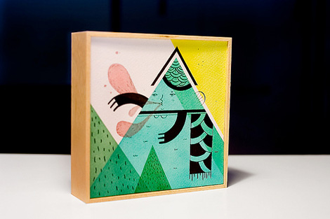
Mar Hernández aka Malota aka really cool designer living and working in Valencia, Spain, offers an extremely fun and inspiring collection of work for our viewing pleasure. Mar’s style is really bold and graphic, but very detailed and complex at the same time. She has a nice range of work — from very flat, computer drawn images, to a sketchier, looser, hand drawn style.
Check out the video entitled “Greenville.” Very cool motion graphics.
05.02.08 | Ethan | Found design | Comments closed
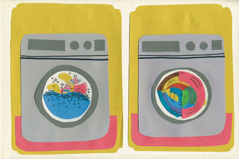
Marcus Walters, a designer and illustrator from the UK, loves washing machines. A lot of his work is similar to the above image — which reminds me of putting felt onto a feltboard as a kid. They have that very flat, semi-dimensional quality to them which I love.
Marcus is also a part of New Future Graphic, which is more graphic design-oriented (posters, ad’s, books, etc).
04.25.08 | Ethan | Found design | Comments closed
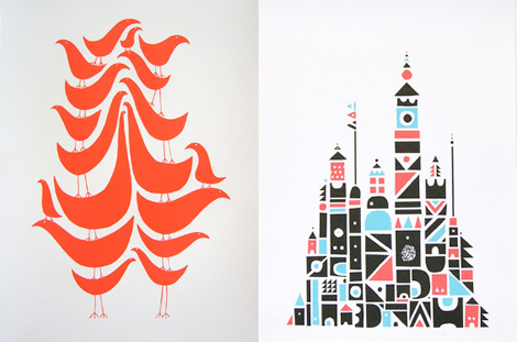
Wayne Pate runs GoodShapeDesign, a Brooklyn, NY based design shop and all around fun place. I’m really into his “Flock” series — if you’re a fan of our feathered friends, now you can have 18 on a single poster!
Also check out his artwork section for some really inspiring collages.
04.18.08 | Ethan | Found design | 1 comment
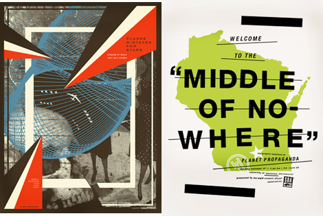
Mike Krol designs for musical bands, sandwiches, accordions, gorillas, light bulbs, and maple syrup, among many other things. He has a very good sense of humor, wit, and typography. I love finding work where the designer’s personality shines through. Especially if that includes heavy metal and Eskimos.
Check out the walking backwards to school video. I loved that!
04.11.08 | Ethan | Found design | 5 comments
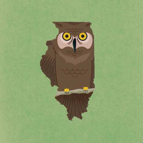
Frank Chimero is having a great time, apparently. His portfolio is full of super fun, exciting work. As a design student, it’s always thrilling to see work that is equal parts vision, humor, inspiration, and a snappy idea.
04.04.08 | Ethan | Uncategorized | 4 comments
Frank Chimero is having a great time, apparently. His portfolio is full of super fun, exciting work. As a design student, it’s always thrilling to see work that is equal parts vision, humor, inspiration, and a snappy idea.
04.04.08 | Ethan | Found design | 6 comments
The Futile Vignette is a design studio run by Mick Marston, out of Sheffield, UK. Mick’s work is a fun combo of contemporary and vintage illustration styles. Lots of rabbits, cats, girls with pig noses, hands holding things, and 2 George Saunders book covers! (Anyone know if those are in print?)
Bonus points for an interesting website, too!
03.31.08 | Ethan | Found design | 2 comments

Leonardo Hss comes to us all the way from Flickr. I couldn’t find any info on him other than what is on his Flickr page. Lots of different styles represented here. Corporate, logo, and some more playful graphic work (like the above image).
Be sure to check out his experimental work as well.
03.21.08 | Ethan | Found design | Comments closed
Hello Freaks are based in Paris, and led by one Jerome Castro (who has a cool blog, in French.) Their illustration work is really impressive, and includes lots of mouth-watering type. Be sure to check the motion work as well. It’s a nice departure from the standard motion reels we’re used to seeing all over.
Thanks to Sharon for the heads up on Hello Freaks.
03.14.08 | Ethan | Found design | 3 comments
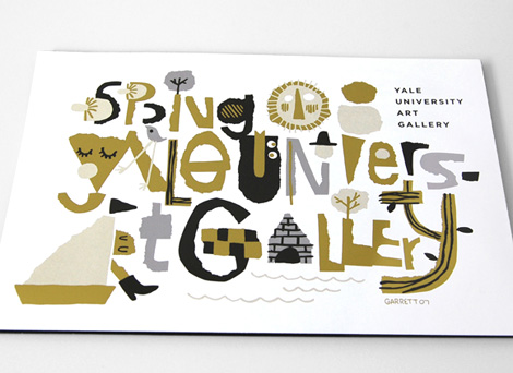
Cover illustration/typography for the Yale University Art Gallery spring catalog
Garrett Morin does great work. He draws lots of type and makes people happy. You may have seen his works in the likes of Mike Perry’s Hand Job book. If you click on over to his site, you’ll find lots of happy characters, t-shirt graphics, corn-cob pipes, animated GIFs, skateboard graphics, magazine covers, and a great animated spot for Death Cab for Cutie / MTV.
Garrett’s also a member of the Rad Mountain collective, which recently did some yummy illustrations for Good Magazine. Check it.
03.06.08 | Ethan | Found design | Comments closed
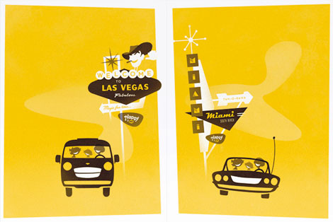
Jesse Kaczmarek is a one-man, super-clean design shop located in NYC. His clients include BMW, Sony, Pepsi, HBO, and on and on. The work remains consistently clean, sophisticated and fun — all at once! Just look at those happy families in their Hertz rental cars!
Also, bonus points for a super slick website.
02.28.08 | Ethan | Found design | 1 comment
Luke Williams is a third year graphic design student at the Maryland Institute College of Art. While making sweet calendar-meets-packaging cubes, he is also working for Abbott Miller/Pentagram in Baltimore. From magazine and book layouts to posters and self-initiated work, Luke’s work is fresh. It’s nice to see a large body of work with this much variety, attention to detail, and experimentation with other mediums.
02.21.08 | Ethan | Found design | 3 comments
Christopher David Ryan is a “Brooklyn-based graphic artist, daydreamer, pseudo-scientist, wanna-be astronaut and untrained intellectual.” His work shows a similar range of experimentation — photography, collage, illustration, found images, etc. Why! He even makes pillows! On his personal website, Ryan is posting at least one image of his work per day for every day of the year. Busy, busy.
02.01.08 | Ethan | Found design | 2 comments
Damien Correll is a Brooklyn, NY based “designer/maker/illustrator.” I first came across his work in the fabulous book Hand Job, by Mike Perry. I really love seeing the intersection of graphic design with his DIY hand-drawn aesthetic. This work is difficult to pin down, but it’s quirky and full of personality.
12.19.07 | Ethan | Found design | 5 comments
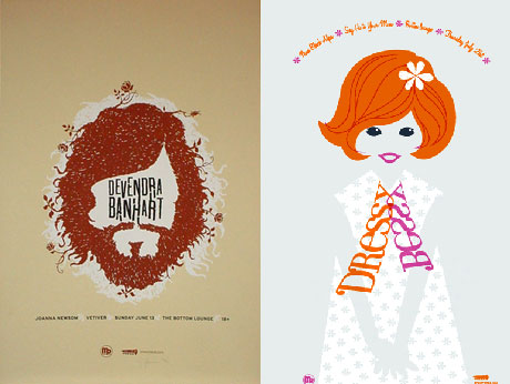
Spike Press is the moniker for one John Solimine, a Chicago based designer. In a world overrun by gig-poster designers, it’s refreshing to see someone with a little originality and illustration sense. These posters are fun, whimsical, and full of narrative — each poster has a very engaging mini-story that will pull you and your wallet right in. Enjoy!
12.06.07 | Ethan | Found design | 5 comments

Woot! Aesthetic Apparatus is a member of my weekly design web site “do they have any new work up yet?” visiting rituals. So I was happy to find not only new work, but a new web site too! There are plenty of new posters, some new test prints, and if you have not yet seen their “doom” series, it’s worth a look. Very fun.
You can scream along with Dan and Michael on YouTube as they show you how to silkscreen a poster.
Coudal has a nice interview with Aesthetic Apparatus as well.
11.23.07 | Ethan | Found design | 2 comments
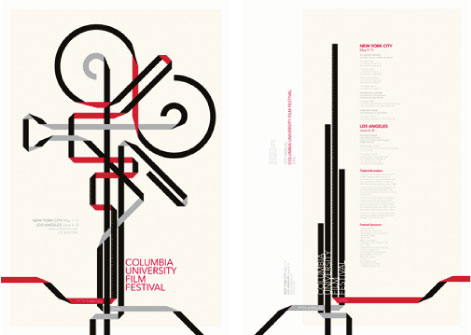
I’ve always been told that when designing a film festival poster to “NEVER use a camera!” in the imagery. Well, Jesse Kirsch just did it, and I’d say it turned out pretty awesome. While he was at it, he also designed a map of Manhattan as a leaf, and a Beatles poster using only hair! What a rule breaker!
11.14.07 | Ethan | Found design | Comments closed
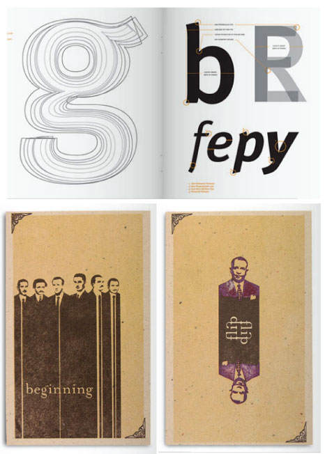
My favorite thing about Jose Rodriguez is not his great work, nice type, or his motion reels. It’s his URL: HeyJose.com! It’s probably the hottest domain name on the web right now. Anyway, the work is definitely on par with the URL. That’s right, solid gold! From the long-suited men of “beginning” to the technical-but-beautiful diagrammatic analysis of FF-Meta, this Sarasota, FL, designer is making some really great images. Go over and check out Hey Jose!
11.08.07 | Ethan | Found design | Comments closed
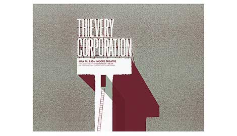
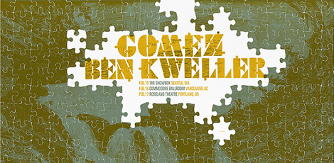
I have a very special place in my heart for poster design. Especially poster design that incorporates type in an interesting, fresh way. I mean, how do they do that? It looks too easy! Andrio Abero, the man behind the poster and design studio 33rpm, is a master at “type and image integration.” This is one of the first firms that kick started my obsession with the poster, way back in the early 2000’s.
10.31.07 | Ethan | Found design | Comments closed
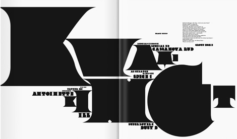
Non-Format are a twin-continent based award winning design firm. They also happen to be the kings of super thick and chunky left justified type. They posses the unique ability to seamlessly integrate their big type with organic illustrative elements, with very nice results. In addition to running their studio, they also design Varoom, a journal of illustration and made images, art directed by Adrian Shaughnessy. In addition, they just released a book.
10.24.07 | Ethan | Found design | Comments closed
Now in its 4th year, Personal Views is a unique series of conferences that brings together an unparalleled group of designers, writers and educators from the world of graphic design. Coordinated by Andrew Howard, and taking place at the Escola Superior de Artes e Design in Matosinhos, Portugal, the series aims to examine contemporary definitions of graphic design by asking these professionals to talk about the values and objectives that have value for them. It is an attempt to explore where the boundaries of contemporary practice lie, to discuss what we might expect of ourselves, and to examine what social and cultural objectives we seek to fulfill.
Available online are lectures by Experimental Jetset, Ellen Lupton, Erik Spiekermann, Wim Crouwel, Steven Heller and Neville Brody among others.
10.16.07 | Ethan | Found design | Comments closed
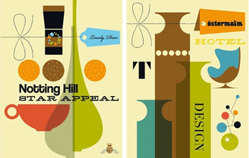
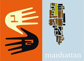
We’re really diggin the online portfolio of Bo Lundberg. He draws influence from modern antiques, objects and patterns that he stumbles across in everyday life.
10.16.07 | Ethan | Found design | Comments closed
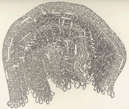
If you like experimental typography, art, Moby Dick, and the letter ‘E’ this is the exhibit for you. Hailing from the midwest, Justin Quinn makes fascinating typographic compositions based on Herman Melville’s epic. Using only the letter ‘E’ and graphite, Quinn recounts entire chapters from Moby Dick. For example, the above piece is entitled “Moby Dick Chapter 55 or 9200 times E.” That’s a lot of E’s. If you’re in the mood for more typography a la concrete poetry, please see Justin’s work at MM Galeries.
10.12.07 | Ethan | Found design | Comments closed
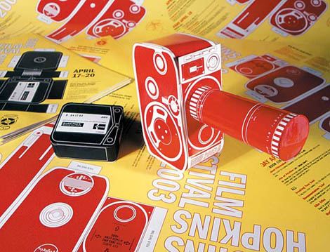
Self described as “Wayne and Garth meets Chermayeff & Geismar,” Post Typography, from Baltimore MD, was originally conceived and founded in 2001 as an avant garde anti-design movement by Nolen Strals and Bruce Willen. They specialize in graphic design, conceptual typography, and custom lettering/illustration with additional forays into art, apparel, music, curatorial work, design theory, and vandalism.
10.12.07 | Ethan | 1960s, graphic-design, records, Seen Elsewhere, Singapore | Comments closed
Self described as “Wayne and Garth meets Chermayeff & Geismar,” Post Typography, from Baltimore MD, was originally conceived and founded in 2001 as an avant garde anti-design movement by Nolen Strals and Bruce Willen. They specialize in graphic design, conceptual typography, and custom lettering/illustration with additional forays into art, apparel, music, curatorial work, design theory, and vandalism.
10.12.07 | Ethan | Found design | Comments closed