


Tim Gough interview
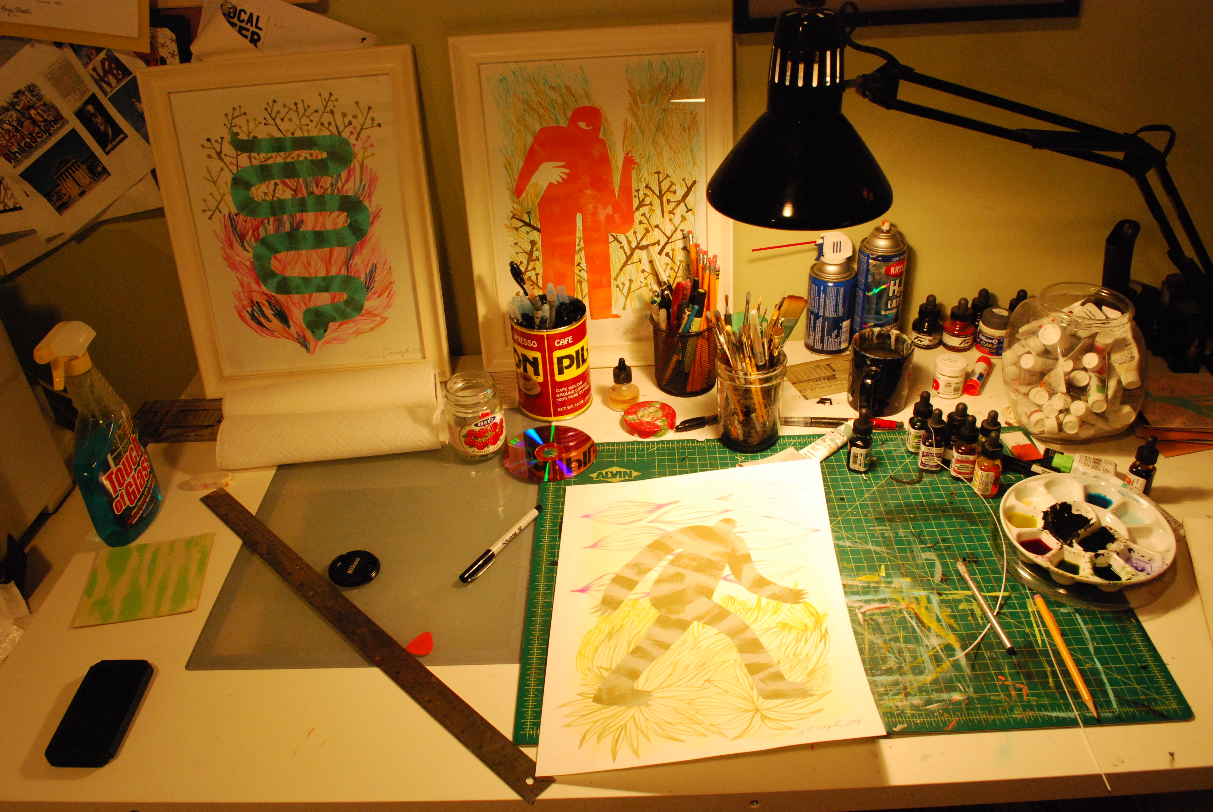
(Photo credit: Adam Wallacavage)
The next addition to the Grain Edit interview series takes us to Philadelphia: City of Brotherly Love, home of founding father Ben Franklin and the Liberty Bell, and double agent Tim Gough. A man of mystery, by day, Tim works as the Art Director for the Philadelphia Weekly. By night, he emerges from the cheese steak littered streets of Philly to do one thing: rid the world of dull illustrations.
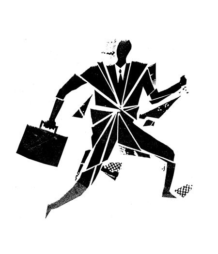
Tim successfully melds images of spies and monstrous creatures with bursts of color, densely clustered patterns and rough textures, creating dynamically rich works. In this interview, he discusses his hometown and background, perplexing experiences after college, influences, and his creative process.
And now to reveal the enigma…
Where are you from originally?
I grew up in the suburbs just north of Philadelphia. I have lived in or around Philly my whole life.
That’s so awesome! What are some of the best things about Philly? I’ve never been!
Philly is a great town. It feels like a big city, but also has a small town vibe. It is also cheap, which makes great for artist and creative types. You can easily set up a studio somewhere and get by while working on projects or whatever.
Have you ever considered moving?
All the time! I have been here my whole life; I need a change of scenery. I have dreams of relocating to the Bay Area.
When did you first become interested in illustration/design?
I was always drawing and doodling, but skateboarding and punk rock really got me excited about graphic design. It was a mystery how a lot of the stuff I was inspired by was created, but I was excited at the possibility of people making a living off creating these images.
What was the first drawing that you did, and how old were you?
I was probably about 4 or 5, and remember drawing Nikolai Volkoff from the WWF in kindergarten. Looking back, he wasn’t even a favorite wrestler [of mine, and I’m not sure] if I even knew his name. I was definitely more into Hulk Hogan or Junk Yard Dog. But he was really easy to draw. I broke his image to few basic parts: red shirt and a square black hat. I still take that approach to drawing to this day.
Did you attend art school? If so, how did you like it?
I attended a graphic arts trade school here in Philadelphia. It was an interesting experience. We were taught some computer skills, but my school was run by some really talented illustrators and designers from the 70s and 80s. They taught a lot of really great techniques that were about 10 years out of touch with what was going on around us. I learned photo realistic airbrushing, and was brought up on marker comps and gouache renderings for advertising mock ups. I was very confused once out of school.
What type of opportunities were you expecting after school and what ended up being the reality? How did you apply what you learned to what was expected of you in the real world?
I think I was just starving for any kind of opportunity. I realized I had to keep searching out work and take what I learned and make the best of it.
What was your first design gig? How did you land it?
I worked at marketing agency right out of school. They were a production company for TV commercials before they decided to switch their focus on marketing and advertising, which was a really odd transition. At times, it was like the blind leading the blind when it came to working with print vendors, and handling production. But, it was a great environment to jump in head first and get a taste of doing everything: posters, fliers, brochures and all that. [I landed it] the old fashioned way. I snail mailed a cover letter and resume.
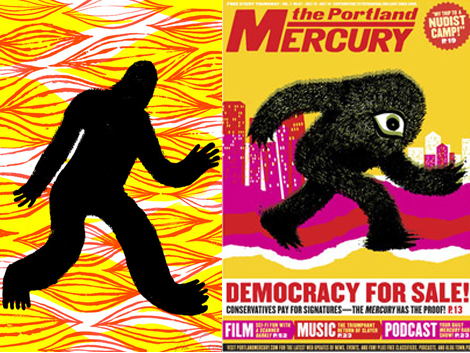
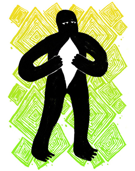
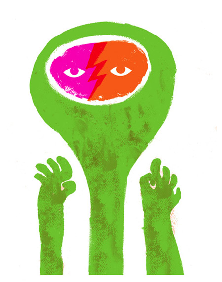
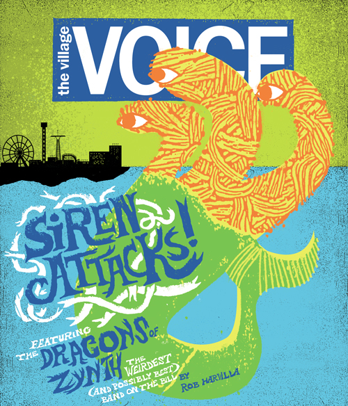
Speaking of the blind, this reminds me of some reoccurring images within your work, like the Cyclops! What’s the story behind that? What about the sneaky spies and “The Roamer?”
I have always been in to sci-fi, monster movies, comic books and all that stuff. So, I guess it makes sense that it carried over into my work.
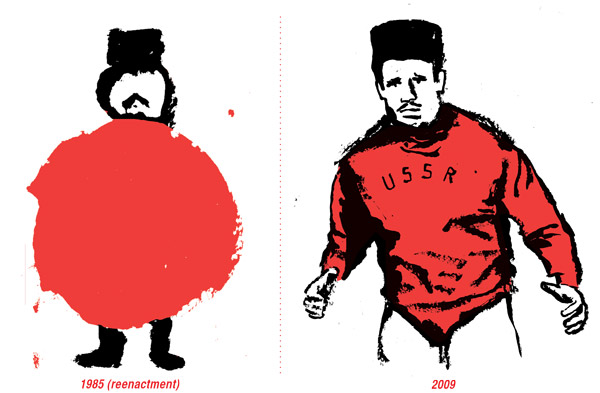
I really dig the details of your line work and textures. Some of your pieces are almost reminiscent of Saul Bass. Who or what inspires you?
I love movies and was definitely exposed to Saul Bass at a young age and didn’t even realize it. Psycho, Mad Mad World, Casino…those titles stood out to me. Illustration from the 60s and 70s, Polish movie posters, Cuban posters and animation from the 60s-80s also inspire me.
Who are some current artists that you admire?
Kris Chau, Greg Pizzoli, Hawk Krall, Print Liberation, Eleanor Grosch, Seripop, Large Mammal, Sasha Barr, Tyler Stout, Gina and Matt so many more. I could go on an on…
[pictobrowser 10159078@N03 72157616455380036]
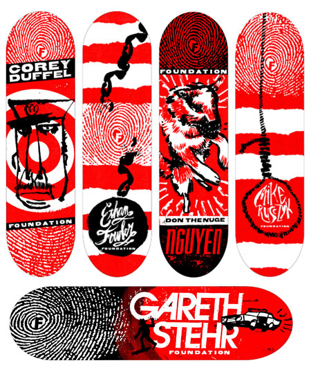
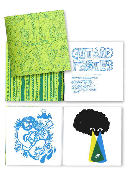
Like Invisible Creature, Jason Munn, and Eleanor Grosch, I noticed that you’ve done quite a lot of gig posters. How did you get into that? How does it feel to have made the cut into the Gig Posters book?
I got into Gig Posters by wanting to get my hands dirty and to fulfill a creative void at my day job. I had a studio that had a print studio attached where a bunch of people were making posters for a local promoter. I loved the stuff that was coming out of there, and was really inspired and wanted to give it a shot. I was easily able to experiment by trial and error and immerse myself in printing at night after working long days at the marking agency. I am honored to be part of the Gig Posters book; there are so many people from that website that blow my mind. I’m barely making posters anymore, but to be asked to be in that book is really exciting. I hope Clay [owner of gigposters.com] makes some money off it, because a lot of today’s poster artists have him to thank for letting us showcase our work on his site for free.
How do you pair a concept with your distinct style?
Concept always comes first; usually I have an idea of how I will execute the final [project] while working on sketches. Sometimes I have to try out a couple different versions till I get it right.
Can you offer any advice to newer designers struggling with the concept vs. style issue?
Sketch out your ideas first and really nail down the concept, you probably have a bunch styles or looks up your sleeve, but that doesn’t really matter unless your work is conceptually sound.
What is a typical day for you like?
Wake up head to the day job, consume mass amounts of caffeine. Sneak some freelance emails here and there. Come home. Eat, freelance, sleep, wake up, and repeat.
How would you describe your creative process?
I start off with a tiny, sloppy sketch and blow that up via computer or Xerox. I work off the original sketch for the most part, but clean it up and add some textures. I try to keep the looseness and energy of the original sketch.
Tim was kind enough to show us his process in creating artwork for the “Free Library Festival” in Philadelphia:
This is my process for working on the “Free Library Festival” artwork here in Philadelphia. In the brief about the project, FREE was to be the focus of the piece and the event. This is an annual event they have every year with music, readings, food, and much more. It was a lot of fun to work on, and awesome to work with Philly’s free library.
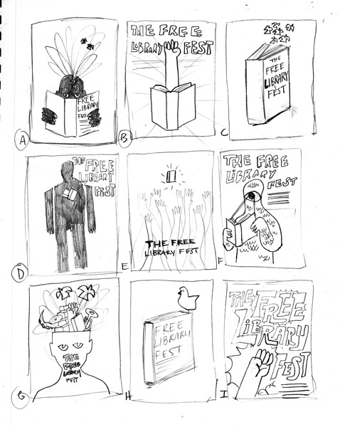
1. I start with various rough concepts based on the conversation with the client. These are more about concept rather than style and composition. This is the beginning of the collaboration between me and the client to try other variations and options while still in this loose sketching phase.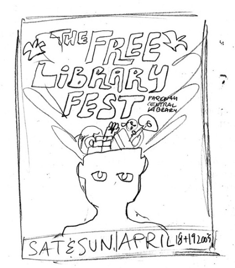
2. After a meeting with the client, they liked one of the sketches from the first round and asked that I refine it and put some more detail into it. I am still keeping it really loose at this point because I don’t want to get caught up in the fine details until the client is into it 100%.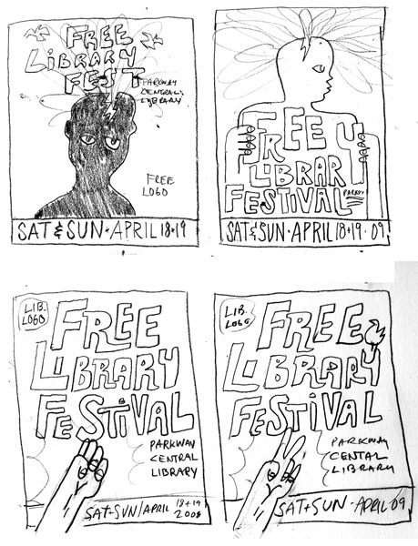
3. During our meeting over the 2nd refined sketch, we discussed the ideas behind the festival and refined the overall theme a little bit more. The tag line, “A Burst of Books, Music, and Inspiration for Everyone,” was included as a result of looking at the initial sketches for the artwork. Four more sketches were created, two were variations on the refined sketch, and the other two were some last minute ideas thrown in.
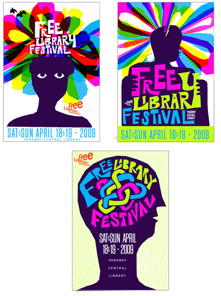
4. At this point, two sketches were picked, but a final image was not decided on. To help the client visualize what final artwork could look like, I did some color mock ups. I just take my low res scans and drop color over them in Photoshop. Sometimes, I will add text or textures really quick if I think that I will use them in the final. Also, if I have any last minute ideas, I will throw them together with the color mock ups.
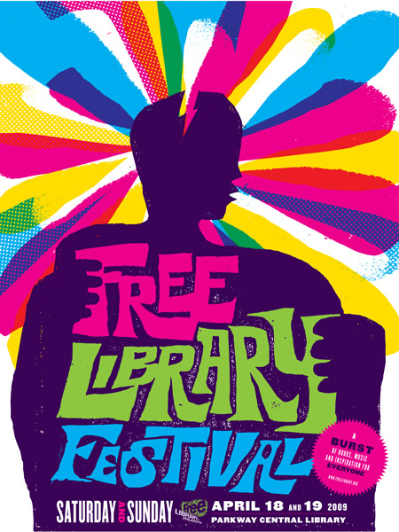
5. Now that the final is picked, I put the hi-res art together. At this point, the composition and color have all been worked out. I will blow up the approved sketch and begin to work on top of it in Photoshop.
What current projects are you working on?
I have some ongoing editorial illustrations at the moment, and I need to get some drawings together for Giant Robot SF shows in March and April.

Speaking of editorial work & GRSF, how much of your work is personal vs. commercial? Do you prefer one to the other?
I do mostly commercial, and it’s really enjoyable for me. Lately though, the commercial work has led to more gallery and art related projects, and I have been really enjoying those. The ultimate goal is to find a perfect balance of each.
How do you know when a project or illustration is finished? When do you know to draw the line, so to speak?
When I feel like I am done, I walk away and then look at it again in the morning with fresh eyes. If I still like it, it’s done.
If you could recommend 2 books + 2 albums to another designer, what would they be?
Books: Penguin by Design: A Cover Story 1935-2005 by Phil Baines & The Push Pin Graphic: A Quarter Century of Innovative Design & Illustration by Seymour Chwast
Albums: The Ramones Anthology, Marquee Moon by Television
If you could eat one thing for the rest of your life, what would it be and why?
Spicy Tuna BiBimBop. We have this great Japanese/Korean spot here. It’s raw tuna, rice, cabbage, avocado, pears, green onion and a sweet spicy sauce. MMMM it’s so good and I feel kinda healthy when I eat it. Finding a spot like this in Philly is totally rare, unlike the west coast where you can get awesome sushi every where.
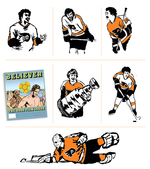
What is one thing most people don’t know about you?
I love hockey and Lost.
—————————————-
I would like to extend a secret handshake and thanks to Tim for taking time to share his work and process with us. To see more work, keep up-to-date with current exhibitions and happenings, visit his website. Also, be sure to check out Tim’s shop for some ultra sweet prints, shirts, and other goodies!
—————————————-
Enjoy reading this interview? Please leave a note in the comments and consider signing up for our tasty free grain edit RSS feed.
Tagscontemporary, Designers, graphic-design, Illustration, Interviews, posters, USA
