


Áron Jancsó
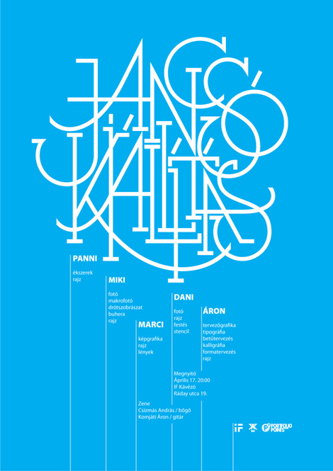
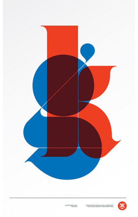
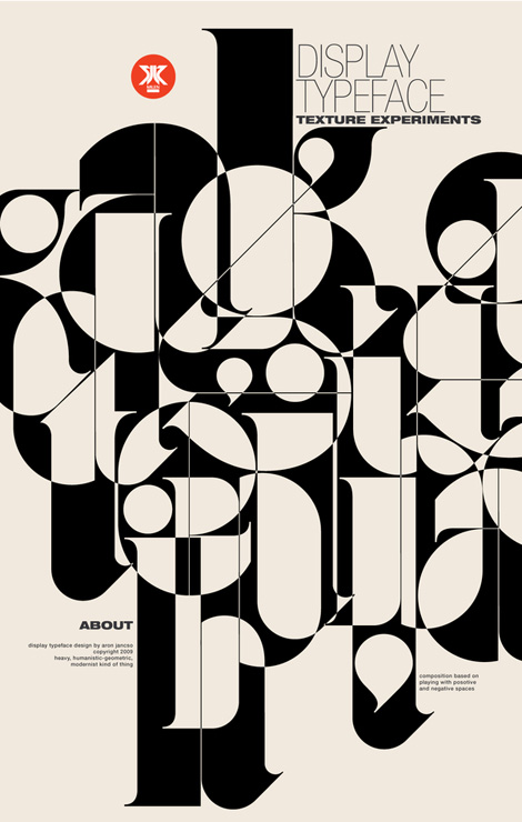
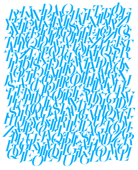
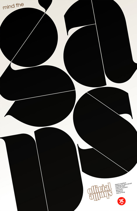
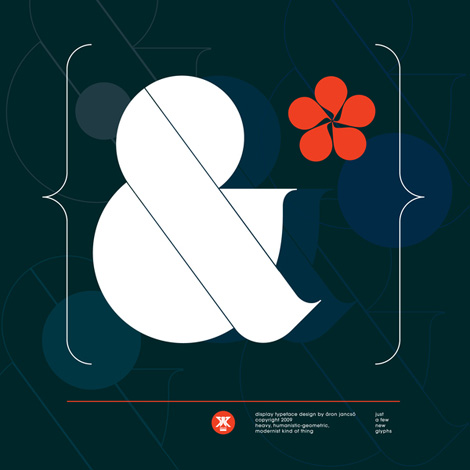
Hungary-based designer / illustrator Áron Jancsó has quite the way with letters. Viewing Áron’s work is a delightfully involved procedure. With such a large variety of typographic experimentation and work, it’s easy to become engrossed with the portfolio while inspecting the various details.
I love the balance that happens between the solid, bold figures alongside the sing-songy lyricism of the more expressive typography. Overall great compositions and contrast in forms.
Also worth viewing:
Herb Lubalin Archives
Photo Lettering: Alphabet Thesaurus 2
New Fonts available at YWFT
Not signed up for the Grain Edit RSS Feed yet? Give it a try. Its free and yummy.
