Ptarmak
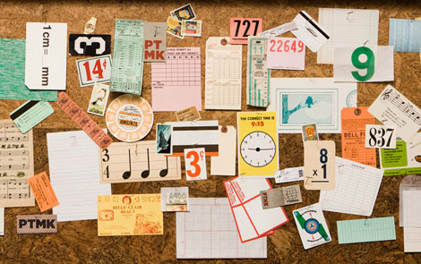
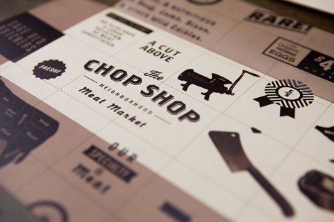
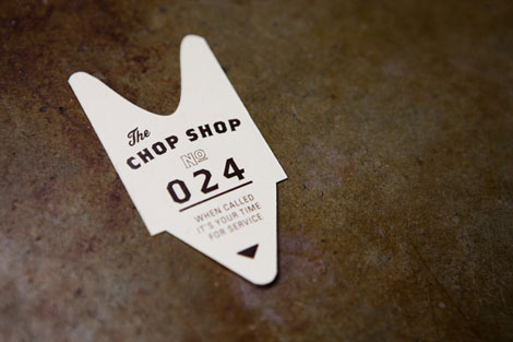
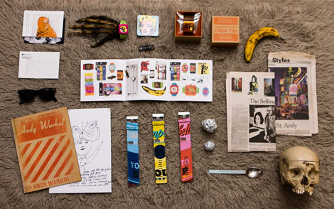
Wow! Fun, exciting work from Austin-based design collective Ptarmak. Their work is a refreshing example of design that looks great, and is also very usable. I love when design can do both of those things. It’s simple and clear, but equally as sophisticated. And that typography: whew!
Another aspect of Ptarmak that I enjoyed, was their spot on presentation. Great design aside, you don’t have anything without a good presentation. The work is photographed nicely and really shows the variety and attention to detail throughout their portfolio.
Also, check out their blog.
——————–
Also worth checking: Ed Nacional.
Not signed up for the Grain Edit RSS Feed yet? Give it a try. Its free and yummy.
——————–
01.14.10 in Found design by Ethan
Share This Share on Facebook


8 comments
Comments feed for this article
Trackback link
http://grainedit.com/2010/01/14/ptarmak/trackback/
01.17.10 at 3:30 pm
Trackback from uberVU - social comments - Social comments and analytics for this post...
That is amazing work. The type on the Chop Shop logo is beautiful.
01.15.10 |
Nathan |
Found design |
magnificent!
(especially The Chop Shop)
01.16.10 |
letterpreston |
Found design |
hey, that’s awesome! they’ve used our Paper Pack contents for their board!
01.16.10 |
Stu |
Found design |
Literally fell in love when I saw this post today… great studio.
01.16.10 |
Joshearon |
Found design |
Oh, they’re behind at least some of the new Whole Foods packaging! I’ve been really struck by the improved design on so much of their store-brand stuff lately. I’m gonna have to go look at more of their stuff!
01.16.10 |
yonatron |
Found design |
Beautiful work and local! Love the iconography.
01.17.10 |
Josh |
Found design |
hello talent.
01.20.10 |
seesaw |
Found design |