Riley Cran
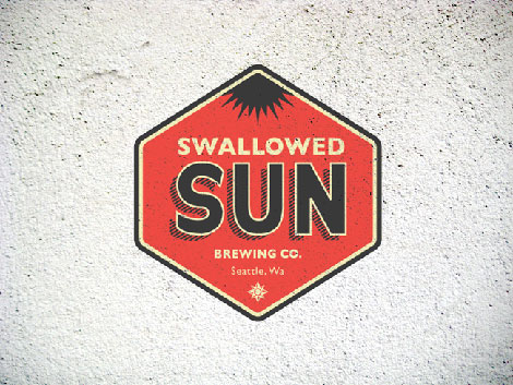
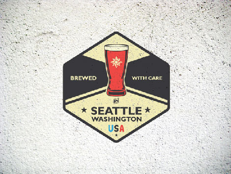
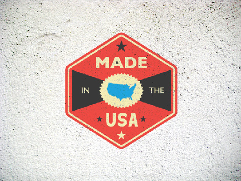
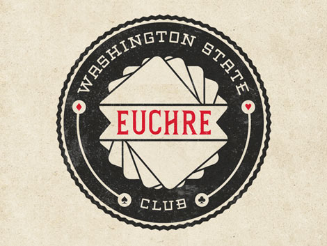
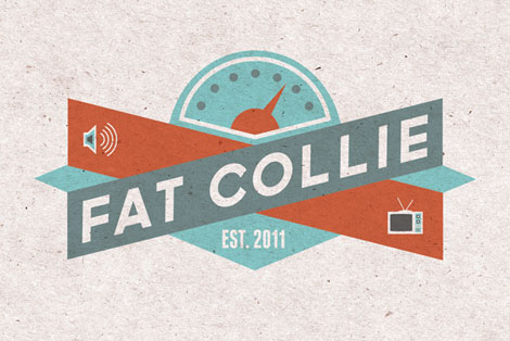
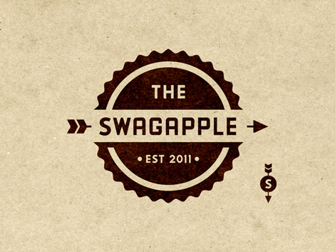
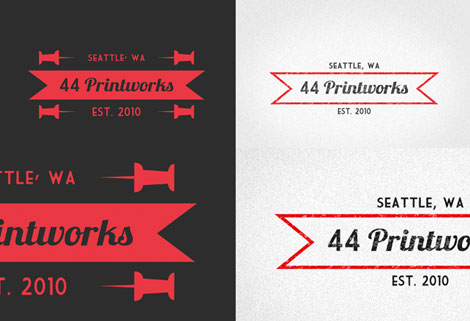
Riley Cran, everyone! Mr. Cran can be found in sunny Seattle, Washington, and has quite the handle on creating compelling logos and marks. I love his branding for Swallowed Sun Brewing Co. — it’s accessible, fun and to the point.
Throughout his portfolio, Riley maintains a keen eye toward typographic detailing and simplicity of form. His color choices and contrast in his work mix quite well with his reference to clean, classic identity design.
See Riley’s work!


Also worth viewing…
Spanish modern graphic design
Quadradão
Like what you see?
Sign up for our Grain Edit RSS feed. It’s free and yummy.
09.07.11 in Uncategorized by Ethan
Share This Share on Facebook


13 comments
Comments feed for this article
Trackback link
http://grainedit.com/2011/09/07/riley-cran/trackback/
09.09.11 at 10:47 am
Pingback from grain edit · Flydende Lava
09.09.11 at 3:31 pm
Pingback from Flydende Lava | | Happy GraphicsHappy Graphics
09.12.11 at 7:27 am
Pingback from Modern Vintage Logo Design Inspiration By Riley Cran | Best Web Gallery - Flash Gallery - CSS Gallery - Web Design Inspiration - CSS Web Gallery - Designing Gallery
10.01.11 at 11:52 am
Pingback from Riley Cran | eeko studio BLOG
09.11.12 at 7:04 am
Pingback from Riley Cran | Bailey's Blog
Awesome. Awesome.
09.08.11 |
lauren scheuer |
Uncategorized |
Riley is the man! Don’t forget to mention his child LostType.com, where he is bringing great nostalgic type back to the working world.
09.08.11 |
Chris D |
Uncategorized |
Nice! These are simple and classic. Love the textured backgrounds these are on!
09.08.11 |
Chris |
Uncategorized |
These logo designs capture the current retro trend perfectly. I really like the high-contrast, flat tone of the shapes on all of these designs. There’s a a strong symmetry in the composition of these designs that actually helps to make them stand out. Center justified compositions can look weak but in this body of work the designs feel solid and balanced.
09.13.11 |
Kim Ruddock |
Uncategorized |
Hmmm… I smell a rat here. This stuff looks practically identical to his father’s work: davidcran.com
09.13.11 |
John Smith |
Uncategorized |
Nice!
09.15.11 |
JSVERLE |
Uncategorized |
Nice textures.. nice vintage look!
10.18.11 |
Scott |
Uncategorized |
I love the way you display these logos on a textured background, they look great with a retro design. I want like to use this style in web design.
02.16.12 |
MGT Design |
Uncategorized |