Andrew Bannecker
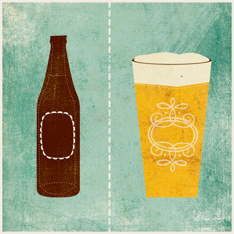
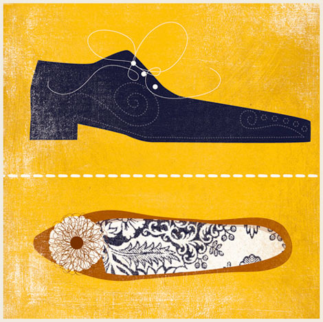
Really, really into these lovely illustrations from Andrew Bannecker. Definitely the best beer and shoe prints I’ve seen in a long time. I love how he mixes flat graphics with intricate details. His work has a nice depth to it as well, thanks in part to those great rough textures.
A few (we want more!) of his prints are available from Charming Wall.
12.19.08 in Found design by Ethan
Share This Share on Facebook


10 comments
Comments feed for this article
Trackback link
http://grainedit.com/2008/12/19/andrew-bannecker/trackback/
12.29.08 at 7:19 am
Pingback from Most Popular Blog Posts of 2008
Those shoe prints are gorgeous!
12.19.08 |
judith Wilding |
Found design |
I LOVE the shoe print–especially the flat. I would buy that shoe! But the print is expertly done, I love the detail and subtle shading.
12.19.08 |
Ashley McFarland |
Found design |
Huge fan. Love his work. I agree– we want more!
12.19.08 |
Jim |
Found design |
I absolutley adore these.
12.19.08 |
gary |
Found design |
We are working on getting more prints in the shop from Andrew! Thanks for the shout out! ~From the folks at Charmingwall~
12.20.08 |
Katie McClenahan |
Found design |
Interesting work! It does seem a little cold and “computery”. Do people actually work with paint anymore or just photoshop and Illustrator?You guys have really focused on computer Illustrators lately did anyone notice that his work looks like Adrian Johnson’s work?
12.21.08 |
fred |
Found design |
Thanks for the info Katie. That would make a lot of people happy! More Bannecker!
12.21.08 |
Ethan |
Found design |
Nice stuff, I agree, we need more
12.29.08 |
Image layout |
Found design |
On a recent United Airlines flight, I noticed Andrew’s cover for Hemispheres magazine poking-out between SkyMall and the safety instruction card. It wasn’t until this post that I’ve had time to explore his other work. Thanks for the post!
The jump to comparing Andrew’s work to Adrian Johnson’s appears too great to achieve. While both utilize flat color and shape to depict space, Adrian’s work is more editorial & witty (see “Gulf Sale” and “..slap your friends” posters). Andrew’s work is nicely executed, but it should be compared to other illustrators that use flat graphics with textures (perhaps Rad Mountain or Little Friends of Printmaking).
The first comparison that came to mind when seeing the images above was actually Andy Warhol’s shoe illustrations. Now those were some fine shoes!
12.30.08 |
Tim Belonax |
Found design |