Foundry Collective
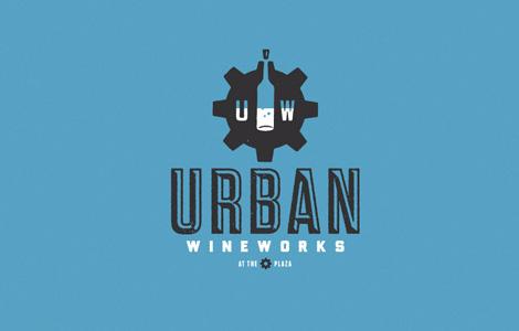
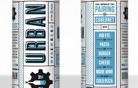
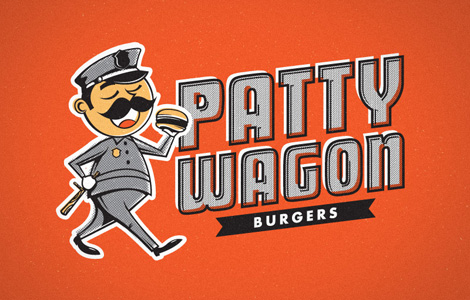
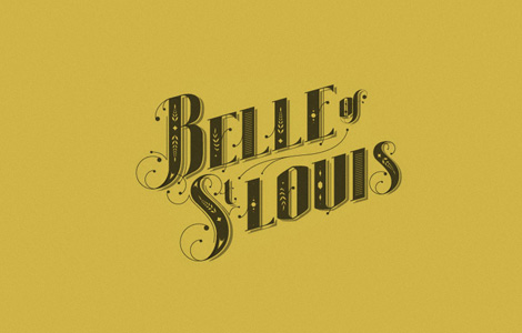
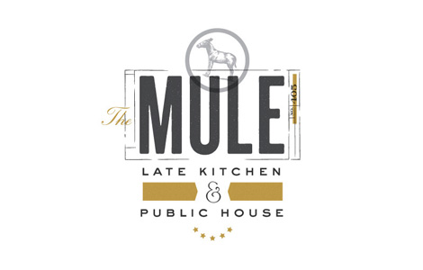
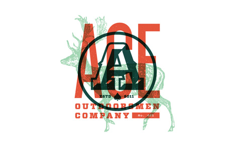
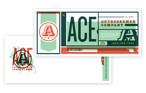
Fun work from the Denver/Dallas group Foundry Collective. These guys have a steady hand in Americana-vintage that translates really well to their identity, packaging and typography. I love their use of color, texture and illustration — their work has loads of personality.


——
Also worth viewing:
Swiss Graphic Design by Geigy
Publicity and Graphic Design in the Chemical Industry
Karl Gerstner: Die Neue Graphik
Like what you see?
Sign up for our Grain Edit RSS feed. It’s free an yummy!
Tagscontemporary, Design, identity, Typography, USA
11.30.11 in Found design by Ethan
Share This Share on Facebook


3 comments
Comments feed for this article
Trackback link
http://grainedit.com/2011/11/30/foundry-collective/trackback/
The illustration work is great by Foundry Collective but I think their real strength lies in the typography they create. The smaller images in this article don’t do the work justice. You can really see the detail and craft of their design on their site portfolio. The Belle of St Louis design is my favourite by far.
12.02.11 |
Kim Ruddock |
Found design |
Love it, love it, love it. The retro touches, wonderful fonts and imitation screenprinted combination is lush
12.08.11 |
Designbysoap |
Found design |
Awesome stuff! Vintage logos look so classy.
02.17.12 |
Scott |
Found design |