


University of California Branding
I’ve been a designer with the University of California, Office of the President, for a little over a year now. During my initial interviews I was shown a bold and newly designed mark with accompanying branding elements. That identity system was one of the main reasons I accepted the position. It was so exciting to me that an enormous public institution would actually make the move toward a witty, fresh, charismatic and entirely unstuffy aesthetic — an aesthetic that seemed to go against all standard expectations of what public education should look like. And to have the opportunity to work on the in-house team that actually put this identity in place? Yes, please!
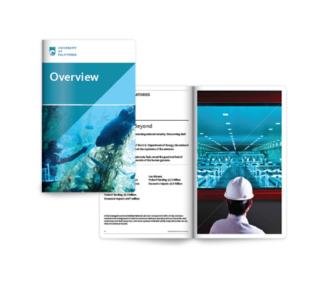
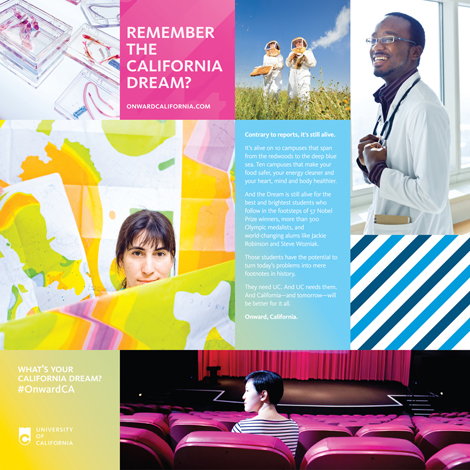
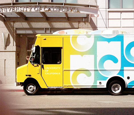
This identity was recently released publicly in the form of a branding video (also created in-house). Previous to this new identity, there wasn’t much unity in the material coming out of the University; brand and style guidelines were pretty much “blue and gold” and the widespread misuse of the University’s historic seal as a logo. More than a re-brand, the change has mainly come in the form of strategic thinking. Where once there was design chaos, now there is uniformity and cohesion. There’s a logo, with a typographic lockup; there are official typefaces (two of them); there is professional photography; there are Word templates for non-designers.
Ultimately, this move toward strategy and cohesion has been a vehicle for telling informative, compelling stories about the University. It’s exciting, and a big breath of fresh air to be involved. I look forward to more of it.


Tagsbranding, contemporary, Design, photography, Typography, USA
