Tim Boelaars
Graphic Design’s hometown, the Netherlands, has no shortage of fantastic designers, illustrators, or artists. Tim Boelaars is one of the many standouts from that fine country.
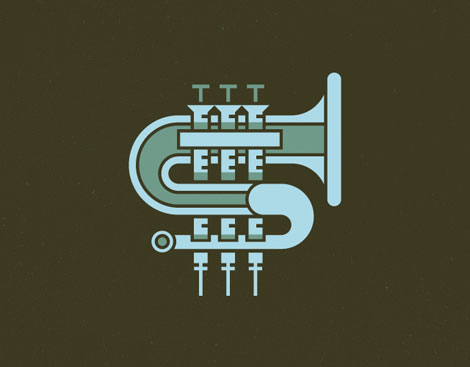
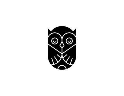
Tim’s work is really good, and overlaps a number of disciplines within design. His talent for bold, whimsical, geometric line work touches all areas of his portfolio. Particularly, I love his logo and icon design. I love when a designers’s personality shows through equally in layout, illustration or a super stark icon.
Check out more of Tim’s work here.
Lots of nice stuff on his Dribbble, too.


——————–
Also worth viewing:
The Modernist
Justin Gabbard
Raise No Chicken
Not signed up for the Grain Edit RSS Feed yet? Give it a try. Its free and yummy.
——————–
08.03.11 in Found design by Ethan
Share This Share on Facebook


15 comments
Comments feed for this article
Trackback link
http://grainedit.com/2011/08/03/tim-boelaars/trackback/
11.23.11 at 11:20 am
Pingback from grain edit · Raymond Lemstra
04.02.13 at 12:45 pm
Pingback from Nick Brue - The Imagists | Bespoke Brand Strategy
Some great examples of Boelaar’s work here. I love that the designs are very simple yet very balanced. Despite their simplicity they are still striking and humorous. The very minimal palette only adds to their effectiveness in my opinion. I would like to to see more pieces though as this list doesn’t really seem to do him justice.
08.03.11 |
Kim Ruddock |
Found design |
Does this guy have clients? Seems like he’s just a kid who got some adobe programs and makes cute doodles for dribble. I don’t get a sense of any client parameters or a sense of purposeful communication from any of his work, design and illustration are mediums to solve problems.
08.03.11 |
Simon |
Found design |
@Simon That’s a bit of a yellow bellied comment from some that leaves no contact info or website. Are you featured on grainedit anywhere? If so link me up. Thanks. This guys stuff is sick, especially his piece for the momentus project.
08.03.11 |
Michael Smith |
Found design |
Simon, do you have any examples of designs and illustrations that solve problems, that you’d like to share with us? Perhaps some out of your own portfolio?
08.03.11 |
matt |
Found design |
@Simon That’s a bit of a yellow bellied comment from someone that leaves no contact info or website. Are you featured on grainedit anywhere? If so link me up. Thanks. This guys stuff is sick, especially his piece for the momentus project.
08.03.11 |
Michael Smith |
Found design |
Simon, take 5 minutes to browse the internet (thats the thing you’re using right now!) and I’m sure you’ll stumble across his website where I’m sure you’ll notice multiple clients and multiple communicative illustrations.
The only thing I can really extract from your comment is pure jealously, and that sir, makes you a ‘Poo Chimp’
Yes, I called you a Poo Chimp.
Good day.
08.03.11 |
Ryan |
Found design |
I thought this was a post about Richard Perez and Ty Wilkins, then I realized it was just some kid who jacked their styles. Sad that this kind of theft gets praised.
08.03.11 |
Sad |
Found design |
High five, Sad. This kid is a hack.
08.03.11 |
simon |
Found design |
@Sad While I do love Richard and Ty’s work, I don’t think that you can say that they own the flat graphic drawing style. I think it is an unfair characterization to say that Tim has “jacked” their style. @simon, unfortunately without descriptions of each piece the context of his illustrations and marks are lost. But this would be true of any piece that is left without explanation. Think how weird the Nike swoosh would appear if you’ve never seen it before or didn’t know what it was for. Yet it is one of the most successful, memorable, marks. I am genuinely bothered by the outrageously venomous comments posted about a talented designer. It’s fine if you aren’t crazy about his work, but it doesn’t give you the right to tear him down. Tim, you’re work is great. Don’t let the internet peanut gallery tear you down.
08.03.11 |
Jeffrey |
Found design |
Tim Boelaars,
Your work can best be described by simplicity in the most positive means. Color is added only to enhance the designs, typography is always well considered, and you’ve been an inspiration to me many-a-time.
Simply put, it’s outstanding. Keep up the fantastic work.
In the words of my print teacher,
make. make. make.
Best.
J
08.03.11 |
Jim |
Found design |
Wow. I am so amazed with the geometrical and whimsical designs that he made. I appreciate the fantastic creations and artworks! Keep it up!
08.03.11 |
graphic design forum |
Found design |
Thanks for featuring such fresh talent. These are beautifully simply, have a great sense of energy and movement, and are overall very strong. Really great work!
08.04.11 |
Anna |
Found design |
Wow! I love the geometric style here… nice n simple shapes look really cool.
10.18.11 |
Scott |
Found design |