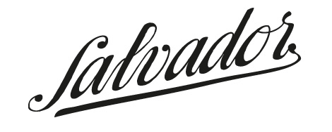
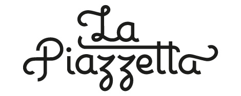
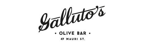
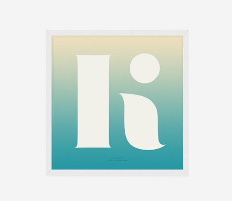
Mads Burcharth
Lots of cool, crisp typographic work from Denmark-based Mads Burcharth. I love his clean, minimal approach to lettering and type design and his ability to add flourishes and interesting details to his work. His style is strong and bold, and has a great flair to it as well.


——————–
Also worth viewing:
Recently Received
This Is Forest — Joel Speasmaker
Designer’s Bookshelf: Amy Cartwright
Not signed up for the Grain Edit RSS Feed yet?
Give it a try. Its free and yummy.
——————–
06.13.12 in Found design, Typography by Ethan
Share This Share on Facebook


6 comments
Comments feed for this article
Trackback link
http://grainedit.com/2012/06/13/mads-burcharth/trackback/
07.12.12 at 8:33 am
Pingback from Type News: Genuine Craft | Uber Patrol
Congrats on the feature, Mads. Well deserved.
06.15.12 |
Julian Hrankov |
Found design Typography |
Congrats on the feature, Mads. Well deserved.
06.18.12 |
july |
Found design Typography |
I’m usually quite critical of typography that is difficult to read but the first example in the circle is so simply beautiful I can’t be mad.
06.18.12 |
Chris W |
Found design Typography |
very nice, simple and clean. i’m a big fan. thanks for sharing!
06.18.12 |
Trina |
Found design Typography |
I love the first one! Clean and simple. The others would make for excellent retro-styled logos. Cheers from Abby from webtemplates.com.au
06.25.12 |
Abby |
Found design Typography |