Brighten The Corners
Brighten The Corners is an independent, multi-disciplined design and strategy consultancy with offices in London and Stuttgart. It is also the title of the fourth studio album recorded by indie rock behemoth, Pavement. As an out-and-out fan of Pavement I find this connection quite interesting.
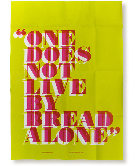
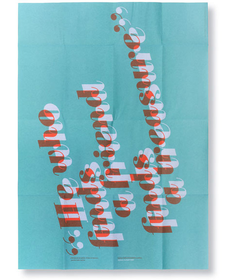
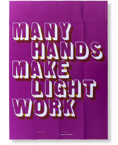
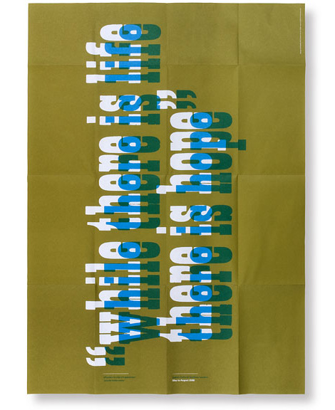
This letter pressed series of Italian quotes initially caught my eye, but the studio is indeed multi-disciplined—with their hands in a variety of projects. In particular, they’re very adept at handling smart, academically-minded publications.
The info section provides a brief note about the studio title: “Although tracing the connection may seem difficult, the more persistent listener will find that repeated sessions of Type Slowly, Date w/ IKEA or Old to Begin will offer invaluable insights.”


Tagscontemporary, graphic-design, posters, Typography, USA
02.08.12 in Found design by Ethan
Share This Share on Facebook


5 comments
Comments feed for this article
Trackback link
http://grainedit.com/2012/02/08/brighten-the-corners/trackback/
02.22.12 at 12:01 pm
Pingback from grain edit · Javier Garcia
02.29.12 at 1:55 am
Pingback from grain edit · Patrik Lindell
Uauu simply beautiful. The projects that celebrate I love typography.
02.08.12 |
JOHNAPPLEMAN |
Found design |
‘Lettuce’ – classic! Love the typography and style.
02.09.12 |
Emma |
Found design |
Love the Victor and Susie graphics. When I did my design course at college I had to make a comic strip out of typography, was loads of fun, and an interesting, different way to look at type.
Also, the Arial Bembo poster is amazing. I would buy this as a print for sure. For a start, the shade of pink on a white background is effective, but the type layout, with letters missing is awesome. A little bit of an in-joke as well, unless you were a designer, it would make no sense at all.
Thanks for sharing. Very inspiring.
02.10.12 |
Amy |
Found design |