


Curtis Jinkins
“This is my website. There are many like it. But this one is mine.”
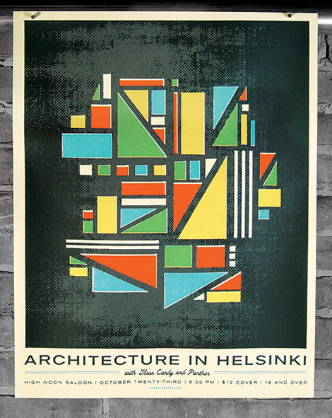
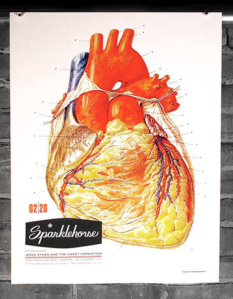
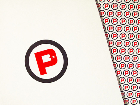
So goes the headline at Curtis Jinkins’s website. Curtis’s website is fairly standard: links to work on the left-hand side, and a lot of white space. What’s unique and nice to see is the repeating logo and background images; they make you look twice at what you’re viewing. It’s a small but subtle touch that adds a bit of dimension to the site.
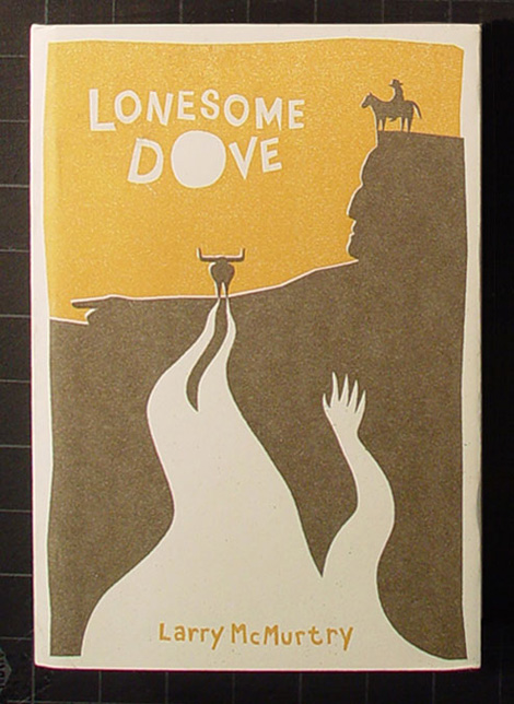
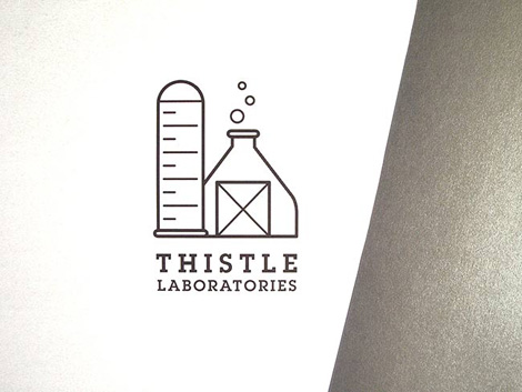
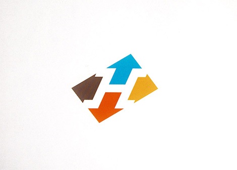
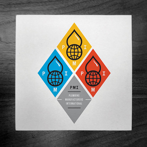
Curtis’s work also reflects a unique perspective. A lot of people make gig-posters. But it’s nice to see the appreciation to composition, layout, typography, and color choices evident in Curtis’s work. I love when a designer can move freely between between various fields, like poster design, illustration and identity work.
(via the mighty draplin)
—–
Also available for your viewing pleasure: Brent Couchman
Enjoy this post? Sign up for our tasty free grain edit RSS feed.
—–
Tagscontemporary, graphic-design, Illustration, posters, USA
