Ryan Rhodes / Bigger than Giants

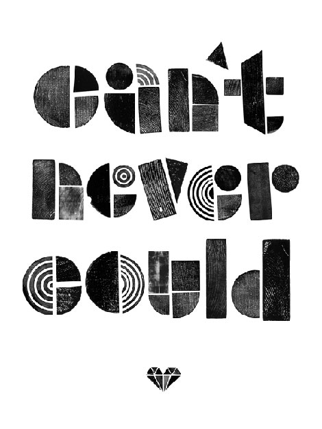
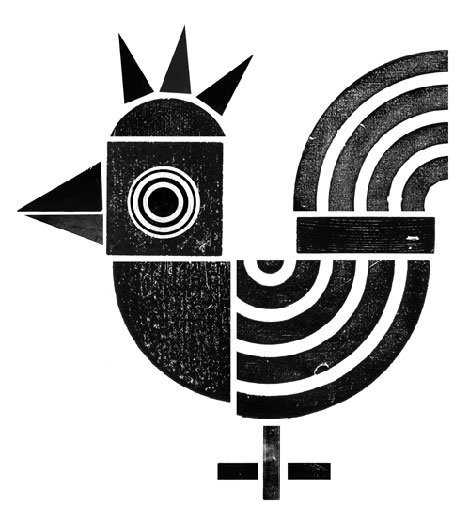
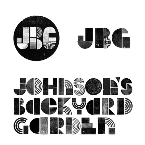
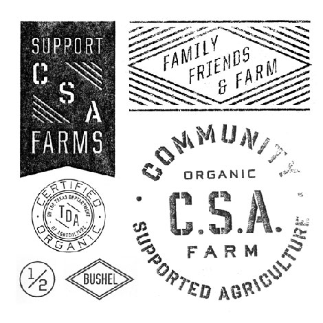
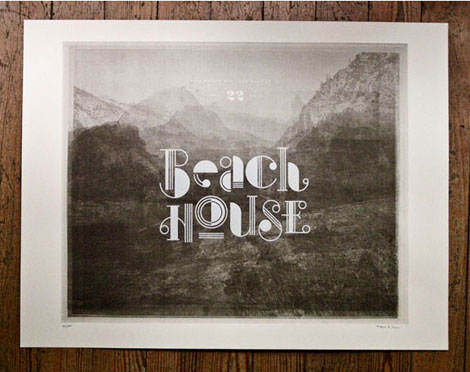
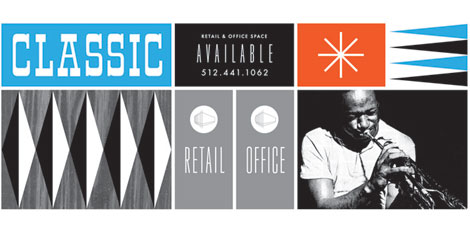
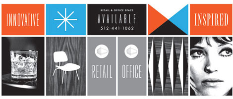
I love the portfolio from Austin-based designer Ryan Rhodes (aka Bigger than Giants). His work represents an interesting range of styles and ideas, and he also possesses some superbly handy typographic skills. (See the inked type work for JBG Farms above and below.)
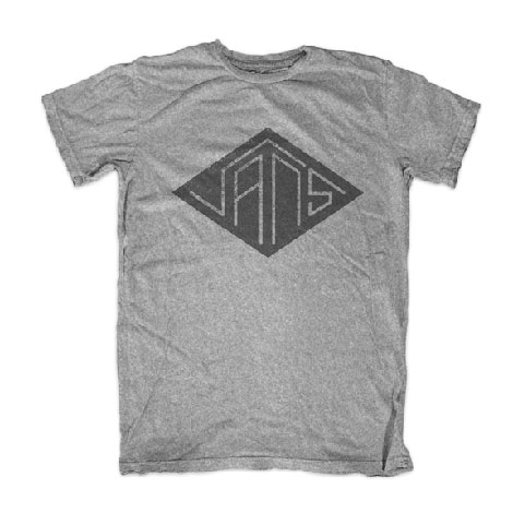
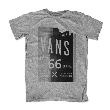
For me, personally, those Vans t-shirts absolutely steal the show. The typographic work within the more minimalist one is especially succinct and wonderful.


Also worth viewing:
Herbert Kapitzki: Graphic Designer and Teacher
Typografische Monatsblätter
Vette Annonce type specimen sheet
Related Books:
In Alphabetical Order: Werkplaats Typografie
Not signed up for the Grain Edit RSS Feed yet? Give it a try. Its free and yummy.
Tagscontemporary, Designers, graphic-design, Illustration, Typography
01.05.11 in Found design by Ethan
Share This Share on Facebook


12 comments
Comments feed for this article
Trackback link
http://grainedit.com/2011/01/05/ryan-rhodes-bigger-than-giants/trackback/
Love the type on “Can’t Never Could”
01.05.11 |
Nick Ramos |
Found design |
Very cool! Amazing typography. But could his portfolio website be any more infuriating to view?
01.05.11 |
Marisa (Good Good) |
Found design |
Hey rhodes, yer famous now dog.
gitter dun.
01.05.11 |
Lonny Hurley |
Found design |
Solid work Ryan!
01.05.11 |
Ty Wilkins |
Found design |
Love the retail office space pieces. Great work!
01.05.11 |
Sean Coleman |
Found design |
Those t-shirts sure are tasty! Where can one purchase such a product? Also, his type work is absolutely perfect. Such an inspiring lot of work, and one Im going to keep an eye on.
01.05.11 |
Ryan |
Found design |
Beautiful use of typography. I really enjoy the letterpress influence into your modern use of typography. I also enjoy the retro feel of the retail office piece. Nicely done!
01.06.11 |
Sko Design Lab |
Found design |
Ryan is so talented and his work shows it. But get this, it’s got nothing on how nice this dude is! Great post, Ethan.
01.08.11 |
Will Bryant |
Found design |
Beautiful!!!
01.10.11 |
Michu Benaim |
Found design |
Thanks for sharing! I love the fonts and the graphics!
01.10.11 |
gabriela |
Found design |
This stuff is nice to look at. The Vans stuff is especially nice and pretty fresh. …I do have a comment however. And this is not meant to be a slight to this designer, because he’s making really nice stuff. But isn’t it amazing how everyone’s work is looking the same? I mean, a lot of this stuff is what Cody Hudson was doing several years ago. And I wonder if someone was doing it before Hudson (feel free to chime in with suggestions in regard to this question)? And if it’s not this particular look that people are aping or simply making, it’s the aesthetic that Aaron Draplin has latched onto (which he does very very well by the way) — which is simply utilitarian design from the 40’s, 50’s and 60’s.
…I dunno, I just feel like not many people are doing new stuff. Myself included. Or maybe we all just have the same aesthetic? And you can’t necessarily prove who did what first. …I’m just starting to think perhaps we’d all be better off to design blind — meaning no connection to the internet, as a start. Thoughts? …Again, props to Ryan for great executions.
-matt
01.11.11 |
Matt Payson |
Found design |
Where can I get one of those Vans shirts. Gnarly.
07.12.11 |
Bret Baker |
Found design |