Search Results

Your search for swiss returned the following results.

Swiss Photobooks: 1927 to Present

swiss photobooks

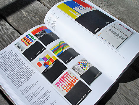
My interest in photography has grown recently and i’ve been on the prowl to find quality books on the subject. One of my latest additions and the one i’m most excited about traces the history of the Swiss Photobook.  Compiled by the Swiss Photographic Foundation (Fotostiftung Schweiz) and published by Lars Mueller, Swiss Photobooks from 1927 to the Present highlights classic and influential titles that exlemplify the era. Weighing in at 7.5 pounds, the massive visual compendium features lush spreads, in-depth summaries, an extensive bibliography and introduces over 60 pieces. A pleasure to look at and an engaging read, this volume is a well-crafted ode to the distinct character of the Swiss Photobook.

Read the rest of this entry »

Swissted

swissted

Swissted is the project of one, Mike Joyce (the NYC-based designer, not The Smiths’ drummer). This project is fantastic — redoing flyers for classic hardcore punk and indie shows in the swiss modernist style. Lots of angular layouts, grids, transparency and scale. And he’s done so many! Take a gander, it’s fun to look through.

Read the rest of this entry »

The Ultimate Swissair Fansite

swissair posters

Patrick Eberhard has amassed an amazing collection of Swissair-related material. His website, Sr692 which is named after the flight number from Zürich to Lisbon, is filled with vintage posters, flyers, logos, stamps, route maps, tickets and books, as well as a detailed history of the airline. This is an absolute goldmine for those interested in Swiss design.

A hat tip to Shelby at Wanken for discovering this amazing resource.

Read the rest of this entry »

Swiss Graphic Design Book Now Available

geigy

Corporate Diversity: Swiss Graphic Design and Advertising by Geigy 1940-1970

A few months ago we featured the book Corporate Diversity: Swiss Graphic Design and Advertising by Geigy 1940-1970 on grain edit. At the time the book was only available in Europe. We’re excited to announce that it is now available for purchase in the U.S. I highly recommend this book. Don’t sleep on this one! Lars Muller and the Museum für Gestaltung Zürich did an excellent job presenting the material.

You can purchase the Book here. Get it before it sells out!

Read the rest of this entry »

Corporate Diversity: Swiss Graphic Design by Geigy 1940-1970

corporate diversity

Corporate Diversity- Swiss Graphic Design and Advertising by Geigy 1940-1970. Published by Lars Muller +Museum fur Gestaltung Zurich – Back cover image of Acaralate canister designed by Markus Low in 1967

The fine folks at Lars Muller have just published an excellent book titled Corporate Diversity: Swiss Graphic Design and Advertising by Geigy. I know alot of designers (myself included) that are extremely excited over the release of this book. It chronicles the work of the design studio J.R Geigy AG which was a launching pad for one of the great periods of Swiss graphic design, in the 1950s and 1960s. It’s amazing to see the quantity and quality of the designers associated with Geigy. Under the leadership of Max Schmid for many years, the studio employed Roland Aeschlimann, Karl Gerstner, Jörg Hamburger, Steff Geissbuhler, Andreas His, Toshihiro Katayama, and Nelly Rudin, among others. Freelance designers such as Michael Engelmann, Gottfried Honegger, Armin Hofmann, Herbert Leupin, Warja Lavater, Numa Rick, and Niklaus Stoecklin were also used. In the 1960s, the Basel office, most especially George Giusti and Fred Troller, was involved in developing the studios of the subsidiaries in the United States and the United Kingdom, placing more emphasis on advertising. This is the first comprehensive presentation of Geigy design, an important Swiss contribution to the international history of design.

Read the rest of this entry »

Poster by Swiss graphic designer Donald Brun

Donald Brun- Swiss graphic designer
Poster for Salon auto geneve – march 14-24 1963

Easily in my top ten favorite posters.

Salon Auto Geneve (Salon International de l’Auto) is an annual auto show held in March in the Swiss city of Geneva. I admire Brun’s decision to represent the event in an a very abstract way. The white circles used as automobile headlamps look like they are derived from a compositional exercise in one of Armin Hofmann’s classes. This would make sense since Donald Brun taught at the Allgemeine Gewerbeschule (Basel School of Design) along side Hofmann.

also worth checking out:
Poster by Swiss designer Hans Neuburg

Hans Neuburg – Swiss poster design

1960s Hans Neuburg - Swiss poster design
Zurcher Kunstler in der Kunsthalle Basel, Switzerland- c1966

Beautiful poster by Swiss graphic designer and author Hans Neuburg.

If you like this, check Publicity and graphic design in the chemical industry  a book by Hans Neuburg.

(via Crabstick’s killer Flickr photostream)

Swiss Air ephemera – design by Kurt Wirth

Swiss Air leaflet - design by Kurt Wirth

Swiss Air leaflet - design by Kurt Wirth
Swiss Air pamphlet – designer: Kurt wirth and Paul Beer c1950s

SwissAir has a rich history with some of Switzerland’s finest designers. Over the last 60 years the Airline has worked with Karl Gerstner, Kurt Wirth, Donald Brun, Fritz Buhler and Siegfried Odermatt just to name a few. The pamphlet above is one of many brilliant pieces to result from this relationship.

It appears to be some sort of promotional piece for the Douglas DC 7 which was produced in 1956. I love how Kurt Wirth laid out the information.

You can see the rest of the pamphlet at Ace Jet 170. Many thanks to Richard for posting this gem.

Be sure to check out our other posts related to SwissAir design.

Swiss modern graphic design – chemical industry

[pictobrowser 10159078@N03 72157603890143837]
Publicity and graphic design in the chemical industry – Hans Neuburg 1967
(Chemie Werbung und Grafik)
Contributions by Josef Muller Brockmann

Clap your hands if you love swiss design.

This has to be one of the best books on graphic design in the chemical industry. Ha! this is probably the only book on graphic design in the chemical industry. Most of the design work in the book is for pharmaceutical companies like J R Geigy and Ciba Aktiengesellschaft, both located in Basel, Switzerland.

The index in the back reads like the who’s who of Swiss design. Designers include: Karl Gerstner, Herbert Leupin, Siegfried Odermatt, Hans Erni, Max Schmid, Fred Troller and Kurt Wirth amongst others.

Just look at the pictures above, the work is incredible. Anyone have any nominations for pharmaceutical/ chemical companies that have great design? Maybe we should put together a top 5 list. For example, the always fun top 5 favorite poisonous gas logos.

Also of interest, this Hans Neuburg poster design.

Modern Swiss luggage label – Hotel Rigi

Swiss Modern luggage label - Hotel Rigi  Brunnen Switzerland
Hotel Rigi – Brunnen, Switzerland

Dynamite vintage label design from the Swiss.

Swiss modern graphic design meets Hotel Astoria Lucerne

Modern Swiss Design - Hotel Astoria Lucerne brochure

Hotel Astoria Lucerne was located in Luzern, Switzerland. As they claim in their promotional material, they were the “most modern Hotel of Central Switzerland”. After looking at this I brochure, I believe them. I’m not sure if the hotel still exists. I was able to find some information on a Hotel Astoria Lucerne designed by Herzog & De Meuron but, I’m not sure if bears any relation. I realize Herzog & De Meuron are modern day architects, but possibly they renovated the existing structure? Anyone have any info on this?

Read the rest of this entry »

Swiss Modern ski resort brochure

[pictobrowser 10159078@N03 72157603481288169]

Grisons is the largest canton (state) in Switzerland. It is home to some of the best ski resorts in the Swiss Alps. The promotional brochure seen above serves as a guide to the ski resorts in the area.

No date listed, but most likely from the early 1950s. Printed by Orell Fussli in Zurich. We posted a map of Zurich produced by Orell Fussli a month ago. If you haven’t seen it yet, it’s worth a look.

Swiss hotels and freshly shaven polar bears

 Swiss geneve hotel luggage label
Luggage label for hotel de l’ours – Geneva, Switzerland c1950s ?

This is exactly how I wanted to be greeted if I ever make it to some fancy Swiss hotel. I want freshly shaven polar bears with bow ties grabbing my luggage!

Robert Roser for Swissair

robert rosers wissair poster.jpg
Direct mail advertisement for Swissair designed by Robert Roser. Most likely from the late 1950s or early 1960s. Hoot!

Büro 146

Buro 146

Büro 146 is an accomplished design studio that collaborates with theaters, schools, and other cultural associations throughout Switzerland. Especially impressive is their work for the Pavillon Le Corbusier, a museum dedicated to the famed Swiss architect. Over the past three years, Büro has crafted promotional materials that beautifully display the institution’s collection. Pulling from the gallery’s iconic multicolored walls, the studio developed a lush tapestry of posters and brochures that highlight the eccentric nature of Le Corbusier’s structures.

Read the rest of this entry »

Raphael Schoen

Raphael Schoen

Raphael Schoen is a Swiss graphic designer and co-founder of Präsens Büro, a studio based in Lucerne. Often designing for creative events and organizations, he’s produced a wide collection of posters that employ abstract collages and bold typography. In his poster for the dance performance, Ritual Warriors, he created an intricate composition that injected warmth and energy into the otherwise black and white photography. The fluid shapes of the photos further enhance the performers’ movements and create the illusion that they are dancing around the type.

Read the rest of this entry »

Erich Brechbühl

Erich Brechbühl

Erich Brechbühl is a Lucerne-based graphic designer passionate about branding and poster design. Combining bold imagery and inventive typography, he crafts dynamic work for museum exhibitions and theaters. I am especially fond of the piece featured above. Inspired by the landscapes of Swiss painter Ernst Hodel, the poster was created for a critical play on Swiss tourism.

Read the rest of this entry »

2016 Holiday Gift Guide: Design & Illustration Books

Grain Edit's 2016 Holiday Gift Guide

Here it is! Our annual Design Book Gift Guide! In this list, we’ve compiled our favorite titles from the past year. We hope this helps you find the perfect gift for your loved ones this holiday season.

Read the rest of this entry »

Neo Neo

Neo Neo

Neo Neo is a Swiss design studio led by Thuy-An Hoang and Xavier Erni. They collaborate with cultural institutions around the world, including Geneva’s Contemporary Art Center and Tokyo’s National Film Center. Not afraid to get a little funky, the studio uses bold and sometimes surprising visuals and mediums within their designs. For Geneva’s La Bâtie Festival, an event in which the city celebrates music and art, the studio employed a long splash of toothpaste as the festival’s key graphic. No matter what they decide to use, their pieces are always chic, fresh, and a testament to the current state of Swiss design.

Read the rest of this entry »

Ludovic Balland

Ludovic Balland

Ludovic Balland is a Swiss designer based in Basel. His studio, Ludovic Balland Typography Cabinet, specializes in editorial layout, typeface design, and photography. The studio has created intricate typographic compositions and clever visual identities for many cultural institutions including Warsaw’s Museum of Modern Art and the Festival Antigel in Geneva. This past March, Switzerland’s Federal Office of Culture (BAK) awarded Balland the Jan Tschichold Award for outstanding achievements in book design.


Read the rest of this entry »

Supero

Supero

Supero is a Swiss design studio that strives to make contemporary, yet timeless, work that slightly bends the rules of Swiss Style. The studio often collaborates with the Contemporary Art Museum of La Chaux-de-Fonds and Neuchatel’s Musée d’Art et d’histoire, designing lively and elegant posters for the museums’ exhibitions and events.


Read the rest of this entry »

2015 Holiday Gift Guide: Design Books

Design book gift guide

Here it is, our annual book gift guide! Below you will find over 30 titles from our favorite publishers. Included are our top picks for illustration, graphic design and typography. Enjoy!


Read the rest of this entry »

Recently Received

Munari's Books via grainedit.com

We’ve received some wonderful titles this week and i’m excited to share them. Included are entries from Nobrow, Laurence King, Princeton Architectural Press, D.A.P, Fshnunlimited and Chronicle Books. See all the books and images after the jump.


Read the rest of this entry »

New Additions to our Holiday Book Gift Guide

Hello I am Erik

If you’re looking for last-minute gift ideas, we’ve got you covered. We received some exciting new titles this week, just in time for the holidays. Included in the list below are titles from Gestalten, Lars Muller, Kat Ran Press and Metropolis Books. These titles along with many others can be seen in the full version of our Holiday Book Gift Guide.


Read the rest of this entry »

2014 Holiday Gift Guide: Books

Design book gift guide

Here it is, our annual book gift guide! Below you will find over 30 titles from our favorite publishers. Included are our top picks for illustration, graphic design and typography. Enjoy!


Read the rest of this entry »

Recently Received

100 Years of Swiss Design on grainedit.com


The mailman has been good to us this week and we’ve received an impressive list of titles. Included are new books from Lars Muller, Princeton Architectural Press, Laurence King, Chronicle Books, Rizzoli, Thames & Hudson and Nobrow. See all the goodies after the jump.


Read the rest of this entry »

Neue Grafik Re-Release

Neue Grafik on grainedit.com

In 1958, the inaugural issue of the Neue Grafik – The International Review of graphic design and related subjects – was launched by four Zürich-based designers. Led by Josef Müller-Brockmann, Richard Paul Lohse, Hans Neuburg and Carlo Vivarelli (LMNV), the journal became a catalyst for an emerging movement in design known as the Swiss School or International Typographic Style. Marked by its asymmetrical layouts, sans-serif typeface and strong use of grids, the International Typographic Style placed heavy emphasis on clarity and precision. Throughout the journal’s history, this rigid yet versatile approach to design was employed and readily adopted by the design community at large.

Original copies of Neue Grafik are scarce and rarely surface on the open market with single issues fetching three hundred dollars or more. With this in mind, I’m excited to announce the re-release by Lars Muller of this significant and sought-after periodical, with all eighteen issues now available as a facsimile reprint. Contained within a stunning red slipcase, the set also includes a 64 page booklet with commentary by Steven Heller, Lars Muller and Richard Hollis.


Read the rest of this entry »

CCRZ

CCRZ on grainedit.com

Beautiful work from CCRZ, a Swiss design studio with a broad range of capabilities.


Read the rest of this entry »

Valentine’s Day for the Design-Minded

House Industries Love Hearts Blocks

House Industries Love Heart Blocks

With Valentine’s Day just around the corner, we’ve compiled a small list of gift ideas for the design-inclined. Included are items from House Industries, Wieden + Kennedy, Braun and more. In addition, you will find some fun items that fit within the sprit of the holiday. See the full list here.


Read the rest of this entry »

Annik Troxler

Annik Troxler via #grainedit

The daughter of the highly influential designer Niklaus Troxler, Annik has created a strong body of work that has a unique voice of its own. Her posters have won many awards including the coveted International Poster Festival in Chaumont, France and the Swiss Federal Competition for Design. This has allowed for some unique opportunities including the chance to collaborate with Mevis & Van Deursen in Amsterdam. In 2011, she returned to her native Switzerland to open an independent studio and began a teaching position at the renowned Basel School of Design.


Read the rest of this entry »

2013 Gift Guide: New & Recent Books

map the world

If you’re looking for holiday gift ideas, here are a few suggestions. We’ve compiled our favorite books from the past year into one giant list. Included are titles focused on editorial design, typography, identity work and brainstorming.

Read the rest of this entry »

Neue Grafik Reprint

Neue Grafik via grainedit.com

I just got word of an exciting announcement from Lars Muller. The complete series of the highly influential Swiss Journal, Neue Grafik, will soon be available as a facsimile reprint!

From the publisher:
“Neue Grafik, the “International Review of graphic design and related subjects,” was initiated by designer Josef Müller-Brockmann and published in eighteen issues between 1958 and 1965 by an editorial collective consisting of him, Richard Paul Lohse, Hans Neuburg und Carlo Vivarelli ( LMNV ). The complete volumes are now available in an excellent facsimile reprint from Lars Müller Publishers.

Read the rest of this entry »

Josef Müller-Brockmann Poster Collection

Josef Muller Brockmann Poster Collection by Lars Muller via grain edit

Josef Müller-Brockmann’s graphics left a lasting mark on Swiss visual communication from the 1950s onward. His posters demonstrate how a sober, formally reduced language works best for conveying a universal, timeless message. Poster campaigns for longtime clients such as the Tonhalle concert hall in Zürich or the Automobile Club of Switzerland follow strict functional criteria–and yet exhibit a variety of design solutions and exciting, dynamic compositions.

This book presents selected posters by Müller-Brockmann and places them in the context of their own time while also examining the validity of his solutions from today’s point of view.

Pre-order a copy via Lars Muller, Amazon or your local bookstore.


Read the rest of this entry »

Gerald Cinamon

Gerald Cinamon

Gerald Cinamon is an American designer who, at an early age, moved to the UK where he would eventually become the chief designer for all paperback typography at Penguin. Heavily influenced by Swiss design, he created book jackets and posters that were bold and iconic – something unique and forward-thinking for book publishing in the 1960s. To honor his contributions to British design, an exhibition has been organized at the Insti­tute of Con­tem­po­rary Art. In addition SEA design has produced a stunning book as well as several prints.

Read the rest of this entry »

House Industries Photo-Lettering App

photo lettering app
photo lettering app
photo lettering app

Has your instagram stream been inundated with Neutraface-laced images the past few days? If you’re wondering why, it’s because House Industries just launched an iPhone app. The new app allows users to create, edit and share photos with select House fonts and Photo-Lettering alphabets. Three fonts – Plinc Swiss, Bubble Gum and House Slant are included with the initial download. Additional fonts, including Neutraface, can be purchased for 99 cents. Download it for free at the iTunes store.

B/W we’re on Instagram now. yeah!

Read the rest of this entry »

Grain Edit Store

grain edit store

To celebrate the launch of our upcoming online store, we will be holding a special preview sale.  If you would like to receive an invite, email us with your details. Please include “grain edit store” in the subject line of the message.

*To access the store you will need a code which will be sent via email prior to the event.

Wee Society

wee society

Introducing Wee Society, a new kids brand created by the folks behind the design firm Office.

The first line of products introduces the Wee Alphas – a quirky crew of 26 illustrated animals with a letter of the alphabet hidden in each one. The Wee Alphas appear in a series of art prints – including a limited edition 13-color screen print and a personalized print that you can customize with your child’s name and a silly (or slightly more serious) statement. See them all here.

Read the rest of this entry »

Typographische Monatsblätter Archive

Typographische Monatsblätter

Louise Paradis, along with the guidance and support from friends and staff at the ECAL/University of Art and Design Lausanne, has launched an amazing website dedicated to the Swiss magazine Typographische Monatsblätter. Focusing on the years 1960-1990, the online archive features covers, typeface identification as well as interviews with many of the magazine’s contributors. Enjoy!

Read the rest of this entry »

Herbert Matter Documentary

visual language of herbert matter

If you missed The Visual Language of Herbert Matter at your local theater you can now pick up a copy of the film at iTunes or Amazon. The 78-minute documentary directed by Reto Caduff traces Herbert’s life and work and includes interviews with design luminaries such as Steven Heller, Jessica Helfand, Robert Frank and Massimo Vignelli.

Read the rest of this entry »

Graphic Design: History in the Writing

graphic design history in the writing

Graphic Design: History in the Writing (1983–2011) comprises some of the most influential published texts about graphic design history. The book documents the development of the relatively young field of graphic design history from 1983 to today, underscoring the aesthetic, theoretical, political and social tensions that have underpinned it from the beginning. Included in the anthology are texts by Ellen Lupton, Robin Kinross, Massimo Vignelli, Steven Heller, Victor Margolin and many others.

Visit occasionalpapers.org for more info and to pick up a copy.

Read the rest of this entry »

Mark Gowing

mark gowing

Mark Gowing is an Australian-based designer. His work encompasses a variety of media, but I find his poster design to be especially compelling. With a Swiss-oriented reference point, Gowing effectively utilizes simple, geometric shapes with engaging results.

Read the rest of this entry »

Burton Kramer Film Trailer

Last year we featured a book about the Canadian, designer, painter and educator Burton Kramer on grain edit. I’m excited to announce that the book’s editor, Greg Durrell, is set to release a full length film on Kramer’s work this spring.

Read the rest of this entry »

Thanks & We’ll Be Back Soon

swiss design
I hope everyone had a safe and joyous New Years. We’re taking a short vacation and will return next week.

Thanks to everyone who took part in our annual Holiday Giveaway Bash! The winners were announced via our twitter stream and facebook page last week.

From the Shop

design books

Jacqueline Casey – Thirty Years of Design at MIT

If you’re looking for some last minute gifts we still have a few items left in the grain edit shop.

*All U.S. based orders received before 11 am on Tuesday Dec. 21, 2011 will ship priority mail.

Read the rest of this entry »

Foundry Collective

Fun work from the Denver/Dallas group Foundry Collective. These guys have a steady hand in Americana-vintage that translates really well to their identity, packaging and typography. I love their use of color, texture and illustration — their work has loads of personality.

Read the rest of this entry »

Saul Bass: A Life in Film & Design

saul bass book

Saul Bass: A Life in Film & Design is the first book to be published on one of the greatest American designers of the 20th century, who was as famous for his work in film as for his corporate identity and graphic work. Saul created some of the most compelling images of American postwar visual culture. Having extended the remit of graphic design to include film titles, he went on to transform the genre. His best-known works include a series of unforgettable posters and title sequences for films such as Alfred Hitchcock’s Vertigo and Otto Preminger’s The Man with the Golden Arm and Anatomy of a Murder. He also created some of the most famous logos and corporate identity campaigns of the century, including those for major companies such as AT&T, Quaker Oats, United Airlines and Minolta.

Read the rest of this entry »

Scott Campbell

scott campbell

Scott Campbell is an illustrator, designer, musician — and by the look of his work, a hands-on, analog, form-making lover. The current crop of work on Scott’s site is terrific. It’s clean, it’s messy, it’s bold, it’s abstract. It’s also very textural and dimensional, which I love. He’s great at using rustic imagery with clean layout and typography.

Read the rest of this entry »

Château Vacant

Château Vacant

Château Vacant is Yannick Calvez, Lémuel Malicoutis and Baptiste Alchourroun, a group of French creatives who have hopped the Atlantic and set up their collective in Montréal, QC. As it states on their website, “We create images and videos thinking with objects and spaces.” Their work is eclectic, cutting edge, and slick, with media ranging from graphics and video to photography, illustration, and installation.

Read the rest of this entry »

Pharma Exhibition

pharma exhibition

The establishment of the pharmaceutical industry, especially in the mid-20th century, played a significant role in the evolution of graphic design and advertising. Herb Lubalin created some of his most influential work while working for Sudler & Hennessey, an advertising agency which specialized in pharmaceutical marketing. PHARMA features a diverse array of original ephemera, rarely seen publicly, by many pioneering graphic designers including Lester Beall, Will Burtin, Paul Rand, Franco Grignani, staff of Geigy and Herb Lubalin, as well as contributions by Carl Fischer and Andy Warhol.

Read the rest of this entry »

Burton Kramer Identities

burton kramer

Burton Kramer Identities is an important and comprehensive book on the work of a leading Canadian designer, educator and painter, who practiced for over 50 years.

Kramer began his design career in the New York office of Will Burtin and went on to work at Geigy under Gottfried Honegger. In 1961, he moved to Zurich, Switzerland, as Chief Designer at the E. Halpern Agency, where he created award-winning work. In 1965, Kramer moved to Toronto to work on graphics and signage for Expo 67. In 1967, he founded Kramer Design Associates, creating identity programs for the Royal Ontario Museum, Ontario Educational Television and in 1974, his well-known logo and identity program for the Canadian Broadcasting Corporation.
Read the rest of this entry »

Recently Received

nobrow

Forming Vol.1 featuring the illustration work of Jesse Moynihan

Fresh from the mailman, here’s the latest titles to hit our shelves.

Read the rest of this entry »

Hans Hartmann: Ein Leben fur die Grafik

hans hartmann

I was excited to receive a package from Hans Harthman’s daughter, Fanny Hartmann last week. Contained within was a copy of Hans Hartmann: Ein Lebenfur die Grafik, a 1991 monograph compiled by Fanny with contributions from Joseph Marti and Fred Zaugg. The book is filled with full-color illustrations and photos from Hans’s prolific career as a designer and artist that spanned over 5 decades. Hans Hartmann’s name is often absent from design history books, so most of the pieces are new to me. I’m surprised by the breadth and depth of is work.  I’ve seen examples of his posters and logos in the past, but I was unaware that he had ventured into sculpture, stained glass windows and exhibition design.

Read the rest of this entry »

Lufthansa + Graphic Design

Joplin posters

The beginning of the 1960s saw one of the most important steps in the development of corporate communication. Lufthansa employed the designer Otl Aicher and his Gruppe E5 student group to develop a visual identity for for the airline. It was substantially realized in 1963 and up until the present day counts as one of the most groundbreaking corporate design solutions of the 20th century. With a focus on the famous brand identity, the design and advertising history of Deutsche Lufthansa from the 1920s to today is comprehensively documented here for the first time. This volume contains numerous illustrations from the corporate archive and background articles and interviews.

Read the rest of this entry »

Bossa Nova And The Rise Of Brazilian Music In The 1960s

bossa nova book

Bossa Nova music arrived in Brazil at the end of the 1950s with an optimism and modernism that paralleled the arrival of the new Brazilian president, Juscelino Kubitschek, who promised ‘fifty years of progress in five’ in his election campaign and announced the building of a new capital city, Brasilia, deep in the heartland of Brazil. The city was designed by Oscar Niemeyer, a man who had just designed a new musical theatre production in Rio of a play written by Vinicius de Moraes and with music written by Antonio Carlos Jobim. These two, along with the singer João Gilberto were about to make Bossa Nova, the first modernist Brazilian art form, the most succesful Brazilian export since coffee.

Bossa Nova And The Rise Of Brazilian Music In The 1960s is a unique collection of the cover art of Brazilian Bossa Nova music, containing hundreds of record covers complete with a history of Bossa Nova, biographies and essays on many of the artists involved in the movement.

Read the rest of this entry »

GVA Studio

grain edit / GVA Studio

The above music cover inspired series is one of many self-initiated projects by the Switzerland based GVA Studio. I really love this series, and I can’t help but think that some jazz record was playing while these prints were in the works. Their simplistic, whimsical nature seems to express the feeling of certain kinds of music so well. Looking at this set of prints also reminds me of a number of classical jazz record covers.

Read the rest of this entry »

Kelli Anderson


In the era of the slick, white, one-dimensional portfolio site, one quickly glazes over after clicking through multiple nearly identical sites. The flip side being that tedious, overly constructed sites become more frustrating and conceptual than actually useful for seeing a designer’s portfolio.

Kelli Anderson has a great site on her hands. It’s unique, fun and easy to use, and it doesn’t get fussy. Her work is exceptional as well. I noticed a nice balance of smart thinking and great hand skills. Kelli has a letterpress in her apartment, so much of her work has a very hands-on, tactile, cared-for feel.

Read the rest of this entry »

Art of the Luggage Label

art of luggage label

Tom Schifanella is Senior VP/Executive Creative Director for Shepherd Agency and a passionate collector of hotel luggage labels. I highly recommend his Flickr stream which is filled with amazing examples of these labels and other travel-related ephemera. Many of the labels from his collection are available for purchase here.
Read the rest of this entry »

Gottschalk + Ash

Fritz Gottschalk

Poster for the Theatre Company at the St. Lawrence Centre

Gottschalk + Ash was founded in Montreal in 1966 by Swiss-born Fritz Gottschalk and Canadian native Stuart Ash. Independently and collaboratively, the two have racked up numerous design awards and honors over the last 40 years, with highlights that include identity work for Ciba and a re-design of the Swiss passport. Their work shown above is a great example of Swiss precision and a playful, more humanized take on design.

Read the rest of this entry »

Lou Dorfsman Exhibition at Kemistry Gallery

lou dorfsman

Kemistry Gallery is celebrating the work of legendary designer Lou Dorfsman, art director for the CBS network.

The exhibition centres on his most notable creation, the 11-metre wide handmade wooden typographic wall that he named Gastrotypographicalassemblage. Created during an era when designers were both artisans and well-trained communicators, the wall is the largest modern typographic artefact in existence, described by Michael Bierut as ‘an irreplaceable piece of design history.’ With custom type created by Herb Lubalin and Tom Carnase, the wall contains almost 1500 individual characters.

Read the rest of this entry »

Crafty 2010 Conference in Singapore

crafty conference

Crafty 2010 will explore the artistry and process behind disciplines from design to art, fashion to film and advertising to specialized print techniques. Held at the Lasalle College of the Arts in Singapore, the project is produced by design think tank Anonymous and curated by art director Felix Ng.

Read the rest of this entry »

Jacques Charette

jacques charette

Booklet cover for Librax Roche Recipe

Jacques Charette attended schools in Ottawa and Brussels (Belgium) as well as the Ecole des Beaux-Arts de Montreal. Before establishing his own firm in 1970, he worked on various materials for Expo 67. He is also responsible for designing the logo for the Society of Graphic Designers of Canada (GDC).

Read the rest of this entry »

Blue Note Album Covers in Motion

I really enjoyed this video tribute to the legacy of Reid Miles. The piece was conceived to promote a series of summer jazz concerts at the Bella Vista Social Pub in Siena, Tuscany. If you are unfamiliar with Reid’s design work for Blue Note, Graphicology offers a side by side comparison of the reimagined covers with the original album art.

(via Swiss Legacy)

Read the rest of this entry »

Vintage Posters by Donald Brun

Posters by Donald Brun, Donald Brun, Swiss design, posters, vintage graphics, 1950s, 1960s

Swiss designer, Donald Brun (1909-1999), has designed an incredible amount of posters, all of which showcase a recognizable style featuring bright punchy colors, varied textures and interesting forms. This poster, created in 1956 for the International Festival of Music in Lucerne, is no exception with it’s array of shapes coming together to form the colorful scroll of a cello.

Read the rest of this entry »

The Visual Language of Herbert Matter

visual language of herbert matter

Really looking forward to the release of The Visual Language of Herbert Matter. It’s due to hit theaters this summer. The film was a finalist in the SXSW title design competition and the poster (designed by Cristiana Couceiro) just won a Merit Award at the 3 x 3 Professional Illustration Show.

Read the rest of this entry »

Robert Sessler

robert sessler

Design work for Hagar -1969

Robert Sessler was born in the Swiss city of Bern in 1914. Robert first began experimenting with design during his late 20s at the Zurich School of Arts where he was trained under the Bauhaus instructor, Johannes Itten. In 1942 he left school to open his own studio and become a member of the Swiss Werkbund. He maintained his studio until 1953 when he was offered a position as the head of the graphic design department at the Saarbrucken School of Art in Germany. He continued to teach at Saarbrucken and later at the University of Saarland until his retirement in 1979.

Read the rest of this entry »

Tom Eckersley

Tom Eckersley, Graphic Design, Illustration, 1960s, 1980s

Pakistani International Airlines poster (1960)

English artist and designer, Tom Eckersley (1914-1997), created numerous posters from the 1940s to the 1980s. Eckersley’s work communicates strong messages by employing bold overlaid colors, simplified forms, and informative text.

This poster, created for Pakistan International Airlines, depicts a dapper looking gentleman in Swiss garb. His playful image is simple, clean, bright and colorful; a stark contrast from the dark turquoise background. The composition is pleasing to the eye; as the figure gazes at the distant aircraft, we too are gazing at his cheerful image. Let’s all go to Geneva!

Read the rest of this entry »

S.britt Interview

S.britt interview illustration

The latest addition to our interview series takes us to the lush green mountainsides of Portland, OR, home to Powell’s Books, incredibly delicious food carts, and one of my favorite illustrators,  S.britt. I originally found his work in 2002, and it piqued my interest in the illustration we feature on Grain Edit today.

Inspired by artists such as Ed Emberley and Richard Scarry, S.britt’s work employs playful images, bright colors, and a sense of humor (aka FUN). In today’s interview, S.britt discusses some of his favorite things about Portland, his education, and reveals his interesting creative process. This is one interview you don’t want to miss!

Read the rest of this entry »

Map of Lucerne, Switzerland

luzern map

The Swiss are known for their well designed watches. Franck Muller, Rolex and Omega are just a few of the manufacturers with established roots in Switzerland. I’m sure more then a couple people visit this country each year just to check out luxury timepieces. Can’t say I fall into that crowd, but I’d be more then willing to go  if someone wants to front the bill! For those that can afford a watch buying trip and happen to have a time machine laying around, this map could prove very useful. The map, which dates back to the late 1940s(?) helped guide tourists visiting the Lucerne area in search of well respected watch merchants.  It includes recommendations from the Swiss Watchmakers Guild, so you know its golden. I think.

I love the teal, and the orange accents, but the pale yellow is a little too much for me. I have a feeling whoever designed this map has a hankering for crusty mustard, word up.

Read the rest of this entry »

Simon Page interview

international year of astronomy

2009 International Year of Astronomy Poster designed by Simon C Page

Simon Page is a self-taught graphic design whiz with a mathematics background. He takes shapes and morphs them into cerebral abstractions. His style shifts around futuristic digital designs and 1960s minimalism, trotting the delicate line between simplicity and detail.  His International Year of Astronomy 2009 poster designs caught the eyes of discerning design writers, including the New York Times and Creative Review. It may be the year for Astronomy but its equally a big year for Page, his posters got a boost in sales from all the acknowledgment he’s been getting in print and on the web.

Read the rest of this entry »

Herbert W. Kapitzki: Graphic Designer and Teacher

herbert kapitzki

Posters for the International Design Center Berlin (IDZ)

Herbert Kapitzki, a former student of Willi Baumeister, conceived and designed exhibitions for the state industrial inspection board (Landesgewerbeamt) in Stuttgart in the 1950s and the early 1960s. He developed a distinct language of forms modelled on constructive forerunners, and campaigned for the popularisation of functional graphic design. His own groundbreaking work was exemplary in this respect.

Read the rest of this entry »

Autografik: Modern Transportation Graphics

autografik

Hell yea. Cool logos on trucks + vans! It doesn’t get much better then this. The Autografik flickr group is set to serve as an archive for modern design applied to motor vehicles. Thanks to Jonathan Turner aka insect54 for setting this bad boy up.

Read the rest of this entry »

You Need the Plate

1972 Munich olympics plate

1972 Munich Olympics Plate : Pictograms designed by Otl Aicher

Now all your favorite 70’s stick figures can hide underneath your food. Spotted this gem on Ebay a few days back.

Read the rest of this entry »

Graphic Design Referenced

graphic design referenced

Graphic Design Referenced by Bryony Gomez-Palacio and Armin Vit

I recently got my hands on a copy of Graphic Design Referenced. This is the latest project from the dynamic  design duo of Bryony Gomez-Palacio and Armin Vit, who also happen to be the brilliant minds behind the UnderConsideration network of sites. As the official press release states, “Graphic Design, Referenced is a visual and informational guide to the most commonly referenced terms, historical moments, landmark projects, and influential practitioners in the field of graphic design. This is a very ambitious project to say the least, but I’m quite impressed with the final result. I’m amazed at the amount of information they were able to cram into this 400 page book.

Read the rest of this entry »

Celestino Piatti + dtv Book: The Unity of the Program

 alt=

Celestino Piatti + dtv: The Unity of the program – Edited by Jens Muller

Two weeks ago we featured the Philips-Twen book from Lars Muller’s new A5 series. Celestino Piatti + dtv is the third title to be released in the series and my favorite of the bunch.

Celestino Piatti was born in the little Swiss village of Dietlikon on January 5,1922. Early on his parents recognized his talent and secured him training at the Kunstgewerbeschule (School of Applied Arts) in Zurich and later a graphic design internship with fellow Swiss designer Fritz Buhler. After four years with Buhler he left to start his own studio and eventually landed the job of a lifetime. In 1961 Deutscher Taschenbuch Verlag (dtv) hired Piatti to design their bookjackets. A comission that lasted up to his death in 2007. For over thirty years, he endowed the books published by dtv with a singular and unique look. He became the most productive book designer of all times, producing covers for over 6300 books that sold in a total print run of over 200 million copies.

Read the rest of this entry »

Ken Leung interview

ken leung

Being a fan of Monocle magazine, I’m excited about our next guest. Ken Leung is a London based freelance designer who helped launch Monocle magazine and until recently served as it’s art director. In today’s interview, Ken shares his love for Textas (marker pens), some of his influences and a few of his favorite books.

Ok, here we go..

Read the rest of this entry »

Lumadessa / Josh Brill: Flora Fauna – Bird Editions

josh brill

Western Tanager 5″x7″ – Designed by Josh Brill

Cool bird prints from Josh Brill. Josh is the man behind Lumadessa, a little art and design label out Portland, Maine. The prints are from his Flora Fauna collection which catalogs the design identities of plants and animals from around the world. The collection also examines the visual character differences and similarities of species. It’s a field guide of discovery, beginning with birds.

Read the rest of this entry »

Philips-Twen Book: Realism is the Score

philips twen book

Philips-Twen: Realism is the Score – Edited by Jens Muller

Just got my hands on a few of the Lars Muller A5 titles and they don’t disappoint. I’ll try to get photos of all three titles up on grain edit within the next week or so. Unfortunately these titles are unavailable in the U.S right now, but should be available soon. Amazon has a release date of October 1st.

Read the rest of this entry »

Lars Muller’s New A5 Book Series

orba squara

Celestino Piatti and dtv: The Unity of the Program – Edited by Jens Muller

I can’t wait to get my hands on these books.

Lars Muller has just launched the A5 series of books. The series is intended as a growing archive on graphic design. Each volume introduces outstanding personalities and important themes from the history of international graphic design, with numerous illustrations, essays and interviews. The series kicks off with books focused on Celestino Piatti, Philips-Twen and Hans Hillmann.

I’m really excited about the Celestino Piatti book. For more than 30 years, he endowed the covers of books published by dtv with a singular look. With more than 6300 covers to his credit, amounting collectively to a total of 200 million volumes, Piatti was one of the most productive designers of all time.

Read the rest of this entry »

Cristiana Couceiro Modern Collage Work

cristiana couceiro

Beautiful collage work from Lisbon based designer Cristiana Couceiro.  As Steve Mehallo puts it, “When one thinks of collage, it’s usually something  . . .  scrapbooky. Not always the case.”

In a recent issue of Moloko, she talked about gathering source material. “On Saturdays I like to go through the flea market collecting memories. Feira da Ladra as we call it here in Lisbon. That means Thief Fair, which is funny collecting other people’s memory to build a new one”. Her source material comes from a variety of modern sources including: record covers, Canadian logos, 1960s paperback books, Latvian magazines, Swiss posters, as well as work from the Bauhaus.

Read the rest of this entry »

Hermann Eidenbenz

mike cina mix

Hermann Eidenbenz – grafa international poster 1936

Beautiful poster from Swiss designer Hermann Eidenbenz. Hermann also designed the Clarendon typeface. Brings back memories of delivering newspapers as a kid.

Typografische Monatsblätter

typografische monatsblätter

TM Nr. 12, 1956, 75. Jahrgang

Typografische Monatsblätter is a Swiss magazine that focuses on typography and photography. Over the years the magazine has played host to an all star cast of contributors including: Herbert Matter, Emil Ruder, Max Caflisch, Wolfgang Weingart, Jan Tschichold, Adrian Frutiger, Jost Hochuli, Walter Cyliax, Helmut Schmidt, Atelier Eidenbenz, Hans Rudolf Lutz and many others. Flickr user Berlintypes has assembled an amazing collection of these magazines from the 1950s -1990s. Enjoy them all here.

Read the rest of this entry »

Erik Nitsche General Dynamics Convair 880 Jet Poster

Erik Nitsche

The Swiss-born modernist graphic designer Erik Nitsche created some amazing posters for General Dynamics including the well known Atoms for Peace series. This poster for the Convair 880 commercial jetliner is one of the harder ones to find. I wish I had an extra $1000 laying around the house because one popped up on ebay last week.

Huge thanks to Ebay seller gbs4783qxq for letting me use this image.

Also worth checking: Erik Nitsche Subway poster & Erik Nitsche General Dynamics Annual Report

50+ Designers on Twitter: Our favorites to follow.

Grain Edit / Designers on Twitter

Alright, so Twitter is the hot thing right now. Somewhere in-between blogging and instant messaging, it’s a super addicting way to see what the design community is up to. Frank Chimero just ate a muffin? It’s crepe day at Chronicle Books? @gogograce just blipped The Style Council? I’m in!

Read the rest of this entry »

Ad for Jupp Ernst Chair by Helmut Lortz

helmut lortz

I want this chair! It was designed by Jupp Ernst and manufactured by Polstermobelfabrik Eugen Schmidt Gmbh during the 1950s. If the chair wasn’t cool enough, Helmut Lortz nailed it on the design of the AD. Someone needs to buy me this chair along with a Robin Day Form Unit Sofa. Please?

Read the rest of this entry »

Jorg Hamburger

jorg Hamburger

Chum mach mit 1962 poster designed by Jorg (jurg) Hamburger / Photograpphy by Hans Peter Muhlemann for Eidg Drucksachen und Materialzentrale – Bern Swirzerland

Beautiful poster by Jorg Hamburger. Swiss minialism at it’s finest. I love the kids climbing in the background and how the poles make for a perfect natural grid.

Read the rest of this entry »

Human Empire

A simple, yet striking album cover designed by Human Empire. The head is constructed out of pure wood, and is reminiscent of the PBS logo from the early 1970s. The three dimensional strands of blocks on the side of the head look like stab wounds oozing with multicolored blood. If only our blood was that interesting!

Read the rest of this entry »

Hotel Deutschland, Leipzig

hotel deutschland

Hotel deutschland, Leipzig, Germany luggage label

Check the bird in the logo. Very similar to the Braniff Airlines logo designed by Alexander Girard.

also worth checking:

Hotel Rigi Luggage label

1960s Zurich Booklet Designed by Franz Fassler

Zurich Switerland Map

Zurich Excursions 1963-Printed by Orell Fussli in Switzerland

The Swiss do it again! Top notch layout by Franz Fassler. Fassler also designed the cover of anwendungstechnik moderner anstrichstoffe seen in our post on modern Swiss book design. This booklet contains information on escorted and non escorted tours around Zurich.

Read the rest of this entry »

For the Love of Grid Systems

The grid systems resource

Sweet Mother! Six columns of grid goodness! Antonio from Aisle One just emailed me with his latest project The Grid System. The site features links to articles, tools, books as well as templates and other goodies. It’s basically an ever-growing resource site on the topic of grid systems and anything associated to it. Tap it and pass it!

(image via the grid loving Swiss Legacy)

Jean Widmer Posters for Centre de Creation Industrielle

jean-widmer-posters-2

Posters for Centre de Creation Industrielle 1969-1972

Beautiful work form the highly underrated French designer Jean Widmer. These posters were created for the Centre de Creation Industrielle. Jean designed the logo as well as all the exhibition posters for the Centre until 1975. He’s mentioned in interviews that his work was influenced by some of the Swiss modernists including Josef Muller Brockmann and Max Bill.  You can easily see that influence in this poster series.

Read the rest of this entry »

We Have our Winners in the Grain Edit Shindig Giveaway!

Thank you everyone for taking part in our giveaway! We had over 1,400 people enter. It was great to see all your comments and look forward to another year.

We randomly selected our 4 winners in the Grain Edit 1 Year Anniversary Giveaway Shindig thing this morning. The winners will be listed at the bottom of the Grain Edit Email Update and Grain Edit RSS Feed. For those of you who subscribe to the email updates, the email will arrive sometime between now and tomorrow morning.

Many Thanks to all the wonderful designers and stores that sponsored today’s giveaway. Without them this wouldn’t of been possible. Please visit their websites and support their work.

——————————————————

Adrian Johnson

Antonio Carusone/AisleOne

BEAUTIFUL/DECAY

Burlesque of North America

Draplin Design Co.

Field Notes Brand

Frank Chimero

House Industries

Scott Hansen/Iso50

Invisible Creature

Jason Munn/The Small Stakes

Julia Rothman

Justin Fines

Lab Partners

Lorena Siminovich/ Petit Collage

Matte Stephens

The Heads of State

Wayne Pate/GoodShapeDesign

Xavier Encinas of Swiss Legacy/ Peter&Wendy

You Work For Them

——————————————————

Stay tuned for our next giveaway, coming soon!

Grain Edit’s 1 Year Anniversary Giveaway Shindig Thing!

grain edit anniversary giveaway

We’re proud to announce the Grain Edit 1 year Anniversary Giveaway Shindig Thing!

We’ve had a great year and we want to thank everyone for making the site what it is today. To celebrate, we’re offering up a bunch of goodies from our favorite designers and illustrators.

Sounds great, but how do I enter to win?

Read the rest of this entry »

Grain Edit: The Year in Review

grain-edit-one-year

Tomorrow we will be celebrating the 1 year anniversary of Grain Edit and we’ve got a big giveaway planned, so be sure to stop by! We’ve had a great year and want to thank all our awesome readers for their wonderful comments and for making Grain Edit a frequent destination.

I’d especially like to thank all of the designers and illustrators that took time out of their busy schedules to share with us.

Some of the highlights of the past year include:

Matte Stephens showed us his awesome home.  Don Clark of Invisible Creature schooled us on his “family portrait”.  Scott Thares of Wink broke out the KISS drawings. Bo Lundberg took us behind the scenes of Barefoot in the Park and Jason Munn of the Small Stakes showed us his Horse Chest.

Ben Butcher of Pixar gave us a sneak a peek into the making of the Wall-E picture book Lots of Bots. Sean and Nicole Flores shared their insane book collection.  Ian Follett showed us some amazing stampsSmall studio, Odopod and Chronicle Books all graciously opened up their spaces for us and Mike Davis of Burlesque served us up a tight mix.

We created some new groups:

Grain Edit Facebook group

Paul Rand Flickr Group

Modern Sticker, Stamp and label club

Some of the most popular posts (besides the interviews and studio visits) of the past year include:

hans_hartmann_posters

Swiss Designer Hans Hartmann

publicity and graphic design in the chemical industry - hans neuburg

Publicity and graphic design in the chemical industry – Hans Neuburg 1967

charles-harper-book-915

Giant Golden Book of Biology – An Introduction to the Science of Life c1961

Saul_bass-henri_paris-5

Henri’s Walk to Paris- c1962- illustrations and design Saul Bass

alian_gree-kids-book-8

Alain Gree – l’electricitie c1969

israel-stamps-modern

Israeli Environment stamps designed by Eliezer Weishoff in 1975

jauna-gaita-magazine-470W

53 Years of Jauna Gaita Magazine

icographic-magazine-910

Issues of Icographic magazine 1971-1978 produced by ICOGRADA

syd-mead-illustration-6

Concepts – Promotional book for US Steel c1961

giovanni-pintori-book-5

Giovanni Pintori exhibition catalog c2003

Dutch type specimen sheet

Vette Annonce type specimen sheet late – Netherlands 1950s/ early 60s

Lastly we’d like send thank you’s to: Coudal, Design Related and Julia Rothman for allowing us to contribute to each of their sites. How magazine for naming us one of the top 10 Sites for Designers for the month of December. David Airey for including us in the Top 50 Graphic Design Blogs and for all the great sites that featured us in their posts.

We have some exciting things planned for the next few weeks and months, so stay tuned. Thanks again everyone!

If you haven’t already, consider subscribing to the Grain Edit RSS. and join us tomorrow for our 1 year anniversary giveaway!

Peter Hofstatter: Psychologie

peter hofstatter psychologie book

This book cover has all I need, big letters and dagger shaped fishies.

Also worth checking:

450+ examples of German and Swiss Modern Book Design

SLEEPY TIME! Do Not Disturb Hotel Door Hangers

do ot disturb hangers

Athens Hotel door hanger + El Al Airlines hanger for sleepy time

Woah, Michael Lebowitz just posted an awesome collection of hotel door hangers.

Read the rest of this entry »

Karl Gerstner and Markus Kutter – die neue Graphik

karl gerstner die neue graphik book

Karl Gerstner and Markus Kutter – the new graphic art – c1959 published by Arthur Niggli Ltd.

Classic book that surveys modern graphic design from its origins up till the late 1950s. Filled with advertisements, posters, packages, lettering, logos and displays. Lots of Swiss design to drool over.  I just wish there were more color images.

I love the clean type and the 3 column grid on the cover. The modern day remake of the cover would be exactly the same except someone would replace the header “die neue graphik” with “this is a design book”. Ha

Includes work from: Hans Neuburg, Joseph Muller Brockmann, Richard Paul Lohse, Ladislav Sutnar and many others.

Read the rest of this entry »

Joseph Muller Brockmann – album cover design

joseph muller brockmann album cover design

Andre-Francois Marescotti / Armin Schibler album cover – Designed by Joseph Muller Brockmann

I’m off to a late start today, I was up late last night making a few changes to the far right column. In addition, I’ve added a page dedicated to our Modern Sticker + Stamp club and Paul Rand group. Give it spin!

I hope everyone had a great weekend. Has anyone been to the Birth of Cool : California at Midcentury exhibition yet? I’m dying to go but, I haven’t had a chance yet. I’d love to hear your thoughts on the exhibit.

Up above. Beautiful example of Swiss graphic design via Alki1.

Grotesque poster

akzidenz grotesk swiss poster

peter & wendy just released this classy piece of posterage entitled “Grotesque”. It’s a double-sided 170 gr/m² Offset paper poster printed in black and PMS 871U. Get your hands on it while you can. It’s a limited edition run of 100.

Modern design and the stamp – Iain Follett’s stamp collection

Iain follett stamps design collection

After discovering Iain Follett’s stamp collection was featured in Creative Review’s January 2008 issue of Monograph, I decided to contact him and see if he would be interested in sharing some of his favorite stamps on grain edit. He agreed and has graciously provided us with some choice stamps and his comments.

Continuing with our designer’s bookshelf series, grain edit is proud to present Iain Follett.

Read the rest of this entry »

Vintage luggage label from Norway

Vintage luggage label from Norway

Label from Bardola Hoyfjellshotel in Geilo, Norway – c1960s?

I think I’m obsessed with modern Scandinavian design from the 1950s- 1960s. First it was furniture and kids books, then Ceramics and now luggage labels! Where does it end? What’s in that Nordic water?

also worth checking:
Swiss Modern luggage label
Modern luggage label from Portugal

Mid Century Modern airline ephemera

Mid Century Modern ephemera sabena luggage label
Sabena label from the late 1950s/ early 1960s

Wow, amazing luggage label from Belgian airlines Sabena. This label is promoting travel to Africa. Look at those colors! I love how the illustrator portrays the faceted shades of the girl’s face in bold “Fauvist” hues.

This is part of Art of the Luggage label’s amazing collection of luggage labels on flickr. Please check them out. They were nice enough to add the label to grain edit’s mid century modern sticker, label and stamp club as well.

Be sure to check these luggage labels we’ve posted in the past.
Modern Swiss label
Portuguese modern label

30 years of Jacqueline S Casey Posters

[pictobrowser 10159078@N03 72157604241328833]
From the book – Jacqueline S Casey Thirty years of design at MIT

Beautiful work from graphic designer Jacqueline Casey. It mentions in the book she was inspired by Karl Gerstner, Kurt Wirth and Anton Stankowski.

“In the early 1950s, John Matill, a writer and editor, founded the MIT office of publications. He was joined in 1952 by Muriel Cooper. Cooper was among the first designers ever hired by a university to represent it graphically. She and Matill hired Jacqueline Casey to design summer session materials in 1955.” Casey continued to work for MIT until her retirement in 1989. (Taken from the introduction of the book.)

Spanish modern graphic design

spanish mid century modern graphic design

Flickr user ex.novo has posted some amazing examples of spanish modern design in advertising from the 1950s, 60s and 70s. The ads are taken from magazines/ journals titled “Clínica Rural” and “Glosa”. Anyone know anything about these journals? Most of the advertisements seem to be related to pharmaceutical products so it’s a great follow up to my previous post on Swiss modern design in the chemical industry.

Big ups to Mike from Burlesque for dropping this gem on me.

Mid Century modern stamp and label group

bulgarian_stamps-design.jpg

Grain Edit is proud to introduce the Mid Century Modern Sticker, Label and Stamp club.

This group features Stickers, Labels and Stamps from the mid 1950s to the mid 1970s.

This would include: vintage matchbox labels, buvards / blotters, luggage Labels, airline labels and stickers, first day covers and stamps.

We are particularly interested in Eastern European match box labels ( czech republic, hungary, yugoslavia, russia etc.) Airline labels + stickers from Swiss Air, Boac, Braniff, Air France, Air India, SAS, CSA , Sabena and Varig and French Buvards ( especially ones by Herve Morvan, Raymond Savignac and Lefor Openo).

Special thanks go out to David McFarline for submitting the stamps shown above.

Deberny & Peignot type specimens

[pictobrowser 10159078@N03 72157603653386438]

Deberny & Peignot – Types from Paris c1960s?

Deberny and Peignot Type specimen booklet imported and distrubuted by Amsterdam Continental.

Includes:
Peignot – created by A.M. Cassandre and Charles Peignot, issued in 1937 for the Paris International Exhibition.

Meridien – Introduced in Europe in 1958-1959, created by Swiss type designer Adrian Frutiger.

Cristal – Designed by Remy Peignot, issued in Europe in 1957.

Jacno – Issued in Europe in 1952, designed by Marcel Jacno.

Ondine – By Adrian Frutiger, issued in 1957.