September 2008

You are currently browsing the monthly archive for September 2008.

Grain Edit’s 1 Year Anniversary Giveaway Shindig Thing!

grain edit anniversary giveaway

We’re proud to announce the Grain Edit 1 year Anniversary Giveaway Shindig Thing!

We’ve had a great year and we want to thank everyone for making the site what it is today. To celebrate, we’re offering up a bunch of goodies from our favorite designers and illustrators.

Sounds great, but how do I enter to win?

Read the rest of this entry »

Grain Edit: The Year in Review

grain-edit-one-year

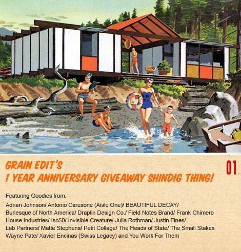
Tomorrow we will be celebrating the 1 year anniversary of Grain Edit and we’ve got a big giveaway planned, so be sure to stop by! We’ve had a great year and want to thank all our awesome readers for their wonderful comments and for making Grain Edit a frequent destination.

I’d especially like to thank all of the designers and illustrators that took time out of their busy schedules to share with us.

Some of the highlights of the past year include:

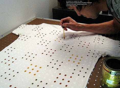
Matte Stephens showed us his awesome home.  Don Clark of Invisible Creature schooled us on his “family portrait”.  Scott Thares of Wink broke out the KISS drawings. Bo Lundberg took us behind the scenes of Barefoot in the Park and Jason Munn of the Small Stakes showed us his Horse Chest.

Ben Butcher of Pixar gave us a sneak a peek into the making of the Wall-E picture book Lots of Bots. Sean and Nicole Flores shared their insane book collection.  Ian Follett showed us some amazing stampsSmall studio, Odopod and Chronicle Books all graciously opened up their spaces for us and Mike Davis of Burlesque served us up a tight mix.

We created some new groups:

Grain Edit Facebook group

Paul Rand Flickr Group

Modern Sticker, Stamp and label club

Some of the most popular posts (besides the interviews and studio visits) of the past year include:

hans_hartmann_posters

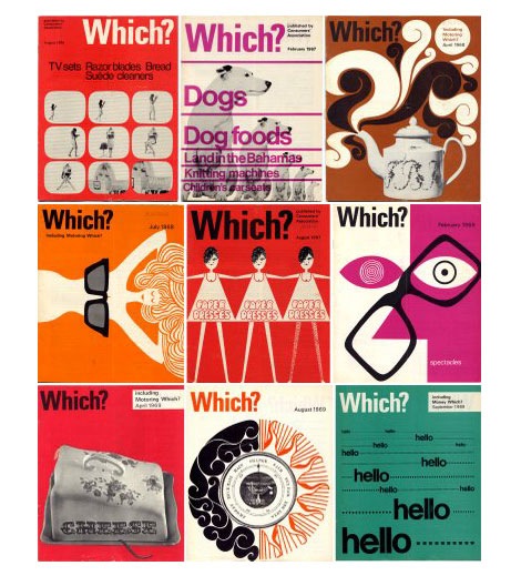
Swiss Designer Hans Hartmann

publicity and graphic design in the chemical industry - hans neuburg

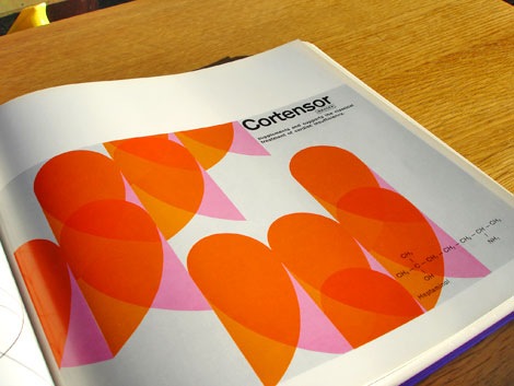
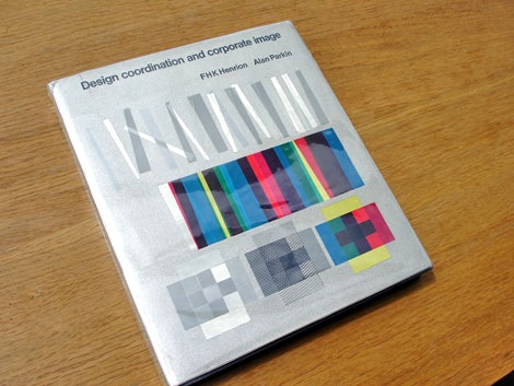
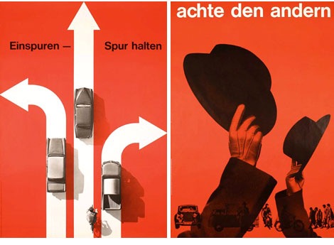
Publicity and graphic design in the chemical industry – Hans Neuburg 1967

charles-harper-book-915

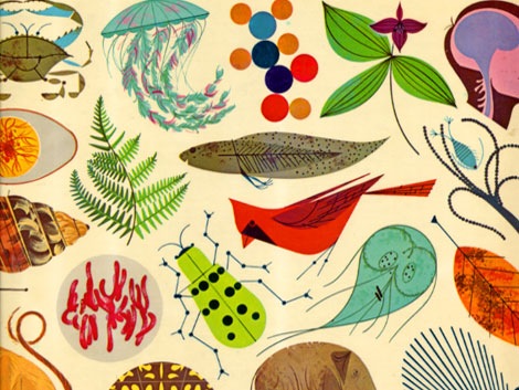
Giant Golden Book of Biology – An Introduction to the Science of Life c1961

Saul_bass-henri_paris-5

Henri’s Walk to Paris- c1962- illustrations and design Saul Bass

alian_gree-kids-book-8

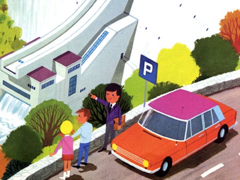
Alain Gree – l’electricitie c1969

israel-stamps-modern

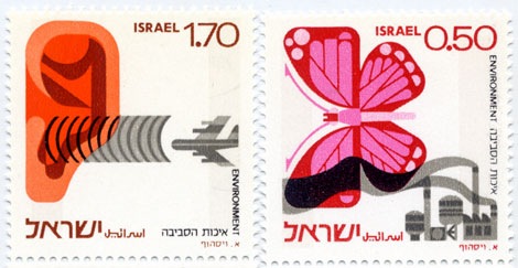
Israeli Environment stamps designed by Eliezer Weishoff in 1975

jauna-gaita-magazine-470W

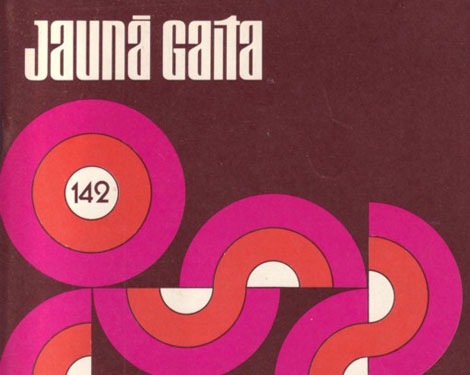
53 Years of Jauna Gaita Magazine

icographic-magazine-910

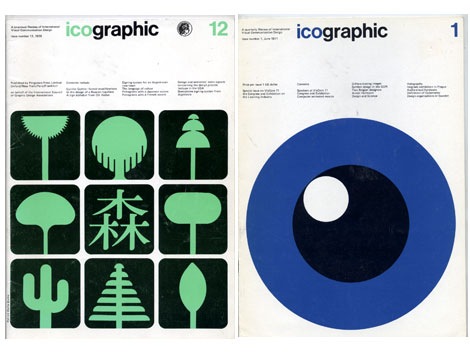
Issues of Icographic magazine 1971-1978 produced by ICOGRADA

syd-mead-illustration-6

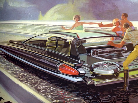
Concepts – Promotional book for US Steel c1961

giovanni-pintori-book-5

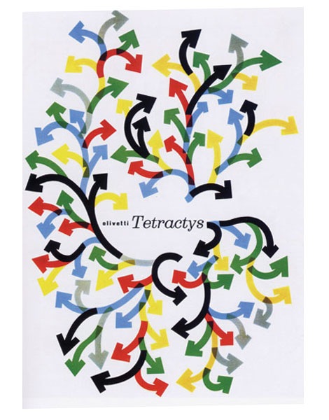
Giovanni Pintori exhibition catalog c2003

Dutch type specimen sheet

Vette Annonce type specimen sheet late – Netherlands 1950s/ early 60s

Lastly we’d like send thank you’s to: Coudal, Design Related and Julia Rothman for allowing us to contribute to each of their sites. How magazine for naming us one of the top 10 Sites for Designers for the month of December. David Airey for including us in the Top 50 Graphic Design Blogs and for all the great sites that featured us in their posts.

We have some exciting things planned for the next few weeks and months, so stay tuned. Thanks again everyone!

If you haven’t already, consider subscribing to the Grain Edit RSS. and join us tomorrow for our 1 year anniversary giveaway!

Harry Sierman: Design, Posters and Books

harry-sierman-biblio-poster

de openbare bibliotheek poster, amsterdam 1968

This is absolutely one of my favorite posters of all time. Design by Harry Sierman.

Harry studied at the Amsterdam Institute for Arts Education and later the Gerrit Rietveld Academy. After graduation he got a job with the Dutch publishing house: Querido  He worked there for many years and became well known for his book design skills.

Back in January I had the chance to trade a few emails with Harry’s daughter in law. She was nice enough to send me a copy of a small book that focuses on Harry’s graphic design and typography work from the 1940s till 2003. I’ve attached a few scans from the book below.

Read the rest of this entry »

Everything is OK

Everything is OK

San Francisco design champ Christopher Simmons wants you to get involved. Christopher is a former AIGA SF president and the owner/operator of Mine, an SF design studio. Everything is OK is a social experiment, equal parts activism, commentary, and a call to action to fight complacency. So get off your butt already!

EIOK is a nominee at the People’s Design Awards! Vote, vote, vote.

Read the rest of this entry »

Grady McFerrin is Movin!

grady mcferrin illustration and art

Grady McFerrin moving announcement circa 2001

This one goes out to all the Grady Mcferrin fans up in this piece!

With the recent release of Grady’s line of products on Chronicle books, I dug up this golden corn from my nugget bank. This moving announcement dates back to 2001 and marks his transition to San Francisco (I think he lives in Brooklyn now). It’s hard to believe, but I found this at a yard sale a few years ago.  I have no idea how many he printed, but my guess is that it’s pretty limited.

The announcement looks like it was silkscreened. The dimensions are 7.25″ x 5″. To the Gocco experts out there: are those dimensions achievable with the large Gocco model?

Holla if you love Grady, Holla if you love Gocco, Holla if just love hollaring!

**Note – I erased the address and phone number, so all you McFerrin stalkers couldn’t go to the SF address looking for his old clothes and used pencil shavings.

Delicious Design League: Posters, Design and Illustration

delicious-design-league

Pinback poster

Lots of good stuff going on in the land of Belgian waffle cookie trees. Delicious is serving up this beauty along with some other tasty treats in their shop.

(Via the always yummy Pica + Pixel)

Richard Alan Roberts: Graphic Design & More

richard-alan-roberts-poster

Yummy geometric type served upon gelatinous globs of red and blue. I’ll take it. Get some here.

Matchboxes designed by Jose Maria Cruz Novillo + Olmos

fosforos-del-pirineo cruz novillo + olmos

Fosforos Del Pirineo – Abcdario Animal (Animal Alphabet) Spain 1970s?

I found these recently. Super cool matchbox covers designed by Cruz Novillo + Olmos. The matchboxes feature an illustration of an animal for each letter of the alphabet. Hard to pick a favorite, but I think I have to go with the yellow oso (bear) loco. I think he cloned himself, because I notice I have two of the letter “O”.

Animal roll call. What’s your favorite matchbook cover from the set?

Read the rest of this entry »

Maraid

czech matchbox labels

This is turning out to be Maraid day. She has an amazing collection of photography and ephemera, plus she always posts beautiful labels to our Mid Century Modern Sticker, Label and Stamp Club.

Get lost in her collection.

Read the rest of this entry »

Vintage numbers

vintage numbers

Race numbers from various UK based races

I love thick fat slabs of juicy numberage and Maraid is serving it up big time. Come get some of these vintage fatties here.

Read the rest of this entry »

Geoff Wagner

Geoff Wagner

While sifting through Geoff’s site today, it was very hard to find that one thing to show, because it’s all so good. Lots of fun stuff, with lots of personality. I totally love that medicine cabinet print. By day Geoff works for Chronicle Books; by night I don’t know what he does. Sleep, maybe? Anyhow, he is a master at taking various ideas and making them look terrific.

Read the rest of this entry »

Aaron Draplin: Design Work and Motel Signs

aaron-draplin-1

Aaron Draplin runs a tight ship. Not only is he an amazing designer, he puts together one hell of a blog. I look forward to checking his site every morning. The guy is a knowledge farm for all things vintage and he always digs up incredible stuff on his notorious road trips.

Lots of great stuff to see on his site, but start by checking out some of his design work.

Read the rest of this entry »

Odopod Design Studio Visit

odopod design studio visit

Thanks to Tim Barber and the rest of the gang at Odopod for inviting me  to their studio last Friday. They regularly meet to discuss design and Tim asked if I would like to join them and bring in some of the things that inspire me.

While I was there I was able to take a few photos of the studio. It’s a beautiful space filled with exposed brick, concrete floors and Eames Chairs. When I walked in the main entrance on the first floor, the first thing I noticed was an Odopod sign that looked like it was ripped straight off a Motel 6. It was hot in San Francisco on Friday so, I was lucky that Odopod came with AC, Free WIFI and HBO (I gotta get one of these signs). The rest of the first floor includes meeting rooms and the company parking lot (What is a design studio without atleast one vintage fixie?). The second floor houses the designers, the book collection and a big letter “O”.

Read the rest of this entry »

Peter Hofstatter: Psychologie

peter hofstatter psychologie book

This book cover has all I need, big letters and dagger shaped fishies.

Also worth checking:

450+ examples of German and Swiss Modern Book Design

British Railways Memorabilia

british railways memorabilia

British Railways Services and Fares booklets for the Riviera (L) Sept 1962 (R) May 1959

Tony Hillman has put together an amazing collection of British Railways publicity material. His site features posters, menus, booklets, brochures, tickets, timetables and commercials. Put some time aside because there is plenty of good stuff too look at here.

(Huge round of thanks goes to Tika Viker-Bloss for sending this my way)

Read the rest of this entry »

Sandra Juto

Sandra Juto

Gothenburg, Sweden’s own Sandra Juto has a great collection of work up on her site. Her work is a mix of illustration, collage, crochet, and design. I love her illustration style; simplistic with nice details, and some cool type!

She also has a shop, a blog, and a flickr. Her “At home” flickr set it pretty fun.

Chronicle Books Office Tour

[pictobrowser 10159078@N03 72157607101366492]

Thanks to Geoff Wagner and the rest of the crew at Chronicle Books for  for taking the time to show me around the Office.  It’s a beautiful space with lots of nice architectural details including exposed bricks, beams and piping. Large globe fixtures dot the ceilings and remind me of the original Lightolier ball lights that are often found in the Eichler homes of the Bay Area. The entrance to the building hosts a bookshop open to the public. Towards the front of the shop, new books are showcased on top of rustic planks of wood recycled from one of the building’s previous tenants. The top floor features an employee lounge with floor to ceiling window walls and nice views of the Soma district.

Read the rest of this entry »

Dirty Laundry: Art of the Stain in Modern T-Shirt Design

dirty-laundry-show

Going to be in Hawaii sometime this month? The Nuuanu Gallery in Honolulu is hosting an exhibition called Dirty Laundry: The Art of the Stain in Modern T-Shirt Design. The basic concept is that they asked designers to stain t-shirts with a medium of their choice (grass, wine, lipstick, etc.) and then design custom artwork that uses the stain as an integral design element. Lots of cool artists and designers are participating including Mike Perry, Damien Correll, Frank Chimero, Kris Chau, Wyeth Hansen and Tim Gough.

You can check out the full roster and get details about the show at the Dirty Laundry website.

1960s – 1980s Which? Magazine Covers

which-magazine-covers

Which? magazine offers reviews and advice for various products and services. It looks like it’s a British version of Consumer Reports magazine. In addition, to the cool cover each issue features interesting information graphics and illustrations. Some of the illustrations remind me of the work of Bill Sokol. Anyone know who the art director for the magazine was?

You can check out some of the issues over at the always yummy Delicious Industries.

We have a winner!

Be sure to check the grain edit RSS Feed/ Email update today.  We have announced the winner in the Raymond Savignac Poster Giveaway!

Thanks to everyone who participated! We will be announcing a new giveaway soon.

Design Coordination and Corporate Image – FHK Henrion

design coordination corporate image FHK henrion

Design Coordination and corporate image – FHK Henrion + Alan Parkin c1967

This is an excellent book on the subject of corporate identity. All the big design guns are in here. The best part, for each case study the designer explains the problems he encountered and his thoughts behind the design etc.

Read the rest of this entry »