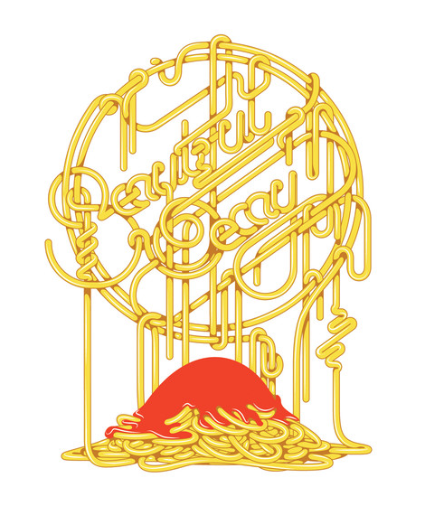
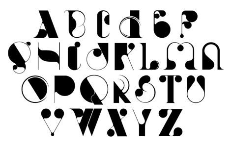
Articles by Liz Meyer

You are currently browsing Liz Meyer’s articles.

Gratuitous Type / No. 2

I was sent this really cool book—or “pamphlet”, as they call it—called Gratuitous Type / No. 2. A self proclaimed “pamphlet of typographic smut”, this small anthology of current interesting typography, lettering and fonts really runs the gamut of interesting new styles. With an advanced design and extremely impressive printing, the publisher/designer and editor (Elana Schlenker) has done a wonderful job putting everything together.

Read the rest of this entry »

Share This

James Edmondson

james edmondson

Amazingly talented letterer, James Edmondson has a portfolio to get completely jealous over. With a keen eye for beautiful forms, he creates type that is reminiscent of the old masters. He keeps his collection of typography modern by adding some interesting and original decorative elements in places like swashes and terminals. With such an exciting portfolio, I’m really interested to see what he does when he graduates from college—I see a very successful typographic career ahead!

Read the rest of this entry »

Share This

Robert Hunter

robert hunter

Robert Hunter is an extremely talented young illustrator based in the UK. His work centers around an untraditional notion of color and negative space, thus creating a style & feeling all his own. His creations tell such intricate and beautiful stories, all without having any text to lead the viewer towards any conclusions. Robert just completed a limited edition comic and artwork for the band Young Colossus, which turned out beautifully.

Read the rest of this entry »

Share This

Oscar Bolton Green

oscar bolton green

The portfolio of Oscar Bolton Green is sort of a wonderland of strange and dreamy imagery. I love the simple forms that he works with, but how he manages to create complex scenes and stories out of beautiful bright shapes. He also experiments with lettering, that fits his style of illustration perfectly—slightly amorphous and experimental. If you find yourself loving Oscar’s work as much as I do, he has a book that has just come out, Bird Beak Book, as well as a shop so that you can buy some of his lovely goods.

Read the rest of this entry »

Share This

Highway by Dan Cassaro

As users of an ever-changing internet, it’s amazing to see large project come together by someone that we’ve been following for years. In this case, I was lucky enough to get a sneak preview of a really great new typeface by Dan Cassaro, called Highway. Easily manipulated to create the look of lettering, but tight enough to use as ready-to-go typography, Highway fills the gap of versatility that many will find just perfect for their next project.

To get a bit more insight into the process and how the idea began to come together, I asked Dan a couple of questions.

Read the rest of this entry »

Share This

Alicia typeface by Alexander Wright

alicia font

The Alicia font is a cool new experimental typeface by Alexander Wright. This face is a good example of taking the ideas and eccentricities of lettering and creating a functional product out of them. If you enjoy this font, HypeForType, the foundry behind the project, also has many other great lettering-inspired display faces to explore within their expanding database of typefaces.

Read the rest of this entry »

Share This

Marta Cerdà Alimbau

Typographer extraordinaire Marta Cerdà Alimbau brings new meaning to the idea of decorating type. With her modern and elegant letterforms, she creates compositions that put her at the top of her game. I love her penchant for creating 3 dimensional forms with letters that allow the work to extend past their natural 2D state. Marta also often collaborates with another extraordinary typographer and friend of Grain Edit, Alex Trochut. With an amazing roster of clients, this young and talented designer is sure to be one to watch going into 2012.

Read the rest of this entry »

Share This

Rifle Paper Co.

I love the work coming from Rifle Paper Co., the small studio of husband & wife team, Anna & Nathan Bond. Sweet and charming, they make work that speaks well to the sentimentality of their illustration style, and embodies the idea of nuanced design.

Read the rest of this entry »

Share This

Damien Correll

Illustration superstar, Damien Correll, has been building up quite a portfolio of work in the past few years. Between his solo career as a freelance illustrator and designer, and his joint design-firm venture with Garrett Morin, Part & Parcel, Damien has taken the editorial and advertising world by storm. His most recent project is an art show at Raised By Wolves in Greenpoint, NY, where he features his newest hand-printed works.

Read the rest of this entry »

Share This

Danielle Davis

Danielle Davis

I recently stumbled upon the charming work of Danielle Davis. Her lettering work pulls from both traditional typography and entirely modern calligraphic styles and she always puts a unique spin on each project. I especially love the small personal illustration touches on each of her projects. Keep up to date with Danielle’s work on her blog and be on the look out for her note card line, Local No. 633, hopefully coming out soon!

Read the rest of this entry »

Share This

McBess

mcbess

The work of McBess has been a source of illustrated inspiration for many new artists over the course of his half-decade-long career. A signature part of style that sets him apart with his natural ability to bring out shadows and highlights predominantly using thin tipped felt pens, a very big feat when working monochromatically. I love the use of lettering to give his illustrations more context, and the flowing, style gives another layer to already unique and intricate pieces.

Read the rest of this entry »

Share This

Communal Table by Caroline Hwang

Communal Table is a publication of recipes, illustrations and photographs curated and illustrated by the talented Caroline Hwang and designed by friend of Grain Edit, Joel Speasmaker of Forest. I love the lovely quality of her work, which integrates so well with the casual flowing feeling of this cookbook. I’ve tried out a couple of recipes and they are all quite tasty (the ‘arugula salad’ is awesome). To pick up a copy, you can find it here, & bonus points go to the fact that proceeds go to the Farm to School charity!

Read the rest of this entry »

Share This

Anton Pearson

Really cool work coming out of Minneapolis by Anton Pearson, a senior at Minneapolis College of Art. Anton creates work that is especially fresh feeling, with innovative type treatments and painterly techniques. I really love his use of color and most of all, how consistent his portfolio of work is—I’m excited to see where Anton takes his work after he graduates and beyond.

Read the rest of this entry »

Share This

Jen Mussari

The portfolio of Jen Mussari is an refreshing mix of quirky handrawn lettering and illustration. What I really enjoy about her style is that it seems very personal and focuses on art-making rather than the production of a commercial product. Jen, with some of her friends, recently launched a really cool project, S Magazine, featuring a lovely cover illustration. Read the rest of this entry »

Share This

Jesse Lefkowitz

Though I’ve been a fan of Jesse Lefkowitz for some time now by sheer chance of spotting his editorial illustrations in publications like Money, Village Voice and Fortune, I’ve only recently discovered his portfolio. His full body of work has a seriously cohesive style that embraces both digital and traditional illustration, but has such a unique updated twist that allows it to fit beautifully as conceptual editorial work. For more of Jesse’s work visit his site & check out his shop to get a few pieces for your own!

Read the rest of this entry »

Share This

Familytree Design

Familytree Design

I recently stumbled upon a poster series by a group of four friends who run an illustration studio, Familytree Design. Besides these posters being extremely cute, I really like the way they use lettering as a story-telling device alternate to the actual illustrations. Each of the posters in the series are illustrated and lettered by a different studio mates, which makes for really great variations in style while maintaining the same color palette to keep the look consistent.

Read the rest of this entry »

Share This

Typography Sketchbooks by Steven Heller and Lita Talarico

typography sketchbooks

I recently received a copy of the newest book by the great Steven Heller & Lita Talarico called Typography Sketchbooks, showcasing pages from the sketchbooks of 100+ typeface designers and letterers. The scope of this book is actually slightly overwhelming, drawing attention to the fact that what we normally think of as a small group of specialists actually is a vast spectrum of people doing different sorts of type-related work.

Read the rest of this entry »

Share This

Chris DeLorenzo

chris delorenzo

Chris DeLorenzo is a graphic designer based out of Andover, Massachusetts, whose modern design style demonstrates what I think of as extremely current and fresh. His work has a sort of comic book inspired feel, while bringing a perfect-fitting hand lettering style to the table. In his own words, Chris notes his influences range from, “pop art, to 1940’s cinema, to graffiti and folk art” which really makes his work unique.

Read the rest of this entry »

Share This

Like Minded Studio

Sydney, Australia based Like Minded Studio, is an internationally celebrated lettering and branding studio. Of their body of work I particularly like the intricate and embellished lettering, which showcases the obvious talent oozing from this studio. The ambition of each of their projects makes me want to hone my own craft—or at least try!

Read the rest of this entry »

Share This

Carson Ellis

Carson Ellis

You’ve probably seen the work of Carson Ellis on street posts and at record stores everywhere, as she has been the artist representing The Decemberists for the past several years. Her illustration has that magical quality of making you want to pick up a pencil and draw something beautiful, even if you have no drawing ability whatsoever. Her charming work interestingly seems to capture the greys and faded quality of her surroundings in Portland, giving everything a calm and quiet tone. Carson has just recently released a book called “Wildwood Chronicles” with Colin Meloy (of the Decemberists), so be sure to pick that up!

Read the rest of this entry »

Share This

Niessen & de Vries

Niessen de Vries
Niessen & de Vries, the Dutch graphic design duo of Richard Niessen & Esther de Vries, have put together a portfolio that captures a strange but wonderful sense of composition using type. Their style focuses on the art of print and the techniques that draw the attention of graphic designers the world over, like overprinting, patterns, off-registration, large scale posters and (of course) amazing typography. While Niessen & de Vries have a very fresh feel to their work, there’s also a great sense of post-modernism by exploring the page purely for arts’ sake.
Read the rest of this entry »

Share This

Flydende Lava

Flydende Lava
I recently stumbled upon the really cool work of Flydende Lava, the nom de plume of Daniel Siim, a student at The Danish Design School. I especially like Daniel’s bold and confident take on how to create letters. It’s really great to see the experiments and of an extremely excited fledgling designer, you never know what you’re going to see next.

Read the rest of this entry »

Share This

Alex Trochut

Alex Trochut

If you’re someone who is excited about type, the name Alex Trochut should be a name often on the tip of your tongue. But if you haven’t seen that name before today: Alex is an amazing young letterer out of Barcelona. With an extensive heritage in the type world (his grandfather was a printmaker and typographic designer), Alex shows his talent through endless experimentations that push the limits of type to the extreme. A couple of months ago Alex published his first book, More is More, which looks to be a great compilation of his work, so be sure to check that out if you what to experience more of this lettering master.

Read the rest of this entry »

Share This

Andrew Woodhead

Andrew Woodhead

Graphic designer Andrew Woodhead takes from his Parisian surroundings by consistently managing to make each typographic project truly elegant. Whether it is a logo or a full typeface, there is a running theme of experimentation and sophisticated stylistic choices that create Andrew’s cohesive style. Designing type & typography for companies big and small, Andrew is sure to be one to watch in the world of design.
Read the rest of this entry »

Share This

Adam R. Garcia

adam r garcia

The work of Adam R. Garcia never fails to impress—from his intricate, detailed sketches to his polished final vector work. By day, Adam works for Nike as a designer, but also has a flourishing freelance life, in which he is predominantly a letterer. I love seeing the process of his projects, as chronicled in his blog, and it’s clear that he doesn’t have to rely on the computer to make his work look beautiful.

Read the rest of this entry »

Share This

Benjamin Critton

benjamin

The work of Benjamin Critton seems to capture the essence of typography of “now”. While it may seem entirely modern, his work takes inspiration from the days of the Bauhaus and post-modern stylings of early geometric typography. He brings his simple forms and sans-serif tendencies to life in experimental ways, using books, clothing and posters. Be sure to check out his many other sites along with his portfolio, including an interesting maze of images and his shop.

Read the rest of this entry »

Share This

Justin Gabbard

justin Gabbard

Justin Gabbard is an illustrator operating out of the East Village in NYC. He has a great sense of self in his work, and it seems that everything he does is entirely natural. Justin has been fortunate enough to work on major advertising campaigns (for companies like Kiehl’s & Microsoft) and is featured in some of the nations top magazines (such as Wired, The New Yorker & Businessweek). And while his lettering is impressive in itself, he also has an amazing illustration portfolio which compliments his personal style perfectly. Read the rest of this entry »

Share This

Mario Hugo

Mario Hugo

Each new piece that I see from Mario Hugo is better than his last. Perhaps it is his unique grasp of what makes a composition beautiful, or the way he uses his incredible drawing ability to render incredibly intricate works of art. Most artists stray from typography in a rebellion of (literally) spelling out their idea to the viewer, but I love how Mario has embraced type and made it a central focus in his work.

Read the rest of this entry »

Share This

Justin Thomas Kay

Justin Thomas Kay has been a staple in the elusive editorial side of the type world since graduating from Milwaukee Institute of Art & Design in 2004. With clear influences from 70’s display typography (à la Lubalin), J.T.K. really captures an era of typography that focused on the potential of using type as image. As a new venture, he recently opened the Version Type Foundry, and I’m excited to see where this new chapter takes him.

Read the rest of this entry »

Share This

Grady McFerrin

The name Grady McFerrin should be easily recognizable if you’re a reader of The New Yorker or New York Times, where his illustration work shows up frequently. But, what I like to (of course) focus on is his lovely lettering style. The thing that makes Grady’s work unique is the un-rendered, folk quality of his text; paired with his minimal color palette, he manages to create pieces that could have come straight out of early Americana. What Grady does is highlight the old and oft-forgotten, and sends the viewer a beautifully nostalgic feeling of the past.

Read the rest of this entry »

Share This

Keetra Dean Dixon

Keetra Dean Dixon

As a freshman in college, I was introduced to the intelligent and thoughtful work of Keetra Dean Dixon. As one of my earliest design influences, she helped me look at typography in a totally unique way. Whether it is using tactile materials (like wax) or lazer cutting or even just a regular pen, her playful take on type brings language to an entirely new level.

Read the rest of this entry »

Share This

Will Staehle

Will Staehle

The work of Will Staehle is inventive with an incredible range of style and content. You might know of him because of his artwork aptly named the Silhouette Masterpiece Theatre, using silhouettes and some delightfully snarky text. Most of his design and type work is with his studio, Lone Wolf Black Sheep—producing iconic book covers, recognizable as some of the best selling books in recent years. He also has a really interesting blog of sorts, called the Dollar Dreadful Family Library, featuring amazing Victorian display type.

Read the rest of this entry »

Share This

Dana Tanamachi

Dana Tanamachi

I (like many other typophiles) first heard of Dana Tanamachi a couple of months ago and was really impressed by her amazing chalk lettering projects. The other day, I saw a couple of time-lapse videos of the projects being created, and was completely blown away by how quickly and well it all comes together. Since she doesn’t use stencils or a projector to aid her drawings, it maintains an almost-perfect notion that this is a one of a kind, fleeting moment in the life of a word, which will probably be soon erased (how poetic!). She is also a part of Louise Fili Ltd., the amazingly prolific lettering studio, where she helps to create some of the world’s most lovely type work.

Read the rest of this entry »

Share This

Owen Gildersleeve

Owen Gildersleeve

The tactile typographic & illustrative paper work of Owen Gildersleeve is amazing. As someone who has often ruined design projects by improper cutting, I can really appreciate the minimal & perfected result he gets from such a complicated process. I also enjoy the fact that the “typeface” that he uses is distinctly his own, creating a sort of signature across all of his work. Read the rest of this entry »

Share This

André Beato

André Beato is an incredibly talented typographer from Portugal that I came across lately. The thing that strikes me most about his work is the fact that he creates unique minimalistic compositions while maintaining interesting & intricate typographic forms. The balance that he has found in creating his projects is quite inspiring. Check out the rest of his site and don’t forget to download the great iPhone wallpaper that he made to support Japan relief efforts.

Read the rest of this entry »

Share This

Jessica Walsh

Jessica Walsh is one of those people that, as a designer, is everywhere at once. Since her work encompasses such a wide array of styles that you’ve probably seen something that she has created without knowing that she did it, which is probably what makes Jessica such an excellent Art Director. She has a great way of putting a fresh spin on each project that comes her way, and I’m excited to see what she produces in the future as an artist & at her latest postion with Sagmeister, Inc.

Read the rest of this entry »

Share This

I Love Dust

i love dust

I recently re-stumbled upon the the work of I Love Dust, and thought I’d share some of their newer work with the Grain Edit family. This interdisciplinary studio creates a wonderful mix of design and illustration, & they have a knack for creating dynamic environments by filling a page with striking colors and texture. I really enjoy their diverse use of type, which is always really tailored to the purpose of the project. On top of their amazingly extensive portfolio, their client roster is just as impressive. Be sure to check out the rest of their portfolio for some serious illustration & design inspiration!

Read the rest of this entry »

Share This

Micah Lidberg

Micah Lidberg

Micah Lidberg is an amazing young illustrator with an incredible portfolio. What really caught my attention is the fact that he also manages to seamlessly incorporate type into his intensely detailed compositions, and does so with the skill of a seasoned letterer. Since Micah has already been named a Young Gun by the ADC and featured in many prestigious magazines, he is definitely one to watch. I predict great things from him in the future!

Read the rest of this entry »

Share This

Darren Booth

darren booth

I was recently introduced to the work of Darren Booth. His artful mix of painting and typographic forms is different and in a lot of ways exciting to see. Darren has worked with an incredible list of clients, including Penguin Books, Target, AOL, The New York Times among many others, and has managed to keep a clear, consistent style throughout each project in his portfolio.

Read the rest of this entry »

Share This

Michael Doret

Michael Doret

A timeless master of lettering, Michael Doret has been a source of inspiration for young letterers and typographers for decades. He began his career in the 1970’s, creating some now ubiquitous typography, like the Knicks, Fuddruckers & the Graphic Artist’s Guild logos. While those are his more famous logotypes, Michael has a vast portfolio of beautiful & interestingly composed original works.

Read the rest of this entry »

Share This

Ray Fenwick

Ray Fenwick

Witty and clever are two words that describe one of my favorite artists/typographic people, Ray Fenwick. A native of Winnipeg, Canada, Ray is far from the main hubs of the creative population, which in a strange way makes his extreme creativity even more interesting. His inventive style of hand-drawn and often calligraphic style is paired with subtle hilarity, and his work is always sure to make you smile.
Read the rest of this entry »

Share This

Deanne Cheuk

Deanne Cheuk

A renaissance woman of sorts, Deanne Cheuk has made a name for herself in the art world as a prolific illustrator. She quickly ventured into hand drawn & custom typography and has really created some amazing things since she began her journey into the world of type. While her work doesn’t always fit within a certain style, Deanne brings an distinct elegance to the art of the display type.

Read the rest of this entry »

Share This

C. S. Neal

cs neal

The work of Christopher Silas Neal is a lovely break from the chaotic mess that is the internet. It’s not often that you come across beautiful hand drawn type, mixed with completely original illustration, so it is a really great treat for the eyes. Also interesting is that his work always has a sense of movement to it. Even his typography, which is predominantly script, seems like it’s rushing across the page.

Read the rest of this entry »

Share This

Esteve Padilla

I was recently introduced to Esteve Padilla’s work and am really impressed with his ability to create interesting grids, while maintaining readable and clear type. Usually, I gravitate towards some crazy and/or experimental typography, but I have a very soft spot in my heart for a designer who knows how to use traditional typography to create beautiful layouts and publications. While Esteve seems to have conquered the difficult task of forming grids, his newest work (a font called “Nowadays”) has a touch of a old-style sign painting aesthetic.

I’m really interested to see where Esteve takes his work, he definitely seems to be a designer to watch for in the future. Read the rest of this entry »

Share This

Voidwreck

Voidwreck, typography, Netherlands

Voidwreck is the collaborative studio of Amsterdam residents Karl Nawrot & Walter Warton. Karl is a graduate of the Werkplaats Typografie, which is considered by some to be the holy grail of typography programs in the world.

As an experimental studio, Voidwreck constantly explore different mediums to develop shape and pattern. The same can be said of their typography, which I think embodies the word ‘modernism’—embracing the new while drawing on geometrical sans serifs as inspiration.

Read the rest of this entry »

Share This

Travis Stearns

Travis Stearns

Travis Stearns is a force to be reckoned with. I really mean that. He’s been a source of inspiration for myself and other young type hopefuls since he entered the ‘internet scene’ in 2006 & subsequently began working at You Work For Them, designing typefaces. Since then he has worked with the likes of Dwell, Nylon, Ghostly International and Wired, among others, and won the Print Magazine New Visual Artist award for his amazing work.

Some of my favorite fonts that he has produced are YWFT Isanti, YWFT Hannah & YWFT Motown, all of which are unique and completely contemporary, but have strong roots in historical typefaces (calligraphic, handwriting & roman). Travis’s fonts have become somewhat prolific, spanning almost every inch of the internet and have made their way into major catalogs and publications.

Read the rest of this entry »

Share This

Jonathan Zawada

Jonathan Zawada

Jonathan Zawada is a graphic designer who lives & works in Australia. I first discovered Jonathan on flickr, and was completely taken by his collection of amazingly rendered pencil drawings. Over the years he has made his way into the world of hand-drawn typography, implementing his style into branding, editorial illustrations and major campaigns for incredible clients. His very polished but still whimsical style really stands out, and I’m excited to see how his art evolves in years to come.

Read the rest of this entry »

Share This

Ill Studio

Ill Studio

Ill Studio is a Parisian design studio with an incredibly experimental edge. They have just released a massive update featuring some beautiful typography-based projects. I’ve been a fan of theirs for years, and love their effortless propensity for creating an inspiring and very new set of work. With each new iteration of their portfolio they get better & better at honing their craft, while maintaining a very specific nod to the past with classic styling and type choices.

Read the rest of this entry »

Share This

Jon Contino

jon contino

For my first post I am honored to bring to you Jon Contino. He is a designer, illustrator and a self-proclaimed ‘Alphastructuaesthetitologist’ (which sounds wonderful & incredibly hard to say) living in Brooklyn. His completely unique hand lettering style uses a rich mix of nostalgia and vaguely modern touches, making his particular brand of typography stand out. I particularly love his use of old sailor songs, sea life and of course the New York whaling-era ephemera. Along with his freelance career, Jon lives a crazy life as a partner at OneTwentySix design studio and owner of a men’s clothing line, CXXVI.

Read the rest of this entry »

Share This
Page 1 of 120123Next »...Last »
Close
E-mail It