André Beato
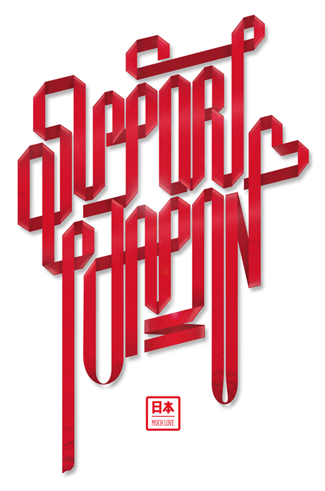
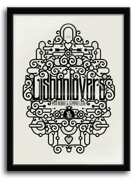
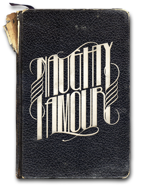
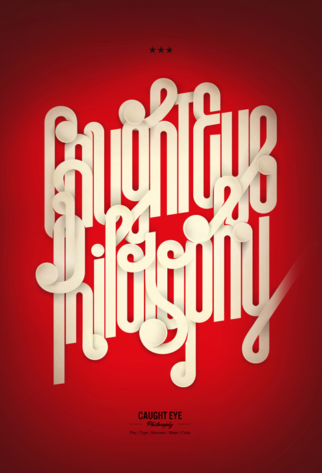
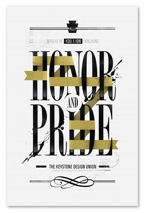
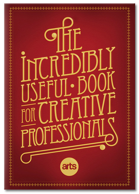
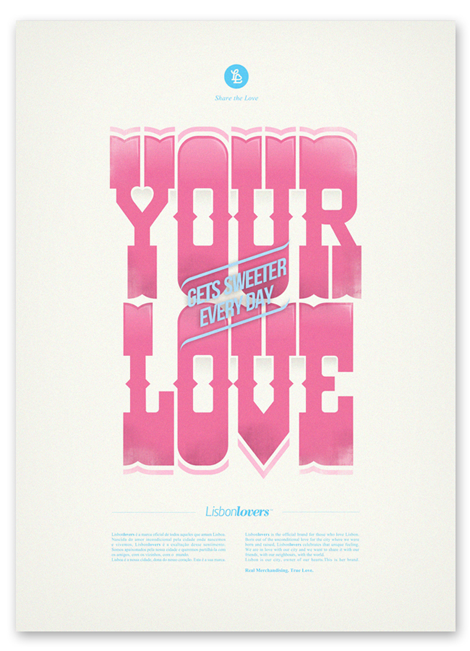
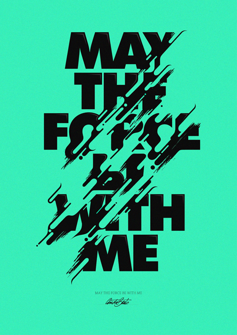
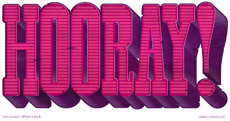
André Beato is an incredibly talented typographer from Portugal that I came across lately. The thing that strikes me most about his work is the fact that he creates unique minimalistic compositions while maintaining interesting & intricate typographic forms. The balance that he has found in creating his projects is quite inspiring. Check out the rest of his site and don’t forget to download the great iPhone wallpaper that he made to support Japan relief efforts.
——————–
Also worth viewing:
Michael Doret
Jeremy Pettis
Jonathan Zawada
Not signed up for the Grain Edit RSS Feed yet? Give it a try. Its free and yummy.
——————–
TagsFound design, portugal, Typography
04.08.11 in Designers, Found design, Typography by Liz Meyer
Share This Share on Facebook


17 comments
Comments feed for this article
Trackback link
http://grainedit.com/2011/04/08/andre-beato/trackback/
04.08.11 at 1:46 pm
Pingback from Vectips Weekly Vector Inspiration #116 | Vectips
04.08.11 at 5:31 pm
Pingback from Weekly Vector Inspiration #116 | The best Tutorials
04.09.11 at 2:58 pm
Pingback from Weekly Vector Inspiration #116 « Advertise Online
04.09.11 at 4:14 pm
Pingback from André Beato: Typographer « These Old Colors™
04.23.11 at 2:25 pm
Pingback from Weekly Vector Inspiration #116 | redbey
Wow - simply awesome work!
04.08.11 |
Emma |
Designers Found design Typography |
Meh, it’s ok. Surprising to see a spotlight on grain. I think Doyald Young would cringe at some of the weight and kerning happening in these…it looks like a first draft that got built in illustrator grid and then juiced up with some photoshop texture.
Cool stuff, don’t get me wrong. But I don’t think I would call it anything better than a lot of other creatives out there.
04.11.11 |
Darnold |
Designers Found design Typography |
@Darnold
Which ones appear to have weight and kerning issues? I find them to be under control.
04.11.11 |
Daniel |
Designers Found design Typography |
I think I would agree with Darnold on a couple of them.
The “Support Japan” and “Caught Eye Philosophy” pieces don’t feel refined yet; and very difficult to read (but that seems to be a trend these days). Also, the completely mono weight characters makes the stems feel weak. He could have thickened them up just enough to make it feel optically correct, but still look mono weight.
Anyways, that’s what creative license is all about, if that’s what he decided was the right decision, then fair enough.
04.11.11 |
Mark |
Designers Found design Typography |
Let’s bring some positivity back to this comment thread!
Beautiful work andré. Especially love this, this , & this.
Keep it up!
<3 jeremy
04.13.11 |
Jeremy Pettis |
Designers Found design Typography |
to see a spotlight on grain. I think Doyald Young would cringe at some of the weight and kerning happening in these…it looks like a first draft that got
04.14.11 |
su deposu |
Designers Found design Typography |
minimalistic compositions while maintaining interesting & intricate typographic forms. The balance
04.19.11 |
prefabrik |
Designers Found design Typography |
I think Doyald Young would cringe at some of the weight and kerning happening in these…it looks like a first draft that got
06.30.11 |
su deposu |
Designers Found design Typography |
difficult to read (but that seems to be a trend these days). Also, the completely mono weight characters makes the stems feel weak. He could have thickened
08.18.11 |
karoser |
Designers Found design Typography |
Blog liked it very much. I found a very useful contents. Thank you.
09.12.12 |
karoser |
Designers Found design Typography |
articles is very nice, ı like your site
11.07.12 |
Kamyon kasası |
Designers Found design Typography |
its ver nice IC Full Circle Show at Super7…
01.29.13 |
pratik yemek tarifleri |
Designers Found design Typography |