Jesse Ragan
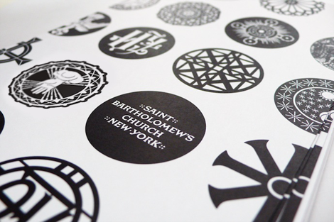
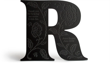
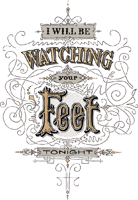
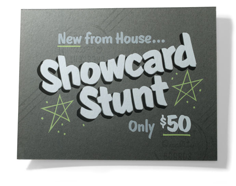
Type designer extraordinaire, Jesse Ragan, released the latest iteration of his website this past week. Chock full of new and meticulously designed work, Jesse’s type design gets more interesting with each project. His projects range from the current typeface of V Magazine, to the logotype for Glade, to working closely with Hoefler-Frere Jones on major typefaces like Gotham and Archer. Jesse, a self proclaimed designer of serious typefaces, is sure to continue to awe and inspire aspiring (and current!) type designers.
——————–
Also worth viewing:
Page 1: Great Expectations
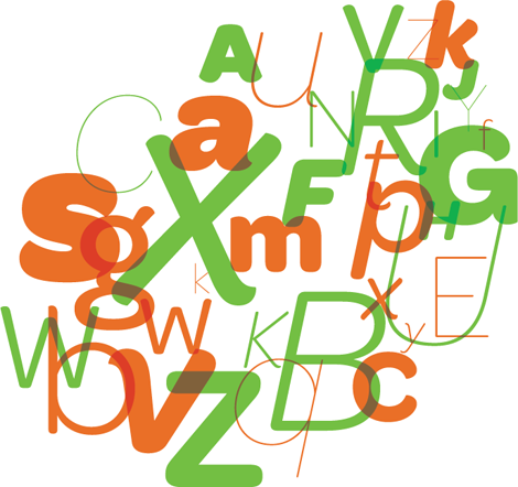
Gratuitous Type / No. 2
James Edmondson
Not signed up for the Grain Edit RSS Feed yet? Give it a try. Its free and yummy.
——————–
TagsJesse Ragan, Typography Design, USA
06.22.12 in Designers, Found design, Typography, USA by Liz Meyer
Share This Share on Facebook


7 comments
Comments feed for this article
Trackback link
http://grainedit.com/2012/06/22/jesse-ragan/trackback/
06.25.12 at 4:33 am
Pingback from Jesse Ragan « winstonmüller
07.12.12 at 8:31 am
Pingback from Type News: Hairline | Uber Patrol
02.08.13 at 2:02 pm
Pingback from Pagan and Sharp - The Imagists | Bespoke Brand Strategy
02.09.13 at 9:26 am
Pingback from Pagan and Sharp « Tracing ∆'s –
05.06.13 at 2:41 pm
Pingback from Pagan and Sharp | Uber Patrol - The Definitive Cool Guide
That looks great! I really like the colors he used.
06.23.12 |
modernlogodesign |
Designers Found design Typography USA |
He’s also got a particular style, but some of his strokes are similar to other artists. But then, he’s a great artist, especially in the field of type design.
06.28.12 |
Ed Richardson |
Designers Found design Typography USA |