Grady McFerrin
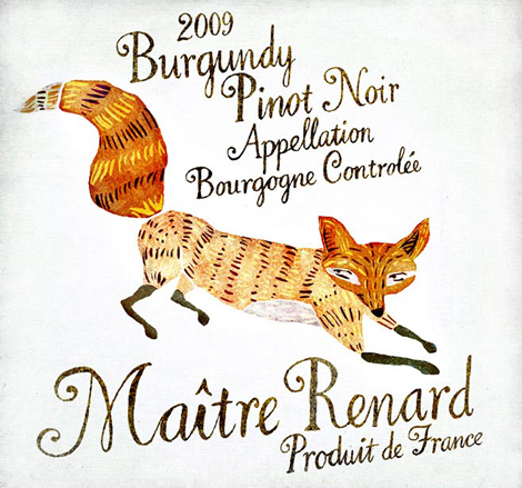
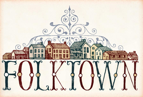
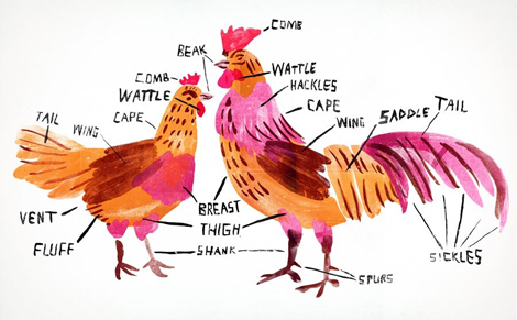
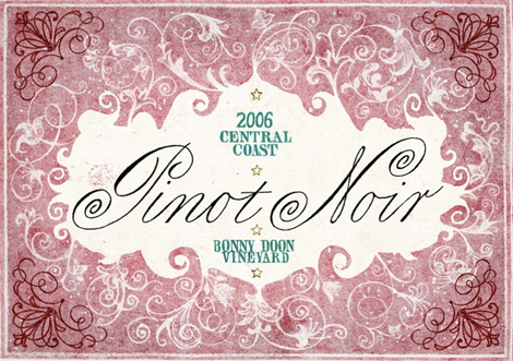
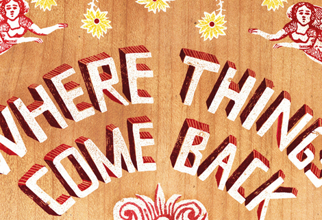
The name Grady McFerrin should be easily recognizable if you’re a reader of The New Yorker or New York Times, where his illustration work shows up frequently. But, what I like to (of course) focus on is his lovely lettering style. The thing that makes Grady’s work unique is the un-rendered, folk quality of his text; paired with his minimal color palette, he manages to create pieces that could have come straight out of early Americana. What Grady does is highlight the old and oft-forgotten, and sends the viewer a beautifully nostalgic feeling of the past.
——————–
Also worth viewing:
Toby Thane Neighbors: Illustration
Scotty Reifsnyder: The Heroes of Folk
Not signed up for the Grain Edit RSS Feed yet? Give it a try. Its free and yummy.
——————–
TagsGrady Mcferrin, Illustration, Typography, USA
07.01.11 in Found design, Illustration, Typography, USA by Liz Meyer
Share This Share on Facebook


6 comments
Comments feed for this article
Trackback link
http://grainedit.com/2011/07/01/grady-mcferrin/trackback/
07.24.11 at 8:38 pm
Pingback from matthb.com » grain edit · Grady McFerrin
07.29.11 at 10:08 am
Pingback from grain edit · Justin Gabbard
09.23.11 at 1:24 am
Pingback from grain edit · Carson Ellis
All of Grady’s lettering is gorgeous! It is very nostalgic. We have to keep that alive!
07.01.11 |
Rhianna |
Found design Illustration Typography USA |
Beautiful work!
07.19.11 |
Angie Pickman |
Found design Illustration Typography USA |
More info about Grady McFerrin in AREA VISUAL:
http://avareavisual.blogspot.com/2011/07/grady-mcferrin-ilustrando-con.html
AREA VISUAL is an inspiration BLOG focused on art, design, ilustration, photography, advertising, urban culture, new trends of web and any creative form of aesthetic expression.
07.24.11 |
AREA VISUAL |
Found design Illustration Typography USA |