McBess
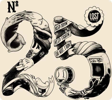
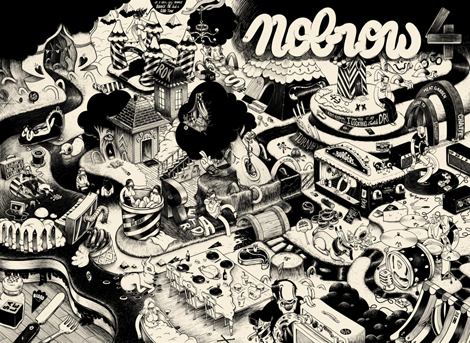
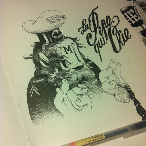
The work of McBess has been a source of illustrated inspiration for many new artists over the course of his half-decade-long career. A signature part of style that sets him apart with his natural ability to bring out shadows and highlights predominantly using thin tipped felt pens, a very big feat when working monochromatically. I love the use of lettering to give his illustrations more context, and the flowing, style gives another layer to already unique and intricate pieces.
——————–
Also worth viewing:
Adam R. Garcia
Alex Trochut
Typography Sketchbooks by Steven Heller and Lita Talarico
Not signed up for the Grain Edit RSS Feed yet? Give it a try. Its free and yummy.
——————–
TagsIllustration, lettering, McBess, Typography, UK
01.09.12 in Found design by Liz Meyer
Share This Share on Facebook


5 comments
Comments feed for this article
Trackback link
http://grainedit.com/2012/01/09/mcbess/trackback/
Thanks for sharing this really inspirational set of illustrations. The style of McBess really reminds me of those very early World War era cartoons and animations. There is also a surrealist feel to his illustrations that I think is accentuated by the use of black and white tones.
01.09.12 |
Kim Ruddock |
Found design |
Nice Blog… Keep it up ~~~
01.09.12 |
web design london |
Found design |
Superb typo artwork, good work! Thanks so much for inspiring us.
01.10.12 |
Logo Design Contest |
Found design |
Love this work! thanks for sharing !
01.15.12 |
Tom White |
Found design |
I must say those works are very inspired. The 25 is doubtless my favorite.
“Keep trying, Keep fighting”..Love it.
Nick
01.18.12 |
Design agency London |
Found design |