Benjamin Critton
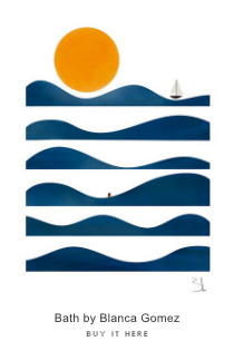
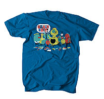
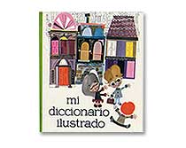
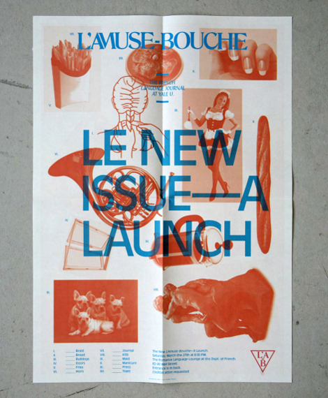
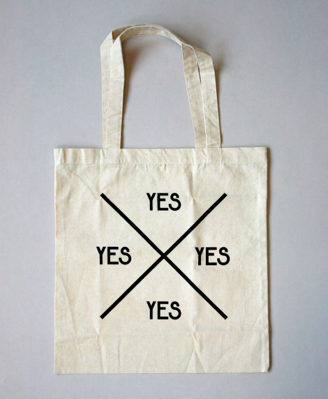
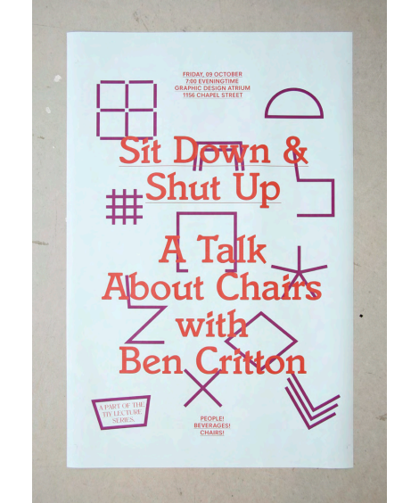
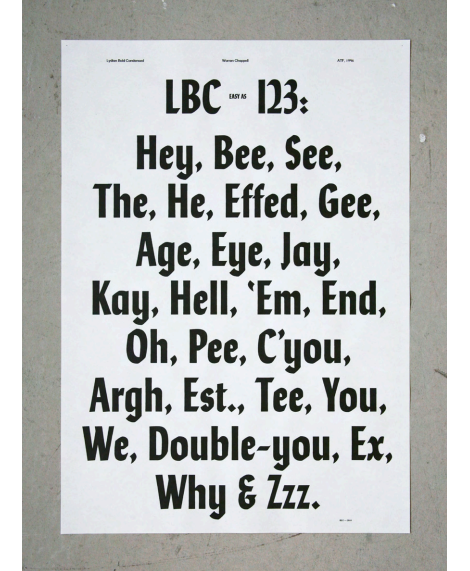
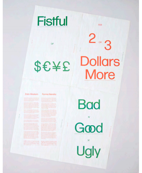
The work of Benjamin Critton seems to capture the essence of typography of “now”. While it may seem entirely modern, his work takes inspiration from the days of the Bauhaus and post-modern stylings of early geometric typography. He brings his simple forms and sans-serif tendencies to life in experimental ways, using books, clothing and posters. Be sure to check out his many other sites along with his portfolio, including an interesting maze of images and his shop.
——————–
Also worth viewing:
Voidwreck
Lufthansa Graphic Design
Robert Sessler
Not signed up for the Grain Edit RSS Feed yet? Give it a try. Its free and yummy.
——————–
08.12.11 in Found design by Liz Meyer
Share on Facebook


