September 2009

You are currently browsing the monthly archive for September 2009.

Christopher Lee / The Beast is Back Illustration

christopher lee the beast is back

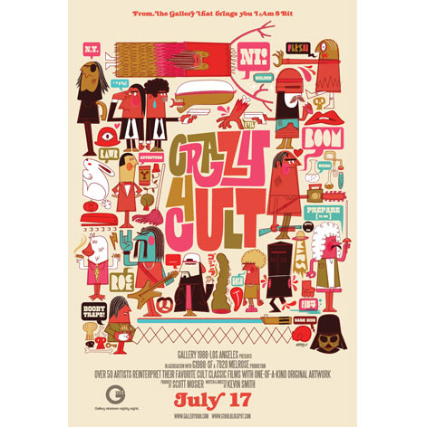
Los Angeles based illustrator, Christopher Lee, has an eye for designing kooky characters. This poster, originally created for Gallery 1988‘s group show “Crazy for Cult,” has a fun take on some characters from cult classic movies. The colors are reminiscent of my mom’s old tupperware (hooray for avocado green!), and the mixture of type is really pleasing to the eye. From Howard the Duck to Data from The Goonies, there are so many little intricacies within each character of this poster that it forces my hungry eye to want more!

Read the rest of this entry »

San Francisco Book Sale 2009

san francisco book sale

Last week I had a chance to stop by the 45th Annual San Francisco Book Sale which was held at the Fort Mason Festival Pavilion. The place was filled with books.  According to the event’s website it is the biggest book sale on the west coast. The five-day event features 300,000+ books in over 50 categories.

Read the rest of this entry »

Photo-Lettering Alphabet Blocks, Prints & T-Shirt Giveaway

photo lettering

Back in June we posted about the launch of House Industries’ Photo-Lettering website. I knew it was just a matter of time before some of those tasty Photo-Lettering typefaces ended up on a slab of wood. That time has come. Last week House announced the release of the Photo-Lettering (Plinc) alphabet blocks as well as a new House Industries serigraph series.

To celebrate the new line of Photo-Lettering products we’ve teamed up with House Industries for a special giveaway.

One lucky winner will win:

Read the rest of this entry »

Friends of Type

This is the story of a brand new blog called Friends of Type. If you have friends and a healthy interest in type, this blog was made for you. A self described “sketchbook, archive and dialogue,” Friends of Type is the place to see typographic process, doodles, and finished work. I’m sure it will become a typographic who’s who in the near future.

Read the rest of this entry »

Andrew Bird Poster by Methane Studios

andrew bird poster
Andrew Bird Poster by Methane Studios. 18″ x 24″

There is so much to love and appreciate about this week’s poster pick by Methane Studios. Let me begin by pointing out the color combinations which I happen to think are perfect. This awesome beast is impressive with its geometric body, patterns, and textures. It’s great seeing how the patterns take on new life with different coloring. As always, the type use and positioning is very well done.

The Andrew Bird poster is available for purchase here.

Vintage Esquire Covers: 1953-1961

vintage esquire june 1955

Over the highways and byways we go on the free and open road!

Esquire magazine’s June 1955 issue playfully depicts a typical aerial view of a freeway using toy cars and colored paper. It’s composition is simple and engaging, with its bright primary colors, windy roads, and cars on the move. I especially enjoy the smart and effortless integration of the magazine’s mascot, Esky (designed by E. Simms Campbell), into the area within the highway and in the highway itself. The tiny map of the Motor City is a nice touch too!

Read the rest of this entry »

Ken Leung interview

ken leung

Being a fan of Monocle magazine, I’m excited about our next guest. Ken Leung is a London based freelance designer who helped launch Monocle magazine and until recently served as it’s art director. In today’s interview, Ken shares his love for Textas (marker pens), some of his influences and a few of his favorite books.

Ok, here we go..

Read the rest of this entry »

Scandinavian Logos of the 1960s & 70s

scandinavian logos

K.P. Jorgensen & Son Logo – Part of 1960s & 70s Scandinavian Logos Set

This made my day. Vancouver based designer Oliver Tomas uploaded an amazing collection of Scandinavian logos from the 1960s & 70s to his flickr account. Thanks Oliver!

Read the rest of this entry »

Tom Messenger


Tom Messenger, a designer and illustrator from London, makes one of the best t-shirt prints I’ve seen. I love his bold stripes, buttons, colors, and breast pocket details. Tom’s work has great texture and personality to it. His range of color accentuates his very flat, bold style nicely.

Read the rest of this entry »

Lumadessa / Josh Brill: Flora Fauna – Bird Editions

josh brill

Western Tanager 5″x7″ – Designed by Josh Brill

Cool bird prints from Josh Brill. Josh is the man behind Lumadessa, a little art and design label out Portland, Maine. The prints are from his Flora Fauna collection which catalogs the design identities of plants and animals from around the world. The collection also examines the visual character differences and similarities of species. It’s a field guide of discovery, beginning with birds.

Read the rest of this entry »

Vintage German “Vero Construc” Booklets

Vero Construc, Germany, Graphic Design

Vero Construc toy construction kit -1975

Nuts, bolts, and sprockets! These are the makings of fine toys, as well as these awesome vintage booklets!

Created for the East German toy company Vero in 1975, these colorful booklets itemize all of the pieces included in the “Construc” construction kit and instructs children in building a stop light. The back cover reads, “Toys With System for the Creators of Tomorrow’s World.” How inspiring!

Read the rest of this entry »

Philips-Twen Book: Realism is the Score

philips twen book

Philips-Twen: Realism is the Score – Edited by Jens Muller

Just got my hands on a few of the Lars Muller A5 titles and they don’t disappoint. I’ll try to get photos of all three titles up on grain edit within the next week or so. Unfortunately these titles are unavailable in the U.S right now, but should be available soon. Amazon has a release date of October 1st.

Read the rest of this entry »

Vintage Arcade Game Graphics

vintage arcade games

Pitfall (Activision) circa 1982

Nick Dart recently launched a cool resource for vintage game graphics. Art of the Arcade features game packaging, advertisements, logos, etc. from the golden era of arcade gaming, the 70’s and 80’s. I miss Pitfall!

On a related note, if you ever find yourself in Portland,OR, you have to stop by Ground Kontrol. The place is filled with classic games like Q-Bert and Pac-Man.

Read the rest of this entry »

Ed Nacional

Meet Ed Nacional. Recent New York Times intern, Parson’s design student, and all around purveyor of great design. Ed’s typographic style, sensibility and skills struck me right off the bat. I especially love the “Nita Nita” graphics and the “We Cab Double You” typography. Sweet stuff.

Read the rest of this entry »

Geoff Mcfetridge: Where the Wild Things Are Title Design

geoff mcfetridge

Geoff Mcfetridge and some of the concepts for the final credits for the upcoming “Where the Wild Things Are” film.

I know i’m not the only one excited about the upcoming Where the Wild Things Are film directed by Spike Jonze. The film is based on a book of the same name published in 1963 by author/illustrator Maurice Sendak. I remember staring at the book for hours when I was a kid. It’s still one of my all time faves.

Read the rest of this entry »

Poster Pick: Sonic Youth at the Turner Hall Ballroom

sonic youth

Sonic Youth Concert Poster designed by the Little Friends of Printmaking

After our interview with the Little Friends of Printmaking we decided to make their Sonic Youth print our Poster Pick of the week. If you haven’t seen the interview yet, it’s worth checking out. Melissa and JW break down the process of creating the Sonic Youth poster from the initial concept to the finished product.

You can purchase the Sonic Youth – Milwaukee concert poster at Poster Cabaret.

Toru Fukuda Illustration

toru fukuda

C’mon ride the train & ride it! Toot! Toot!

This cheerful train track is created by Tokyo based illustrator and character designer, Toru Fukuda. He runs a delightful website titled Drawing Wonder, where he illustrates whimsical cartoons inspired from the 1960s and 1970s.

This particular illustration depicts unhitched trains, alternate tunnels, a nice water tower, even a free wheelin’ mustached conductor! Using multiple hand drawn layers, bright primary colors and thick lines, Toru successfully channels his inner Ed Emberley. Who’s up for a ride to Happyville?

Read the rest of this entry »

Poland Wieliczka Salt Mine Postcard 1972

Wieliczka Salt Mine

1972 Poland Wieliczka salt mine postcard designed by K. Rogaczewska.

Poland’s Wieliczka Salt Mine, in the suburbs of Kraków, produced table salt continuously for over 700 years. Although operation ceased in 2007, visitors can still tour the mine, where they can see statues and artwork carved entirely out of salt (including a chapel, complete with salt chandeliers!). In 1972, K. Rogaczewska designed this postcard, which depicts the hillside town of Wieliczka and the salt crystals of its mine. Read the rest of this entry »

Eric Smith / I Draw All Day

I love the portfolio from Washington-based Eric Smith. Mr. Smith’s work seems to represent his friendly, optimistic personality quite well. Based on his monikor (I Draw All Day) and portfolio, one can assume that Eric does, indeed, draw all day.

Style wise, the overall simplicity, boldness, and use of color is very compelling. I’m particularly drawn to Eric’s hand-drawn typographic work and style. I love the way in which the letters are formed and put together.

Read the rest of this entry »

Little Friends of Printmaking interview

Little Friends of Printmaking

(Photo credit: C. Taylor)
The latest installment to the Grain Edit interviews takes us to Milwaukee, Wisconsin: home to big name breweries, delicious Gouda, and husband-wife design duo…The Little Friends of Printmaking!

Melissa and JW Buchanan are the brains behind the Little Friends, and they are best known for their often outrageously intricate prints that explore everything from the complexities of the mind, fun-loving animals, to leisure time activities.

In this interview, they discuss the perks about working with their significant other, the highs and lows of attending art school, and their creative process.

And now, let the fun commence!

Read the rest of this entry »

Paige + Modern

James Birrell

James Birrell – View of the elevated restaurant, Centenary Pool, Brisbane’ (via Paige Modern)

Many thanks to Paige Russell for featuring us in her “Meet the Maker” series. Paige is a product designer with a passion for hunting vintage modern. Her blog’s (Paige + Modern) mission is to celebrate both vices and be home to all other great things she find along the way; inspiration, cheekiness, smart-pants thinking, sharp design, eye candy, & tales of great explorers.

Read the rest of this entry »

Lars Muller’s New A5 Book Series

orba squara

Celestino Piatti and dtv: The Unity of the Program – Edited by Jens Muller

I can’t wait to get my hands on these books.

Lars Muller has just launched the A5 series of books. The series is intended as a growing archive on graphic design. Each volume introduces outstanding personalities and important themes from the history of international graphic design, with numerous illustrations, essays and interviews. The series kicks off with books focused on Celestino Piatti, Philips-Twen and Hans Hillmann.

I’m really excited about the Celestino Piatti book. For more than 30 years, he endowed the covers of books published by dtv with a singular look. With more than 6300 covers to his credit, amounting collectively to a total of 200 million volumes, Piatti was one of the most productive designers of all time.

Read the rest of this entry »

Page 1 of 198123...Last »