August 2009

You are currently browsing the monthly archive for August 2009.

Orba Squara

orba squara

Fresh air and the open road!

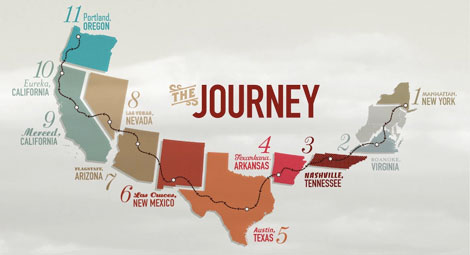
The fine folks at Random Collective designed a unique website chronicling New York based singer-songwriter Orba Squara’s journey across some of the United States. Commemorating his second album, Orba Squara’s site boasts a beautiful visual diary complete with photos, custom maps, and neat type treatments. Its layout is a 430 ft long lateral scroll, which translates the daily findings of the trip appropriately.

Orba Squara’s website is Random Collective’s first project. Founded by Jose Cabaco, Random Collective is all about connecting people from different disciplines, to work on a variety of projects. As its name suggests, it can be anything; a band of 2 or 20, writers or art directors, designers or photographers, architects or webcoders…even all of the above!

Check out Orba Squara’s website, and stay tuned for their website.

Read the rest of this entry »

grain edit goes to Portland!

For the last week or so your trusty Grain Edit crew have been in the sunny city of Portland, Oregon. This city is great — the weather is perfect, the people are nice, and the design is spectacular.

A few of the highlights so far include the 12 hour drive up, hanging out with some amazing designers, Portland’s vast food cart cuisine, waffle sandwiches, vintage video games, and much more.

This Sunday we’ll be making the long trek back to the Bay Area. Be on the lookout for lots of fun goodies from our week long trip here.

Stefan Kanchev Logo Design, Stamps & TV Graphics

aesthetic apparatus

aesthetic apparatus

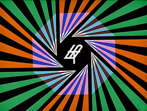
Television graphics

Absolutely stunning work from Stefan Kanchev (1915-2001) who was a Bulgarian graphic artist. During his prolific career he designed hundreds of logos, posters, stamps, book covers, labels as well as graphics for TV. Much of his work is inspired by Bulgarian folklore and traditions.

In 1994 Stefan Kanchev was recognized as one of the top ten designers of trade marks in the world along with Paul Rand, Saul Bass and etc. The title was awarded by the International trademark centre in Ostend, Belgium. His logo work will blow your wig back.  I highly suggest you spend a few minutes browsing his archives.

Read the rest of this entry »

We Have Our Winner

Thanks to everyone who took part in our giveaway! It was great to see all your comments.

We randomly selected our winner in the  HunterGatherer Laptop Sleeve Giveaway this weekend.

Our winner will be listed at the bottom of the Grain Edit Email Update and Grain Edit RSS Feed.  For those of you who subscribe to the email updates, the email should arrive soon.

——————————————————

Many thanks to Incase for sponsoring the giveaway. You can see all the latest Incase happenings at the Incase blog.

——————————————————

Keep an eye out for the next grain edit giveaway and enjoy the rest of the weekend.

Jenny Grigg

Jenny Griggs Book Covers

These book covers from Australian designer Jenny Grigg are absolutely superb. I love how she uses texture and composition to make such playful and compelling work. I want to touch and feel these books as much as I want to read them.

Read the rest of this entry »

Doom Flower Print by Aesthetic Apparatus

aesthetic apparatus

Doom Flower Mini Print by Aesthetic Apparatus – 6″ x 6″.

Many of you are familiar with the distinctive works of Aesthetic Apparatus and this week we’re happy to add their ‘Doom Flower’ to our growing list of poster picks. This design studio continues to please us with their creative choices and prints like this. The colors used here stay true to their Doom series which is well worth browsing. The flow relies heavily on color and shape in the creation of the energetic flower pattern. The skull in the center adds an interesting balance and helps break things up a bit. I think this demonstrates great use of color and pattern. Those guys make it look so easy!

This print is available at www.postercabaret.com

Read the rest of this entry »

Odiléa Toscano: Graphic Design & Illustration

olidea toscano

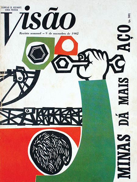
Brazilian designer, Odiléa Toscano, illustrated delightful magazine covers and book jackets in the 1960s and 1970s. This particular illustration, created as the cover of Visão Magazine in 1962, omits a handful of energy as it uses bright complementary colors and geometric heavy forms and type. I really enjoy the intricate cutouts of the subject’s hair and the shapes he’s about to twist with his wrench!

(Via Design Diário)

Read the rest of this entry »

Cristiana Couceiro Modern Collage Work

cristiana couceiro

Beautiful collage work from Lisbon based designer Cristiana Couceiro.  As Steve Mehallo puts it, “When one thinks of collage, it’s usually something  . . .  scrapbooky. Not always the case.”

In a recent issue of Moloko, she talked about gathering source material. “On Saturdays I like to go through the flea market collecting memories. Feira da Ladra as we call it here in Lisbon. That means Thief Fair, which is funny collecting other people’s memory to build a new one”. Her source material comes from a variety of modern sources including: record covers, Canadian logos, 1960s paperback books, Latvian magazines, Swiss posters, as well as work from the Bauhaus.

Read the rest of this entry »

We Are The Friction

This second edition of Sing Statistics, “We Are the Friction” looks to be quite spectacular. I really, really can’t wait to get my hands on it.

Read the rest of this entry »

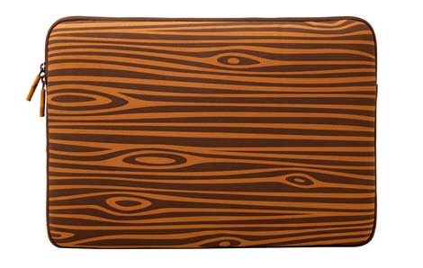
HunterGatherer Laptop Sleeve Giveaway

huntergatherer

15″ HunterGatherer Laptop Sleeve

For our latest giveaway we’ve teamed up with Incase. Incase recently released the HunterGatherer Laptop Sleeve and iphone slider case. This is a part of a series of projects curated by Arkitip. To celebrate we’re giving away a 15″ Hunter Gatherer laptop sleeve to one lucky winner.

Read the rest of this entry »

Twitter List Update

designers on twitter

Way back in the olden days of computers, when the internet was still a small child, we highlighted some of our favorite designers using Twitter. As designers jumped on left and right, and Twitter exploded, our post evolved several times over.

Now, with well over fifty listings , we present another update to Designers On Twitter. There are lots of great designers on this latest update, including Hatch Design, Odopod, Julia Rothman, Sing Statistics, Ellen Lupton, Christopher Simmons, Hybrid Design, Brett MacFadden and Crew Design, among others.

Check out the list: Designers to Follow on Twitter.

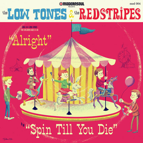
S.britt Illustration

s. britt

Ah, the joy and merriment of the carousel! This record cover by Portland based illustrator, S.britt, depicts all the fun adults can have riding on whirling whimsical animals.

Created for Canadian based bands The Low Tones and The Redstripes, this illustration juxtaposes cheery animals and people with the morbid title of “Spin Till You Die.” The assortment of colors remind me of my mom’s Tupperware from the ’70s, and the textures add a familiar worn-in touch. The pink and white of the carousel top are also like Mother’s Circus Animal cookies. Yum!

Read the rest of this entry »

Hatch interview

jaqk cellars

JAQK Cellars wine shippers designed by Hatch

This is part 2 of a 2 part interview. You can view part 1 at the excellent iso50.

Hatch is a San Francisco design firm founded by Joel Templin and Katie Jain. In part one of our interview, Alex spoke with Katie and Joel about the firm and their design process. In part two we take a look around the studio and talk with Katie about the packaging for JAQK cellars.

Read the rest of this entry »

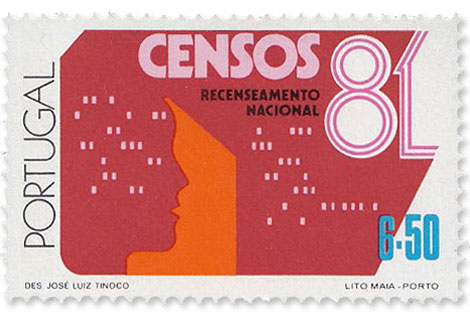
Portugal 1981 Census Stamps

invisible creature

1981 Portugal Recenseamento Nacional Censos stamp designed by José Luiz Tinoco.

Beautiful Portuguese stamp from the 1980s. That man’s head is either made of IBM punch cards or little people windows. You make the call.

Read the rest of this entry »

Build a bike!

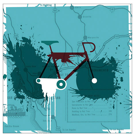
We all love a good fixie. Clean lines, simple mechanics, and oh so trendy. And if you’ve been drooling over that Don Clark Nor Cal print below, this just may be your summer bicycling dream come true.

Cruising Craigslist for bikes is great, but you never quite know what you’ll end up with. Urban Outfitters took out the guess work and teamed up with Aristotle Bikes, bringing you fancy fixies that you can customize on the web. Click the components and they magically change colors! Thanks for the awesome bikes, internet!

Get your cogs on at Urban Outfitters Bikes.

The Public Works


Public Works looks to be a sweet gallery show and speaker series. It’s happening in Chicago, and focuses on those designers who have contributed to the independent art and music scenes there. You can find it at the Andrew Rafacz Gallery, including the likes of Chris Eichenseer, Justin Fines, Cody Hudson, and Andy Mueller, among others.

Also check the AIGA Chicago for lectures by Delicious Design League, Harper Reed and Dawn Hancock.

Read the rest of this entry »

Poster Cabaret Bicycle Art Prints

invisible creature

Nor Cal – Designed by Don Clark of Invisible Creature – 17.5″x17.5″

We’re excited to announce The Poster Cabaret 2009 Bike Print Set. Bicycle ridership has increased in recent years and as someone that rides daily I am glad to see so many artists inspired by them. The series features artists like Don Clark of Invisible Creature, Eleanor Grosch of Pushmepullyou Design, Brian Turner of The Cricket Press, Jay Ryan, and Diana Sudyka.

All are interesting and dynamic designs that will no doubt not simply appeal to cyclists. I love what Eleanor Grosch has done in the aptly titled ‘Bicycle’. It is an awesome design made up of a few simple shapes and colors, but it drew my attention immediately.

The limited edition prints are available at www.postercabaret.com

Read the rest of this entry »

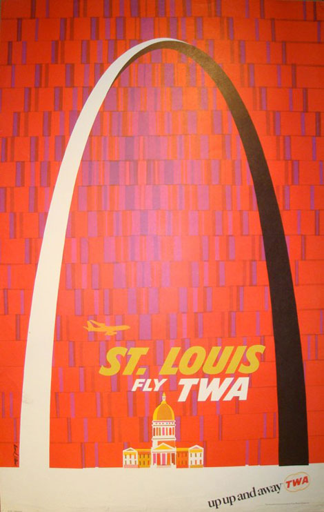
David Klein: Vintage TWA Posters

David Klein

If only travel posters still looked this good!

American illustrator, David Klein (1918-2005), created numerous travel posters for Howard Hughes’ Trans World Airlines (TWA) in the 1950s and 1960s. His posters use eye-popping colors, iconic landmarks, and scenic images to advertise global travel.

The composition of this particular poster is fantastic, as Klein sets the St. Louis Gateway Arch against a festively patterned background, emphasizing its momentous size. The analogous colors of the type, airplane, and old courthouse are a warm treat too!

Read the rest of this entry »

Olivetti Lettera 22 Manual

olivetti lettera 22

Olivetti Lettera 22 Manual

I’m blown away by this Olivetti Lettera Manual Ed Cornish posted over at the excellent we made this (blog). Absolutely stunning! You can see the full manual at Ed’s Flickr account.

Read the rest of this entry »

Cecilie Ellefsen Illustration

Cecilie Ellefsen

Cecilie Ellefsen is a Norwegian illustrator and animator with a fine talent for creating intricate dioramas made of paper and plastic. Her work incorporates brightly colored cutouts of animals, forests, and mythical creatures. Her compositions pose a lot of depth, and they’re so fun to look at (especially when they’re lit!). Read the rest of this entry »