October 2009

You are currently browsing the monthly archive for October 2009.

Dan Cassaro / Young Jerks

Dan Cassaro / Young Jerks

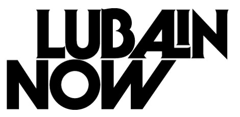
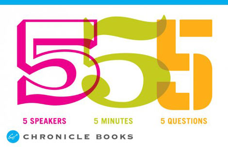
Brooklyn-based Dan Cassaro is the front man, ring leader, and typographic skipper of Young Jerks — his no-nonsense moniker. Making your way throughout the aisles of Dan’s portfolio, you’ll notice typography gracing posters, logos, books, other printed materials, and a swath of motion graphics. Fancy typography, indeed. Mr. Cassaro has the knack for creating keen type that makes you smile. I urge you to head over and take a look.

Read the rest of this entry »

Twitter Lists

twitter lists

A few days ago Twitter rolled out a new feature called “lists”. This feature is still in Beta, so it appears it’s only available to a small group of users right now. Lists are a way to organize the people you follow and to discover new and interesting Twitter accounts. We set up a handful of lists in different catergories, so you can easily find new designers & artists to follow.

Our lists include some of our favorites to follow in graphic design, typography and illustration. We also set up lists for web design, blogs and stores, but these lists need alot of work. You can find all of our lists on the right hand side of our Twitter profile page. These lists are far from comprehensive, so if you have any suggestions of people to add please let us know in the comments.

Graphic Design Referenced

graphic design referenced

Graphic Design Referenced by Bryony Gomez-Palacio and Armin Vit

I recently got my hands on a copy of Graphic Design Referenced. This is the latest project from the dynamic  design duo of Bryony Gomez-Palacio and Armin Vit, who also happen to be the brilliant minds behind the UnderConsideration network of sites. As the official press release states, “Graphic Design, Referenced is a visual and informational guide to the most commonly referenced terms, historical moments, landmark projects, and influential practitioners in the field of graphic design. This is a very ambitious project to say the least, but I’m quite impressed with the final result. I’m amazed at the amount of information they were able to cram into this 400 page book.

Read the rest of this entry »

Darling Clementine Design & Illustration

darling clementine illustration

Play that saxophone letter E!

Norway’s Darling Clementine designed this jazzy poster for Blårollinger, a concert series for children and adults in Oslo. I am in awe of all the little creatures and singing and playing instruments; they fit so well with the large type, which have also been personified to have fun! I also really dig the color scheme, with its warm and cool complements…very appropriate for the season and weather.

Read the rest of this entry »

70s Portuguese Brochure

70s portugal brochure

Beautiful brochure for a chain of hotels in Portugal.

From the inside of the brochure: “From the oldest times, “pousada” in Portuguese has meant “resting place””inn”. Quiet isolated situations by the sea shore, in the mountains or on the plains. Lovely views, wealth of history, traditional culture.

The Pousadas make up a network of hotel establishments built by the state, housed in historic buildings, castles, palaces, and monasteries or specially built.”

Read the rest of this entry »

Modern SeeSaw

spacetime wall art

The girl on the end is seriously hating on the little dude. Ride on bro!

I came across this ad in an old Italian design magazine a few years back. I scanned in the image and quickly forgot about it. In my haste I forgot to write down any relevant information. Now I’m stuck without a clue as to who made this super cool kids toy.

Read the rest of this entry »

Poketo + Kitsune Noir = SPACETIME!

poketo wall decals

YES! Our wall decals from the Poketo and Kitsune Noir collaboration, SPACETIME, finally arrived! This collaboration features four of our favorite illustrators: Mike Perry, Damien Correll, Cody Hudson, and Andy Miller. These gents each designed wall decals, shirts, and wallets.

Read the rest of this entry »

Daily Drop Cap


Are your initial caps lacking luster? Is your first letter feeling timid? We all know how tough it can be being a capital on the internet — so much pressure. But there’s good news! The Daily Drop Cap can really give your nervous caps a second wind.

Read the rest of this entry »

Sasquatch Music Festival Posters by Invisible Creature

sasquatch music festival

Sasquatch Music Festival Poster (Bubbles) – Designed by Invisible Creature

This week our poster pick(s) are a series of posters designed by Invisible Creature for the Sasquatch Music Festival.  The series presents a  host of  characters that we’re certain you’ll enjoy.  A limited color palette was employed throughout this series that is filled with whimsy and sure to please. I am especially fond of Sigmund and Blanche. If I had enough wall space they could all live with me.

The entire series is available at the Poster Cabaret.

Read the rest of this entry »

Meg Hunt Illustration

meg hunt

Step aside Partridge Family, there’s a new bus in town!

This four-color print, by the wonderful Phoenix based illustrator Meg Hunt, incorporates a few of my favorite things: animals, transportation, and lots of patterns! This mobile zoo accounts for a lot of animals, including a llama, zebra, long necked giraffe, and even a tiny little quail. I really love the juxtaposition of wood grain patterned bus against the intricately patterned road and buildings, and the color scheme makes me want some bubble gum. Fun!

Read the rest of this entry »

Vintage Russian Posters – Real 1970s Proper Like

vintage Russian posters

Most articles I see related to Russian poster design tend to focus on the film and propaganda posters of the 1920s and 30s. Works by Alexander Rodchenko and El Lissitzky as well the Stenberg brothers often come to mind.  This post is dedicated to an era of Russian poster design that seems to get less coverage. The 1970s.

Don’t miss this one!

Read the rest of this entry »

Lubalin Now

lubalin now

Lubalin Now: The inaugural exhibition in the newly re-located Herb Lubalin Study Center of Design and Typography.

On view in Cooper Union’s new gallery, the installation includes recent posters, publications, and motion graphics by internationally recognized graphic designers that spotlight an emerging trend toward expressive lettering and typography. Original sketches, magazines, logotypes, and posters selected from the Lubalin Center Archive will illuminate Lubalin’s influence on contemporary graphic design.

Featured artists include Herb Lubalin, Justin Thomas Kay, Non-Format, Marian Bantjes, Markus Eriksson, Brett MacFadden and many more.

Read the rest of this entry »

Fernando Volken Togni

Fernando Volken Togni - Illustration

Very fun work from Brazilian illustrator Fernando Volken Togni. The color palettes for these illustrations are perfect — they draw me right in. I love Fernando’s simple, super graphic, super bold, and super tasty illustration style. That peacock is dying to be made into a print.

I’ve been a fan for a while now — can’t wait to see more.

Read the rest of this entry »

Chronicle Books 555 Event

chronicle books 555

I had a blast speaking at Chronicle Books’ 555 event last week. Huge thanks to Suzanne LaGassa and the rest of the Chronicle crew for the invitation. The theme of the night was centered around blogs/design communities. Lauren Smith and Derek Fagerstrom from the Curiosity Shoppe and Smarts and Crafts, David from BoingBoing, Joe from Typophile, and Suzanne from the Chronicle Book’s blog also presented that night. Each of us we’re given five minutes to speak about our process and inspiration. It was great to meet everyone and I hope this series continues!

You can see pictures from the event here.

Terrible Yellow Eyes

terrible yellow eyes, alberto cerriteño

“With a Private Boat” by Alberto Cerriteño

Terrible Yellow Eyes is a collection of works inspired by Maurice Sendak’s beloved children’s book, Where the Wild Things Are. Illustrator and animator Cory Godbey created the project to pay tribute to and celebrate Sendak’s story about a young boy sailing to the land of the Wild Things and conquering its inhabitants.

Read the rest of this entry »

Katie Kirk Illustration & Design

katie kirk

wedding invites designed by Katie Kirk

I love these wedding/reception invites designed by Katie Kirk of Eight Hour Day. The invites are for Katie’s sister who plans to get married in Mexico and then have a giant pig roast in Wisconsin. I hope the pig on the front of the invite enjoys his last days of freedom! He’s on his way to being ham nugglets.

Last time we checked in with Katie she was wrapping up work on her first children’s book. The book, which is titled Eli No!, tells the story of a mischievous dog and his journeys. At the time, the book was lacking a publisher. Since then, the book has secured a deal with Abrams. Looking forward to the release!

Read the rest of this entry »

We Have Our Winner

Thanks to everyone who took part in our giveaway! It was great to see all your comments. We randomly selected our winner in the Photo-Lettering giveaway earlier today.

Check the Grain Edit email update/ RSS feed tomorrow morning. The winner will be listed at the bottom.

——————————————————

Many thanks to House Industries for sponsoring the giveaway. Check their store for Photo-Lettering blocks, t-shirts and prints.

——————————————————

Polish Book Covers

polish book covers

Will over at the excellent Journey Round My Skull posted an amazing collection of Polish book covers. There is some seriously wacky stuff going on these book jackets. Whats up with beard face?

Read the rest of this entry »

Mikey Burton

Mikey Burton

It’s great when you find that one designer that can wear various design hats. Such is the case with Philadelphia’s Mikey Burton. Looking through his portfolio, I’m impressed with the amount, style and conceptual range of his work. The edgy boldness of the letterpress prints is a nice balance to some of the quieter, more restrained logos.

Read the rest of this entry »

alphabeasties and other Amazing Types

alphabeasties

I’ve been a fan of Werner Design Werks for a few years now, so I was excited to hear about their recent release of alphabeasties: and other Amazing Types. This beautiful children’s book features animals crafted out of typefaces. How about an alligator set in Volta EF? You got it! There’s even a dachshund made out of “d”s set in Bauhaus. Gary fans rejoice!

In the same vein as Bruno Munari’s Alfabetiere, alphabeasties achieves a perfect balance of fun and well-executed design. Pick up a copy for your your kid, but don’t be suprised if you end it keeping all to yourself.

Read the rest of this entry »

‘Cutie Bear’ by Delicious Design League

delicious design league
Cutie Bear by Delicious Design League. 18″ x 24″

The best part about bringing you the poster pick series is reading your responses to our selections. This week can’t disappoint because it is virtually impossible to see the work of the designers at Delicious Design League and not be smitten.

Delicious Design League is based in Chicago and commandeered by Billy Baumann and Jason Teegarden-Downs. The firm focuses on designing for the music industry but leaves room for all things design. ‘Cutie Bear’ feels right at home here at Grain Edit. Clean lines and smart color combos never go out of style. The trick is to make it look effortless, but it’s obvious a great deal of thought goes into something so, well, cute.

Cutie Bear is available for purchase here.

Read the rest of this entry »

Neither Fish Nor Fowl interview

jim datz neither fish nor fowl anna wolf photography

(Photo by Anna Wolf)

Let’s travel to the boogie down borough of Brooklyn, New York — home to the colossal rides and hot dogs at Coney Island, the beautiful Central Library, and one of my favorite illustrators Jim Datz.

For those who are in the know, Jim goes by the moniker Neither Fish Nor Fowl. His work is reminiscent of olden times, with images of sailors, explorers, keystone cops, and mustached men in bowler caps.

In this interview, he discusses his transition from architecture to illustration, dapper gents and hippies, his creative process, and reveals something that most folks don’t know about him.

Let’s dive right in, shall we?

Read the rest of this entry »

18 Dick Bruna Book Covers

dick bruna

Dick Bruna- Book covers

Lets start the week off right. How about a dose of Dick Bruna book covers.

Read the rest of this entry »

Said the Computer to the Specialist

A while back we posted the first issue of Nobrow’s fabulous illustration zine, Gods & Monsters. Said the Computer to the Specialist continues in the Nobrow screenprinted zine tradition, with this conceptually dark body of work from Tom Rowe.

Read the rest of this entry »

Celestino Piatti + dtv Book: The Unity of the Program

 alt=

Celestino Piatti + dtv: The Unity of the program – Edited by Jens Muller

Two weeks ago we featured the Philips-Twen book from Lars Muller’s new A5 series. Celestino Piatti + dtv is the third title to be released in the series and my favorite of the bunch.

Celestino Piatti was born in the little Swiss village of Dietlikon on January 5,1922. Early on his parents recognized his talent and secured him training at the Kunstgewerbeschule (School of Applied Arts) in Zurich and later a graphic design internship with fellow Swiss designer Fritz Buhler. After four years with Buhler he left to start his own studio and eventually landed the job of a lifetime. In 1961 Deutscher Taschenbuch Verlag (dtv) hired Piatti to design their bookjackets. A comission that lasted up to his death in 2007. For over thirty years, he endowed the books published by dtv with a singular and unique look. He became the most productive book designer of all times, producing covers for over 6300 books that sold in a total print run of over 200 million copies.

Read the rest of this entry »