Justin Thomas Kay

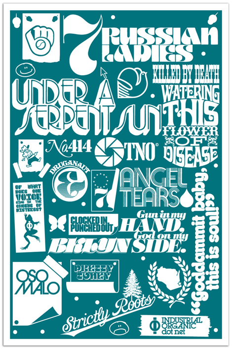
Justin Thomas Kay has been a staple in the elusive editorial side of the type world since graduating from Milwaukee Institute of Art & Design in 2004. With clear influences from 70’s display typography (à la Lubalin), J.T.K. really captures an era of typography that focused on the potential of using type as image. As a new venture, he recently opened the Version Type Foundry, and I’m excited to see where this new chapter takes him.

Read the rest of this entry »

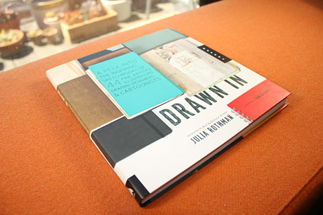
Drawn In by Julia Rothman

julia rothman

In our current day and age we have a plethora of opportunities to view designers’ sparkling clean, polished work. It’s not as often that we get to view the process or beginnings of this work. Julia Rothman‘s new book, Drawn In takes us into the pages of sketchbooks from 44 artists, designers and cartoonists.

Read the rest of this entry »

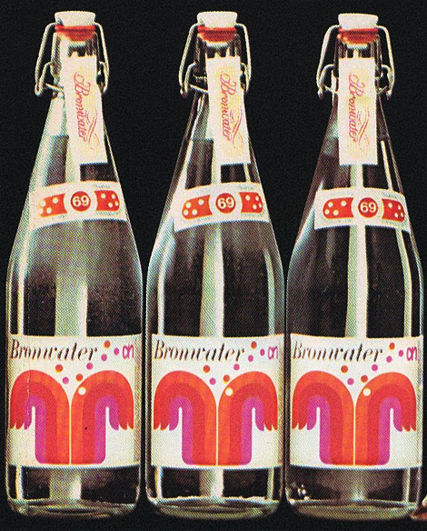
Louis Swart — Dutch Packaging

Louis Swart

Louis Swart was a packaging Designer in the Netherlands in the 1960s and 70s. Working in the design industry between the young ages of 13 and 40, Swart greatly paved the way for the future of Dutch package design. You can read more about the life and work of Louis Swart as well as view more of his great work at the Graphic Design Museum Blog.

Read the rest of this entry »

Lufthansa + Graphic Design

Joplin posters

The beginning of the 1960s saw one of the most important steps in the development of corporate communication. Lufthansa employed the designer Otl Aicher and his Gruppe E5 student group to develop a visual identity for for the airline. It was substantially realized in 1963 and up until the present day counts as one of the most groundbreaking corporate design solutions of the 20th century. With a focus on the famous brand identity, the design and advertising history of Deutsche Lufthansa from the 1920s to today is comprehensively documented here for the first time. This volume contains numerous illustrations from the corporate archive and background articles and interviews.

Read the rest of this entry »

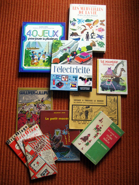
Book Gems from the South of France

On a recent and most adventurous trip to the South of France, I had the pleasure of visiting the small village of Montolieu. Known as the “Village of Books,” Montolieu has a grand array of artisans that specialize in book binding and printing as well as antiquarian bookstores specializing in everything from vintage periodicals and antiquities to comics, art and kids books.

Today’s post will unearth some of my favorite finds from my trip, including books illustrated by J.P. Miller, Charley Harper, and Alain Gree.

Read the rest of this entry »

Duane Dalton

duane dalton

Love the quality and breadth of work from Ireland-based designer, Duane Dalton. Mr. Dalton has a great minimal, restrained style which relies heavily on a strict adherence to the grid and the sparse use of color.

Read the rest of this entry »

Grady McFerrin

The name Grady McFerrin should be easily recognizable if you’re a reader of The New Yorker or New York Times, where his illustration work shows up frequently. But, what I like to (of course) focus on is his lovely lettering style. The thing that makes Grady’s work unique is the un-rendered, folk quality of his text; paired with his minimal color palette, he manages to create pieces that could have come straight out of early Americana. What Grady does is highlight the old and oft-forgotten, and sends the viewer a beautifully nostalgic feeling of the past.

Read the rest of this entry »

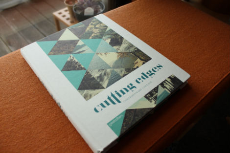
Cutting Edges: Contemporary Collage

Let’s face it. Some of us are image hoarders. With the wealth of images that can be found online and in print, it’s no wonder that collage is medium that many artists like to work in. The process of collecting images and carefully organizing them in a way to create and communicate fresh ideas is nothing new, yet there are many artists working in this medium today.

Cutting Edges, a hearty book published by Gestalten, successfully curates contemporary artists cutting and pasting their way out of vintage found imagery in order to produce innovative work. Featuring work by the likes of Jelle Martens, Anthony Zinonos, Eduardo Recife and more, the book is pure eye candy and totally worth adding to your own library.

Read the rest of this entry »

This Is Forest — Joel Speasmaker

Forest Joel Speasmaker

Joel Speasmaker, also known by his studio moniker Forest, just updated his website with a big pile of great design. You may know of Joel’s pursuits through the early 00s magazine The Drama, or through more recent work as Editor of Swindle, Art-Director of Anthem, or on a more personal level through his series of zine editions: Forest Small Books.  Joel continues to work hard and is always keeping it moving, so pay his new site a visit! Read the rest of this entry »

Heartwork: Art Benefit for Target House

heartwork

Heartwork is a project designed to raise money for art supplies within the art room at Target House—this wonderful home-away-from-home for the families of children facing long-term treatment at St. Jude’s Children’s Research Hospital.

The idea is simple. Every year, a group of talented artists will create a series of posters to raise money for the art room. Each of the posters will feature a different interpretation of the Target House elephant mascot, chosen because it represents family, long life, strength and playfulness—attributes with special meaning at a place designed for families to live, play and heal.

Read the rest of this entry »