Recently Received
Forming Vol.1 featuring the illustration work of Jesse Moynihan
Fresh from the mailman, here’s the latest titles to hit our shelves.
09.19.11 | Dave | Off Our Bookshelves |  2 comments


Forming Vol.1 featuring the illustration work of Jesse Moynihan
Fresh from the mailman, here’s the latest titles to hit our shelves.
09.19.11 | Dave | Off Our Bookshelves |  2 comments

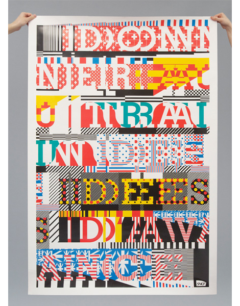
Niessen & de Vries, the Dutch graphic design duo of Richard Niessen & Esther de Vries, have put together a portfolio that captures a strange but wonderful sense of composition using type. Their style focuses on the art of print and the techniques that draw the attention of graphic designers the world over, like overprinting, patterns, off-registration, large scale posters and (of course) amazing typography. While Niessen & de Vries have a very fresh feel to their work, there’s also a great sense of post-modernism by exploring the page purely for arts’ sake.
Read the rest of this entry »
09.16.11 | Liz Meyer | Found design |  7 comments
The work of Patrick Macomber (aka South Yall) is pretty dang terrific. I’m always drawn to those designers that operate within a more minimal framework — it’s exciting to see someone arrive at a solution with the fewest moves possible.
09.14.11 | Ethan | Found design |  7 comments
Roman Klonek is a Polish illustrator in Dusseldorf, Germany. His Eastern European roots are very evident in his work, which is often colorful woodcuts of natural scenes full of interesting characters. As Roman states about his work, “You will find a bizarre balancing act between propaganda, folklore and pop.”
09.12.11 | Dave | Found design |  4 comments
I was excited to receive a package from Hans Harthman’s daughter, Fanny Hartmann last week. Contained within was a copy of Hans Hartmann: Ein Lebenfur die Grafik, a 1991 monograph compiled by Fanny with contributions from Joseph Marti and Fred Zaugg. The book is filled with full-color illustrations and photos from Hans’s prolific career as a designer and artist that spanned over 5 decades. Hans Hartmann’s name is often absent from design history books, so most of the pieces are new to me. I’m surprised by the breadth and depth of is work. I’ve seen examples of his posters and logos in the past, but I was unaware that he had ventured into sculpture, stained glass windows and exhibition design.
09.12.11 | Dave | Off Our Bookshelves |  13 comments

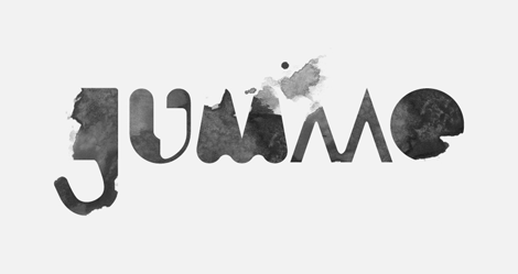
I recently stumbled upon the really cool work of Flydende Lava, the nom de plume of Daniel Siim, a student at The Danish Design School. I especially like Daniel’s bold and confident take on how to create letters. It’s really great to see the experiments and of an extremely excited fledgling designer, you never know what you’re going to see next.
09.09.11 | Liz Meyer | Found design |  1 comment
I’m a sucker for maps and all things travel related, so it’s no wonder that these postcards by Cape Town’s Radio are so appealing. Each postcard features a map of one of the nine provinces in South Africa, and is chock full of buildings, landmarks, animals, and agriculture representative of each region. Currently a work in progress, the completion of this postcard series will provide a most excellent pictorial view of the entire country.
09.08.11 | Grace Danico | Found design, Illustration |  12 comments
Riley Cran, everyone! Mr. Cran can be found in sunny Seattle, Washington, and has quite the handle on creating compelling logos and marks. I love his branding for Swallowed Sun Brewing Co. — it’s accessible, fun and to the point.
09.07.11 | Ethan | Uncategorized |  13 comments
Italian postage stamps designed by E. Consolazione, R. Cuzzani, and A. de Stefani in 1967 to commemorate the 50th anniversary of the Giro d’Italia cycling championship.
09.06.11 | Dave | Off Our Bookshelves |  9 comments
If you’re someone who is excited about type, the name Alex Trochut should be a name often on the tip of your tongue. But if you haven’t seen that name before today: Alex is an amazing young letterer out of Barcelona. With an extensive heritage in the type world (his grandfather was a printmaker and typographic designer), Alex shows his talent through endless experimentations that push the limits of type to the extreme. A couple of months ago Alex published his first book, More is More, which looks to be a great compilation of his work, so be sure to check that out if you what to experience more of this lettering master.
09.02.11 | Liz Meyer | Found design |  7 comments