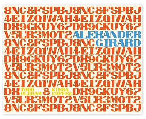
Alexander Girard by Todd Oldham & Kiera Coffee

alexander girard

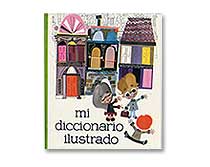
Todd Oldham who put together an excellent monograph on Charles Harper and Kiera Coffee recently released an exciting new book chronicling the work of the late Alexander Girard. This 672-page beast published by Ammo covers virtually every aspect of Girard’s distinctive career. As one of the most prolific and versatile mid-20th century designers, Girard’s work spanned many disciplines, including textile design, graphic design, typography, illustration, furniture design, interior design, product design, exhibit design, and architecture. Exhaustively researched and lovingly assembled by Oldham, this tome is a must-have book on Girard’s oeuvre.

Read the rest of this entry »

Anton Pearson

Really cool work coming out of Minneapolis by Anton Pearson, a senior at Minneapolis College of Art. Anton creates work that is especially fresh feeling, with innovative type treatments and painterly techniques. I really love his use of color and most of all, how consistent his portfolio of work is—I’m excited to see where Anton takes his work after he graduates and beyond.

Read the rest of this entry »

Tony Dispigna

tony dispigna

Tony Dispigna may be a very influential craftsman to today’s “throwback” design connoisseurs without many realizing. In 1969, shortly after graduating from Pratt, Tony joined forces at the legendary Lubalin Smith & Carnase. He has worked to produce notable classic typefaces like Lubalin Graph and Serif Gothic. Tony is currently a professor at Pratt and the New York Institute of Technology, and has also taught at SVA. Although much of Tony’s work is based on type, he also has a really good sense for creating wonderful logos, as you will see below.
Read the rest of this entry »

Jen Mussari

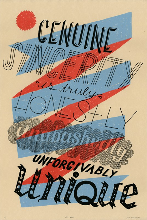
The portfolio of Jen Mussari is an refreshing mix of quirky handrawn lettering and illustration. What I really enjoy about her style is that it seems very personal and focuses on art-making rather than the production of a commercial product. Jen, with some of her friends, recently launched a really cool project, S Magazine, featuring a lovely cover illustration. Read the rest of this entry »

From the Job Board

designer jobs

Recently Added to the Grain Edit Job Board:
Designer – GOOD (Los Angeles, CA)
Senior Brand Writer – Fossil (Dallas/Richardson, TX)
Senior Designer / Art Director – Fossil (Dallas/Richardson, TX)

You can subscribe to our job listings via RSS, Email or follow at Twitter and Facebook.

Read the rest of this entry »

Foundry Collective

Fun work from the Denver/Dallas group Foundry Collective. These guys have a steady hand in Americana-vintage that translates really well to their identity, packaging and typography. I love their use of color, texture and illustration — their work has loads of personality.

Read the rest of this entry »

Raymond Lemstra

Raymond Lemstra

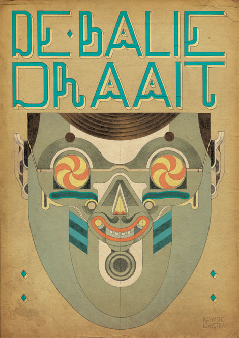
Raymond Lemstra is a Dutch illustrator based in Amsterdam with a unique and playful aesthetic that thematically explores primitivism through character design and masks. He takes great care in every illustration he creates, which is evident in the assiduous details of his line work and compositions. Raymond plays with soft colors, geometric figures, and crosshatching techniques to create strikingly peculiar images that I can’t get enough of.

Read the rest of this entry »

Saul Bass: A Life in Film & Design

saul bass book

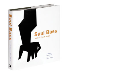
Saul Bass: A Life in Film & Design is the first book to be published on one of the greatest American designers of the 20th century, who was as famous for his work in film as for his corporate identity and graphic work. Saul created some of the most compelling images of American postwar visual culture. Having extended the remit of graphic design to include film titles, he went on to transform the genre. His best-known works include a series of unforgettable posters and title sequences for films such as Alfred Hitchcock’s Vertigo and Otto Preminger’s The Man with the Golden Arm and Anatomy of a Murder. He also created some of the most famous logos and corporate identity campaigns of the century, including those for major companies such as AT&T, Quaker Oats, United Airlines and Minolta.

Read the rest of this entry »

Scott Campbell

scott campbell

Scott Campbell is an illustrator, designer, musician — and by the look of his work, a hands-on, analog, form-making lover. The current crop of work on Scott’s site is terrific. It’s clean, it’s messy, it’s bold, it’s abstract. It’s also very textural and dimensional, which I love. He’s great at using rustic imagery with clean layout and typography.

Read the rest of this entry »