I Am Always Hungry

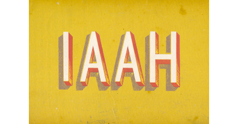
i am always hungry

I’ve been a fan of I Am Always Hungry for quite a while so I’m happy to see they’ve recently updated. We haven’t seen any new work from IAAH in some years; as such they’re now releasing 40 projects in as many days. Out of this latest release I’m quite drawn to a number of their typographic studies, experiments and branding for a number of feature films. They’re dark and raw and very playful in their own eerie way.

Read the rest of this entry »

WTHR App Inspired by Dieter Rams

wthr app

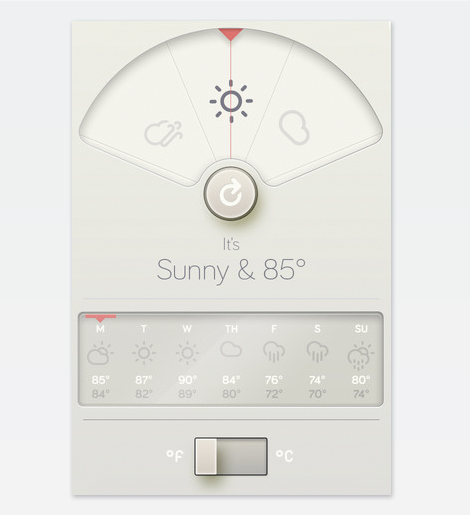
David Elenga has created a simple yet elegant weather app called WTHR which is inspired by Dieter Rams’ Ten Principles of Design. At the top of the screen the current weather condition is displayed along with the temperature for your area. Just below is a 7-day forecast and a nifty switch which allows you to select between Fahrenheit or Celsius. Unfortunately version 1.0 has some bugs and usability issues which should hopefully be resolved soon. I would hold off on downloading the app until the release of version 1.1 which is slated for sometime next week.

Read the rest of this entry »

Matthew Tapia

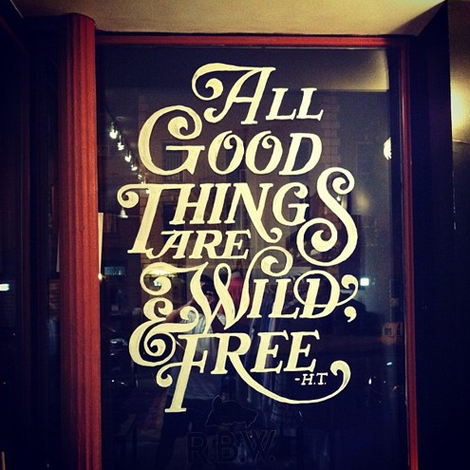
I was recently introduced to the work of lettering artist Matthew Tapia. He’s been an active figure in the skate and surf scene, but his elegant handiwork is incredibly well suited for all sorts of intricate lettering design. As a testament to his love for his craft, I witnessed him slaving away at 2am on the above mural, at a shop nearby my apartment (Raised by Wolves)—now that’s some dedication! To keep up with Matthew’s current work follow him on tumblr, and keep an eye out for his work hopefully soon in a shop (or on a store window) near you!

Read the rest of this entry »

Atipus

atipus

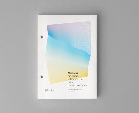
We’ve posted a number of great Barcelona-based designers and illustrators in the past, and the work from Atipus is no exception. Atipus is a studio doing really sharp branding, art direction and general design for print and web. What really struck me was the distinctiveness and personality throughout their portfolio. The work is clean and accessible as well as smart and well thought out.

Read the rest of this entry »

Save Prentice

prentice hospital

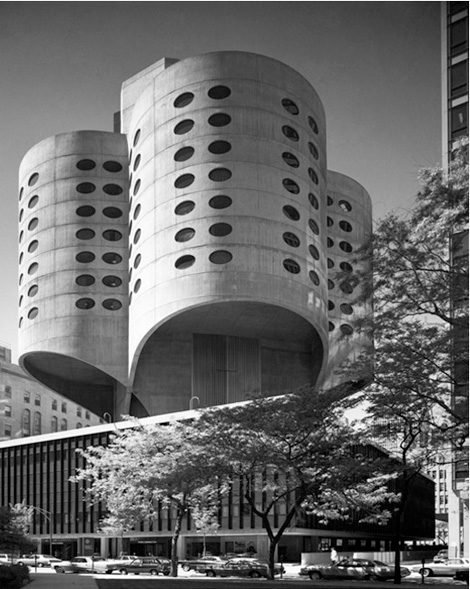
Designed by famed architect Bertrand Goldberg, Prentice Women’s Hospital has added drama and interest to the Chicago skyline for nearly four decades. Unfortunately, like Marina City Towers and many of Goldberg’s other architectural wonders, the hospital has no formal protection.

Today, the vacant building is threatened with demolition by Northwestern University, which sees the land on which Prentice sits as expansion space for a new research tower.

The same structural daring that once inspired the world to take a different look at Modernism can again capture its imagination this time though preservation and innovative reuse. You can support the comeback story of this cloverleaf-shaped icon by signing this petition. Your voice, and the voices of others who care about the past because of what it means for the future, will send a clear message – Prentice is a masterpiece worth saving.

Read the rest of this entry »

Lesley Barnes

lesley barnes illustration

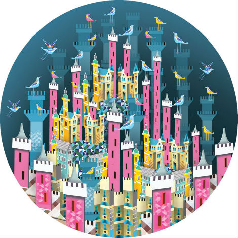
I’ve been following the work of Glasgow based illustrator and animator Lesley Barnes for quite sometime now. Her illustrations continue to surprise and delight me in their bright colors, geometric shapes, and often magical and mythical subject matter. Her use of patterns and repetition is extraordinary, and is a true visual treat.

Read the rest of this entry »

Swiss Photobooks: 1927 to Present

swiss photobooks

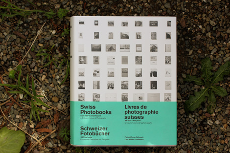
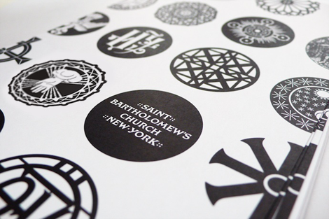
My interest in photography has grown recently and i’ve been on the prowl to find quality books on the subject. One of my latest additions and the one i’m most excited about traces the history of the Swiss Photobook.  Compiled by the Swiss Photographic Foundation (Fotostiftung Schweiz) and published by Lars Mueller, Swiss Photobooks from 1927 to the Present highlights classic and influential titles that exlemplify the era. Weighing in at 7.5 pounds, the massive visual compendium features lush spreads, in-depth summaries, an extensive bibliography and introduces over 60 pieces. A pleasure to look at and an engaging read, this volume is a well-crafted ode to the distinct character of the Swiss Photobook.

Read the rest of this entry »

Jesse Ragan

Type designer extraordinaire, Jesse Ragan, released the latest iteration of his website this past week. Chock full of new and meticulously designed work, Jesse’s type design gets more interesting with each project. His projects range from the current typeface of V Magazine, to the logotype for Glade, to working closely with Hoefler-Frere Jones on major typefaces like Gotham and Archer. Jesse, a self proclaimed designer of serious typefaces, is sure to continue to awe and inspire aspiring (and current!) type designers.

Read the rest of this entry »

Gary Taxali Interview

gary taxali

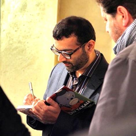
Today’s Grain Edit interview is brought to you by guest contributor Deva Mirel, and features the words and works of illustrator/fine artist Gary Taxali. We catch up with Gary after he returned in early May from his first solo show abroad at The Outsiders in London. Gary lives and works in Toronto but is originally from India. Here he discusses his most recent show, locating the desi in his work, why kids love him, and some straightforward tips on being in the business of making art.

Read the rest of this entry »

Mads Burcharth

Mads Burcharth

Lots of cool, crisp typographic work from Denmark-based Mads Burcharth. I love his clean, minimal approach to lettering and type design and his ability to add flourishes and interesting details to his work. His style is strong and bold, and has a great flair to it as well.

Read the rest of this entry »