January 2010

You are currently browsing the monthly archive for January 2010.

Andrio Abero

Andrio Abero / 33rpm / Rufus Wainwright

Way, way back in the Fall of 2007 we posted the work of designer/illustrator Andrio Abero. Recently, I noticed that Andrio had redesigned his site, and added a lot of new work. I love the variety in Andrio’s portfolio — there’s a nice range between the simple, bold, and understated and the more textural, fuzzy, washed out imagery.

Read the rest of this entry »

Great Britain Energy Resources Stamps 1978

great britain stamps

1978 Great Britain Energy Resources stamps designed by Peter Murdoch

Beautiful stamp set was designed by Peter Murdoch, creator of the fibreboard “Chair Thing” and the collapsible cardboard display systems at the 1968 Mexico City Olympics.

Read the rest of this entry »

Jessica Hische Studio Visit

jessica hische studio visit

During a recent trip to New York, I had the pleasure of visiting the illustrious designer, Jessica Hische. In addition to creating wonderfully precise type, such as her Daily Drop Cap series, Jess carefully curates her incredible studio / home that I’m proud to feature on the site today. In today’s studio visit, she gives us advice on collecting furniture, and has a pretty awesome surprise at the end! Take a peep…

Read the rest of this entry »

Limited Edition Grain Edit T-Shirt Now Available

grain edit t shirt

Grain Edition #01 – Limited Edition Grain Edit T-Shirt designed by Invisible Creature

We are excited to announce the Limited Edition Galaxy Blue Grain Edit T-Shirt is now available. The shirt was designed by Seattle’s own Invisible Creature. We love the design and hope you do too! The 5 color t-shirt features a gaggle of cool creatures sitting down for story time (my favorite is the little guy with the red and blue eyes). Each shirt is lovingly screen-printed by the guys and gals over at Blue Collar Press right here in the good ole USA.

You can order the Limited Edition Galaxy Blue Grain Edit Shirt here.

grain edit t shirt

For More Details:

Read the rest of this entry »

Vintage Calendars

vintage calendars

1970 Self promotional calendar designed by Terzostudio (Giorgio Tramontini)

Two weeks ago we posted some of our favorite calendars for 2010. Today lets look at some calendars of the past.

Read the rest of this entry »

Brent Couchman

For quite a while I’ve noticed Fossil‘s excellent collateral and identity — I just never knew that the man responsible for much of that work was the one-and-only, Brent Couchman. That is, until now. Brent has a great eye for mixing the clean with the colorful. His bold, bright work is engaging and historically-informed, a real pleasure to look at.

Read the rest of this entry »

Emigre at Gallery 16

emigre magazine

If your in the Bay Area, there’s a cool exihbition over at Gallery 16. The exhibition celebrates the 25th Anniversary of Emigre, and will present artwork from Emigre as well as the new Gingko Press publication Emigre No. 70: The Look Back Issue – 25 Years in Graphic Design. The 512 page book covers the best of a quarter century of Emigre magazine.

Read the rest of this entry »

Matthew Lyons Illustration

matthew lyons illustration

Space is the place, and I’m completely head over heels over UK illustrator Matthew Lyons!

This particular illustration, entitled Planet 4570 (1961), is a fake movie title that incorporates dramatic light and shadow, minimal brushstrokes, jewel-like crags, and strong type. His aesthetic is incredibly refined for his young age (21), and his work employs contemporary interpretations of the space age future, which feels new yet distantly familiar.

Read the rest of this entry »

Europe by Car

europe by car

I love the cover of this Europe by Car brochure. The roads make for a nice grid structure and give the piece a Mondrian-esque quality. The business model for the company was pretty interesting as well. Europe by Car offered services for Americans interested in traveling around Europe for extended periods of time. Using their services you could purchase a European car to use on your travels. At the end of your vacation, Europe by Car would also help ship your new car back to the U.S.

The brochure includes prices for cars from Porsche, Austin Healy, Citroen, Jaguar etc. I just wish their price sheet was still valid. A Porsche for $3700? sign me up!

Read the rest of this entry »

Typ journal from Czechoslovakia

Typ journal from late 1940s in Czechosolvakia

Young people working in the printing industry in Czechoslovakia from 1920s to mid century were graced with a beautiful journal, Typ. The decision to use only a couple of colors, lots of negative space, play with alignment, and change the placement of the title kept the design on the forefront, in the late 40s and today.

Read the rest of this entry »

Matte Stephens Studio Visit

matte stephens

I’m excited to announce that I will be writing for Herman Miller’s Lifework blog from time to time. The blog which recently launched in December, explores issues that arise around working from home.  For my first contribution, I spoke with artist Matte Stephens about his inspiring workspace. You can see the full piece here.

Read the rest of this entry »

Ptarmak

Wow! Fun, exciting work from Austin-based design collective Ptarmak. Their work is a refreshing example of design that looks great, and is also very usable. I love when design can do both of those things. It’s simple and clear, but equally as sophisticated. And that typography: whew!

Read the rest of this entry »

Jay Ryan

jay ryan

Andrew Bird @9:30 Club poster – Designed and Illustrated by Jay Ryan

The work of Jay Ryan was one of my first introductions to graphic design and gig posters — way back in the olden days. I spent many quality hours checking out his website and taking in his work at Flatstock. Screenprinted squirrels, eccentric characters, and hand lettered typography? It’s so interesting that these diverse objects can come together and say something so compelling about a band like Shellac, or Built to Spill, or Sebadoh.

Jay Ryan is this week’s poster pick — and you can purchase his work through Poster Cabaret.

Read the rest of this entry »

The Future is Today: 2010 Calendars

2010 calendar seesaw press

2010 Calendar by SeeSaw Designs.

Having trouble remembering what day it is? Still stuck on 2009? Well friends, the future is today!

This particular calendar, designed by SeeSaw Designs, nicely juxtaposes organic forms and geometric shapes. The pairing of the corals with the varied blue hues is pretty dandy too.

We’ve compiled a list of some of our favorite calendars of 2010 for all you procrastinators out there. Check it out!

Read the rest of this entry »

Jonny Wan Illustration

jonny wan

Guns Pattern 2 – 17″x22″ Designed and Illustrated by Jonny Wan

Really loving the work of Sheffield based illustrator Jonny Wan. His portfolio is filled with interesting explorations with shape and color, plus the dude can draw some guns! If I had cartoon hand, I would ask Jonny if I could take a few of these heaters out to the local hand-drawn gun range to squirt some rounds!

You can catch Jonny over at Twitter and for those interested in purchasing a print, you can pick one up in his shop.

Read the rest of this entry »

Map of Lucerne, Switzerland

luzern map

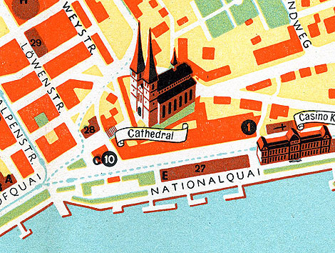
The Swiss are known for their well designed watches. Franck Muller, Rolex and Omega are just a few of the manufacturers with established roots in Switzerland. I’m sure more then a couple people visit this country each year just to check out luxury timepieces. Can’t say I fall into that crowd, but I’d be more then willing to go  if someone wants to front the bill! For those that can afford a watch buying trip and happen to have a time machine laying around, this map could prove very useful. The map, which dates back to the late 1940s(?) helped guide tourists visiting the Lucerne area in search of well respected watch merchants.  It includes recommendations from the Swiss Watchmakers Guild, so you know its golden. I think.

I love the teal, and the orange accents, but the pale yellow is a little too much for me. I have a feeling whoever designed this map has a hankering for crusty mustard, word up.

Read the rest of this entry »

The Catton House

catton house

The Catton house designed by Arthur Erickson and Geoffrey Massey in 1967

More amazing work from the late great Arthur Erickson.

Read the rest of this entry »

Chad Kouri

Chad Kouri / Grain Edit

Grain Edit friend and design champ Chad Kouri, of Long Live Analog and The Post Family, has a wonderful solo show opening this Friday at Chicago’s Rotofugi Gallery. Chad’s work, like his moniker, is based in the analog. It’s a compelling collage of found images, hand drawn elements, and textures.

Read the rest of this entry »

Esther Aarts Illustration

Esther Aarts illustration

It’s out with the old, in with the new. Goodbye 2009, hello 2010!

Netherlands based illustrator, Esther Aarts, created this holiday greeting card for van Ditzhuijzen accountants. Its charm lies in its personified objects, such as the gleeful teabags and toothy stapler, set against coarsely textured backgrounds. I really like the color scheme with its varied pink hues in stark contrast to the grainy black, and the hand drawn type is also an added plus…making way for a fresh new year.

Read the rest of this entry »

Identity Programs by Noel Martin

noel martin

Identity for Ohio Arts Council designed by Noel Martin

Noel Martin was a self taught graphic designer who taught at the Art Academy of Cincinnati and served as the in-house designer for the Cincinnati Art Museum for many years. He was one of the first to modernize art museum exhibition catalogs. In an article at the New York times Steven Heller also notes, “With the ubiquitous branding and expert merchandizing of museums today, it is easy to forget that graphic design was once a low priority for them. In 1947, when Mr. Martin became the Cincinnati Art Museum’s first graphic designer, most museum publications were staid and musty.”

The Container list has a nice post on a self-promotional piece titled, Identity Programs, that presents some of Noel’s iconic minimalist logos.

Read the rest of this entry »

Simon Page interview

international year of astronomy

2009 International Year of Astronomy Poster designed by Simon C Page

Simon Page is a self-taught graphic design whiz with a mathematics background. He takes shapes and morphs them into cerebral abstractions. His style shifts around futuristic digital designs and 1960s minimalism, trotting the delicate line between simplicity and detail.  His International Year of Astronomy 2009 poster designs caught the eyes of discerning design writers, including the New York Times and Creative Review. It may be the year for Astronomy but its equally a big year for Page, his posters got a boost in sales from all the acknowledgment he’s been getting in print and on the web.

Read the rest of this entry »