Wayne Pate – good shape design prints

Wayne Pate  good shape design prints design illustration

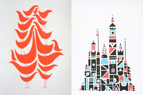
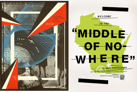
Wayne Pate runs GoodShapeDesign, a Brooklyn, NY based design shop and all around fun place. I’m really into his “Flock” series — if you’re a fan of our feathered friends, now you can have 18 on a single poster!

Also check out his artwork section for some really inspiring collages.

Pascal Blanchet cartoons and illustration

Pascal Blanchet cartoons and illustration

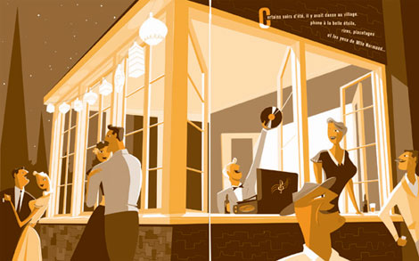
I’m just in awe of Canadian comic book creator and illustrator Pascal Blanchet’s work. It was tough to decide what image to post, everything is so good.
(Many thanks to Julia at Book by its cover for passing this along)

Syd Mead concept illustrations for US Steel

[pictobrowser 10159078@N03 72157604562347640]
Concepts – Promotional book for US Steel c1961

Industrial designer / illustrator Syd Mead is well known for his vehicle designs and backgrounds for classic science fiction films like Blade Runner and Aliens during the 1980s. Long before these projects, he produced a series of conceptual illustrations and paintings for US Steel. The futuristic automobiles, diagrams and environments were published in several promotional books during the early 1960s.

These books are intense to look at. The full page spreads are over 2 feet wide and heavily detailed. Keep in mind when viewing the images above, that this work is very early on in his career, as he had recently finished his studies at Art Center in Pasadena.

Hans Neuburg – Swiss poster design

1960s Hans Neuburg - Swiss poster design
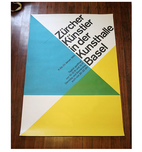
Zurcher Kunstler in der Kunsthalle Basel, Switzerland- c1966

Beautiful poster by Swiss graphic designer and author Hans Neuburg.

If you like this, check Publicity and graphic design in the chemical industry  a book by Hans Neuburg.

(via Crabstick’s killer Flickr photostream)

1960s Japanese graphic design magazine

1960s japanese graphic design magazine
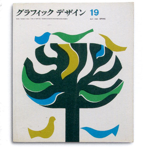
Graphic design magazine – japan 1965

Running with a Japanese theme today. Can’t stop thinking about those flicks I caught this past weekend. Great cover for a Japanese graphic design magazine from the sixties.

Also worth checking out, is this Japanese poster we posted.

Nikkatsu – Japanese actions films

Nikkatsu studios - cult Japanese actions films
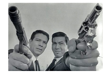
Jerry Fujio and Jo Shishido in A Colt is my Passport c1967

I had a chance to check out a few films from the No Borders, No Limits: 1960s Nikkatsu Action Cinema series this weekend. These super stylized films produced by the Nikkatsu film studio were heavily influenced by Hollywood and the French New Wave. The Seijun Suzuki films re-released by Criterion are part of the Nikkatsu catalog. If you’ve seen any of Suzuki’s films, it will give you an idea of the films featured in the No Borders, No Limits series.

The series focused on some of the more obscure films to come out of the Nikkatsu studio. All 3 films I saw were great. I just wish I could of seen the other 3. You can find out more about these films at Outcast Cinema.

Mike Krol – posters, logos and package design

Mike Krol  posters, logos and package design

Mike Krol designs for musical bands, sandwiches, accordions, gorillas, light bulbs, and maple syrup, among many other things. He has a very good sense of humor, wit, and typography. I love finding work where the designer’s personality shines through. Especially if that includes heavy metal and Eskimos.

Check out the walking backwards to school video. I loved that!

Japanese graphic design – book covers

Japanese graphic design - book covers from the 1960s
1960s Japanese book cover designs

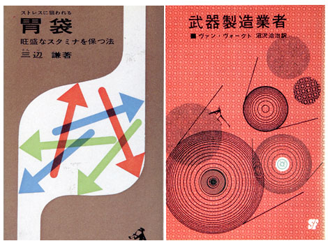
I don’t know much about the company that published the book on the right, but the book on the left was published by Kappa in 1963. Keep your eyes out for Kappa, they have other cool covers.

Icographic Journal – Isotypes, Icons and Pictograms

[pictobrowser 10159078@N03 72157604453540681]
Issues of Icographic magazine 1971-1978 produced by ICOGRADA

Icographic (The review of International Visual Communication Design) was founded by John Halas in 1971. It was designed / edited by Patrick Wallis Burke and released quarterly, well atleast for the first year. The journal addressed the broader areas of visual communication such as semiotics, communication theory, ergonomics of visual communication and the psychology of perception. Of the four issues I have, two deal with Pictorgrams, Isotypes and symbols. I’m fascinated by the work of Otto Neurath and Otl Aicher (both of which are featured within the Journal) so it was a real pleasure to stumble unto these issues. In addition to Neurath and Aicher, there are sections on signing systems designed by Yugoslav architect Radomir Vukovoc and Pictograms by Ian McLaren and Claude Braunstein.

The layout and content remind me of another design journal produced during the same general time period titled Dot Zero. I will be covering Dot Zero in a future post but, for now enjoy the Icographic slideshow above.

Invisible Creature – design and illustration

Invisible Creature - design and illustration

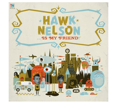
Invisible creature has a slew of great design and illustration work at their site including the album art for the latest Hawk Nelson record.

Be sure to check our interview with Invisible Creature.