Mattson Creative

grain edit / mattson creative
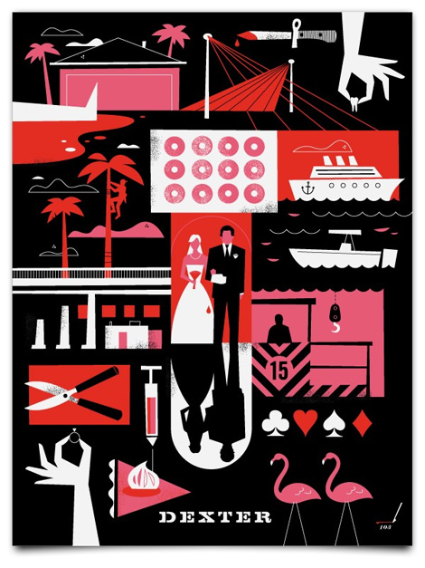
What if all all TV series’ posters looked like this? I can’t imagine a world like that, but what a wonderful world it would be! Ty Mattson, the man behind Mattson Creative, has created posters for both Dexter and Lost.

The composition of these Dexter posters is great — I love the variety of stylized details, all relevant to the show. I’ve seen a few episodes of the first season of Dexter, but these prints pique my interest. There very well may be some more Dexter in my future.

Read the rest of this entry »

Harry Murphy + Friends


“The Gap Records and Tapes, San Francisco.”

Graphic Design San Francisco is a book that was published in the late ’70s by the Institute for Graphic Design (which would later become AIGA SF) and Chronicle Books. For the first in a series of posts about the works of San Francisco Bay Area designers and firms, as their portfolios stood on the brink of the ’80s, I present to you Harry Murphy + Friends.

“The Philosophy of Harry Murphy + Friends is to maintain design work of consistently high quality, while producing a large volume of projects involving an exceptionally wide range of related disciplines, frequently with rigorous deadlines.

Since locating in the San Francisco area in 1966, Harry Murphy + Friends has won over 700 national and international design awards for architectural graphics, space design, environmental art, corporate identity, print graphics, and packaging.”

Read the rest of this entry »

House Industries at Heath Los Angeles

house heath

Letters, numbers, ceramics and craftsmanship collide in a month-long House Industries exhibition at the Heath Los Angeles studio and store. House will transform the legendary tile and tableware maker’s airy Beverly Boulevard space into an unprecedented emulsion of clay, metal, ink, cotton, wood, lacquer, lithography and letterforms.

The exhibition will feature several new objects including custom-fired House-Heath tiles, reclaimed wood end-grain tiles, hand-printed folding plywood divider screens, tree ornaments, letterpressed greeting cards and much more. Heath also stocks hard-to-find House classics such as the Eames House blocks and the Alexander Girard Nativity.


Read the rest of this entry »

2010 Holiday Wish Lists

Grain Edit Holiday Gift Guide
Dear Holiday Spirit(s):

We’re approaching the end of 2010, a year filled with work, work…and did we mention, more work? Seeing as we’ve all been on our best behavior, please take a look at the wish list we’ve compiled with some of our favorite artists and friends. It’s much BIGGER than last year’s list and excited to share it with you. Please say you’ll bring some of these goodies our way!

Yours Truly,
Grain Edit + Friends

Read the rest of this entry »

Poster Pick: Arcade Fire at the Key Arena

invisible creature

For this week’s poster pick, Invisible Creature presents us with a cold, ghost-like city, where it’s remaining inhabitants are fleeing in a school bus into an unknown suburban abyss. The artwork was inspired by the equally bleak lyrics of ‘City With No Children’, a song from Arcade Fire’s latest release, ‘The Suburbs‘. I appreciate the selective use of color and asymmetrical layout, which immediately caught my eye. This gets my vote as one of the Creature’s most impressive posters to date.

You can pick up a print at the Poster Cabaret or enter to win a copy in the Grain Edit Holiday Giveaway Bash.

Read the rest of this entry »

American Trademark Designs

American Trademark Designs

For my first post here at Grain Edit, I’m going to share one of my favorite design books from my bookshelf: American Trademark Designs. Published in 1976 by Dover Books and written and compiled by Barbara Baer Capitman, this book is chock full of 732 delicious black, bold, and inky vintage logos. My favorite aspect of this book is that it showcases extremely recognizable logos that have been stamped into the back of our eyelids (IBM, Mr. Peanut, Pepsi-Cola, Playboy) right alongside rarely seen identities created by tiny firms for tiny companies. Some marks are also showcased next to their former, replaced versions, displaying the brand’s evolution.

I’ve scanned some of my favorite graphics to share with you. A portion of this book is also available for view in Google Books, but it’s much more interesting on paper.

Read the rest of this entry »

2010 Design Sponge scholarship!

design sponge scholarship

Only one day left to apply for the 2010 Design Sponge Scholarship. This year they’re awarding $10,000 to both undergrad & grad students. Apply here.

Read the rest of this entry »

Voidwreck

Voidwreck, typography, Netherlands

Voidwreck is the collaborative studio of Amsterdam residents Karl Nawrot & Walter Warton. Karl is a graduate of the Werkplaats Typografie, which is considered by some to be the holy grail of typography programs in the world.

As an experimental studio, Voidwreck constantly explore different mediums to develop shape and pattern. The same can be said of their typography, which I think embodies the word ‘modernism’—embracing the new while drawing on geometrical sans serifs as inspiration.

Read the rest of this entry »

Malota Projects

Malota, Mar Hernandez, Spain, illustration

Malota is the pseudonym of Spain based illustrator and designer Mar Hernandez. Mar’s work uses a lot of punchy colors, varied textures and gradients, as well as sharp geometric shapes, which is evident in this illustration of a cat in boots. I really love the way she depicts the cat’s fur and kooky tail. Its facial expression and whiskers are really fun too!

Read the rest of this entry »