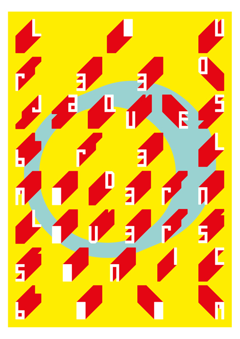
July 2012

You are currently browsing the monthly archive for July 2012.

Type and Media 2012

type and media

Allonghata by Christine Gertsch

Type and Media is an intensive one-year masters course in type design held at The Royal Academy of Art in Den Haag, The Netherlands. The course teaches a wide range of skills in the area of type design such as calligraphy, stone carving, non-latin scripts, typeface revivals, Python programming, modern font editing software as well as the creation of new letters. All of the final project typefaces created in the last four months of the 2011/2012 course are available to view here.

Read the rest of this entry »

Herb Lubalin: American Graphic Designer 1918—81

herb lubalin book

I’m really looking forward to the upcoming release of Unit Editions’ Herb Lubalin monograph. This meticulously researched book offers a complete career overview of Herb Lubalin, beginning with his early days as one of the original Mad Men in the New York advertising world of the 50s and 60s, and continuing into the years of his greatest achievements as one of the world’s most influential typographers and graphic designers.

More details after the jump.

Read the rest of this entry »

It Was A Famous Night

it was a famous night

Ever have a dream concert you wish you could attend? Like The Beatles and the Muppets or Raffi and Kanye?

It Was A Famous Night does just that — at least in terms of the gig-poster. The project curates eight artists to dream up their favorite concert and design the poster. Visually, and aurally, there’s some great work here. I’m most excited to see CD Ryan’s Spiritualized, Broadcast, Boards of Canada show.

Read the rest of this entry »

Laura Cattaneo AKA Halfpastwelve

laura cattaneo

Halfpastwelve is the online home of Milan-based designer Laura Cattaneo. Currently she works as a journalist for Il Sole 24 Ore, art-directs for la vita nòva and collaborates with IL — Intelligence in Lifestyle magazine.

After browsing her portfolio, I was impressed with the range and quality of her work.  She easily transitions from editorial design and illustration to information graphics all while consistently creating work that is visually stunning. I’m especially drawn to her redesign of La Domenica, a cultural supplement of Il Sole 24. Along with team members Adraino Attus, Francesco Narracci and Luca Pitoni, she has created a layout that is minimal yet bold and beckons the reader to explore it’s contents.

Read the rest of this entry »

/Sponsor/ Squarespace

A Huge thanks to squarespace for sponsoring this week’s RSS Feed!

Design a visually rich website with magazine-quality layouts that scales to any screen size – all without touching a line of code. Squarespace 6 is a revolutionary new website creation platform with over 50 new features. Squarespace’s breakthrough LayoutEngine technology allows anyone to create magazine-quality layouts within the browser that responsively scale to any screen size, from mobile devices to desktops. The platform comes equipped with 20 new, fully customizable templates and offers sophisticated media management, robust blogging engine, deep social network integration, real-time statistics, multiple author support, and more. For a free trial, visit www.squarespace.com.

Interested in sponsoring the Grain Edit Feed? Visit our sponsorship page for more info.

Lotta Nieminen—Design

While most Grain Edit readers know Lotta Nieminen for her extraordinary illustration styles, but she also has an incredibly rich and beautiful design portfolio. Her keen eye for typography and layout design is relatively unmatched, and each project somehow manages to out-do the last. Together, her two portfolios create an exciting mix of work & almost a perfect dichotomy of truly minimal vs. extremely detailed.

Read the rest of this entry »

No Man’s Land by Blexbolex

No Man\'s Land, Blexbolex

Photos by Nobrow

It’s no secret that French illustrator Blexbolex has an affinity for hard-boiled detectives and crime drama. His latest work, No Man’s Land, continues in the narrative style of his previous books Dog Crime and Abecederia, and takes us on a wild journey through one man’s psyche in a quest to retrace the steps he took in taking his own life. At 140 pages, No Man’s Land is an epic graphic novel, chock full of beautiful energetic images. His style is incredibly visually arresting with its limited color overlays and heavy attention to the tiniest of details.

This is definitely a must-have book for any Blexbolex fan or illustration enthusiast, and is available via Nobrow.

Read the rest of this entry »

Forma&Co

forma&co

Forma&Co is a collaborative Barcelona-based studio. What really caught my eye with this studio were their large-scale programs promoting various happenings in Barcelona. The scope of the programs themselves are interesting: neurobiology and dusk-’til-dawn free museum accessibility. The visual design of the work is great; F&Co have a bold, fun, boisterous style that attracts attention and translates well to bus signs, banners, and city-specific substrates.

They do a lot of fun illustration work as well; check their site for more.

Read the rest of this entry »

/Sponsor/ Squarespace

A Huge thanks to squarespace for sponsoring this week’s RSS Feed!

Design a visually rich website with magazine-quality layouts that scales to any screen size – all without touching a line of code. Squarespace 6 is a revolutionary new website creation platform with over 50 new features. Squarespace’s breakthrough LayoutEngine technology allows anyone to create magazine-quality layouts within the browser that responsively scale to any screen size, from mobile devices to desktops. The platform comes equipped with 20 new, fully customizable templates and offers sophisticated media management, robust blogging engine, deep social network integration, real-time statistics, multiple author support, and more. For a free trial, visit www.squarespace.com.

Interested in sponsoring the Grain Edit Feed? Visit our sponsorship page for more info.

The Art of Logo Design

art of logo design

Off Book is a web-original series from PBS Arts that explores cutting edge arts and the artists that make it. In the latest episode they explore the world of logos that surround us with design luminaries such as Stephen Heller, Kelli Anderson, Gerard Huerta and Sagi Haviv. See the full episode here.

Read the rest of this entry »

Pets Rock Posters

pets rock
Eight Hour Day

Design strategy and marketing agency Zeus Jones was recently hired to bring a fresh perspective to Purina ONE BeyOnd’s sponsorship of the Pitchfork Music festival. For this year’s event they came up with the idea of giving away professionally-designed posters that celebrate the awesomeness of pets and music. Zeus Jones sought out some of their favorite designers and had them imagine what “Pets Rock” meant to them. Check out the following from grain edit faves – Lab Partners, Brent Couchman, Tad Carpenter and Eight Hour Day.

Read the rest of this entry »

I Am Always Hungry

i am always hungry

I’ve been a fan of I Am Always Hungry for quite a while so I’m happy to see they’ve recently updated. We haven’t seen any new work from IAAH in some years; as such they’re now releasing 40 projects in as many days. Out of this latest release I’m quite drawn to a number of their typographic studies, experiments and branding for a number of feature films. They’re dark and raw and very playful in their own eerie way.

Read the rest of this entry »

WTHR App Inspired by Dieter Rams

wthr app

David Elenga has created a simple yet elegant weather app called WTHR which is inspired by Dieter Rams’ Ten Principles of Design. At the top of the screen the current weather condition is displayed along with the temperature for your area. Just below is a 7-day forecast and a nifty switch which allows you to select between Fahrenheit or Celsius. Unfortunately version 1.0 has some bugs and usability issues which should hopefully be resolved soon. I would hold off on downloading the app until the release of version 1.1 which is slated for sometime next week.

Read the rest of this entry »

Matthew Tapia

I was recently introduced to the work of lettering artist Matthew Tapia. He’s been an active figure in the skate and surf scene, but his elegant handiwork is incredibly well suited for all sorts of intricate lettering design. As a testament to his love for his craft, I witnessed him slaving away at 2am on the above mural, at a shop nearby my apartment (Raised by Wolves)—now that’s some dedication! To keep up with Matthew’s current work follow him on tumblr, and keep an eye out for his work hopefully soon in a shop (or on a store window) near you!

Read the rest of this entry »

Atipus

atipus

We’ve posted a number of great Barcelona-based designers and illustrators in the past, and the work from Atipus is no exception. Atipus is a studio doing really sharp branding, art direction and general design for print and web. What really struck me was the distinctiveness and personality throughout their portfolio. The work is clean and accessible as well as smart and well thought out.

Read the rest of this entry »

Save Prentice

prentice hospital

Designed by famed architect Bertrand Goldberg, Prentice Women’s Hospital has added drama and interest to the Chicago skyline for nearly four decades. Unfortunately, like Marina City Towers and many of Goldberg’s other architectural wonders, the hospital has no formal protection.

Today, the vacant building is threatened with demolition by Northwestern University, which sees the land on which Prentice sits as expansion space for a new research tower.

The same structural daring that once inspired the world to take a different look at Modernism can again capture its imagination this time though preservation and innovative reuse. You can support the comeback story of this cloverleaf-shaped icon by signing this petition. Your voice, and the voices of others who care about the past because of what it means for the future, will send a clear message – Prentice is a masterpiece worth saving.

Read the rest of this entry »

Page 1 of 198123...Last »